The best ink trap typefaces for websites
A look at type that features prominent cuts or tapering into the type and a variety of recommendations you can use in your designs.
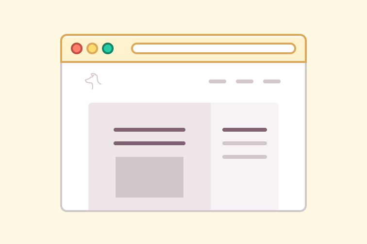
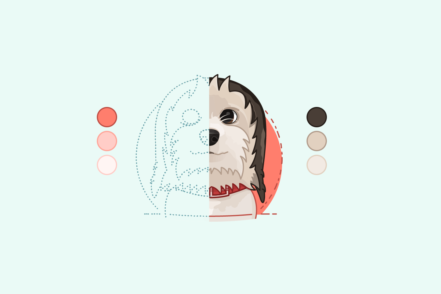
Our websites can offer us an important advantage when it comes to choosing colour for illustration—constraint.
Lazy loading doesn’t have to be difficult, here’s how to add smooth loading images to your website.
There are three types of stroke alignment, so when and where is each useful?
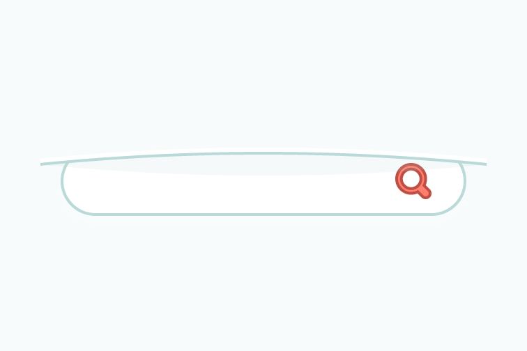
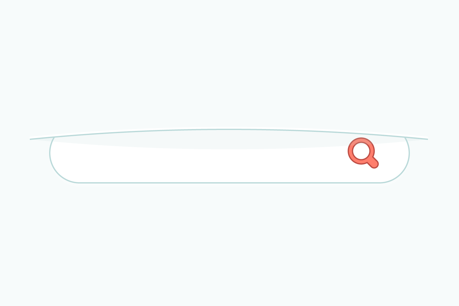
An in depth tutorial to add buttery smooth animations to reveal your website search.
Add a little extra polish to any of your designs with these tips.
It happens, sometimes you can be stuck starting a new design, here’s some tips that aim to help overcome the challenge.
In Illustrator it appears more difficult than it needs to be to export a colour palette to hex values, here’s a quick way.
Learn how to create, change and duplicate patterns as swatches.
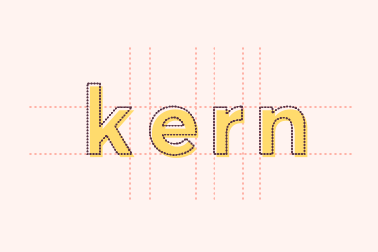
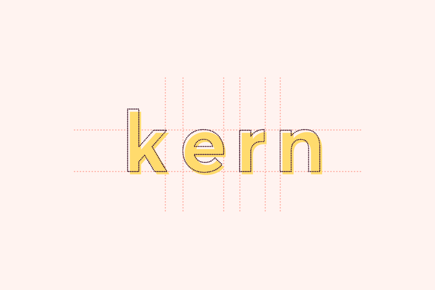
Understand the differences between the two, along with how and when to use them.
You may have two shapes and want to combine them, but still want to refine the overall shape or save it for later. This post shows you two options.
The second in a monthly series where I roundup some of the best things in design I found over the course of the previous month. It aims to be a source of website, illustration and branding inspiration, as well as some articles that are a good read.
As it’s the festive time of year, I thought I would add to the lists of gifts that people are writing. December and Christmas in general is one of my favourite times of year.
I’ve been working on a recent branding project for a company called Go 2 Golf. It will be a website that will help people find golf courses across the UK. The first step for them was to have a logo made, this is the process I went through to make it.
With horizontal scrolling, submenus are quite challenging to make work. Due to the CSS you have to use, a CSS only solution isn’t viable. In this post I show you how to utilise JavaScript.
Maintenance weeks are where detail website tasks, instead of a regular post. I spend time fixing bugs, updating grammar and posts in general, as well as adding featured images. It varies and this type of post details what’s been done.
This is the start of a monthly series of a roundup of 8 websites that I have found that are well designed. There is no particular theme, other than inspirational, which I hope you find is the case. I’ve added a few notes around why I believe they’re well designed as well.
Memorising shortcuts of any application improves efficiency. Now I’m by no means the most efficient person in Illustrator, I’m generally just happy designing. However, there are shortcuts you absolutely must know, because it saves you tediously clicking through panels and menus.
The redesign of this website has been needed for some time. Overall the website is quite small in terms of templates required. I wanted to put the effort into making the website feel like it is a growing source of content. There is much to cover in this, as I start with the new logo briefly, sketching, wireframes and design.
Circular is very much in the spotlight at the moment. It has a distinct look to it that so many huge companies are using. From Google to airbnb, it’s everywhere. If you’re looking for alternatives, with different prices and through a different service, this post is for you.
In the last post the basis for the visual style was set. In this post it will continue with that to complete the filters. There are some challenging areas like colour selection, as it can look overwhelming.
The previous post in the series completed the wireframes. They’re a solid basis for adding visual style. The content and interface elements required are all there. Further layout refinements, colour choices, typography and clarity improvements will be made throughout this post.
Maintenance weeks are where detail website tasks, instead of a regular post. I spend time fixing bugs, updating grammar and posts in general, as well as adding featured images. It varies what I will do, and this posts serves as detailing what has been done.
Continuing from the last post, which looked at the initial sketching and wireframe. This post will focus on the completion of each of the filters.
Filtering is a huge part of online shops, it’s an effective form of navigation. In most cases it’s an area which is overlooked on small screens. I have seen some good implementations and many lack the ease of a larger screen. In this post I want to explore the idea of it being a tab bar, starting with sketching & wireframes.
Illustrator being a vector application means it can be easy to overlook the export process and making things pixel perfect. It’s easy to do, so you don’t notice it. It’s particularly important that you try to retain this for logos and icons.
I’ve finally done the redesign of this website! Version five lived for longer than I ever intended. This post is going to be a shorter summary of the changes. I’ll be posting a full case study over the coming weeks.
It’s likely you know how to align things in Illustrator, but you can never remember how to space things equally, so you resort to the tedious way of spacing them individually. If you want to align objects with an equal space between them, this quick tip will show you how.
It’s been proven as apps have shifted away from the ‘hamburger’ navigation, to a bottom bar, engagement and browsing metrics have increased. Over time these findings have an impact on the thought process of those designing websites. In this post I detail a list of websites that are using the tab bar navigation.
Pricing tables are reasonably common for various types of services, they serve as a way to give the user an anchor. Generally meaning that you’ll be able to direct the customer into the package the company really wants to sell most of. While this post won’t cover the psychological side of that, it will focus on clarity and visual style. It’s an interesting website element to take a look at, so let’s start.
One of my aims during redesigning this website is to keep the seamlessness between content output and redesign. It’s not the easiest of tasks, as any time spent writing, is time taken away from the redesign or vice versa.
Tables in general are something I naturally avoid doing in design applications, they’re frustrating to make. They are easily to overlook due to this and that they can be quite uncommon in use. Let’s say you wanted to design a table in Illustrator, and you wanted a quick and accurate way to do so. This post will show you how.
Aligning to a key object in Illustrator is one of the most useful alignment options. If you’ve ever been frustrated with aligning objects centrally, then everything nudges over a few pixels. This is where align to key object comes in, read on for how to.
Following on from the datepicker post where it was more about getting the basics in place and focusing on some important Illustrator techniques that allow for accuracy and efficiency. This post will focus on guiding you through the process of making the datepicker easy to understand and have better aesthetics.
In this post I’m going to show you how to make a datepicker efficiently. A reasonably common user interface element, but can be a source of frustration, to make in design applications. Due to the grid, and amount of items in that grid it can be difficult to align everything…
So you use Illustrator for designing websites, and that could be because you’re on a retina screen and Illustrator is vector. So you can design at 1x and it not matter, at least that’s the case for me. However, when it comes to exporting it’s a pain, you can use ‘Save to Web’ and increase the size to 200%, but that’s tedious. You know how to export SVG, but exporting PNG files is the issue at retina sizes. In this post I will show you how to overcome that.
Swatches in Illustrator isn’t something I have used very often. Partly this has been down to being unsure of the best way, and not trusting that they will remain there. As there are random ones to begin with that you will never use and the process of deleting them seems annoying each time. In this post I’ll show you the best way to clean up existing swatches, add your own and keep them updated.
I figured I would write a post about the tools I use. Some will be familiar, but hopefully there are some that are unfamiliar and end up being useful to you.
The second to last post in this series, coding the page. You’re going to build the page using flexbox and make it responsive. The method that will be used to make it responsive, is mostly mobile first, but it will be making logical decisions based on where CSS only needs applying. This saves you from having to undo it in another media query.
The focus has been very much desktop so far, but considerations have been highlighted throughout for smaller screens. I will only cover ‘mobile’ sized resolutions, as for this particular layout you will only need to make minor adjustments for ‘tablet’ sized resolutions.
This is the start of a series where I’m going to take a common design pattern and go through the process of planning, designing and code. It will follow the process I go through to make websites, but taking a smaller component. The pattern you will focus on within this series is a hero area.
Here’s a quick tip of all the ways you can export SVG in Illustrator. Each have their conveniences, advantages and disadvantages. It’s entirely up to you which you use, there isn’t really a bad way.
Following on from the colour series I have a selection of websites that can help inspire your colour palettes. There is a variety between inspiration, resources and tools to pick colours.
Following on from the two previous posts, this post will cover things I have learnt about selecting colours over the years. These tips are the sort that when starting something new, you wish you knew, ahead of time. The majority of these tips will stand true, at least 90% of the time, and help making the right decisions easier.
This is the second part in this colour series. The topic I will cover in this post is tweaking your palette. Following the previous post, you will have selected a 5 colour palette, which should serve for the majority of your use cases. However, at this stage, it won’t be perfect. I’ll guide you through the process of tweaking your palette. From trying your colours in different combinations, to colour blindness. This post helps to refine your palette.
In this first post, I’m going to run through why colour theory is only a small part of choosing colours. Then you’ll begin to pick your palette. I’ll explain the things, that I consider when choosing a colour palette. This should help to inform your choices.
The idea of this post comes from a previous one, ‘accuracy in wireframes’. I thought more about the topic, which was around trying to decide layout and adding visual style. Focusing on two very important aspects of making websites leads to difficulties. It was part of a larger problem in my process.In this post I want to cover ways, where split focus can creep in, and the purpose of each step, so you can gain understanding for avoiding split focus. This is based on my process, so yours may differ, but the premise is the same.
I’ve seen tweets, and hear people say “I’m no good at sketching/drawing.” So they don’t bother with doing it. For me not sketching your website before going into a wireframe or design, means you’re missing out!Just because you feel like you can’t sketch, doesn’t mean you shouldn’t do it. After all, you’re capable of building a website, and at some point in the past you weren’t. In this post, I’ll show you my process and how to sketch websites.
This is one of the first things; I’ve worked on aside from what’s posts, to give away. It’s quite difficult to figure out what to design to give away, without just adding to the masses of things out there already. I’ve decided to code up some form styles. So you should be able to grab their styles and apply them right away to your forms. There are three variations.
I have updated my logomark. It’s been around 5 years, since I last made a change relating to my logo. Since then, I have grown as a designer, my aims, goals, and where I am have shifted. I’m going to cover the steps leading up to this. It’s relevant to the process and gives a better of understanding of what’s planned for this website. Then, I will cover the process.
I wrote a fairly lengthy post previously on vertical rhythm. I considered adding a section on how to adjust font sizes whilst maintaining vertical rhythm. However, with the experience of seeing how people struggle with the topic of vertical rhythm, it was best to keep it for a separate post.I will assume you do have a grasp of vertical rhythm, at this point, otherwise some parts may not make sense. In the examples I will be using em units, with Sass. So I assume you will have an understanding of how em units work. However, I will give you a brief overview.
Here’s 4 typefaces from typekit; that you may not have used. These are typefaces I have used in the past and have qualities that I believe make a good choice. Generally they are all suitable for paragraph text. They feature nice italics and a variety of weights. Hopefully through this post you can discover some nice typefaces that you can find appropriate for your designs.
In this post I’m going to cover a process I’ve brought in for doing wireframes, I’m finding really useful lately. It involves taking back all the visual style and just focusing on the layout of elements — as a result creating accurate wireframes. Then you build up your visual style from there. The problem for me comes from wireframes that have too little detail, being used as the basis for the whole page.
Vertical rhythm is the typographic practice, to create a vertical harmony between text, images and so on. On the web it’s quite difficult to achieve. Yet understanding what it is, with the aim to maintain it, you can improve your reading experience. If you’re aware of it, but have struggled to understand vertical rhythm, this post is for you. It will focus more on the why, rather than the how. So you come away with a better understanding.
Illustrator has a fair variety of default width profiles, however you may find yourself wanting to tweak them slightly. In my case I needed to tweak one, for creating some eyelashes. It’s not apparent how to do this. So it makes for a good post to explain for anyone having a similar problem.
I think the variety of masking techniques there are in Photoshop are part of its strongest features. In this post I’ll show you the ones I use most frequently. How to clip images to a shape and how the overlay blending mode can be used as a mask to dodge and burn non-destructively.
I find myself needing to remember, how do I create a set of grid guides in Illustrator. As I’m a relatively new convert to using Illustrator, well I find myself switching between Illustrator and Photoshop, for much of the work I do. This is a quick tip to show you how to make a grid, for those who just can’t remember, due to it generally being easier to remember in Photoshop. In the post I will cover how to create a simple grid and toggle it’s visibility.
In the October 2014 update, Adobe added a new grid/guide creator and it’s great. It covers the majority of things extensions like GuideGuide do and has a couple of advantages.I’m not sure it’s been given the attention it deserves, a small feature, yet one we will use so often. It’s simple to use and allows you to save (like GuideGuide) and should sync your grid layouts with Creative Cloud.
In this post I’m going to go through some of the considerations necessary for choosing the right typeface for paragraphs.There are a few factors that come with choosing an appropriate typeface. These are are x-height, contrast, width and context. After reading this post you will gain the understanding necessary to make the right choices to choose legible typefaces.
Good typography is playing a bigger role in the design of websites nowadays. However when starting out it’s something that is overlooked. Considering the web is all about content, it’s important that we give everyone a good reading experience.I’m starting with a few examples that can really help improve your reading experience. I want to help you understand why these things are important and provide guidance as to why it does work.
This feature was added to Photoshop in the last year or so, as of writing. I aim to show you how it will make your PSDs more manageable. It’s become such a large part of my Photoshop workflow. If you’re not using it, this post will definitely make you want to.
I’m always looking up the Adobe generator syntax and yet I never bookmark it. I feel like it would be a valuable resource to clearly show. Something I think the Adobe documentation lacks. This could be the reason I haven’t bookmarked it.
Initially I thought it would be quite frustrating to get going with SVG, but after jumping in and seeing where I got it’s quite simple.
An attempt at adding browser chrome to images without the need for extra markup.
I have a single Dribbble invite to giveaway. I assume the majority of people who will come to this post will know what Dribbble is but for those who don’t here is a quote from the Dribbble about page.
It’s my aim to help you be a better designer. Join my monthlyish email list and I’ll send new tutorials to help you design & code beautiful websites. You can unsubscribe anytime.
Also, as a subscriber I can provide critique on your designs—send something through after you confirm your subscription.