The best ink trap fonts for web design
A look at type that features prominent cuts or tapering into the type and a variety of recommendations you can use in your designs.
— views

If I think back to the first time I saw a typeface with ink traps, it was Retina by Frere-Jones. I wasn’t immediately fond of the style at first, but trends have a habit of growing on you.
I’ve wanted an opportunity to look at this particular style of type—as I’ve worked on my portfolio and I consider a redesign for this website. Within this post I’m going to detail the things to look for and a bunch of typefaces.
What details are you looking for?
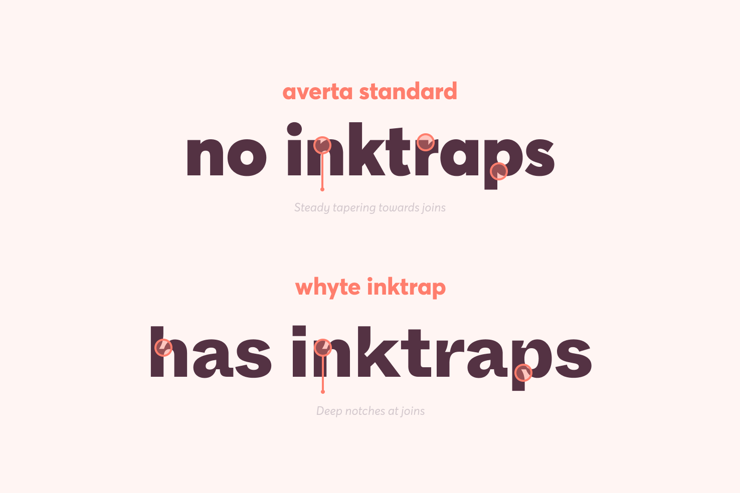
The majority in this post will be ‘ink trap’ by definition, but some may use similarly exaggerated forms. As you can see in the example, Averta has a steady tapering towards the joins. Whereas, Whyte has angular notches, which give a sense of the individual letters having part missing.

Looking at another less apparent example, with Degular Display the tapering happens far quicker to create a stronger contrast. Unlike Whyte it isn’t as like a ridge, creating a different feel.
What’s the purpose of an ink trap
Ink traps retain legibility at smaller sizes in print. They’re carefully designed parts of type, which disappear when printed—due to the ink bleeding and filling in the gaps.
While it may display a certain way on screen, the appearance will change when printed. If you pay attention to printed material and notice the type isn’t as crisp as it could be, this could be down to the choice of typeface.
What’s this got to do with websites?
It can serve the same purpose on the web. Looking at the examples at smaller type sizes, ink traps help by opening spaces in the letters further. This can make legibility better at those sizes.
Google Fonts
The availability of ink trap typefaces on Google Fonts is pretty good. There are a fair few options that compete with premium ink trap typefaces later in this post.
Bricolage Grotesque

I’ve seen this used quite a lot, it’s very popular lately and has the strongest ink trap personality of all the Google Font examples. It has a similarity with Whyte Inktrap in terms of the prominent ink traps. But otherwise it has quite a fun look and feel.
Spline Sans

This reminds me a lot of Degular, but there are some subtle differences between the two. If you look closely at the ‘e’ you’ll see where the crossbar joins it’s completely rounded—a nice detail that’s characterised in other letters too.
Spline Sans Mono

The mono space version of Spline Sans, also a variable typeface.
Anek

Anek is a variable typeface, there’s a good variety of weights and styles. It feels like a fairly balanced typeface with quite a large x-height that would be good for either headings or paragraphs.
Anybody

A subtle example again particularly in lighter weights. I like the unique ascenders on the lowercase ‘y’.
DM Sans

DM Sans is another example that’s pushing it, but it has a subtle tapering at the joins. I like the flatness of the double storey ‘a’.
Pathway Extreme

There’s a uniqueness to Pathway Extreme deep angular cuts that differ from typical ink traps. The thinner crossbars add personality if you were to use it as a display choice.
Premium fonts
Now for the premium picks from various foundries.
Whyte Inktrap
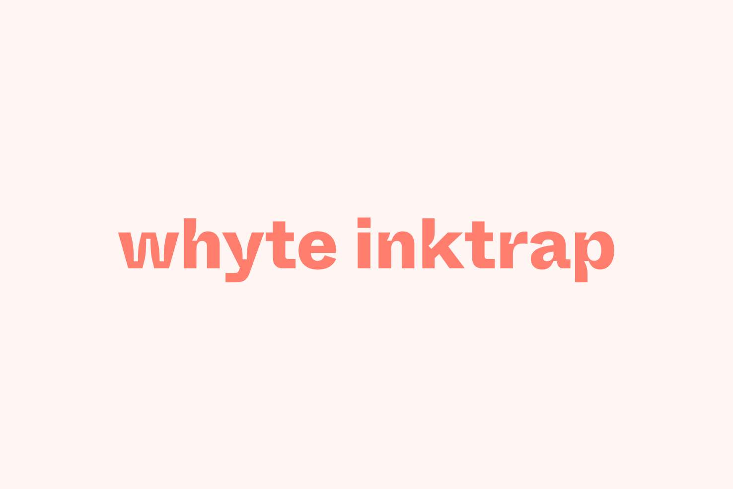
In terms of Ink trap fonts, I feel like Whyte could be the ‘Circular’ of this style. The Figma website was the first time I’d come across Whyte and I’ve seen it used a few times elsewhere.
It feels futuristic, because of its curves on the ascenders—which goes against the feeling of a traditional grotesque. It surprised me how it remains legible at small sizes—even in the heavier weights—despite the ink traps being as prominent as they are.
Degular
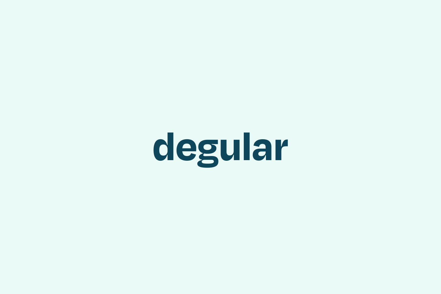
Available on Adobe Fonts and one of my favourite typefaces I’ve come across recently—I had to use it in my portfolio.
The first typeface by OH no Type Co featured in this article. Which comes in three optical sizes, each with ink traps that lead to wonderfully exaggerated curves at the joins.
Retina
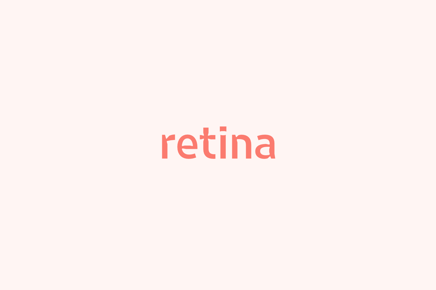
It’s important to note the microplus version is where you see the ink traps.
In smallish sized lighter weights, it adds extra character. In larger sized heavier weights it feels overdone—which makes it have a much more limited use case.
GT Flexa
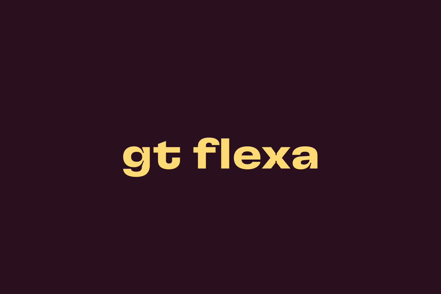
An incredibly flexible and versatile typeface—to be fair it’s in the name—as the website will demonstrate. You could create endless compositions, I wish I could afford the full thing.
I enjoy the wide crossbars on the lowercase ‘t’ and ear of the lowercase ‘r’. They add a uniqueness.
Neue Machina
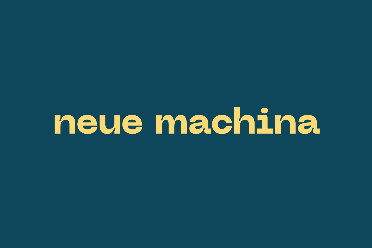
A typeface which has a lot of character, it has deep ridges at the joins for a real exaggerated style.
It has an almost monospace feel with the lowercase ‘a’, ‘i’ and ‘l’ which gives it a quite futuristic feel. But combining abrupt curves with lovely geometry, it feels unique but familiar.
Jaune Grande

A typeface that throws out a lot of conventions. The bolder weights are particularly nice, the letters push the limits of legibility.
It’s as if this is what the Didone of the sans serif world would look like—with the characteristic contrast between thick and thin lines.
Halyard (text & micro)
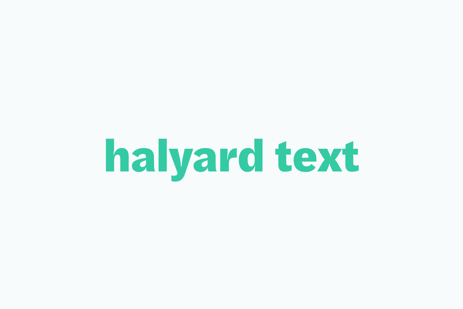
At first it looks like a pretty plain sans serif, but on closer inspection at the micro variation, it feels delicate and legible.
The micro italic really embraces the ink traps and almost as if the letterforms were written. The italic lowercase ‘h’ and ‘p’ in the light weight are excellent.
On a similar level, the text version is slightly more subtle, but just as nice.
Albeit each of these have different intended use cases. I’d definitely use the micro italic with some tighter letter spacing for more decorative uses.
Fraktion Sans
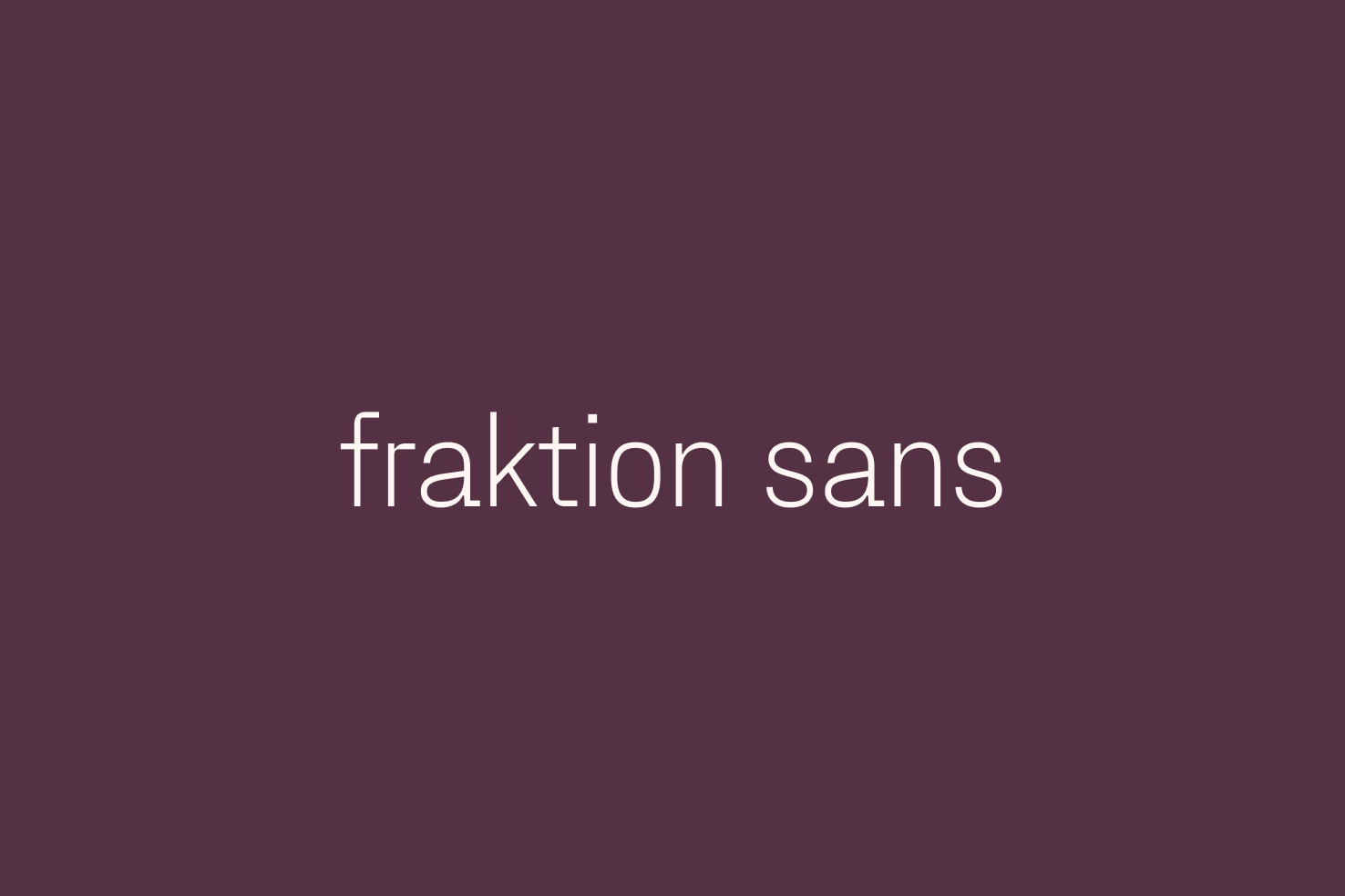
Another option from Pangram Pangram, with plenty of weights and styles, it’s an option which is more on the compact side.
Like many of the choices in this article, it has an angular style about it. The lowercase ‘a’ is identical (or almost) to its monospace counterpart—which sets this typeface apart.
Uxum Grotesque

Uxum features a more subtle approach to ink traps. They have the depth of other typefaces, but are much finer. It creates a nice harmony and allows for unique characteristics—which sets itself apart from your Circular and FF Mark styles.
Polysans
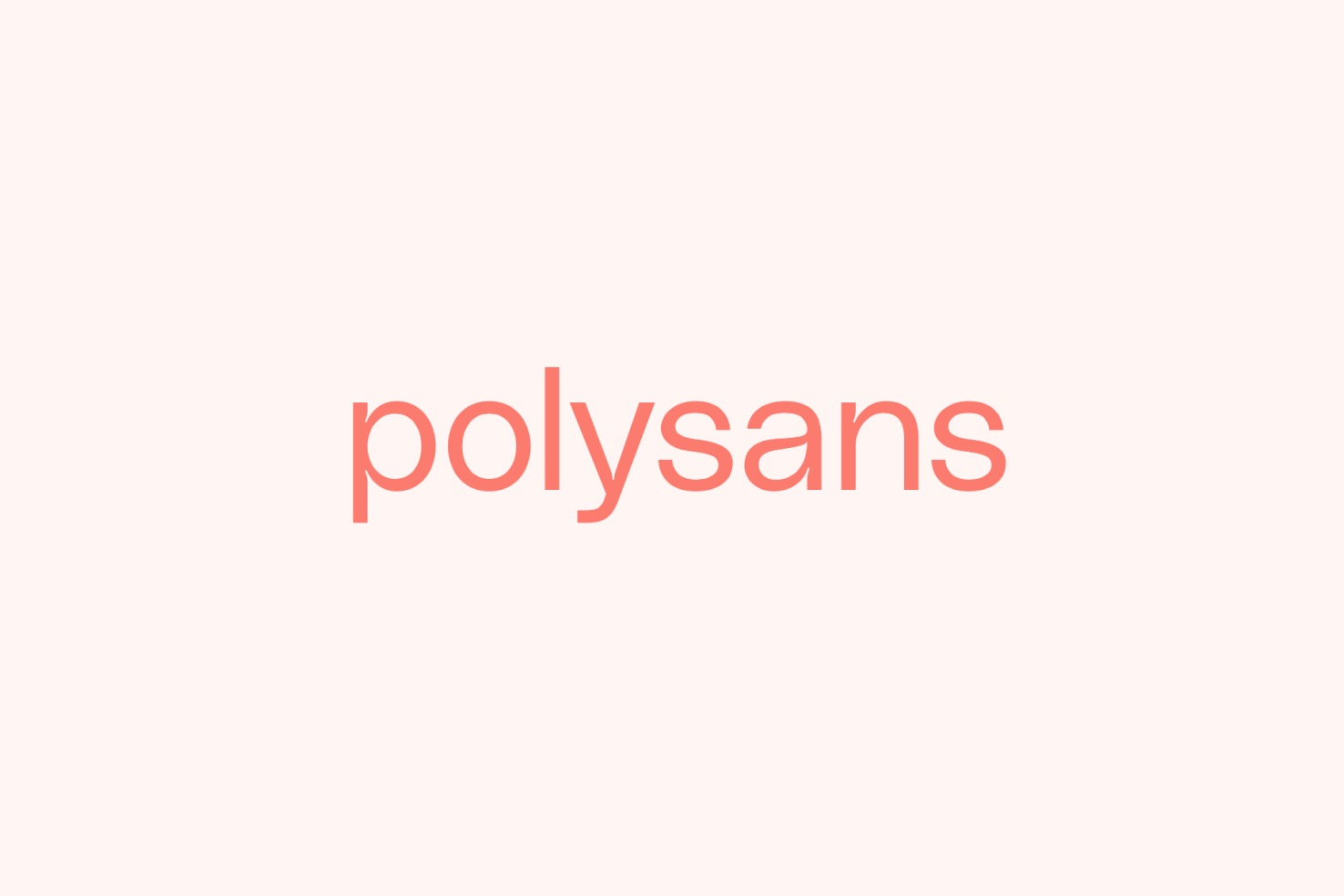
Polysans is similar to Uxum, in the sense it has much finer ink traps. It has a Helvetica feel about it, especially with lighter weights. The difference being it comes with proper italics.
Covik Sans / Mono
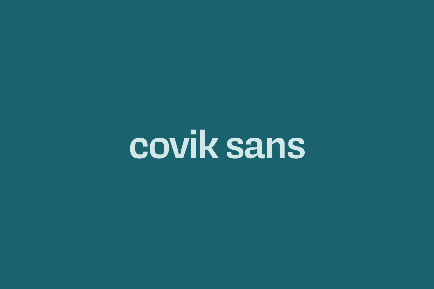
The final OH no Type Co. option and it’s a push to include this as it doesn’t feature ink traps. It has a contrast to suggest, which is why I want to include it. It’s different to a lot of the type in this article too.
F37 Jan
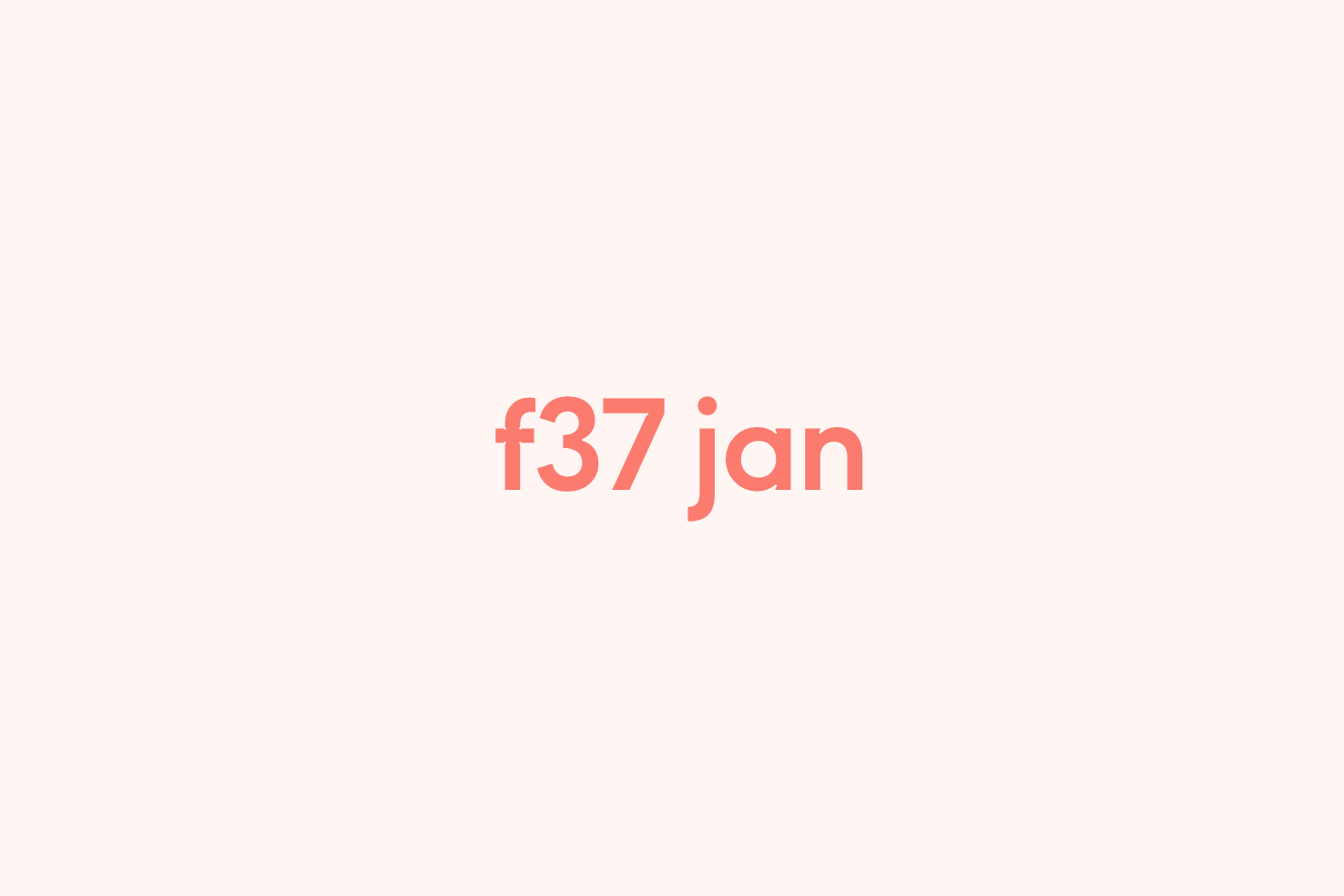
If you’re looking for geometric type, then look no further than F37 Jan. It’s inspired by Matthew Carter’s Bell Centennial and Jan Tschichold’s Untitled Sans Serif—which makes for a great blend of styles.
The one thing I’d like to see is heavier weights as part of the set.
Tomato Grotesk
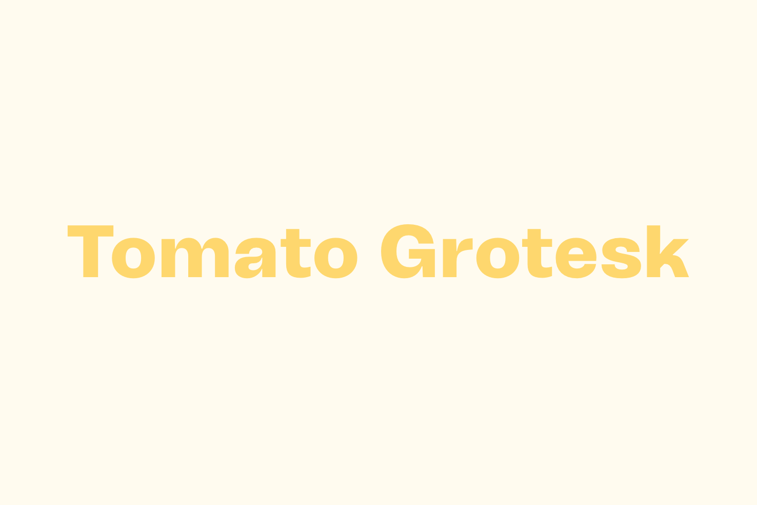
A typeface with a few unique properties of its own along with the ink traps. The double storey ‘a’ and lowercase ‘k’ have a unique style to them compared to others in this post.
A style that’s grown on me
As I reflect on it, it’s a nice response to the “plainer” sans serif typefaces that have dominated since 2015 give or take. It gives us more creative options for our designs without hindering legibility and readability of some of the more experimental typefaces out there.
Nonetheless, it’s an interesting use of a design detail that otherwise fulfilled a purpose. It’s grown on me and I feel it’s going to gain more popularity than it already has.
View on Github