This post was published 9 years ago
There’s a chance things are out of date or no longer reflect my views today
Search overlay with smooth reveal animation
A common part of a website is the ability to search. Depending on how important search is to your website can define much of how it looks and how it’s prioritised in the design.
Search is a common function of a website, app, etc. Depending on how important search is to your users can define how it’s prioritised and looks within your design.
In this post, I want to show you how to create a search which appears with a smooth transition on the click or tap of a button.
What you’re making
If you’d like to grab any of the code and skip the post feel free to browse the CodePen.
All code and design files can be downloaded for being part of my list.
Design: overview
Here’s the design you’ll be making. It’s quite simple, so I have avoided a walk through as the designs themselves serve as a place to explain.
Search overlay
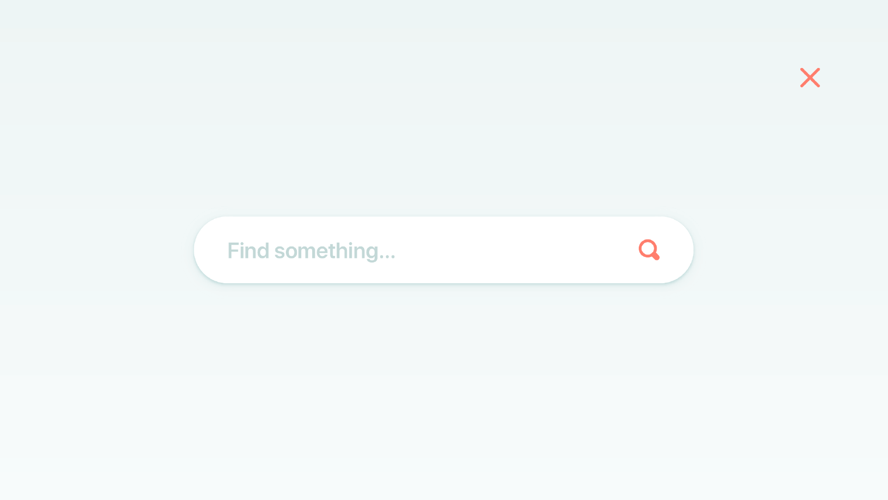
Overall, the design aims to visually grab the attention. It makes use of the screen size available through the large input and icons. I wanted the form to appear ‘clickable’ through having clearly a defined input. As you see some which do away with the defined field approach.
There are a couple of shadows applied to the search field itself. A smaller shadow to add intensity to the bottom, and another with larger radius to make it feel more realistic. The shadow is a darker version of the background which makes things feel intentional.
The background has a subtle gradient, the aim is for it to have a sense of depth as it transitions over the existing background.
Small screen
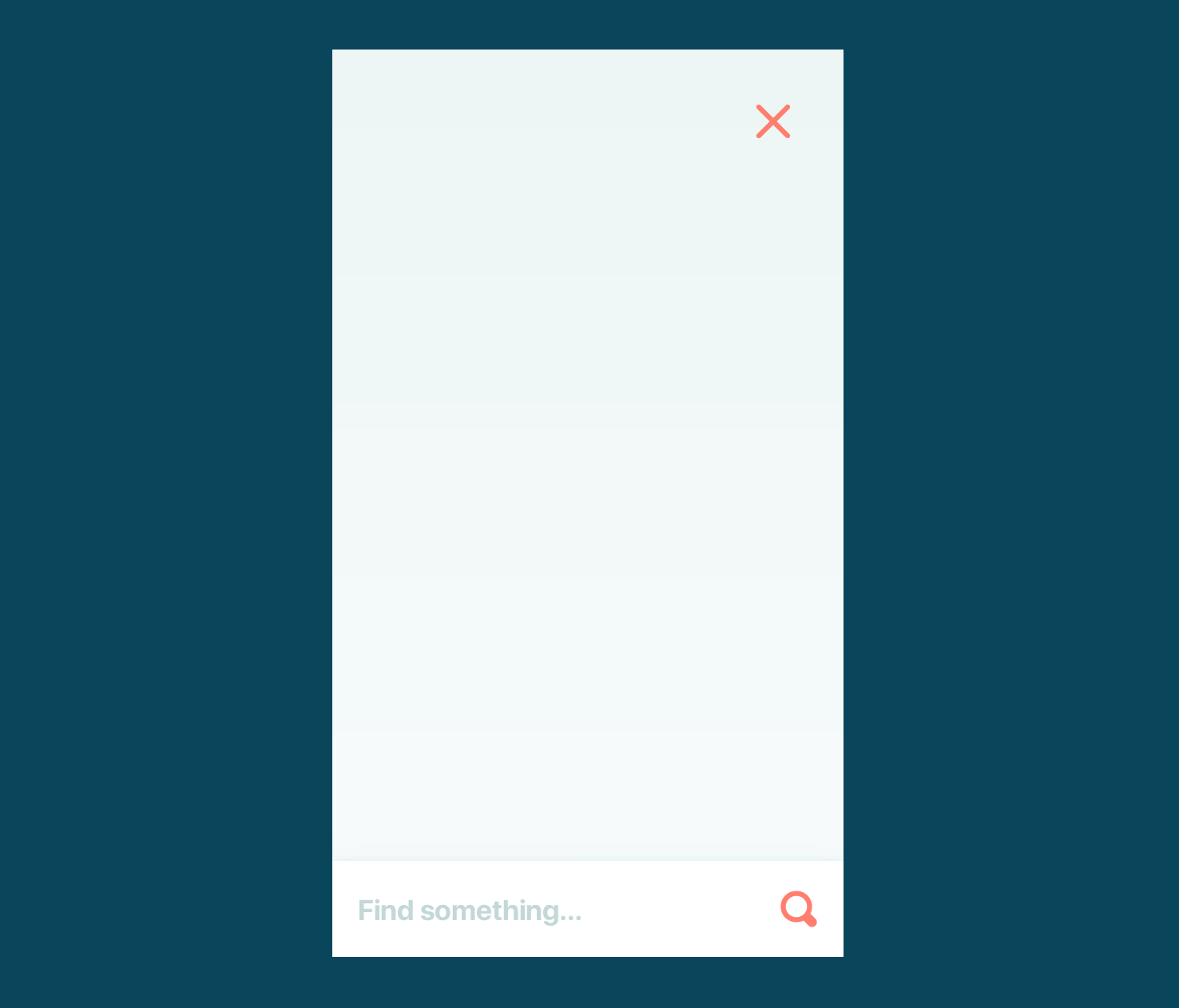
For smaller screens, I’ve opted to move the search to the bottom of the screen. This means it’s easier to reach, as you can focus on the input with JavaScript, but it doesn’t always bring up the keyboard.
Things are sized more according to the screen size, with the icons and form field. Aside from them, nothing else has changed.
Icon setup
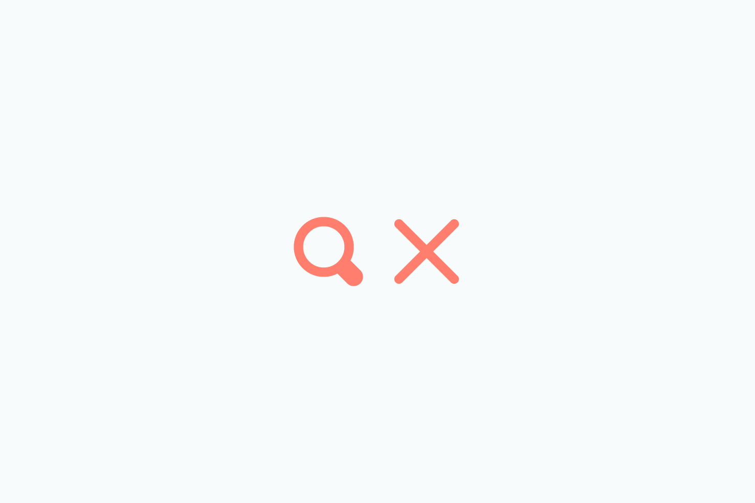
The icons are designed on at 32px x 32px and scaled down to 24px x 24px for the small screen design. You can download the two icons used for your design.
HTML
Let’s get into making this usable, starting with HTML. The summary of the markup you need: button to open, button to close, overlay and the form.
Open button
The button is an anchor tag, with an SVG inside. This allows us to style and reuse the icon easily. Pasting this code into your editor without CSS will mean the icon will be a black square.
<a href="#link-to-search" class="button button-open">
  <svg
    xmlns="http://www.w3.org/2000/svg"
    width="32"
    height="32"
    viewBox="0 0 32 32"
    class="icon"
  >
    <rect class="fill-none" width="32" height="32" />
    <path
      class="fill-currentcolor"
      d="M29.82861,24.17139,25.56519,19.908A13.0381,13.0381,0,1,0,19.908,25.56525l4.26343,4.26337a4.00026,4.00026,0,0,0,5.65723-5.65723ZM5,14a9,9,0,1,1,9,9A9.00984,9.00984,0,0,1,5,14Z"
    />
  </svg>
</a>
The class names button and button-open will be used for both styling and JavaScript later in the post. The href should ideally link to a fallback search page, should JavaScript fail or be disabled.
You may notice the icon has several class names applied to it. I’ve detailed my process about how I use SVG for icons before.
Overlay
The overlay itself is a <div> tag round a form. Each element inside the form has an appropriate class to be used for styling.
<div class="overlay hiding">
  <!-- Form markup here -->
</div>
You will notice the overlay has two class names. overlay and hiding all general styling will be applied to .overlay. .hiding will have styles which hide the element and will be transitioned to .showing.
This approach helps keep our CSS more maintainable. As when you switch class names there is less to override.
Close button
Similar to the open button, the icon and class name are different.
<button class="button button-close">
  <svg
    xmlns="http://www.w3.org/2000/svg"
    width="32"
    height="32"
    viewBox="0 0 32 32"
    class="icon"
  >
    <rect class="fill-none" width="32" height="32" />
    <path
      class="fill-currentcolor"
      d="M18.82813,16,29.41406,5.41406a1.99979,1.99979,0,0,0-2.82812-2.82812L16,13.17188,5.41406,2.58594A1.99979,1.99979,0,0,0,2.58594,5.41406L13.17188,16,2.58594,26.58594a1.99979,1.99979,0,1,0,2.82813,2.82813L16,18.82813,26.58594,29.41406a1.99979,1.99979,0,0,0,2.82813-2.82812Z"
    />
  </svg>
</button>
Search form
The form markup should be placed inside the overlay <div>.
<form action="#" class="form-search">
  <label for="keywords" class="visuallyhidden">Search</label>
  <input
    class="input input-search"
    id="keywords"
    name="keywords"
    type="search"
    placeholder="Find something…"
    autocorrect="off"
    autocapitalize="off"
    required
  />
  <button type="submit" class="button button-search">
    <svg
      xmlns="http://www.w3.org/2000/svg"
      width="32"
      height="32"
      viewBox="0 0 32 32"
      class="icon"
    >
      <rect class="fill-none" width="32" height="32" />
      <path
        class="fill-currentcolor"
        d="M29.82861,24.17139,25.56519,19.908A13.0381,13.0381,0,1,0,19.908,25.56525l4.26343,4.26337a4.00026,4.00026,0,0,0,5.65723-5.65723ZM5,14a9,9,0,1,1,9,9A9.00984,9.00984,0,0,1,5,14Z"
      />
    </svg>
  </button>
</form>
The form markup isn’t complex and each individual element has a relevant class name. Which will be used for styling later. The icon is the same one used earlier (ideally the repetition would be avoided).
You should be able to adjust the form to one that works with your CMS.
Sass: visual style and layout
This is where it gets trickier, there’s quite a bit to get through for the styling. This bit focuses purely on getting the layout and visual style in place. I’m going to be writing the CSS using Sass, though you can get the compiled code from the Pen.
Variables
// Variables
$base-px: 8px;
$breakpoint: 768px;
$breakpoint-max: $breakpoint - 1px;

// Colours
$background: #f7fbfb;
$background-2: #eaf5f5;
$background-3: #bbd8d8;
$primary: #fd7f71;
$primary-2: #c3d8d7;
$white: #fff;

// Font stack
$system: -apple-system, BlinkMacSystemFont, 'Segoe UI', Roboto, Helvetica,
  Arial, sans-serif, 'Apple Color Emoji', 'Segoe UI Emoji', 'Segoe UI Symbol';
$base-px is for spacing, $breakpoint and $breakpoint-max are for media queries. Then you have several colours and a system font stack. These variables will allow you to tweak things easier.
General setup
// Basics
// ----------------------
body {
  display: flex;
  justify-content: center;
  align-items: center;
  align-content: center;
  background-color: $background;
  height: 100vh;
  font-family: $system;
}
This code is so the open button will align centrally vertically and horizontally.
Hiding the label
A design choice is to hide the label, however, it still serves a purpose to screen readers (albeit proper accessibility isn’t covered here).
// For hiding the label
// ----------------------
.visuallyhidden {
  position: absolute;
  overflow: hidden;
  clip: rect(0 0 0 0);
  width: 1px;
  height: 1px;
  margin: -1px;
  padding: 0;
  border: 0;
}
.visuallyhidden is a reasonably common practice, which ensures the element is hidden, but can be picked up by screen readers.
SVG colour inheriting styles
This CSS is important for the SVG icons having the correct colour applied to them. As mentioned earlier there are class names applied to the SVG paths.
// SVG Helpers
// ---------------------------
.fill-currentcolor {
  fill: currentcolor;
}

.fill-none {
  fill: none;
}
The fill property is an SVG specific property. The default fill on an SVG is black, this is why you need to have one for removing the fill.
Icons
Each icon used is the same size, starting at 24px for smaller screens and then increased to 32px at the $breakpoint.
// Icon
// ---------------------------
.icon {
  width: 24px;
  height: 24px;
  transition: 0.3s ease-out;

  @media (min-width: $breakpoint) {
    width: 32px;
    height: 32px;
  }
}
Button and input ‘reset’
These styles normalise the browser applied styling and give you a consistent starting point. Particularly the appearance property, this removes much of the browser default styling.
// Input/button reset
// ---------------------------
.input,
.button {
  display: inline-block;
  -webkit-appearance: none;
  -moz-appearance: none;
  appearance: none;
  line-height: normal;
  border: none;
  outline: none;
  max-width: 100%;
  font-family: $system;
}
Button .button
This is the reason you apply two class names to each button. For each button I want to ensure a consistent cursor and color. The .button itself and .icon within scale up.
// Button
// ---------------------------
.button {
  cursor: pointer;
  color: $primary;
  transition: 0.3s ease-out;

  &:hover,
  &:focus {
    transform: scale(1.125);

    .icon {
      transform: scale(1.25);
    }
  }
}
The important thing to note is the color, this is inherited by the icon. You can change this to any colour and the icon will follow suit.
The hover state is applying a scale effect to both the button and the icon. With the subtle ease-out transition it makes for a kind of jelly effect.
Button to open .button-open
This is the means for opening the search overlay. In JavaScript shortly you will apply code so when it’s clicked, the overlay opens.
.button-open {
  // Display/alignment
  display: flex;
  justify-content: center;
  align-items: center;
  align-content: center;

  // Sizing
  width: 96px;
  height: 96px;
  border-radius: 48px;

  // Style
  background-color: $white;
  box-shadow: 0 1px 1px rgba($background-3, 0.6), 0 3px 3px rgba($background-3, 0.4),
    0 8px 16px rgba($background-3, 0.3);

  &:hover,
  &:focus {
    box-shadow: 0 2px 2px rgba($background-3, 0.4), 0 4px 4px rgba($background-3, 0.3),
      0 12px 32px rgba($background-3, 0.3);
  }
}
Along with the icon transition earlier the box-shadow is also being made to appear as if the element is becoming slightly raised. It’s a subtle tweak to show depth.
Button to close .button-close
The close button is reasonably simple, you’re positioning it to the top right and making sure it the background colour is transparent.
// Button (close)
// ---------------------------
.button-close {
  position: absolute;
  top: 7.5vw;
  right: 7.5vw;
  padding: 0;
  background-color: transparent;
}
Form .form-search
The form element itself, serves as a container to limit the width of the input and allows you to align the search button easily.
.form-search {
  position: relative;
  width: 100%;

  @media (min-width: $breakpoint) {
    max-width: 720px;
  }
}
Adding position: relative will make sure the button is anchored to the form element. At smaller screen sizes you want the form to fill the viewport.
Search input
There’s quite a bit of CSS applied to this element, the majority is related to visual style and sizing, rather than alignment.
// Input
// ---------------------------
.input-search {
  // Sizing
  padding: 26px ($base-px * 2) 25px; // 72px height
  width: 100%;

  // Style
  font-size: 18px;
  font-weight: 600;
  color: $primary;
  background-color: $white;
  box-shadow: 0 1px 1px rgba($background-3, 0.6), 0 3px 3px rgba($background-3, 0.4),
    0 8px 16px rgba($background-3, 0.3);

  @media (min-width: $breakpoint) {
    // Sizing
    padding: 29px ($base-px * 6); // 96px height

    // Style
    font-size: 32px;
    border-radius: 30em;
  }
}

.input-search::placeholder {
  color: $primary-2;
}
I find it easier to use padding to apply the size you want over adding a height and corresponding line-height.
Overlay
The overlay is fixed to the viewport and everything again is positioned centrally with flexbox. This is much of the heavy lifting for positioning.
// Overlay
// ---------------------------
.overlay {
  // Display
  overflow: hidden;
  display: flex;
  justify-content: center;
  align-items: flex-end;
  align-content: flex-end;

  // Positioning
  position: fixed;
  z-index: 3;
  left: 0;
  width: 100%;
  height: 100%;

  // Style
  background-image: linear-gradient(to top, $background, $background-2);

  @media (min-width: $breakpoint) {
    align-items: center;
    align-content: center;
  }
}
On smaller screens the form is aligned to the bottom, as you get beyond the $breakpoint the form is aligned centrally. align-items and align-content properties are what control this.
Going into further detail, a z-index is applied to ensure it’s above the other content. There is only the left value set here, normally you would want to apply a top or bottom value. However, when getting into the animation shortly, this will be covered.
The gradient is also applied here so it matches the design.
SCSS: animation/transition setup
If you followed along with the code as is, you should have what resembles a complete design. The following code will have the class names applied through JavaScript at the relevant points.
Hiding
The initial state the form is hidden. That’s why the class on the overlay <div> is class="overlay hiding".
// Initial state
.hiding {
  max-height: 0;
  opacity: 0;
  bottom: 0;

  // This transition happens when the close button is clicked
  // and should be faster than the .showing state
  transition:
    max-height .3s .2s cubic-bezier(0.215, 0.61, 0.355, 1),
    opacity .6s ease-out;

  // When hiding inner elements should be invisible too
  .button-search,
  .input-search {
    opacity: 0; }

  // Offset the button
  .button-search {
    transform: translate3d(0, 33%, 0); }

  // Offset the input more
  .input-search {
    transform: translate3d(0, 50%, 0); }
Hide the contents
What’s happening here is you’re using both max-height and opacity to hide the contents of the overlay. The overflow set earlier in .overlay ensures that everything is completely hidden.
Closing goes off from the bottom
Next you have the bottom property, this will be apparent when closing the overlay. It will appear to go off the screen from the bottom.
Hint at the height collapsing
With the transition the max-height value transitions quicker than the opacity. The reason for this is to give a hint that the height is shrinking.
Inner elements ‘nudge’ up
The form elements will be positioned centrally, or at the bottom depending on screen size. So in both instances making them reveal upwards looks as if it’s a coordinated and waiting for the overlay to be open.
Showing
When .button-open is clicked this class name will be applied to the overlay.
// Showing state
.showing {
  max-height: 100vh;
  top: 0;

  // This happens when the open button is clicked
  // max-height transition is to appear more subtle
  transition: max-height 0.4s 0.2s cubic-bezier(0.215, 0.61, 0.355, 1), opacity
      0.8s ease-out;
}
With the showing state the max-height ensures the height is transitioned and the top position ensures the overlay looks like it comes from the top. Working in combination with the hidden state when the showing class is swapped for hiding it will look like it’s going off the bottom of the screen.
This is the good thing about removing class names through JavaScript—which will be covered shortly. You also don’t have to write as much CSS. So you don’t need to have opacity: 1 and you don’t need to change the transform on the inner elements. This is because those styles don’t exist once the class name is removed.
Transitioning inner elements
Finally, once the overlay opens, you want the form elements to transition in slightly later. This gives a more intentional appearance.
.button-search {
  transition: 0.4s 0.6s ease-out;
}

.input-search {
  transition: 0.8s 0.3s ease-out;
}
I’ve chosen to make the button have a quicker overall transition, but a longer delay. This gives the search input a chance to appear.
The search input is delayed by .3 seconds, which is inline with the max-height transition. The aim is so it begins to happen, as that the max-height transition is ending.
JavaScript
Here’s all the JavaScript to make this function. It’s broken down in to four parts. The variables which select the elements you need throughout. Two functions, the first, for adding focus to the search and the second, which will toggle the visibility. The event listeners to watch for clicks on the buttons.
// Keep search toggling out of the global scope
;(function (window, document, undefined) {
  // Variables
  var open = document.querySelector('.button-open')
  var close = document.querySelector('.button-close')
  var overlay = document.querySelector('.overlay')
  var search = document.querySelector('.input-search')

  // Focus on an element
  var focusOn = function (element) {
    // Only focus on the element if it contains the relevant
    // class name that means it’s actually visible
    if (overlay.classList.contains('showing')) {
      console.log('focus')
      element.focus()
    }
    // Otherwise remove the focus from the element
    else {
      element.blur()
    }
  }

  // Toggles a set of class names on an element
  var toggler = function () {
    // Add the active class to the element clicked/tapped
    // So if necessary the style can be changed
    this.classList.toggle('active')

    // Toggle the classes which set off the transition
    overlay.classList.toggle('hiding')
    overlay.classList.toggle('showing')

    // Once the overlay’s transition ends focus the search field
    overlay.addEventListener('transitionend', focusOn.bind(null, search), false)

    // Prevent the clicks from navigating away
    return false
  }

  // Add the event listener to the toggle
  open.addEventListener('click', toggler, false)
  close.addEventListener('click', toggler, false)
})(window, document)
Have a scan over the code and then I’ll cover it in more detail.
Contain everything with an IIFE
You’re containing all the code required in an ‘IIFE’. This means immediately invoked function expression. Which makes the code only accessible from within this to avoid code conflicting elsewhere.
// Keep search toggling out of the global scope
;(function (window, document, undefined) {
  // Code here
})(window, document)
Todd Motto has a great explanation on his blog of why this is approach is used.
Variables
The first step is to assign all the elements, that will have some change happen to them, to variables.
// Keep search toggling out of the global scope
;(function (window, document, undefined) {
  // Variables
  var open = document.querySelector('.button-open')
  var close = document.querySelector('.button-close')
  var overlay = document.querySelector('.overlay')
  var search = document.querySelector('.input-search')
})(window, document)
Both buttons, the overlay and search input are selected. Click event listeners will be assigned to both the open and close buttons. The overlay will have class names changed and the field will be focused once the transitions end.
Assigning event listeners to the buttons
Next, you want to assign click event listeners to both of the buttons.
// Keep search toggling out of the global scope
;(function (window, document, undefined) {
  // Variables
  var open = document.querySelector('.button-open')
  var close = document.querySelector('.button-close')
  var overlay = document.querySelector('.overlay')
  var field = document.querySelector('.input-search')

  // Add the event listener to the toggle
  open.addEventListener('click', toggler, false)
  close.addEventListener('click', toggler, false)
})(window, document)
With addEventListener you have a few parameters. The most important are the event to listen for, in this case click. The second parameter is to pass a function that you want to be called.
It’s important to note that you don’t write the function as toggler(). This is so the function is only called when you click on the relevant element.
The third parameter is more for backwards compatibility. It doesn’t have much bearing here, so I’m not going to go into detail.
Writing the ‘toggler’ function
Now you need to write the toggler function. The aim for this is to toggle a couple of class names to make the search visible. Once the transitions have completed, it would also be ideal to focus on the search input. So the user can begin typing without any extra interaction.
// Keep search toggling out of the global scope
;(function (window, document, undefined) {
  // Variables
  var open = document.querySelector('.button-open')
  var close = document.querySelector('.button-close')
  var overlay = document.querySelector('.overlay')
  var search = document.querySelector('.input-search')

  // Toggles a set of class names on an element
  var toggler = function () {
    // Toggle the classes which set off the transition
    overlay.classList.toggle('hiding')
    overlay.classList.toggle('showing')

    // Once the overlay’s transition ends focus the search field
    overlay.addEventListener('transitionend', focusOn.bind(null, search), false)

    // Prevent the clicks from navigating away
    return false
  }

  // Add the event listener to the toggle
  open.addEventListener('click', toggler, false)
  close.addEventListener('click', toggler, false)
})(window, document)
Toggle class names to keep things efficient
Digging into the function now, the class names that set off the transition are toggled on the overlay variable. Clicking the open button means 'hiding' will be removed and 'showing' will be added.
Alternatively, when close is clicked 'showing' will be removed and 'hiding' will be added.
Arguments are passed using bind
You’ll notice bind following the focusOn function in the transitionend event listener.
The reason you use bind is to avoid the function being called too early. It’s still the case even when you pass arguments. So if you want to pass arguments, bind is one of the best solutions.
It’s important to note the first parameter of bind is what you want this to be assigned to. In this instance there isn’t any use for this so null is passed.
Focusing on the input
Finally, to complete your code is to add the focusOn function. This has one parameter element, which when it’s used the toggler function is the search variable.
// Keep search toggling out of the global scope
;(function (window, document, undefined) {
  // Variables
  var open = document.querySelector('.button-open')
  var close = document.querySelector('.button-close')
  var overlay = document.querySelector('.overlay')
  var search = document.querySelector('.input-search')

  // Focus on an element
  var focusOn = function (element) {
    // Only focus on the element if it contains the relevant
    // class name that means it’s actually visible
    if (overlay.classList.contains('showing')) {
      element.focus()
    }
    // Otherwise remove the focus from the element
    else {
      element.blur()
    }
  }

  // Toggles a set of class names on an element
  var toggler = function () {
    // Toggle the classes which set off the transition
    overlay.classList.toggle('hiding')
    overlay.classList.toggle('showing')

    // Once the overlay’s transition ends focus the search field
    overlay.addEventListener('transitionend', focusOn.bind(null, search), false)

    // Prevent the clicks from navigating away
    return false
  }

  // Add the event listener to the toggle
  open.addEventListener('click', toggler, false)
  close.addEventListener('click', toggler, false)
})(window, document)
The first part of the focusOn function is the if statement. This is looking at the overlay to check if it contains a class name. If this is true it will find the element and bring focus to it.
In the else you can assume that’s when the element is being closed and remove the focus by using blur().
Bringing focus to an element is hit and miss, it serves you well in desktop browsers. However, for mobiles it does focus, but doesn’t always bring up the keyboard. This is fine, but something to be aware of.
That’s it
You should now have the complete overlay. If you’d like to take this a step further, the JavaScript could be made more reusable. The toggler function could be passed elements instead of referring to variables.