Kerning vs tracking: what they are and how to use them
Understand the differences between kerning and tracking, along with how and when to use them.
60 views
When using kerning or tracking on your type it can help with legibility or correct the way type looks for a specific situation. It’s important to understand the differences and when to use them.
What is kerning?
Kerning is when you adjust the space between two individual letters. In the world of fonts, it’s the relationship between two letters. Making them feel like they were intentionally placed near each other.
In the image you’ll see on characters like ‘W’ that the guides go under the letter. This is an important benefit of kerning, which I will cover in more detail later in the post.
You’ll commonly use kerning for logo type, art directed pieces of design, and generally areas where you know the words are never going to change.
Kerning is built in
The vast majority of fonts will have their own kerning defined within. Letters where the space appears larger need what’s called optical adjustment. This is where the type foundry will define the way certain characters behave together. So where you have, for example, a capital ‘w’ before a letter the space will be adjusted accordingly.
So why do it yourself?
It’s not always perfect and it’s generally make or break for having a well-designed logo. You also have to consider the usage intentions of the typeface, as it may be more suited smaller or larger sizes. So while there is nothing stopping you from using a particular font how you wish, you will likely find undesirable spacing between letters.
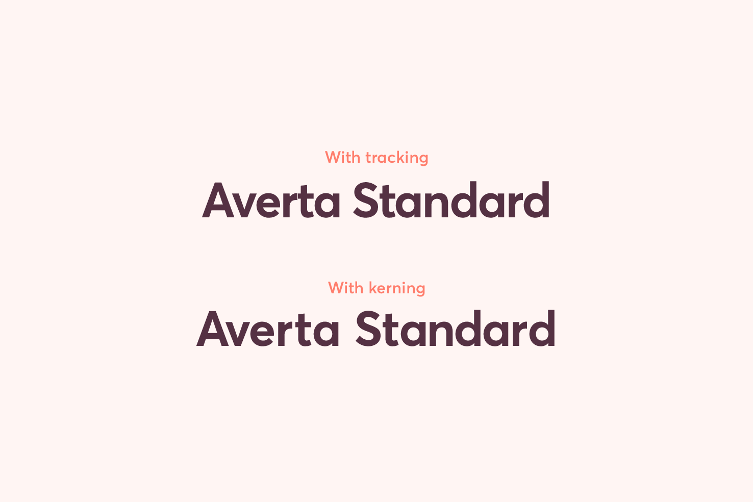
In the image there are two examples of text. The example without kerning, you can see less desirable distribution of spacing between many of the letters.
Particularly the ‘er’ pairing, there is too much space for the size of the type. The ‘rt’ pairing is an awkward combination, because they meet closely, but also have empty space below that. With that said they benefit from a tiny addition of space.
Kerning applied to the font depends on the intended use
In the example, large type was used and the kerning applied was to reduce the spaces between letters. Whereas, if I were to shrink the text down with the particular kerning applied, the spaces may need to be increased.
If you were to choose a display typeface the kerning will have been optimised for larger sizes. Alternatively, one for paragraph uses will be optimised for smaller sizes. Using each of these out of their intended uses will mean more adjustment is necessary.
A display typeface will have tighter kerning at smaller sizes, because it compensates for its use at larger sizes. A paragraph typeface will have looser kerning at larger sizes, because it compensates for its use at smaller sizes.
What is tracking?
Tracking is similar to kerning in the sense it adjusts the positions of letters. However, tracking adjusts all the spacing between letters by a specified amount. It disregards the relationship between letters.

The differences are subtle, but important. If you compare both sets of type in the image you will notice where tracking is poorer in comparison to kerning.
Tracking in CSS is similar to letter-spacing
They essentially are the same. You can use the majority of measurements available to CSS, but it doesn’t take a unitless value like tracking.
The closest measurement to tracking is em. As this will make the spacing relative to the font size, which is how tracking works.
How do I convert tracking to letter-spacing?
The most accurate method to convert tracking for CSS, is using em. 100 tracking is the equivalent to .1em. 150 would be .15em, 200 .2em and so on.
Hopefully you can see the pattern that emerges for translating the two. It isn’t 100% precise, but it does match closely if you want to achieve consistency between all type on your website.
How to kern in Illustrator
It’s a simple task to carry out in Illustrator, however a bit trickier to master.
Kern quickly with arrow keys
- Press t
- Place your cursor between two letters
- Hold alt
- Nudge with left and right arrow keys (use shift for larger jumps)
Precise kerning with the character panel
- Place your cursor between two characters
- Enter a value into the box
- Tweak until satisfied
You can also use this dropdown to apply different types of kerning. For example, ‘optical’ applying this across the whole type should make the overall kerning better.
How to distribute kerning space
The techniques to master kerning take some time. As I mentioned earlier it’s making the space feel equal between all letters and natural. While it’s inefficient to kern whole blocks of text, doing so for logos and smaller type compositions can improve legibility as well as overall quality.
Apply a little blur
Doing this means you’ll see the type blur slightly. This can help identify areas where letters may merge poorly.
Zoom out
This has a similar effect to adding blur. Whilst it’s not an accurate representation of the way it will be read. It can help you identify poorer kerning.
Optical alignment: nudge under capitals
This is more of a tip. Where you have an uppercase letter like ‘T’, ‘Y’ or ‘P’ you’re usually better off nudging slightly under the letter.
This may seem to go against the true bounds of the letterform, however, in the world of type, optical alignment nine times out of ten is better.
Use ligatures
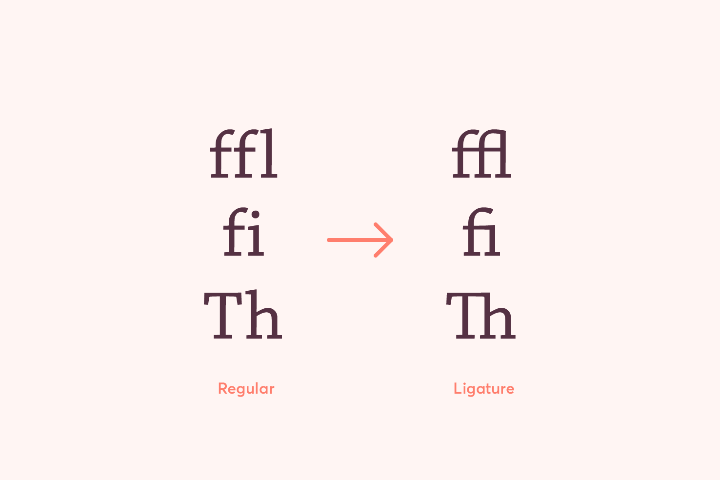
A ligature is where two or more letters form one. They are very handy for creating a better relationship between two letters. But not every typeface has ligatures.

The combinations in the image, show how the letters combine. It’s quite obvious and if this is new to you, it may appear worse. However, in the context of reading, your eyes only partially take in letterforms, so ligatures help with reading efficiency.
Ligatures improve readability because when you read and scan text you don’t take in every letterform. Ligatures can help make this more efficient by reducing awkward spaces. They are there to make things feel more natural and intentional.
How to apply tracking in Illustrator
Tracking requires the tweaking of one option, like kerning but controls all letters. To apply tracking it generally works in increments of 100. However, you can use any number necessary for more precise control.
- Select your text layer or specific line of text
- Open the character panel with cmd + t
- Set the value in the box by clicking the dropdown arrow or typing a number
Use cases
There are a few use cases of tracking which are useful out of choosing to do so for style.
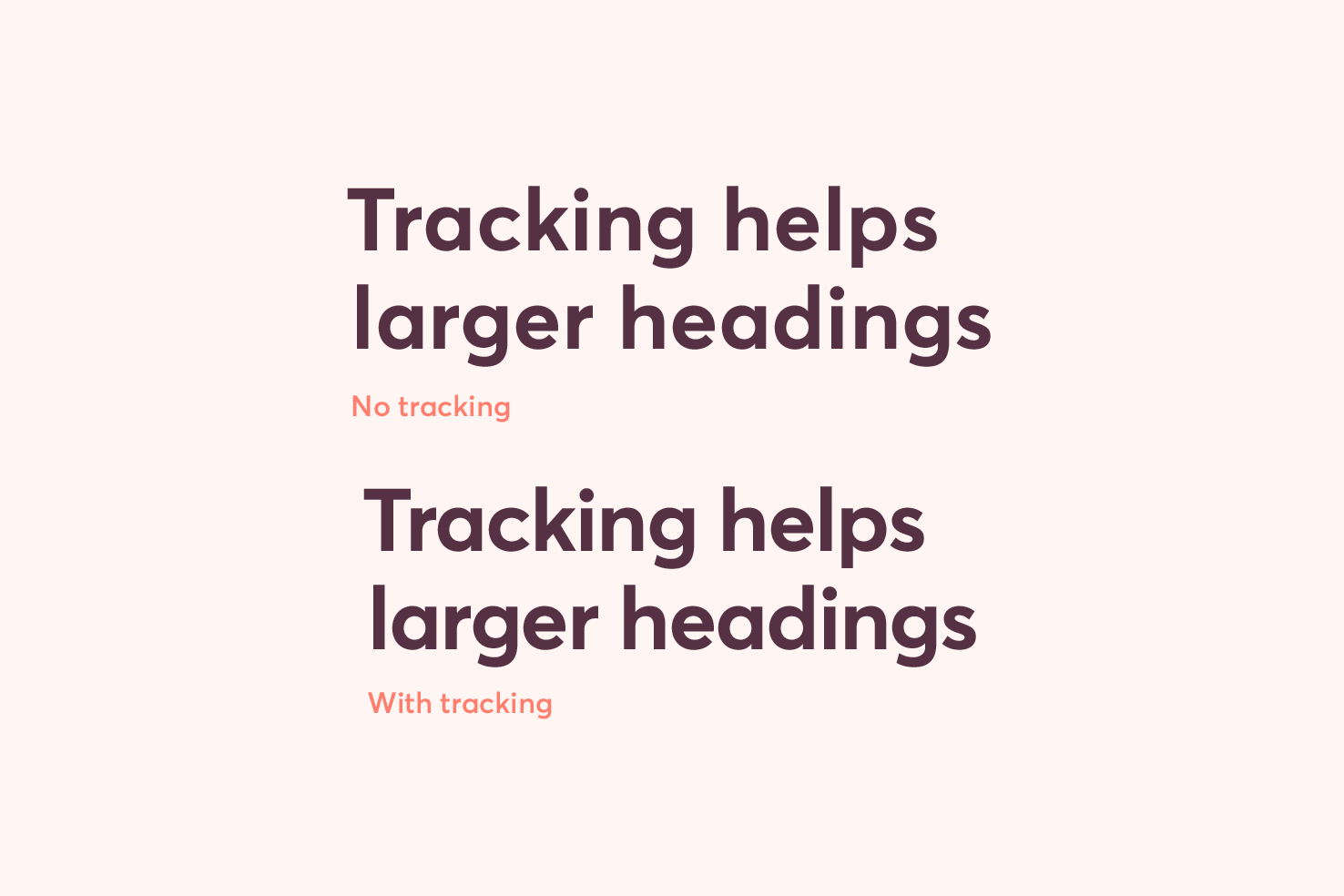
Decrease tracking to titles
When using a font size which is large you can increase readability by applying negative tracking.

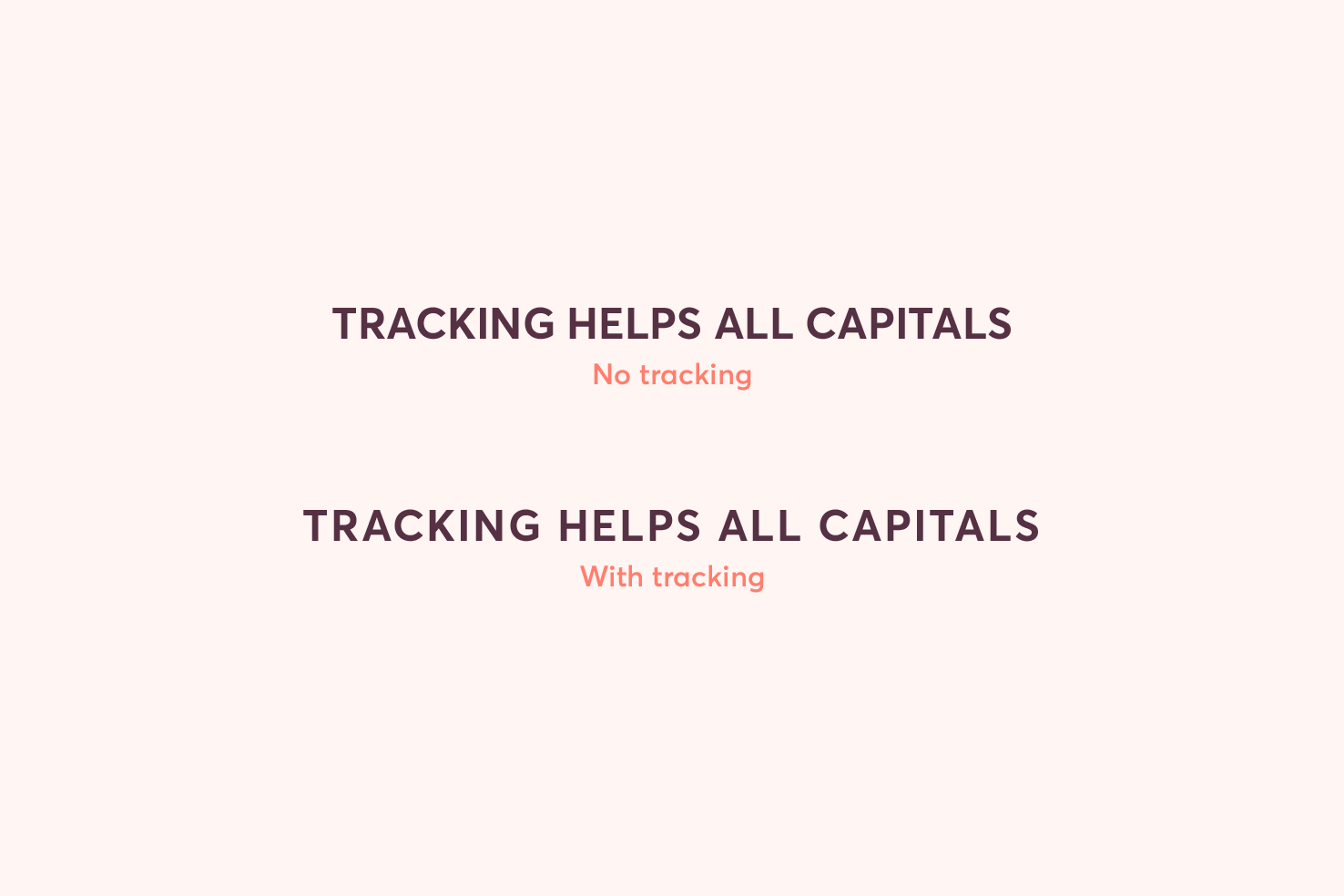
Increase tracking to all/small caps
When making something all capitals, usually at a small size it is stylistic. However it can usually benefit from a small increase to tracking.

As all caps letters near each other may appear too close. Especially at a smaller size you will benefit.
Recap: when to use kerning or tracking?
When you have complete control over the content. Kerning only makes sense in places you can apply it quickly. It’s not possible to apply on a large scale.
A logo is the main use case, but you may have a one off image that you want to typeset and have ideal kerning. If you’re applying it to your own website, tracking (letter-spacing in CSS) is the better option. It’s highly inefficient and impractical to maintain kerning at that scale.
View on Github