Monthly design roundup #2
Monthly design roundup #2 — the best websites, illustration, branding, and articles I found this month, with a few notes on each.

The second in a monthly series where I roundup some of the best things in design I found over the course of the previous month. It aims to be a source of website, illustration and branding inspiration, as well as some articles that are a good read.
Design
There are some great websites I came across this month. Ueno have put out some great work recently, with their own rebrand and PrescribeWellness.
Basecamp
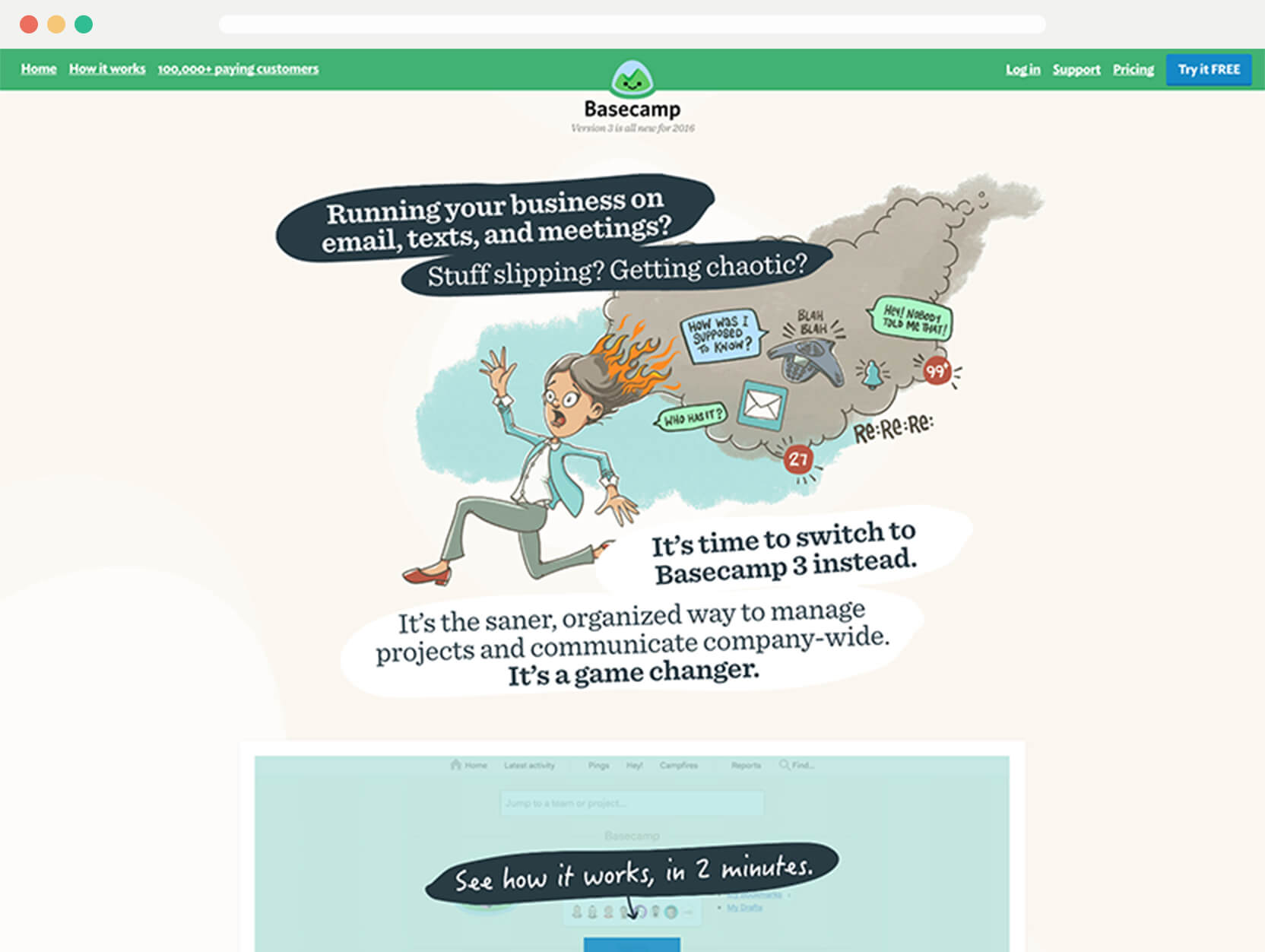
I really admire the approach of Basecamp as a company, and I feel like this design reflects them well. They aren’t afraid to do things differently. It’s a pleasant redesign and features a lot of illustration.
Design Inc.
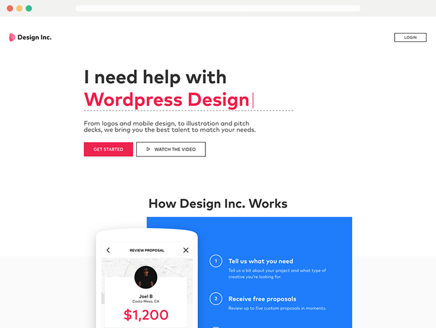
Design Inc. have been through a few iterations lately. The last version was better visually, but that could only go so far with the amount of services offered. This is a good fit and explains the what Design Inc. is well.
Friends & Fools
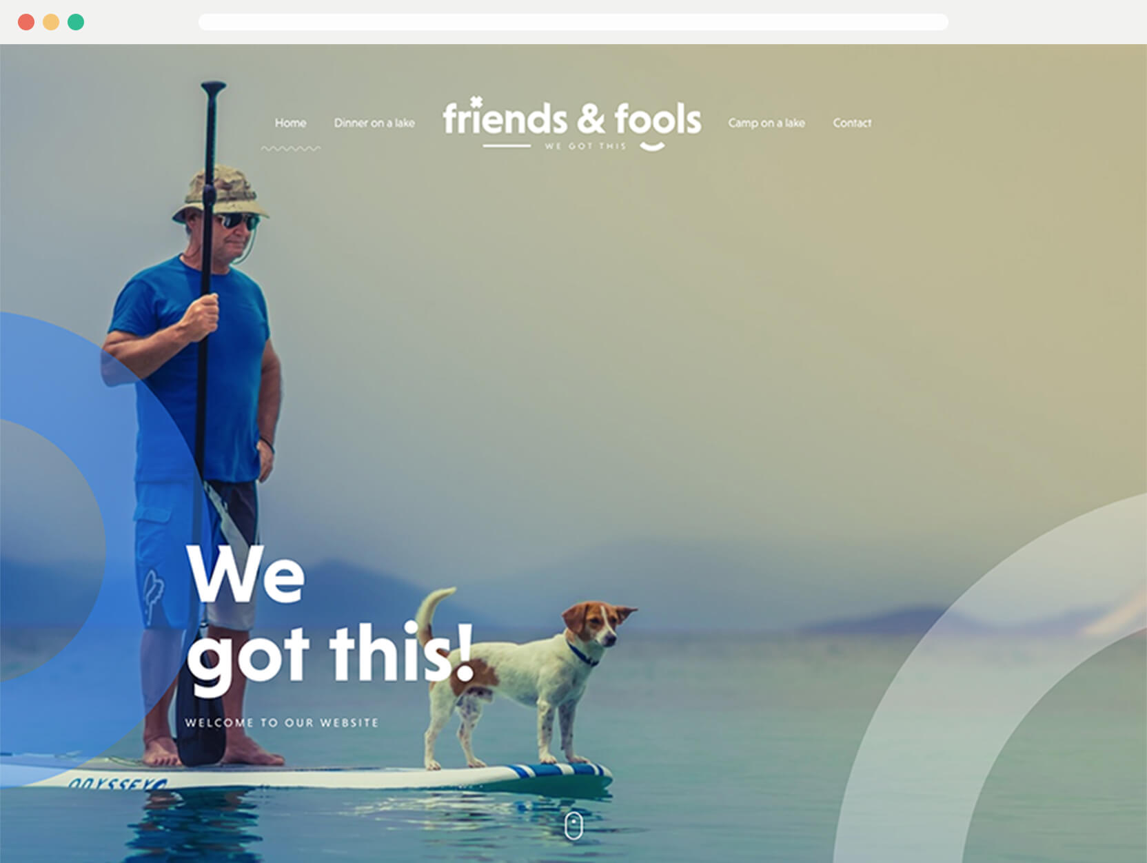
Big and bold design. There are some nice little details throughout the design and it’s a nice use of big type.
Inturn
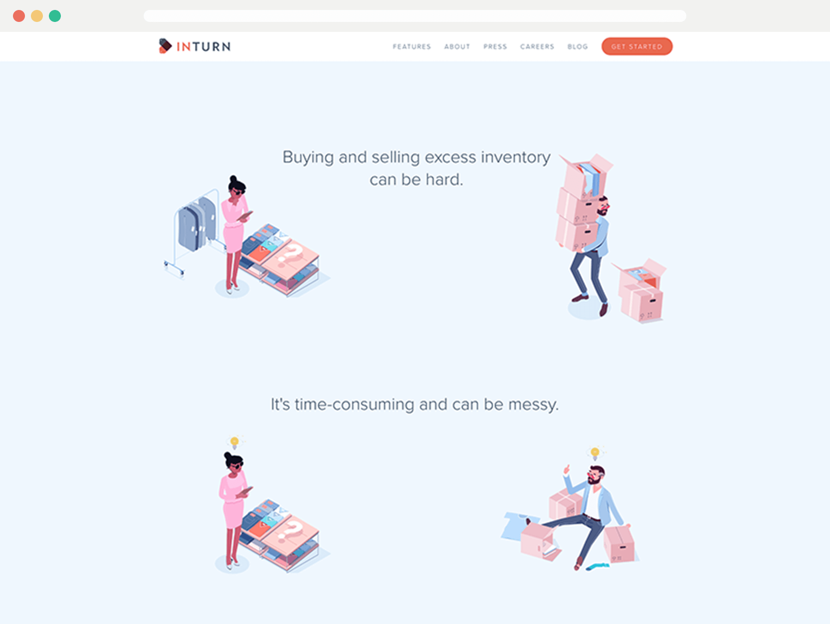
The animated illustrations help guide you through the page and it helps you to understand the service. However it could be a little more descriptive for the final point, but generally you get it.
Ueno

Ueno are a constant source of inspiration and great work. I was curious to see what would come of their rebrand. I like how everything is nice and smooth as you scroll through.
Yoke
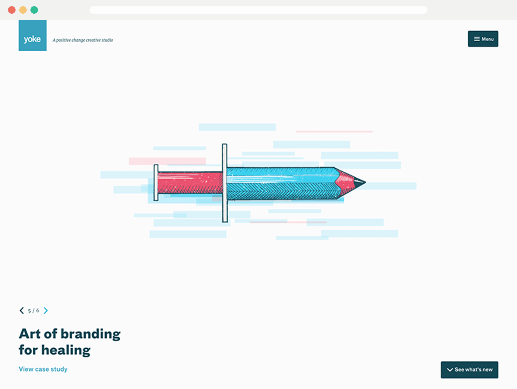
Quite a minimalist design, but the illustrations add a bit of fun. Following that is a nice grid layout of content. Overall really well designed.
PrescribeWellness
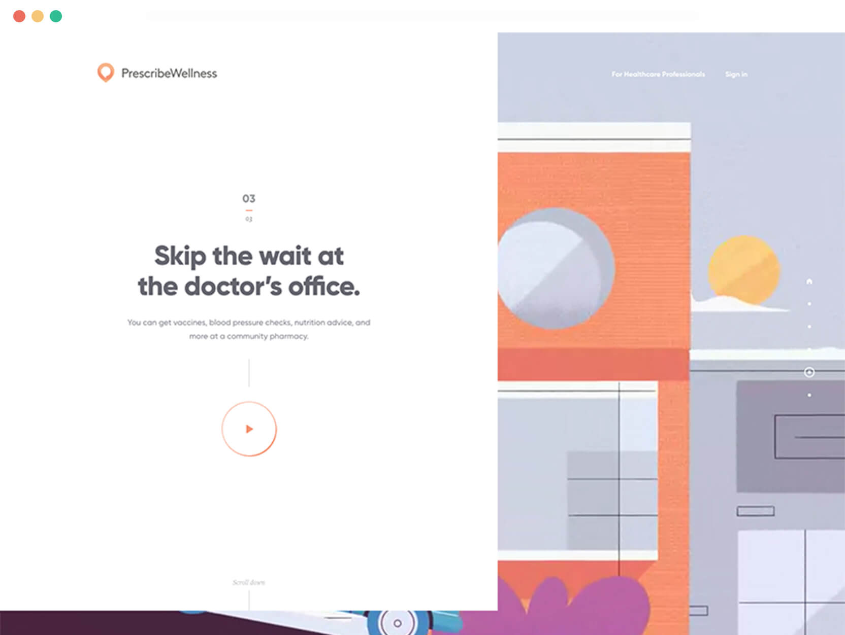
This certainly isn’t what you would think a healthcare website would look like. Scroll on through and there is smooth animations and little videos in the background. It makes for a surprisingly nice touch.
Toi
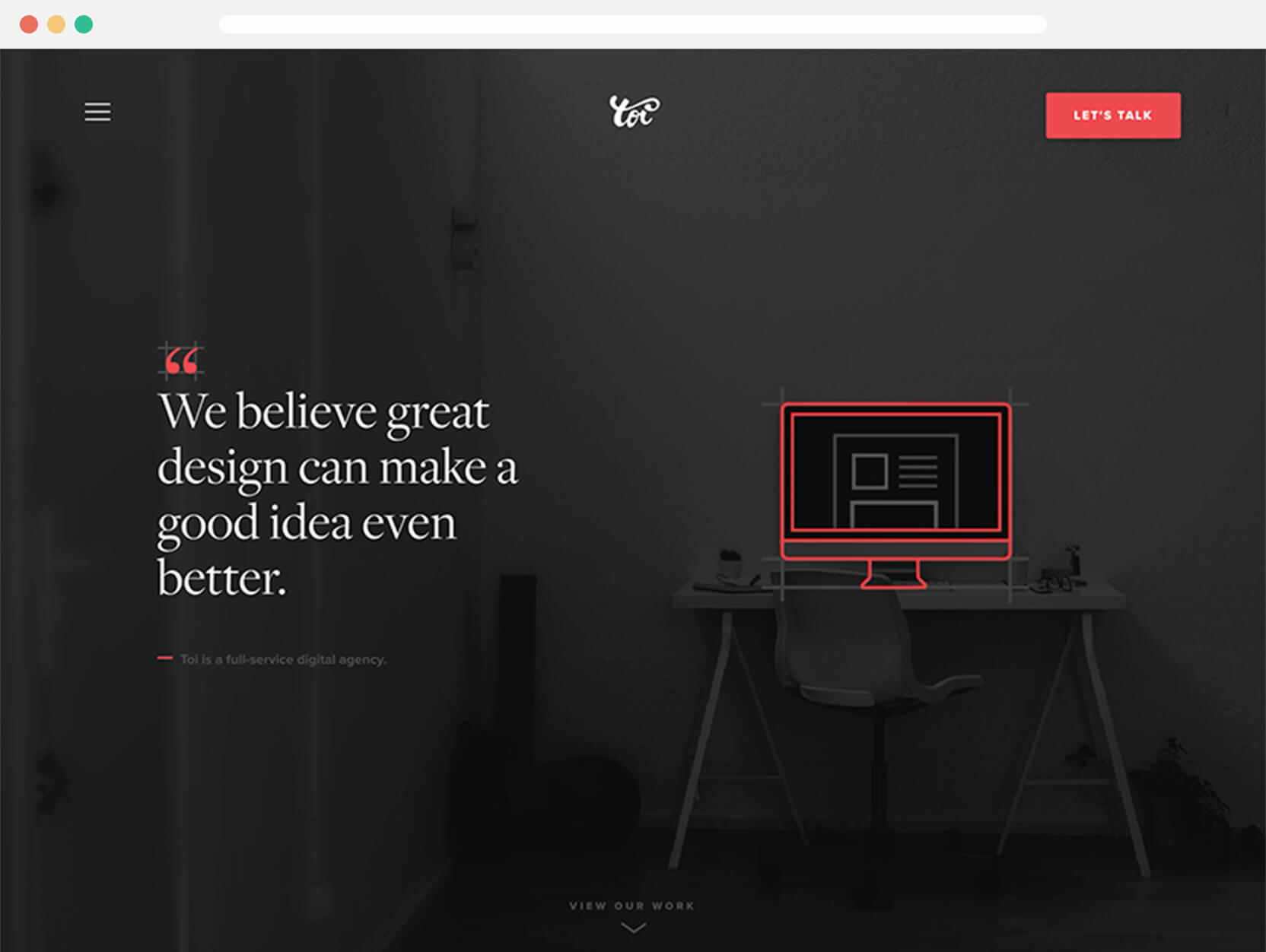
The animated image combining real life with a ‘blueprint’ style over the top is really nice touch and adds a sense of uniqueness. It’s persisted throughout the design. Each slide and section throughout is well considered.
Apps/Tools
Here’s a few apps/tools I found over this month. Most notably Setapp, it seems like a great idea and beneficial to both parties where apps are concerned.
Spark for Mac
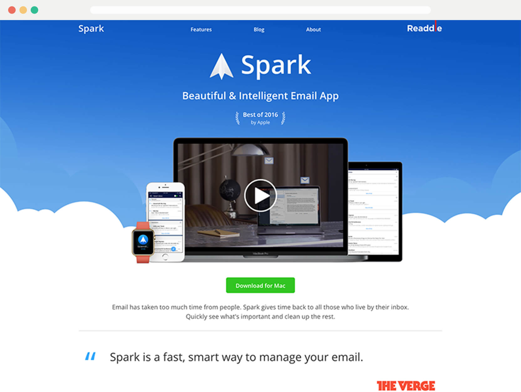
I’ve been using Spark for iOS for quite a while now. It’s been a reasonable replacement for Mailbox, and now it’s out for Mac. I was using Nylas N1 before this. I’m not completely sure it will replace Nylas, but I like I now have a cross platform mail app with snoozing again.
The main thing is I feel like Spark won’t suddenly disappear.
Setapp
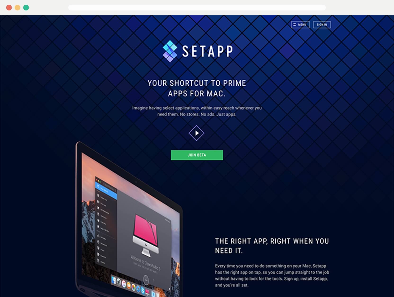
Setapp is a competitor to the Mac App Store. “Imagine having select applications, within easy reach whenever you need them. No stores. No ads. Just apps.” Currently in beta, but you can get an invite if you sign up. It aims to be a subscription service of apps. It looks really promising.
Logo Miner
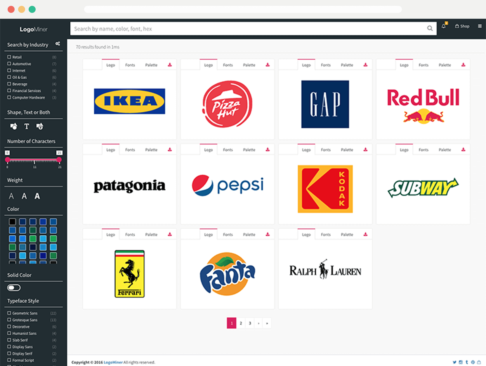
If you need a logo this is the place to remember. It looks like a great source of logo files.
Rightlight
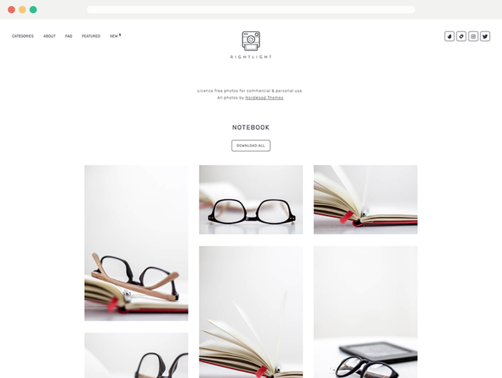
A free stock photography website, another to add to your collection to refer to. There’s some great photos, which I’m sure will be suitable for your projects.
Articles
Last months articles weren’t very design focused, but this month the aim is to keep everything related to design.
The benefits of sketchbook work
What this article made me think more about was the detail within sketches. Sketches can both be detailed and quick with less effort than a wireframe.
As lately I’ve questioned the value of wireframes. They’re a time sink, for what can be little return value. It depends how you work and whether you feel they are beneficial. Over making a full design versus the discussion around them.
Rethinking message notifications on iOS
On the face of it this looks like a small improvement, but it would be quite significant. It’s similarly frustrating to get a notification and you reply within the notification, but the other person sends additional replies.
This usually means you miss some messages or have to go in the app to make sure you haven’t. I could see this improving things like that.
Beauty vs function
It is seen as a crime in today’s design world to focus on making things look good. It always takes a back seat. I believe we’ll eventually come full circle and start designing things without the fear of focusing on aesthetics.
Tobias has posted many great articles over the past month, so I would highly recommend subscribing to his newsletter, if you haven’t already.
Space yourself
All the different spaces available to us. I’ve found this really helpful for understanding which should be used where.
Why it’s time to prioritise visual content
People will visit your website and scan the content in a matter of seconds. The images they see will determine the likelihood of them lingering on your website.
It’s a fair point and a good reminder to try make content as appealing as possible. However, I don’t think you need the stock photography account recommended, there are plenty of free sites out there!
Top monospaced fonts for coding
I found this a handy list to find some variety in monospaced fonts. They’re in fashion lately as well, outside of code, so it’s a useful list.
That’s it for this month
There has been some great web design found this month and I’m particularly excited to see where Setapp heads.
View on Github