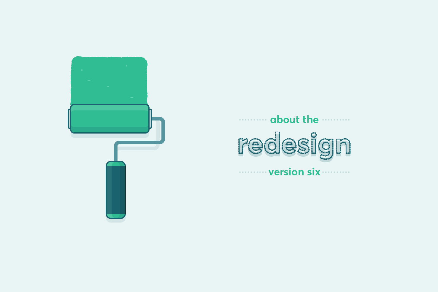
Design

From speedy workflow based quick tips and resources, practical techniques to create well designed interfaces.

Monthly design roundup #1
Design

Monthly design roundup #1

This is the start of a monthly series of a roundup of 8 websites that I have found that are well designed. There is no particular theme, other than inspirational, which I hope you find is the case. I’ve added a few notes around why I believe they’re well designed as well.

My design process — v6 case study
Design

My design process — v6 case study

The redesign of this website has been needed for some time. Overall the website is quite small in terms of templates required. I wanted to put the effort into making the website feel like it is a growing source of content. There is much to cover in this, as I start with the new logo briefly, sketching, wireframes and design.

Alternatives to Circular
Design

Alternatives to Circular

Circular is very much in the spotlight at the moment. It has a distinct look to it that so many huge companies are using. From Google to airbnb, it’s everywhere. If you’re looking for alternatives, with different prices and through a different service, this post is for you.

Shop filter series: visual style
Design

Shop filter series: visual style

The previous post in the series completed the wireframes. They’re a solid basis for adding visual style. The content and interface elements required are all there. Further layout refinements, colour choices, typography and clarity improvements will be made throughout this post.

Shop filter series: sketching & starting wireframes
Design

Shop filter series: sketching & starting wireframes

Filtering is a huge part of online shops, it’s an effective form of navigation. In most cases it’s an area which is overlooked on small screens. I have seen some good implementations and many lack the ease of a larger screen. In this post I want to explore the idea of it being a tab bar, starting with sketching & wireframes.

Pixel perfect templates in Illustrator
Design

Pixel perfect templates in Illustrator

Illustrator being a vector application means it can be easy to overlook the export process and making things pixel perfect. It’s easy to do, so you don’t notice it. It’s particularly important that you try to retain this for logos and icons.

About version six
Design

About version six

I’ve finally done the redesign of this website! Version five lived for longer than I ever intended. This post is going to be a shorter summary of the changes. I’ll be posting a full case study over the coming weeks.

Illustrator quick tip: evenly distribute objects
Quick tip

Illustrator quick tip: evenly distribute objects

It’s likely you know how to align things in Illustrator, but you can never remember how to space things equally, so you resort to the tedious way of spacing them individually. If you want to align objects with an equal space between them, this quick tip will show you how.

Websites using alternatives to the ‘hamburger’
Design

Websites using alternatives to the ‘hamburger’

It’s been proven as apps have shifted away from the ‘hamburger’ navigation, to a bottom bar, engagement and browsing metrics have increased. Over time these findings have an impact on the thought process of those designing websites. In this post I detail a list of websites that are using the tab bar navigation.