Illustrator quick tip: which stroke alignment?
There are three types of stroke alignment, so when and where is each useful?
One of the things you may face with applying a stroke to an object in Illustrator, is which of the three alignments should you use? Each type has its own advantages and disadvantages, which this post will explore.
9 times out of 10 you should stick with centre
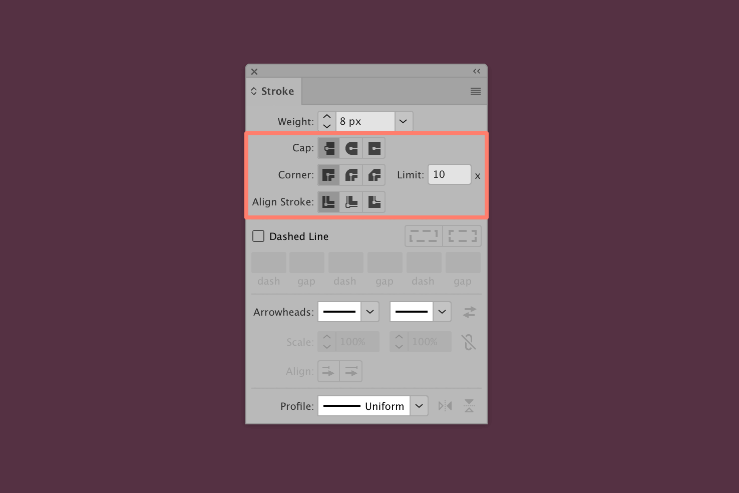
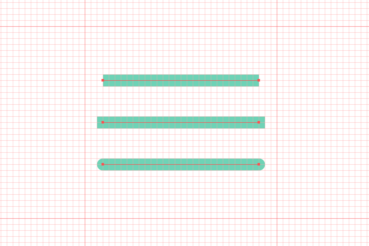
There are three alignments, centre, inside and outside. You’ll see there are subtle differences between them. Each make the look and feel of an object slightly different. They also behave differently with caps and corners.
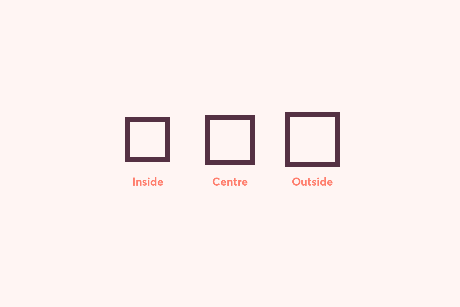
At first it looks like the squares are made larger. However, to summarise this post quickly, you should almost always use centre. Why? I’ll get into the details now.
Inside alignment
Aligning your strokes to the inside is by far the easiest to manage. It doesn’t affect the dimensions of your object, the size you make, is the size you export. However, there are two downsides to keep in mind.
Inside doesn’t accommodate stroke caps

The biggest negative of inside alignment is no stroke caps. If rounded caps and joins are part of your style, you won’t be able to achieve them as easily. You would need to expand the object and do it manually—no thanks.
Open paths are only central without a custom stroke width
If your design style doesn’t require stroke caps, you still need to watch out when drawing paths which aren’t closed. It may be tricky to achieve consistency. As they will always align to the centre, you can overcome this by making a custom stroke width profile.
Outside alignment
The outside stroke is one of the trickier ones to use and it’s not one I’d personally recommend using unless you’re in a rush. It’s suitable for complex shapes, with intricate areas which you want to retain those details.
Different dimensions on save
As the stroke is applied completely round the outside the size will appear the same (in Illustrator). However, on saving it will increase. This is the main thing to be aware of.
If you were intent on having a particular size, you may find your design to be off in those areas. For example, if you were to make a 16px favicon, which had a 1px stroke on the outside your favicon would be 18px.
Difficult to align
With the stroke not being accounted for in the dimensions it can make things trickier to align precisely. You’ll find things snap or line up using guides, but you’ll need to nudge the object over slightly each time.
Corner radius feels off
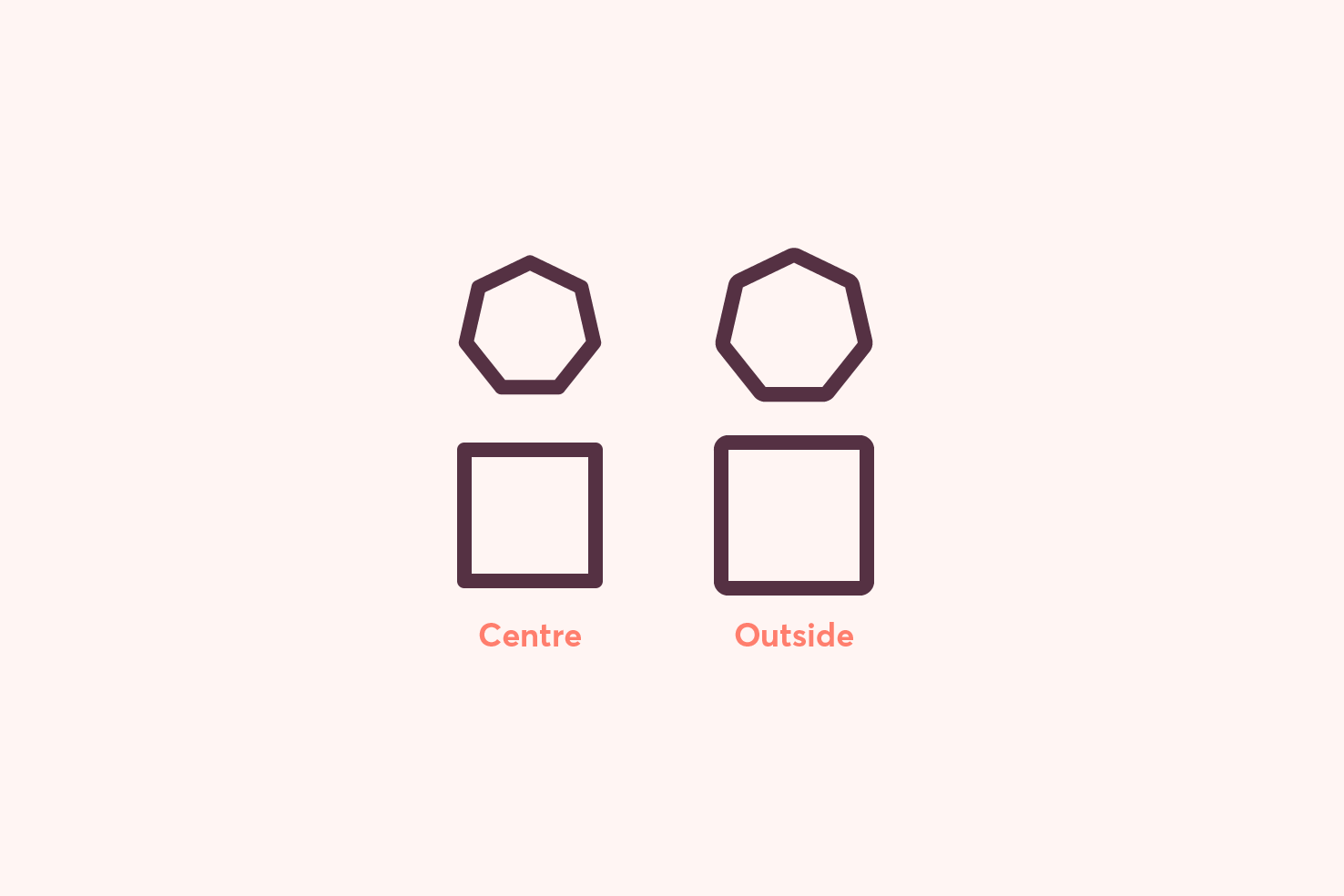
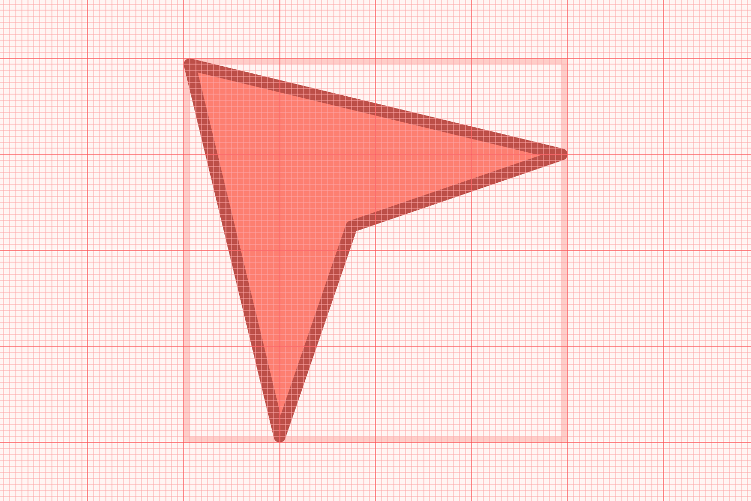
As demonstrated in the image you will see the centre and outside stroke alignments. Having the correct corner radius can make things feel more intentional.
Centre alignment
Finally, with centre it’s the default. As it’s the only available option until a path is closed. I aim to use the majority of the time, though it’s not without its ‘gotchas’.
Different dimensions and alignment is off
Again, as the stroke isn’t positioned inside the path the dimensions are different. You’ll also need to also nudge things over slightly to account for the stroke when aligning things precisely.
Centre is better for stroke caps and corners
As mentioned previously, inside alignment doesn’t account for stroke caps and corners. The outside does to an extent, but things like inner corner radii can feel off.
Centre is better for SVG
When you use inside or outside for stroke alignment the exported paths have a fill. When you export with a centre alignment you have access to all the stroke properties. This allows you to adjust the width, caps and joins without having to save it out again.
Stroke caps
When you add a stroke cap that’s rounded or projecting. It can also affect the dimensions, as it extends beyond the anchor point. This is something to be aware of when you require exact dimensions when a path isn’t closed.
The solution: a template
If centre is the best, how do you size things reliably? The answer is to make a template and use a grid & guides.
Enable guides
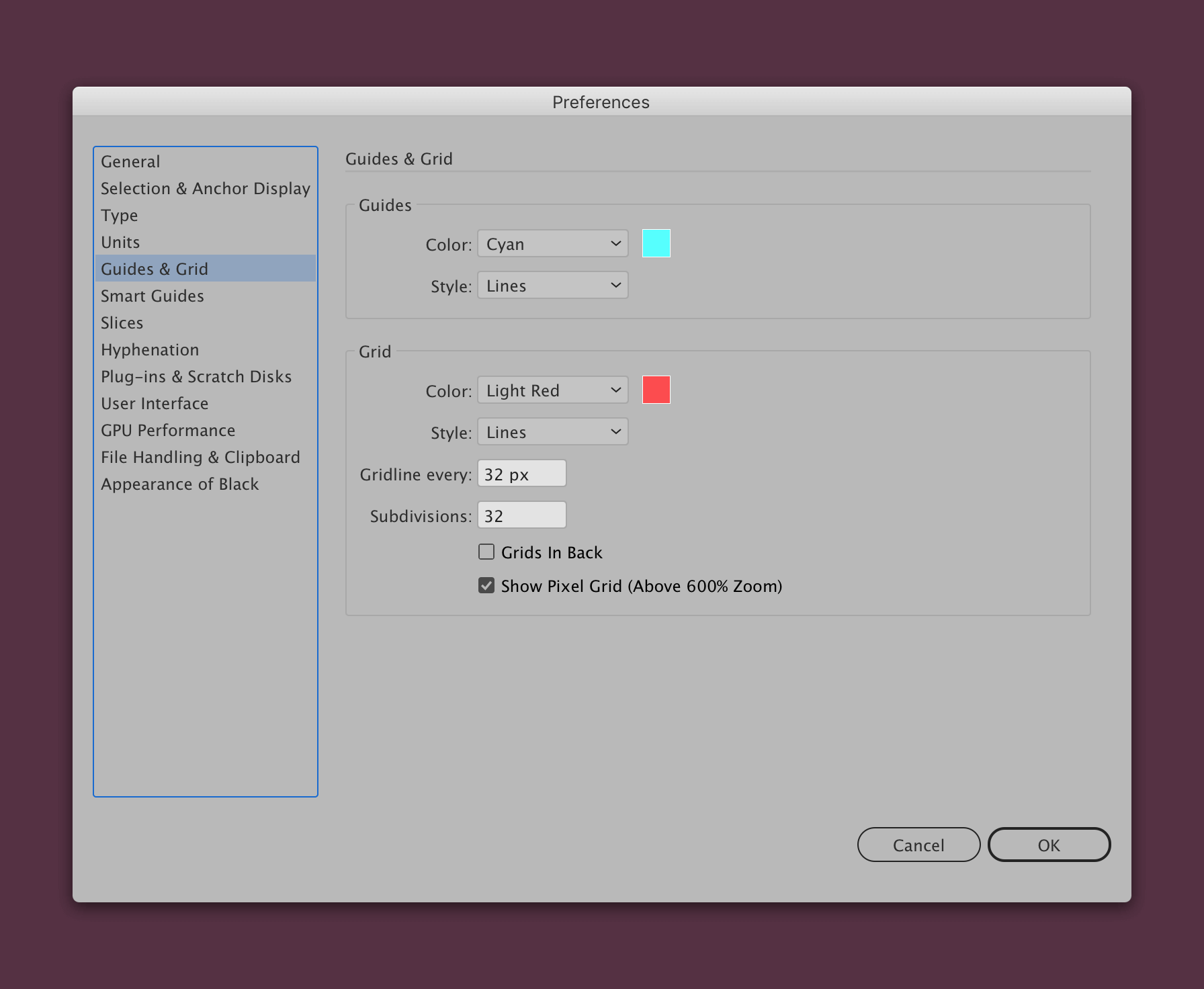
Go in to the Illustrator menu > Preferences > Guides & Grid, to setup your grid. Change ‘gridline every’ to be the size of the object you’re making. Add the same value in subdivisions (or fewer if it suits you better). This way you’ll end up with a reliable pixel grid.
Enable snap to grid & snap to pixel
You can enable these under View > Snap to Grid and View > Snap to Pixel.
Enabling these initially will help with sizing the template quickly. Keeping snap to pixel enabled will ensure things stay on the pixel grid where possible.
Draw a square the size of the object
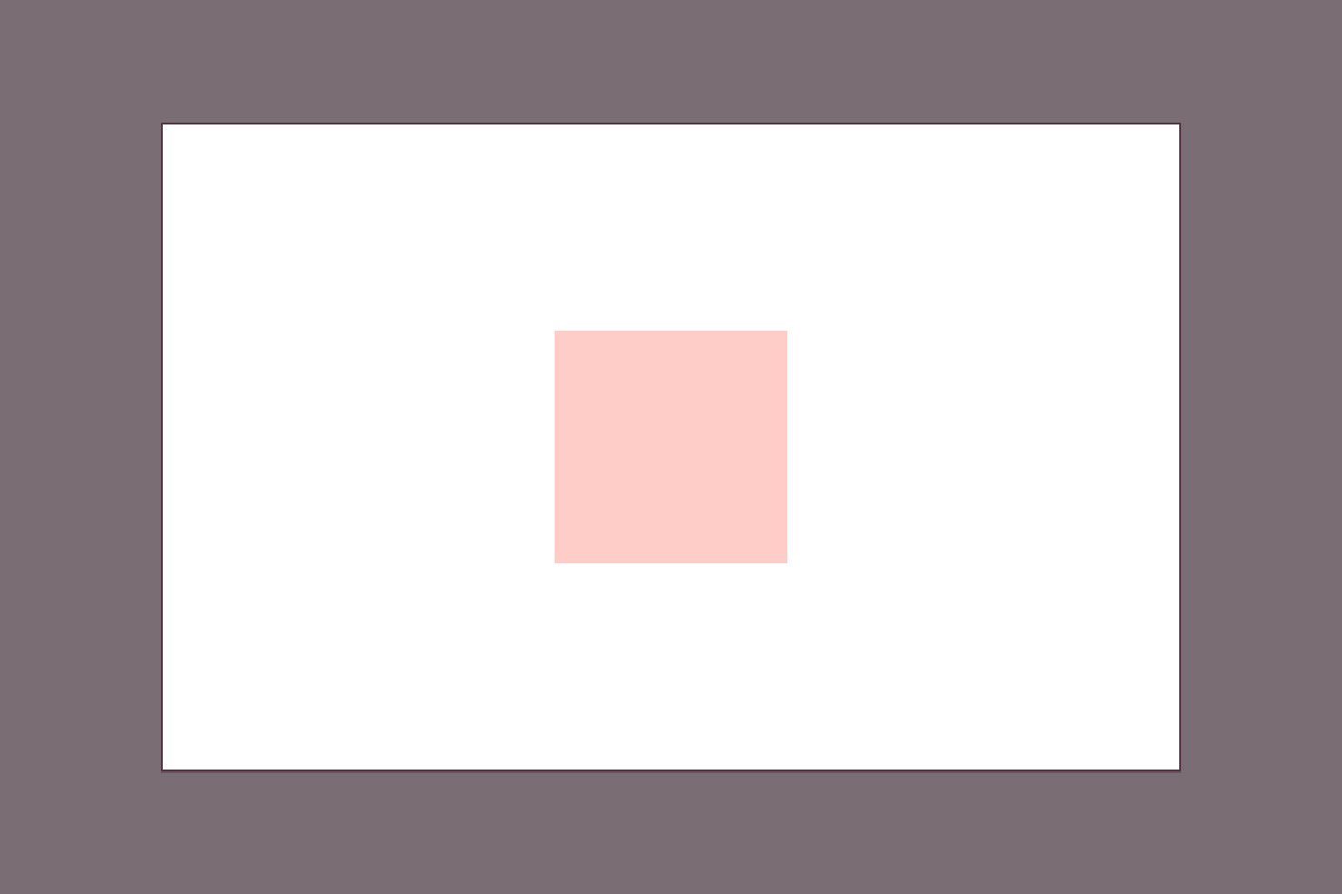
In this example I want to have a 32px icon. So using the rectangle tool by pressing m and draw a 32px rectangle.
Draw another rectangle minus the stroke width (optional)
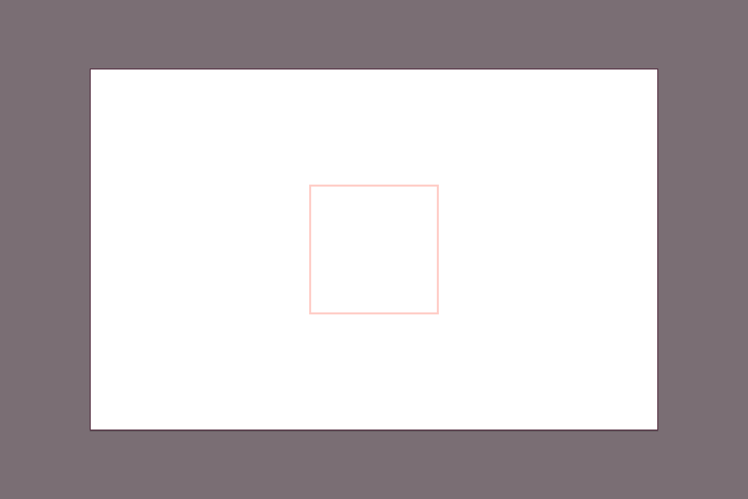
This step is optional, as it serves as more of a reminder, for the place your points should start from. Once a stroke is applied it will go into the defined area.
The size here depends on the stroke width you intend to use. When aligning centrally you can take the stroke size minus the overall width. In this case of 32px, it would be a 31px inner square with a 1px stroke. With a 2px stroke it would be 30px, as half of the stroke is positioned either side of the path.
On export or aligning
When exporting you’ll want to remove the fill applied (if there is one) and group the objects together cmd + g.
Grouping the template and object together is ideal for aligning. It’s also useful if you have icons, everything will scale consistently too.
That’s everything
This is the way to get all the benefits of having a centre stroke. So if you want round caps and joins, you can. You don’t have to worry about alignment, and scaling proportionally.
View on Github