Rules I follow when typesetting
I’ve developed some habits over the years when it comes to the display of text in a design with the aim of readability and aesthetic balance. And it feels like it could be useful to document this.
— views

When writing or typesetting a design, I have things I follow in terms of creating a good flow to the article or balance within a page. However, I always believe in pragmatism with rules like this as there are things out of your control, like screen size, varying content, etc.
It’s important to aim for the ideal, but not to the detriment of creating something unmaintainable.
Here’s a breakdown
- Line height is proportional to size
- Letter spacing or tracking is proportional to size
- Everything is sentence case
- Everything is left aligned
- Use the correct type of dash
- Use the correct quotes
- Hanging lists and punctuation
- Avoid punctuating titles where possible
- When emphasising, highlighting or linking text watch out for punctuation
- Use paragraphs to create help rhythm
- Avoid orphans and widows
Line height is proportional
There’s a few things you can use to determine the line height for your type. It’s a balance between your text looking loose or readable.
- Font size
- Line length
- The proportions of the typeface (eg: baseline, cap height, x height)
- Where you’re using the type
- How often this needs to change
- What control over the change you have
For example, in a hero title you can afford to be precise with your line height but where components vary with the text within; you may find challenges.
Each of the items listed can impact your choice of line height. For larger headings, a line height lower or closer to the font size can be ideal. Whereas paragraphs with a good measure can be around a more comfortable 1.5x the font size.
Line length determines your line height
It’s an important to use the length of your copy to determine your line height. The shorter the line length, the smaller the line height. The longer the line length, the larger the line height.


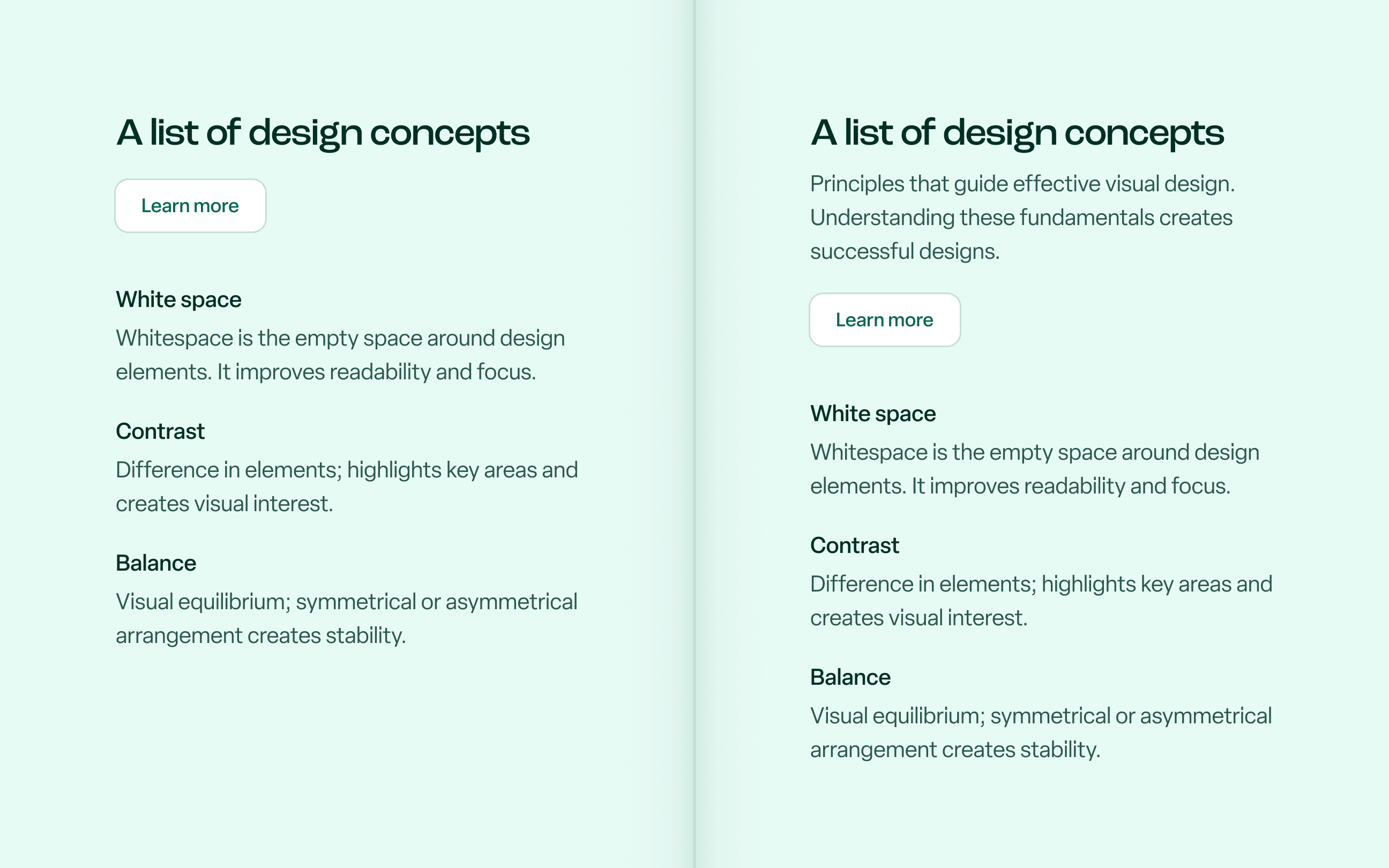
Fig. 1 A heading and paragraph require different line height due to their line length and size
This works for large and small type, as a readable measure still applies. It’s a fine balance because with shorter line lengths it can easily look like there’s too much space between each line and throw off your composition. But for longer line lengths if it’s too tight it will be difficult to read.
Using baseline, cap height and x height
These are the important proportions of a typeface to create balance when creating your text composition. Spacing is applied using the ‘box’ of the type across web and some design tools by default—I’ll get into this and text-box-trim shortly.

Fig. 2 Shows cap height, x height and baseline and how those affect line height
But first, let’s look at how you apply spacing. Doing so evenly between items will result in an awkward feel to the space because of how this line height works.
Using a combination of baseline, cap-height and x-height to choose your spacing will help create a better balance.
Understanding the ‘half leading’ of CSS
Half leading1 in the browser based world of design means that half of the line height is applied to the top and the bottom of your text box.

Fig. 3 There are two examples of text here, a heading and paragraph
The heading’s box is more flush with the text, as there isn’t anything extra to be applied above and below. And this can change the way your spacing looks if not taken into account. The line height of the heading uses 0.9 or 90% and the line height of the paragraph uses 1.5 or 150%.

Fig. 4 Markers comparing applied spacing values against their optical appearance
This used to be more of an issue in the days where you used Photoshop or Illustrator to design. But as Figma is now the industry standard, expectations between designers and developers around spacing are more aligned.
Levelling it out with text-box
As of writing, the method to remove this through text-box trimming is gaining traction in terms of browser support2 with Safari and Chrome. It’s not quite ready for day to day, but as more users upgrade this should become more viable.
It’s available in Figma and Sketch albeit both have limited control compared to CSS. And I imagine once the usage aligns, they will dictate how it’s used as they don’t have the same extent.
This will be more of a thing of the past in the future3, but I am curious to see how text-box-trim changes how you design.
Letter spacing or tracking is proportional
Like line height, I don’t think you can apply a simple percentage rule to any typeface and call it a day for every design you do.


Fig. 5 Shows the difference between the heading with tracking on and off
It takes a little tweaking depending on the typeface you’re using. Think of a display typeface versus a text typeface. Using them at varying sizes will require different extremes of tracking. Typefaces with ink traps, for example, tend to be designed for display use and benefit from tighter tracking at large sizes.
Everything is sentence case
Everything, whether that is a heading, button, navigation link or whatever else you can think of. It’s sentence case—no exceptions.
It should go without saying but the only exceptions are names or something important like ’I’.

Sentence case is superior for readability and remembering the system. Is it the first letter or is it a name? Simple. The inconsistency at which people apply title case is enough to oppose it when setting a style guide.
Everything is left aligned
This is something I feel I always contradict myself with. But like any guidance it doesn’t mean there aren’t exceptions—eg: a hero section.
Fig. 7 Two options of designs with central and left alignment for comparison.
Anyway, for the vast majority of your design it should be aligned to the left (or right if your language is right to left). It means your right side of text has a ragged edge which makes it easy to scan. It’s most true for articles.
If your composition works better centrally, it must be a small amount of text. You don’t want to be reading large centralised paragraphs.
Use the correct type of dash
I’d recently heard a pointer for identifying AI copy was the use of the em dash (—). Which feels unfair, but I see it, AI does like to use them. I hope doesn’t lead to a lack of their use—as I like to use them.
I do wonder if this comes from the assumption that the judge of the writing assumes the writer doesn’t know how to use them? Which is where I was going with that. And knowing where to use each dash ensures your writing is typographically correct.
Hyphens (-)
Hyphens are used to join words to create meaning or indicate where a word breaks within a sentence to maintain grammatical correctness.
En-dash (–)
The name comes from the letter ’n’ as the character tends to be the width of the letter ’n’. But its use is important to understand.
It’s used to indicate a range. It could be a range of numbers, dates or start and end of a destination eg: MAN–LON.
Em-dash (—)
The name comes from the letter ‘m’ as the character tends to be the width of the letter ‘m’. And in terms of CSS this is where the em unit comes from too.
The easiest way I remember how to use an em-dash is as more of a substitute for a commas, parentheses or semicolons.
I see it as a way to break up a sentence. The statement you write in between the dashes should make sense on its own and the sentence should make sense on its own if the statement between the dashes is removed.
I could be wrong here, but that is my understanding.
Composing sentences with em-dashes
My stylistic preference, when writing a sentence that contains an em-dash it shouldn’t have spaces before and after it. You can use a   but otherwise no space is preferred.
Design is not just what it looks like and feels like — design is how it works
Design is not just what it looks like and feels like—design is how it works
Keyboard shortcuts
The en and em dash have the following keyboard shortcuts to access.
en-dash
⌥Option-em-dash
⌥Option⇧Shift-Use the correct quotes
I’ve put this before in a previous article, but let’s go over it again. There’s straight quotes and curly quotes. Curly quotes are more complementary with your typeface.

Fig. 8 Left are straight quotes, right are curly quotes
The best reference for the usage of quotes smartquotesforsmartpeople.com. The shortcuts are fairly simple, but it’s better if you have something to do it automatically for you as it can be easily missed.
Opening double quote
⇧Shift⌥Option[Closing double quote
⇧Shift⌥Option]Opening single quote
⌥Option[Closing single quote
⌥Option]When dealing with automatic transformation into them. Many apps do this by default. For code, you’ll need to use a library like smartypants.
Hanging lists and punctuation
The aim with hanging punctuation is keeping a clear key line. Overall, it helps keep the rhythm for the eye to follow. Depending on your design tool of choice there is varying levels of control and convenience to do this in your design.
Fig. 9 Comparing the difference between a body of text with and without hanging quotes.
Across these examples, you can see the difference hanging the quotes makes to the flow of the writing. I like it as a design detail as it gives an opportunity to add a little flair without being disruptive.


Fig. 10 Comparing the difference between a body of text with and without hanging lists.
With CSS use hanging-punctuation
To achieve it for all the cases you may require it was a challenge, until hanging-punctuation came about.
123456p { hanging-punctuation: none; hanging-punctuation: first; hanging-punctuation: last; hanging-punctuation: allow-end;}It’s a flexible property, you can combine all three values or have one or two.
The browser support is poor as of writing4—but it presents a future with greater control.
Although, I like hanging punctuation for the alignment reason, it can be challenging to always achieve it on smaller screens with the more restricted space.
Avoid punctuating titles where possible
I will try to avoid punctuation in a title because it looks messy. I find it’s difficult to apply with consistency. If one title is punctuated it will stand out more when another isn’t.


Fig. 11 Comparing the difference between a mobile hero design with and without punctuation part of the title and description.
Watch out for full stops in centralised titles
It’s something that can optically throw off the balance of your heading. It stands out more on mobile due to the narrower width. Well I am kind of reaching, but it does stand out optically.


Fig. 12 Comparing the difference between a mobile hero design with and without punctuation part of the title and description.
On a separate note, it’s similar to hanging punctuation. Where you have a central title with a full stop at the end the final line will feel off optically.
When emphasising, highlighting or linking text watch out for punctuation
This is a small detail, but the vast majority of the time and more so with linking you shouldn’t include the full stop.
Use paragraphs to create help rhythm
When some things like headings, lists, buttons follow a heading; it can create a sense of awkwardness in an article or design.

Why? For me it’s down to the presence of the thing which follows the heading. A heading following a heading may not feel right. A button following a heading will likely feel out of place due to the balance between the elements.
The spacing flows much better when there is a paragraph to break it up. Your rhythm suffers when there isn’t.
Sometimes you can’t avoid it and it shouldn’t be at the expense of unnatural writing or forcing it but it’s a conscious effort I make.
Avoid widows and orphans
Widows can create some awkwardness in your design. A widow is a single word or short line of text. So where you have greater control over the flow of text in a component you can try to ensure it doesn’t happen.

CSS text-wrap can handle it
Before text-wrap it would be generally pointless to try cover every possible case of a widow in your design. But now with CSS you have two options to control text wrapping.
text-wrap: balancebalance does exactly that it aims to achieve the most balanced layout. Which is ideal for your headings and this works well the majority of the time.
text-wrap: prettypretty is a bit of a arbitrary word to decipher what happens, but it ensures that there isn’t one word left on it’s own. It’s for the use cases where balance would be excessive—like lengthier paragraphs.
There is also a performance aspect to it. If you think the browser has to calculate and reflow the text to balance it correctly.
Before text-wrap this is something that would be less practical to chase in a lot of situations and you’d have had to approach it manually. A method of doing so is still valuable to know.
Manual balancing
Methods for manually balancing titles or keeping word groups together is worth knowing. Sometimes you might find text-wrap doesn’t quite balance the title the way you want or you need to break a long word.
Don’t reach for <br/>. Use <wbr/> or .
12<h1>Fundamentals of visual design</h1><p>Underlying principles and elements<wbr/>that guide effective and visually appealing design.</p>Using a (non-breaking space) will ensure you can keep word pairs together and using <wbr/> will only insert a <br/> when necessary.
Avoiding widows
A widow is where a single line of a paragraph ends up at the top of a new column or page, separated from the rest of its text. In print, this is a well-known problem. On the web it’s less common because we rarely work with columns or paged layouts.
But if you use CSS columns or break-inside for content layout, it’s easy to come up against them. That lone line draws the eye to an awkward gap rather than the content. It breaks the reading flow. You can use break-inside: avoid on elements you don’t want split across columns, but that can create its own spacing issues. The honest answer is that if you’re using CSS columns for long-form text, you’ll likely need to test and adjust manually.## Ending thoughts
Taking these rules into account, a balanced approach to typesetting improves both readability and visual appeal. Paying attention to factors like line height, letter spacing, and alignment makes things more intentional and works within the constraints of the chosen typeface.
Keeping in mind the practicality of doing these things ensures your design is maintainable and not introducing more work. However, I have written similarly before with visual design tips and these posts seem to go down well.