Design

From speedy workflow based quick tips and resources, practical techniques to create well designed interfaces.

Colour series: adding new colours & tips
Design

Colour series: adding new colours & tips

Following on from the two previous posts, this post will cover things I have learnt about selecting colours over the years. These tips are the sort that when starting something new, you wish you knew, ahead of time. The majority of these tips will stand true, at least 90% of the time, and help making the right decisions easier.

Colour series: tweaking your palette
Design

Colour series: tweaking your palette

This is the second part in this colour series. The topic I will cover in this post is tweaking your palette. Following the previous post, you will have selected a 5 colour palette, which should serve for the majority of your use cases. However, at this stage, it won’t be perfect. I’ll guide you through the process of tweaking your palette. From trying your colours in different combinations, to colour blindness. This post helps to refine your palette.

Colour series: picking your palette
Design

Colour series: picking your palette

In this first post, I’m going to run through why colour theory is only a small part of choosing colours. Then you’ll begin to pick your palette. I’ll explain the things, that I consider when choosing a colour palette. This should help to inform your choices.

Avoiding split focus will make you a better designer
Design

Avoiding split focus will make you a better designer

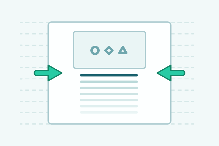
The idea of this post comes from a previous one, ‘accuracy in wireframes’. I thought more about the topic, which was around trying to decide layout and adding visual style. Focusing on two very important aspects of making websites leads to difficulties. It was part of a larger problem in my process.In this post I want to cover ways, where split focus can creep in, and the purpose of each step, so you can gain understanding for avoiding split focus. This is based on my process, so yours may differ, but the premise is the same.

Tips for sketching websites
Design

Tips for sketching websites

I’ve seen tweets, and hear people say “I’m no good at sketching/drawing.” So they don’t bother with doing it. For me not sketching your website before going into a wireframe or design, means you’re missing out!Just because you feel like you can’t sketch, doesn’t mean you shouldn’t do it. After all, you’re capable of building a website, and at some point in the past you weren’t. In this post, I’ll show you my process and how to sketch websites.

Three free form styles
Design

Three free form styles

This is one of the first things; I’ve worked on aside from what’s posts, to give away. It’s quite difficult to figure out what to design to give away, without just adding to the masses of things out there already. I’ve decided to code up some form styles. So you should be able to grab their styles and apply them right away to your forms. There are three variations.

Responsive vertical rhythm
Design

Responsive vertical rhythm

I wrote a fairly lengthy post previously on vertical rhythm. I considered adding a section on how to adjust font sizes whilst maintaining vertical rhythm. However, with the experience of seeing how people struggle with the topic of vertical rhythm, it was best to keep it for a separate post.I will assume you do have a grasp of vertical rhythm, at this point, otherwise some parts may not make sense. In the examples I will be using em units, with Sass. So I assume you will have an understanding of how em units work. However, I will give you a brief overview.

Typekit gems
Design

Typekit gems

Here’s 4 typefaces from typekit; that you may not have used. These are typefaces I have used in the past and have qualities that I believe make a good choice. Generally they are all suitable for paragraph text. They feature nice italics and a variety of weights. Hopefully through this post you can discover some nice typefaces that you can find appropriate for your designs.

Accuracy in wireframes
Design

Accuracy in wireframes

In this post I’m going to cover a process I’ve brought in for doing wireframes, I’m finding really useful lately. It involves taking back all the visual style and just focusing on the layout of elements — as a result creating accurate wireframes. Then you build up your visual style from there. The problem for me comes from wireframes that have too little detail, being used as the basis for the whole page.