Hero area series: plan & design
This is the start of a series where I’m going to take a common design pattern and go through the process of planning, designing and code. It will follow the process I go through to make websites, but taking a smaller component. The pattern you will focus on within this series is a hero area.
— views
This is the start of a series where I’m going to take a common design pattern and go through the process of planning, designing and code. It will follow the process I go through to make websites, but taking a smaller component. The pattern you will focus on within this series is a hero area.
You will plan, design, code and then build upon that with Wordpress to make it editable through the Customizer interface. You’ll learn how to use the majority of Wordpress Customizer features and learn how to anticipate changes in a design that allow for some extensive editing. To start the series you’ll be guided through the planning and design phases.
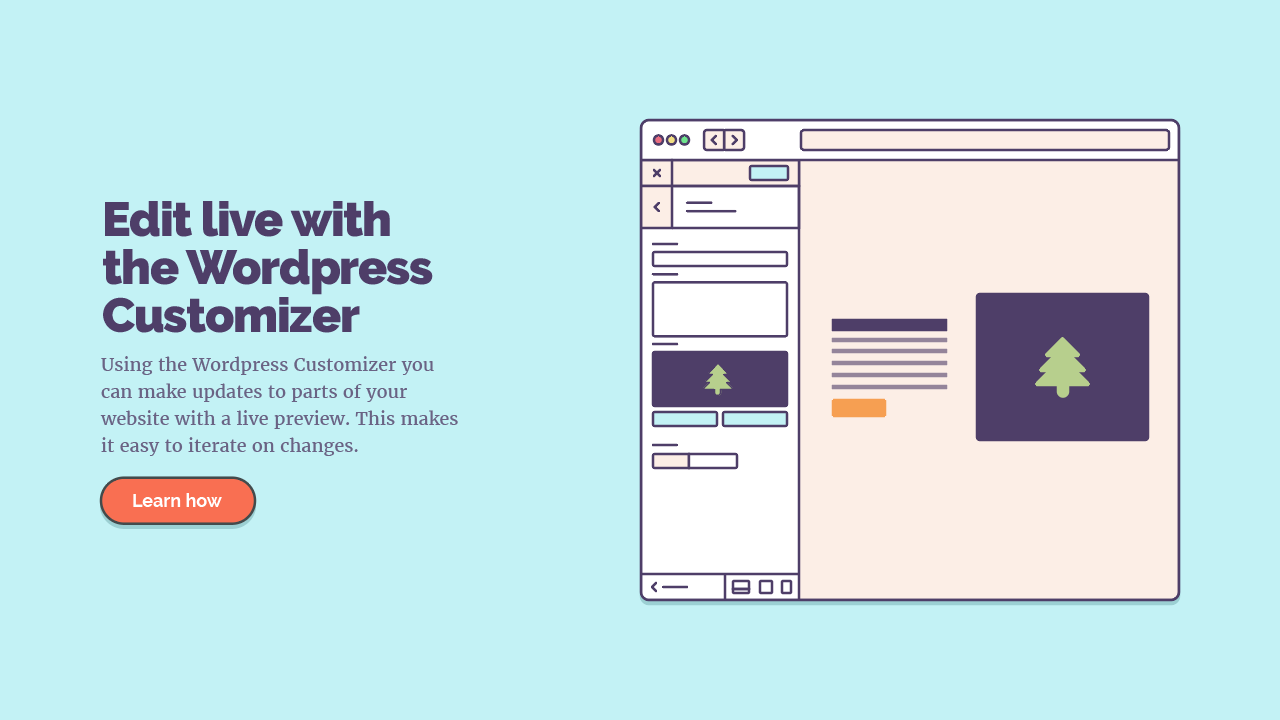
What you’re designing
Don’t want to do the tutorial?
If you’d like to skip ahead, download the Illustrator file.
Planning
Firstly, we need to decide what the aim and contents of this area will be. In theory, deciding the contents means we could do the majority of the Customizer functionality and HTML without the design. With this approach, we are thinking of the content first and providing the best solution toward that.
An area to display work
The aim is for this to be an area to display work or similar things. It must be inviting and draw attention. This is a key piece of work that you would want to display. It’s the most important thing of the moment and it’s where you want to drive your visitors. Hence the name ‘hero’.
For that you need
- A title
- A subtitle (optionally, it may be valuable to provide a bit of extra description)
- Image
- Background colour
- Link to the work
We also need to consider different screen sizes, legibility of text on the background and the visual hierarchy of elements. All of this contributes to an effective hero area.
Sketching
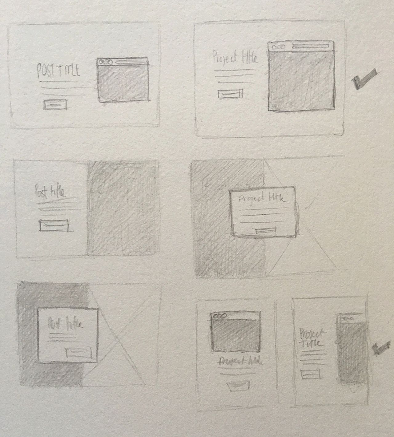
Sketching is part of any process for me. At this stage, although it may appear a small area, we can explore different layouts for different screen sizes.
Intentions
From the sketches, you can see that all of them are quite tall. As mentioned earlier, the aim is to clearly draw attention to this key piece of work.
The layout will be flexible to change with screen size and shouldn’t become obscured at any stage. The overall layout should remain very similar through screen sizes as seen in the smaller sketches.
It’s always my aim to try distance myself from the larger screen design. Resisting the urge to just stack things in one column, for small screens. As a result, you can usually keep the layout very similar, or come up with something far better than a single column.
Designing the hero panel
I use Adobe Illustrator for the majority of my design work. You can use what is most comfortable for you. It should translate well similarly, although the directions are for Adobe Illustrator.
Choosing colours & typefaces
The goals for this are to draw attention and appear inviting. So both the colours and typefaces need to reflect that. Though from the sketches you’re afforded a large area, so the background colour, in particular, doesn’t need to be too overwhelming.
Typeface choices are fairly unrestricted, but for this instance, you’re looking for something to complement the theme. I will be looking for typefaces with plenty of weights and styles.
Colour choices
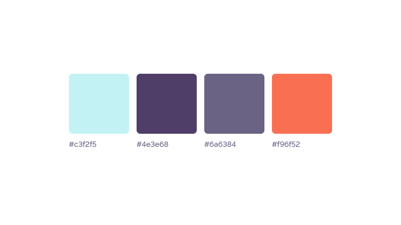
- #c3f2f5 Light blue: primarily a background colour
- #4e3e68 Dark purple: high contrast for headings
- #6a6384 Lighter purple: lower contrast for paragraphs
- #f96f52 Orange: eye catching colour
I have chosen four colours here. I have chosen a light blue, in a large area this will be bright and welcoming. The second colour is for text, it offers a good legibility against the background blue. Finally, the third colour is for the button, it’s a complementary choice and should draw attention suitably.
If you’d like to learn more about choosing colour palettes. I have written about the techniques I use.
Typefaces
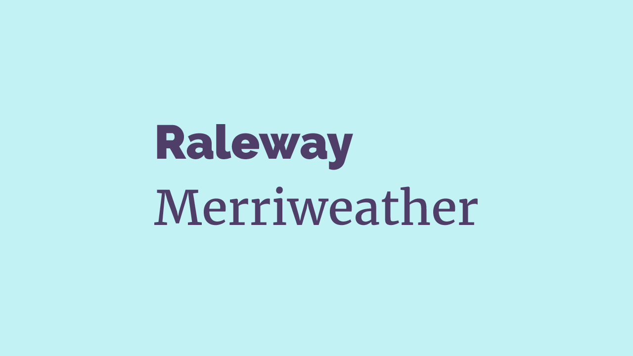
The choices I have made are Raleway and Merriweather. Raleway will be used for the main heading. There are a few reasons for these choices. Both typefaces have a good variety of styles and weights.
Raleway particularly had the bold weight I was looking for. With it being lower contrast, the strokes of the letters are much more consistent and this creates clear and bold titles.
Merriweather complements Raleway well, due to similar x-height and opposing contrast. It has a variety of weights and styles and is great for readability.
Download Raleway and Merriweather. Add them to a collection on Google Fonts and download.
Now to setup our document
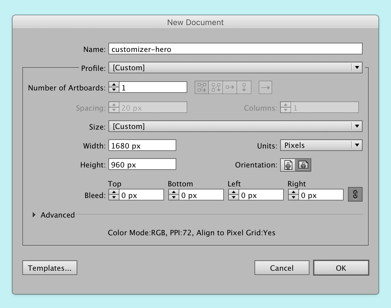
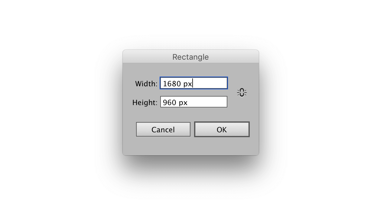
Typically I will start a document at 1680px width, the height is more of an estimation. I choose 1680px width as it’s a balance between small and large desktop sizes. It’s worked well for me.
Add the needed layers
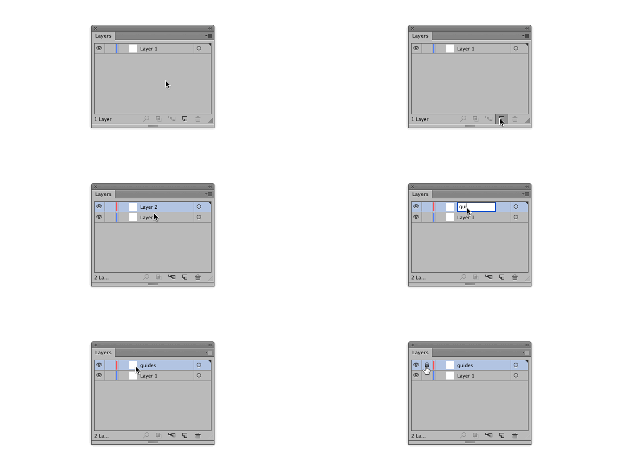
The image demonstrates adding new layers, renaming and locking them. In the layers panel, we have access to adding, deleting and renaming. To rename double click the layer, alternatively you can double click the small layer image next to the name for more options.
We need three layers, ‘guides’, ‘small-screen’, and ‘large-screen’. Each of these will have a purpose over the course of this post and the next.
Add some grid guides
With the guides layer selected, add a rectangle m that is 1080px to the document. Centre it on the artboard with the align window.
Choose your grid settings
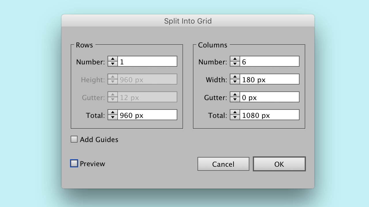
Add guides
With the grid still selected, press cmd + 5. Now we can toggle this grid. Lock the ‘guides’ layer. You can toggle these guides with cmd + ;. Make sure these are on throughout.
I have written about the process of adding grid guides in Illustrator. If you need a better reference.
Fill the artboard
Now that your document is setup, you need to fill the artboard with the light blue colour. This will be the primary use of this colour.
After that with the rectangle selected, press cmd + 2. This will lock the layer, it’s handy at this stage because you will avoid selecting it when it’s not necessary.
Adding the title & description
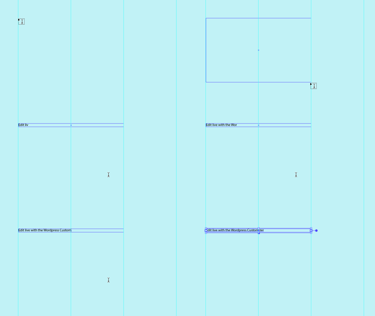
Press t and drag out a text layer 2 columns wide and add your title. Press cmd + return, to exit that type layer.
Add another text layer for your description, positioning it similarly.
Edit live with the Wordpress Customiser Using the Wordpress Customizer you can
make updates to parts of your website with a live preview. This makes it easy to
iterate on changes.
Styling the title and description
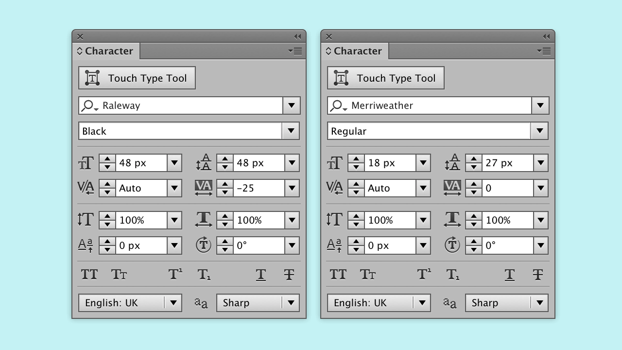
| Title | Description | |
|---|---|---|
| Font size | 48px | 18px |
| Weight | Black | Regular |
| Leading/line height | 48px | 27px |
| Tracking/letter spacing | -25/.025em | 0 |
| Colour | #4e3e68 | #6a6384 |
Large titles need balanced lines
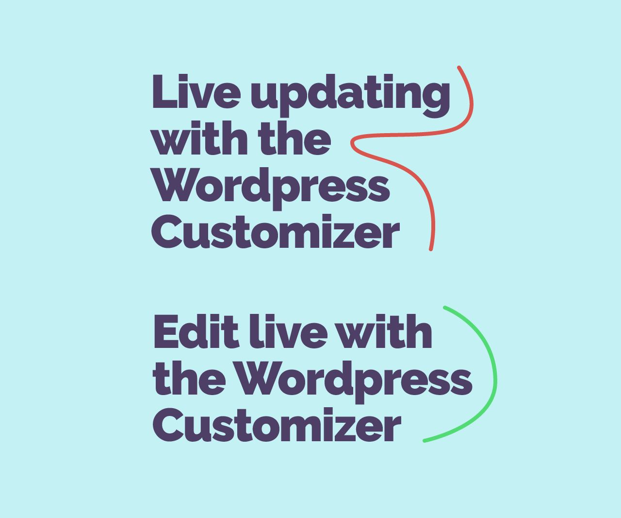
When writing your title specifically in a hero area, there are fewer words per line. You may disregard care for how the line is balanced because there are so few words per line, but it’s equally important.
The first example with the red line isn’t ideal. Our eyes have to work harder, as there are large gaps on the right. Consider the second example (it’s more balanced) when you’re writing titles.
Avoid widows
When referring to widows in typography, it means short lines at the end of a paragraph. If this can be avoided, especially in areas where we have more control over the text like this one, it’s a must.
Taking care with these can help make our reading experience nicer. So in our case, anything with 3 or less words isn’t ideal.
Add button
Finally, for this section is to add the button. Add another rectangle by pressing m. Like earlier click to open the window to add dimensions.
The dimensions are not hugely too picky, however, I like the height of the button to have some relation to the other elements, so I have put this as 48px. Make the width 162px, you may need to adjust this, but for the text ‘Learn how’ this is suitable. This should make the padding for our CSS around 14px top and bottom, and 36px for left and right.
The button style
If you don’t have the appearance panel open, in the menu bar go to Window > Appearance.
Fill the rectangle with the orange colour (#f96f52) and add a 2px stroke in the dark purple colour (#4e3e68). The alignment of the stroke is to the inside.
Rounding the button
Next go to Window > Transform, in the transform panel you can adjust the corner radius. Enable the Link Corner Radius Values button, which is in the centre. Add a large say 60px and this will make sure all corners are equally round.
Add the shadow
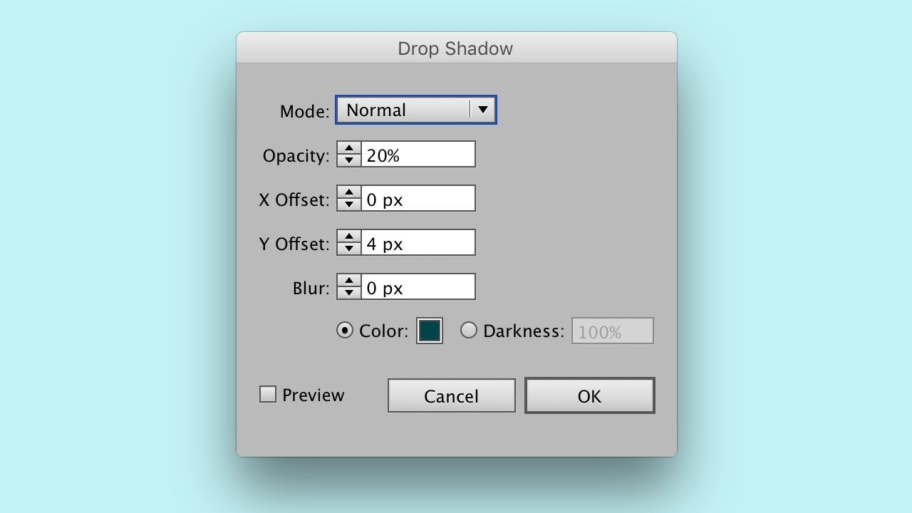
Next is adding the shadow with the colour #004449 at 20% opacity. Offset X should be 0 and Y should be 4px. Make sure the mode is set to normal.
The shadow is a dark version of the background, with 100% saturation. In most cases I avoid black for shadows, the colour can appear off. Try it out to see the difference.
Vertical rhythm
It’s worth a word on vertical rhythm, as the choices I make tend to be with one in mind. Each element that has a particular size, for example, title, paragraph text and the button, has been chosen in mind of a vertical rhythm. Vertical rhythm is hard to maintain on the web, but we can, at least, make our choices based on this.
The aim is to base everything around 12px. The grid width (1080px) is a multiple of 12, the title is a multiple of 12 and the button height being 48px.
The only thing that isn’t is the text, but that number falls between 12 and 24. Vertical rhythm is an aid to making good decisions and create a pattern with our measurements.
Aligning text elements
The positioning is to the left most column of your grid and aligning that to the vertical centre. There are common patterns for how people scan websites, this layout will flow nicely with that in mind, with a typical logo and navigation above.
How to align to selection or artboard
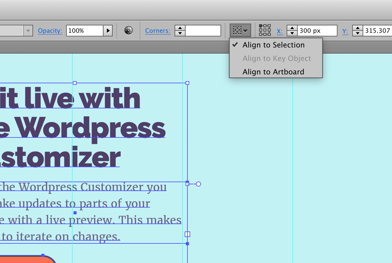
With your layers selected, in the control bar you can change how alignment is handled.
Align, group and centre
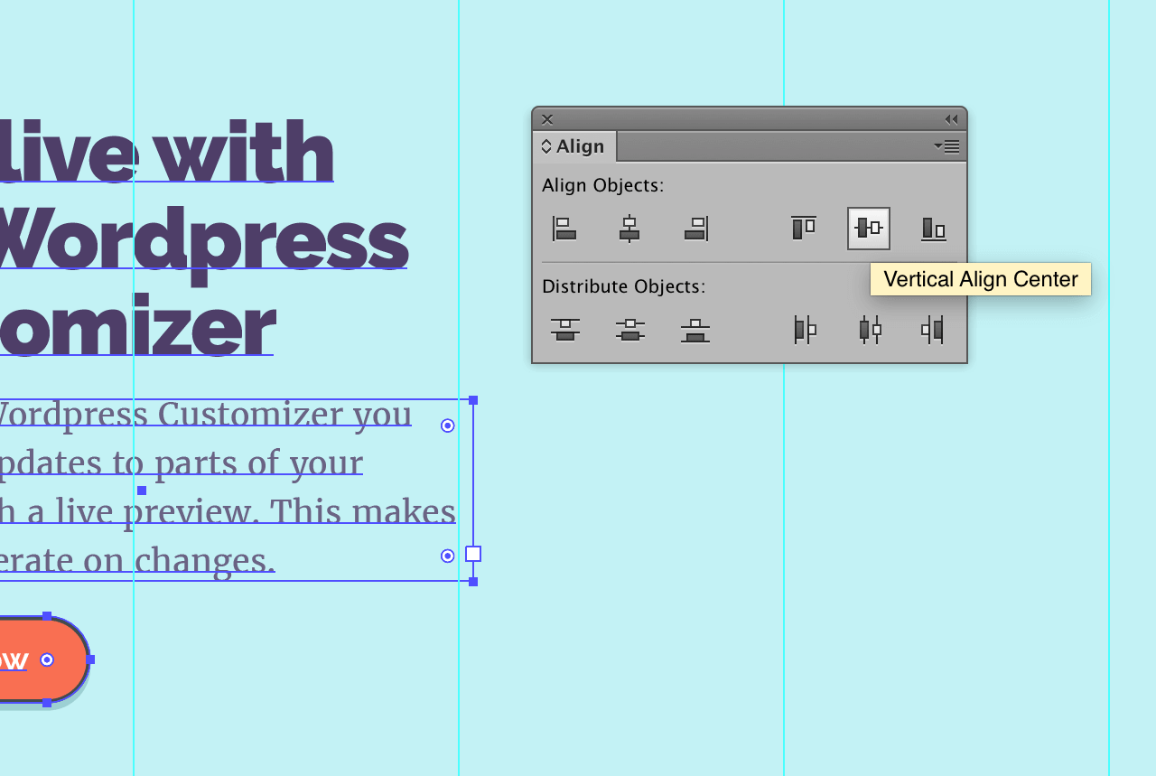
Select the title, description and button, making sure Align to Selection is enabled. Go to Window > Align, click horizontal align left. Then press cmd + g, grouping those layers together.
Adding an image
Next to add the image, we want this to occupy 3 columns. I have made an illustration to complement the text. Equally, you will want to add something to complement this.
Proportionally the image needs to be larger than the height of the text. This is quite specific, but the image being larger than the text makes it feel like there is less. It’s something to compare it to, as well as, add something with visual interest.
Feel free to adjust the image. If you’d like a tutorial on this illustration let me know on twitter.
Adding the shadow
You now want to apply the same shadow as you did earlier, to the image. The shadow colour #004449 at 20% opacity. Offset X should be 0 and Y should be 4px. Make sure the mode is set to normal.
Align the image to the artboard
Finally, to repeat what you did for the text, you need to centre the image on the artboard. In the Align window, with the image selected
Next week
It’s time to change focus onto the small screen layout. You’ll learn to make the right adjustments to layout to keep our aim of retaining a similar layout.
View on Github