Typekit gems
Four underused Typekit typefaces worth considering. All suitable for paragraph text, with good italics and a range of weights — each with a rationale for the choice.
— views

Here’s 4 typefaces from typekit; that you may not have used. These are typefaces I have used in the past and have qualities that I believe make a good choice. Generally they are all suitable for paragraph text. They feature nice italics and a variety of weights.
I’m aiming to make this an infrequent series, that I aim to explain the rationale for my choices, rather than just being another ‘listicle’.
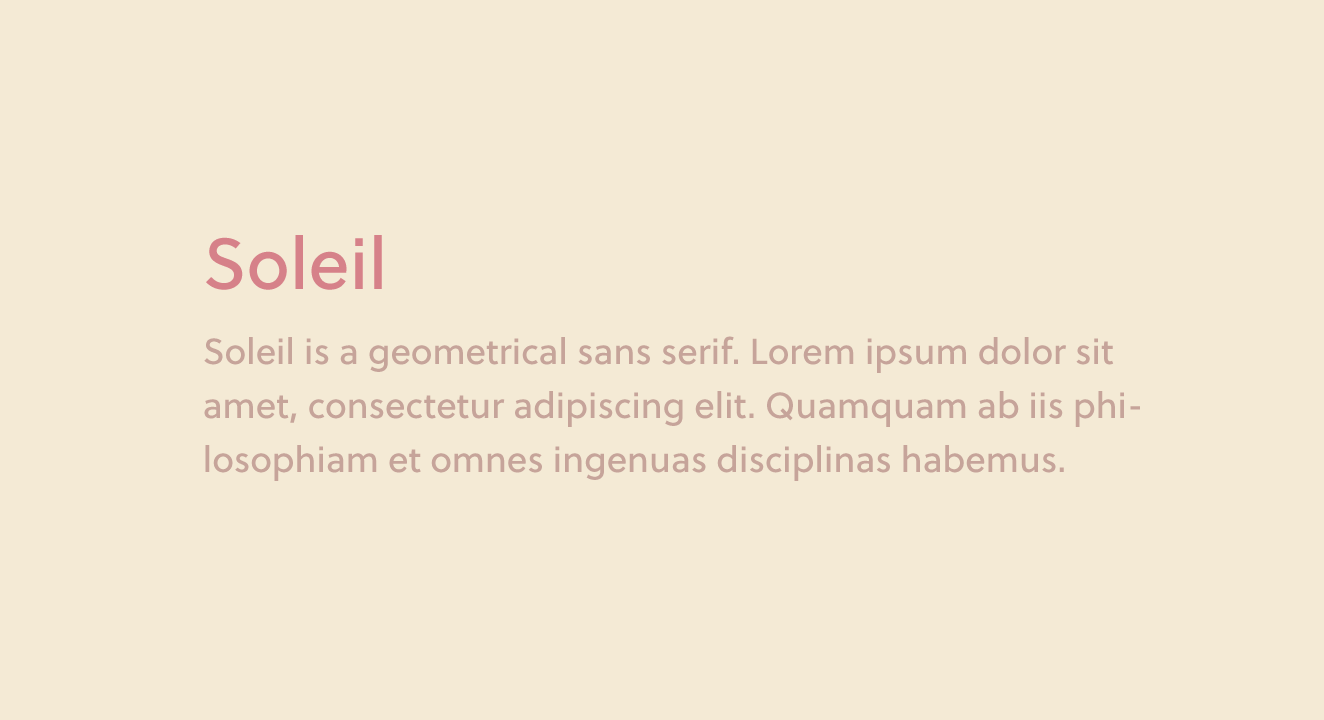
Soleil
Soleil by TypeTogether, is a geometric sans serif, with a variety of weights and a nice italic. As a result makes it versatile typeface.

Why and how I’ve used it
I find it isn’t quite as geometric as the likes of Futura (as the foundry mentions on their website, it has asymmetric counters). This means some of its features have a softer feeling to it. As well as having a good x-height making it suitable for paragraphs.
I have used it in the past on sheet metal fabricators website. It fit this type of industry well with the preciseness of geometry and the subtle softness, which keeps it friendly and approachable.
It works really well at smaller sizes and the bolder weights feel just right. Which is something that is generally missing from many typefaces, the bold weight can be a let down.
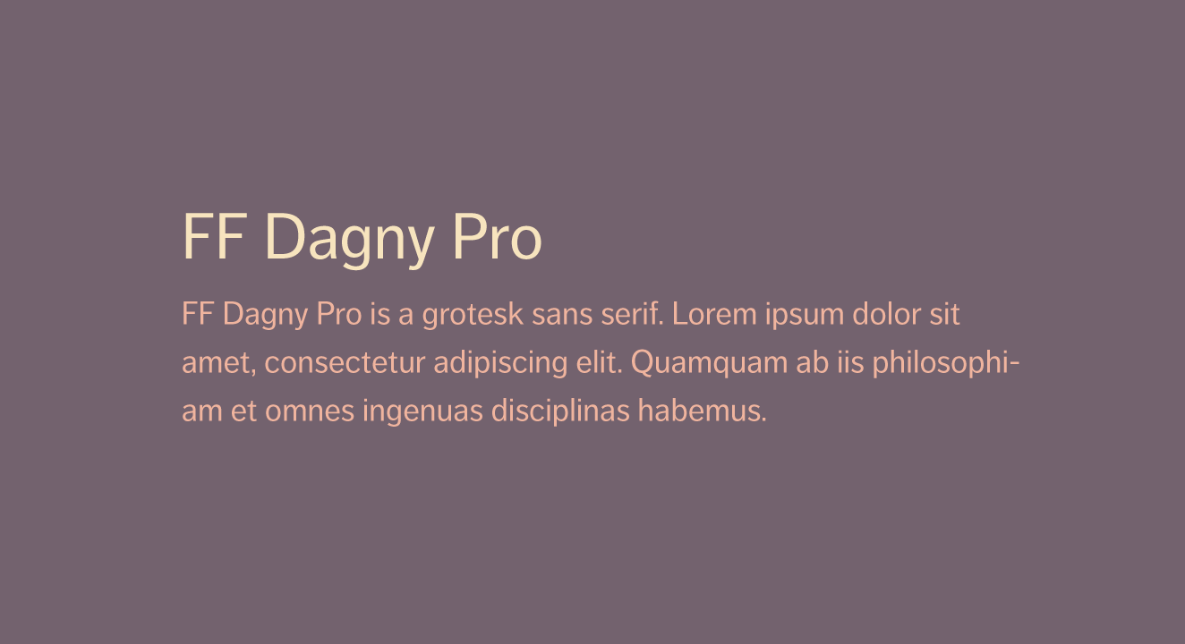
FF Dagny Pro
FF Dagny Pro by FontFont is another versatile sans serif, with a fair variety of weights. Great for body copy, as it’s highly legible. One of the reasons for it’s legibility, is the contrast it has. The balance is just right.

Why and how I’ve used it
It makes blog posts and other types of articles nicer reads. When you have a typeface that makes things easier to read, it becomes one you can rely on. I’ve used it on more content heavy websites in the past.
The attention to detail in the italic, is something I admire. The ‘a’ goes from a double story to single story. The letters with ascenders and descenders retain their character and as a whole. Nice italics, in sans serif typefaces, are something that can be overlooked.
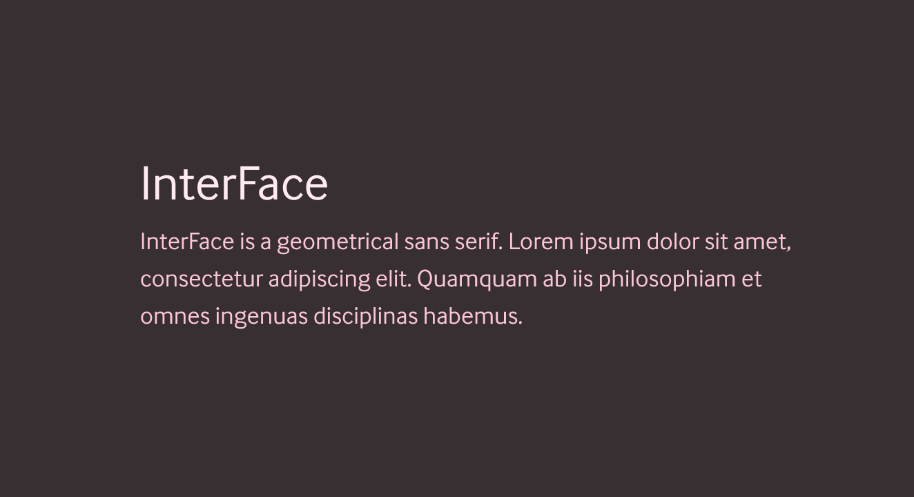
InterFace
InterFace by Dalton Maag is a sans serif with personality, it’s softer and more humanist. It’s got a larger x-height, and as it’s described “…fractionally raised above the norm allows for a slightly narrowed design.”

Why
I like the friendliness this typeface offers. It works well at small sizes and remains legible. It has a variety of weights and the bolder weights don’t feel overly heavy at smaller sizes too.
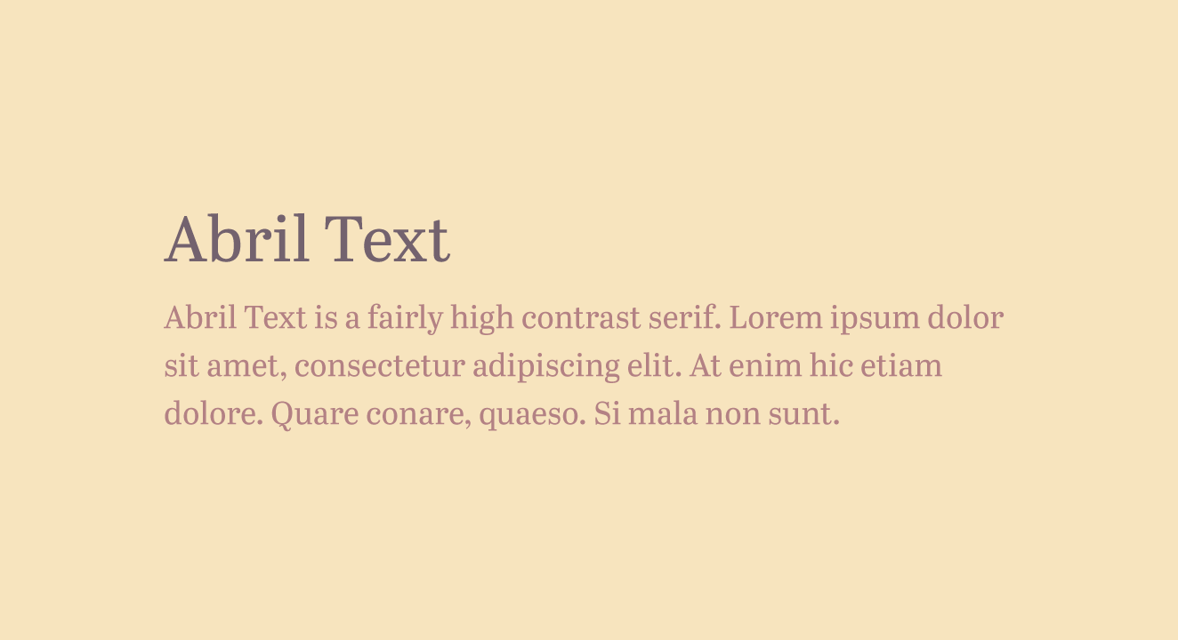
Abril Text
Another great typeface from TypeTogether. It has other variants such at titling, display and fat face. It’s in the name; that it’s suitable for paragraphs of text. Though it manages to retains the character of the display well.

Why and how I’ve used it
I’m a huge fan of Didone typefaces in general, they have a class and high quality feel about them. Although this isn’t a Didone as such, the fact it draws inspiration from that style, is a winner for me.
I’ve used it for paragraph text for a special occasion cards website. It communicated the look and feel I was going for.
View on Github