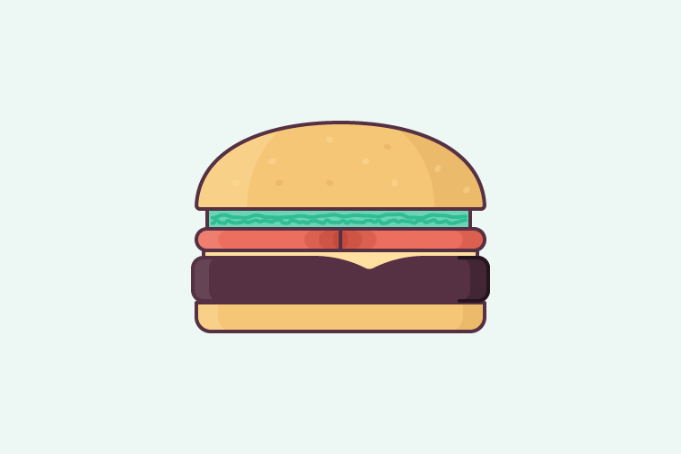
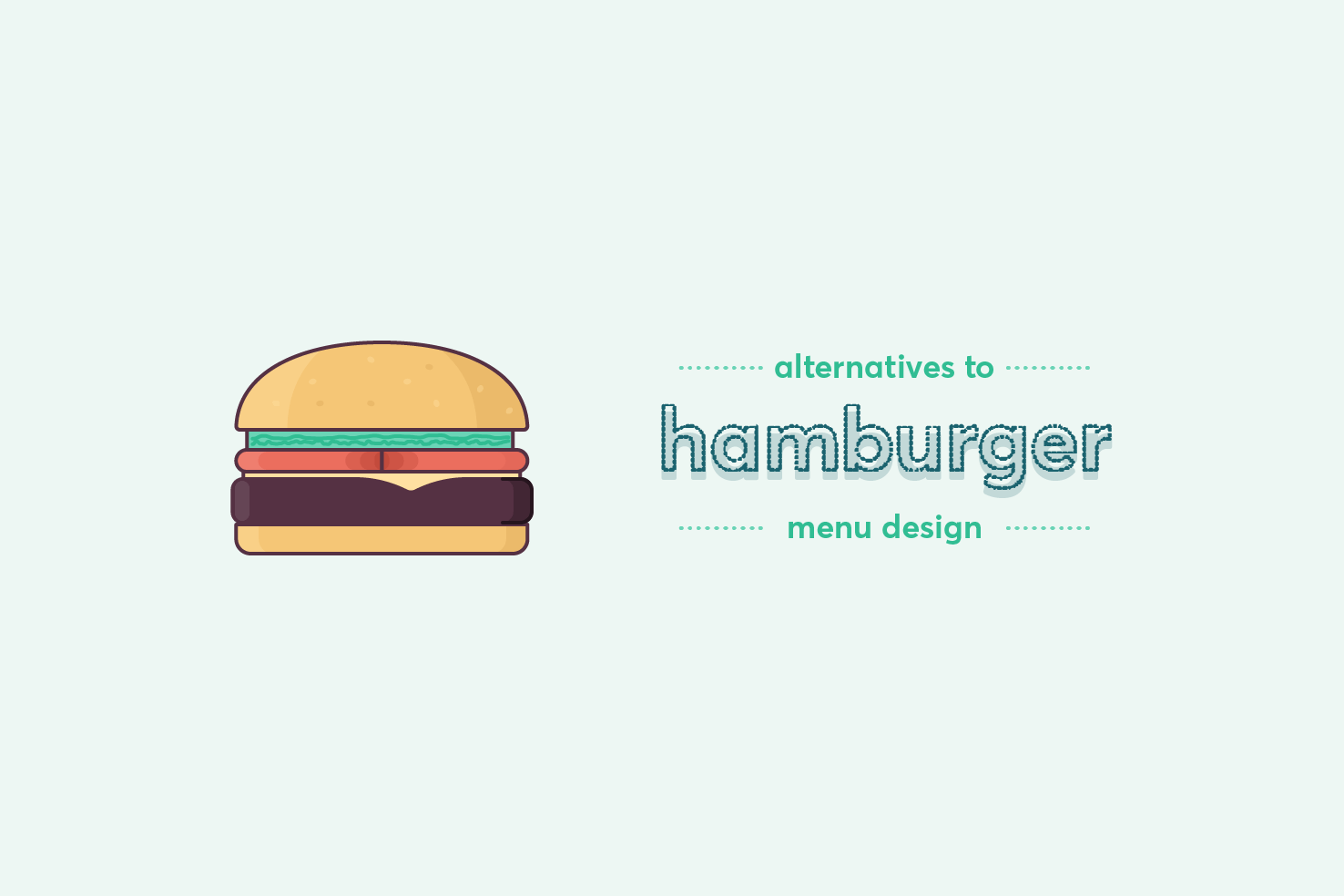
Websites using alternatives to the ‘hamburger’
A collection of websites using tab bar-style navigation as an alternative to the hamburger. Engagement improves when apps move away from hidden navigation.
From speedy workflow based quick tips and resources, practical techniques to create well designed interfaces.
A collection of websites using tab bar-style navigation as an alternative to the hamburger. Engagement improves when apps move away from hidden navigation.

A tutorial on designing a pricing table in Illustrator. The focus is on clarity and visual style — choosing colours, typefaces, and using Illustrator effectively.
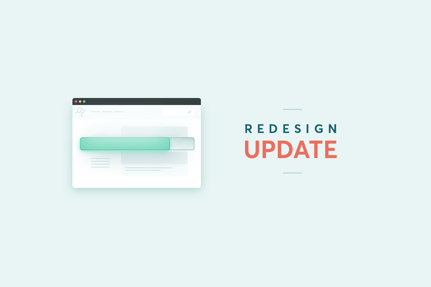
A progress update on the v6 redesign — balancing writing with redesign work. Includes early iterations of designs and illustration from the process.
Tables are tedious to make in Illustrator, but there’s a quicker way. This post shows how to create an accurate table efficiently using Illustrator’s built-in tools.
Aligning to a key object in Illustrator is one of the most useful alignment options. If you’ve ever been frustrated with aligning objects centrally, then everything nudges over a few pixels. This is where align to key object comes in, read on for how to.
Part two of designing a datepicker in Illustrator. After the structural basics, this post focuses on styling — clarity, aesthetics, and a better user experience.
How to design a datepicker efficiently in Illustrator. The grid layout makes alignment tricky — this post uses split into grid and align tools to tackle it.
Designing at 1x in Illustrator is fine for vectors, but exporting PNG files at retina sizes is a pain. This quick tip shows how to export 2x PNGs from a 1x canvas.
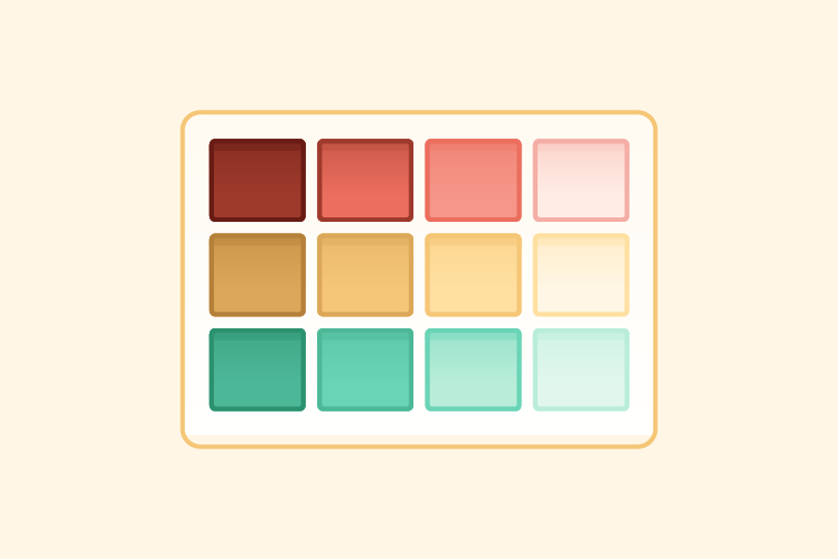
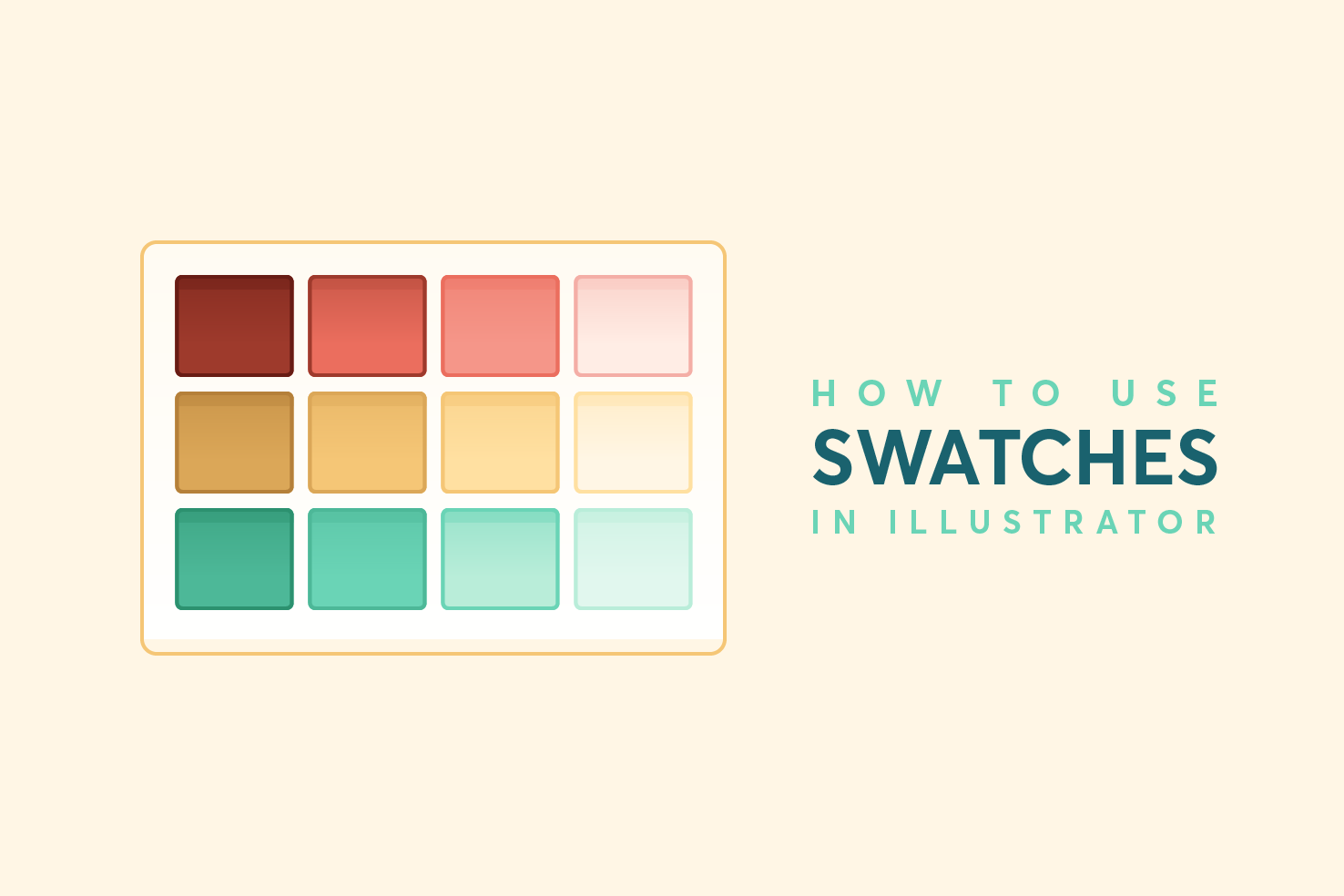
How to make the most of swatches in Illustrator. Covers cleaning up the defaults, adding your own global swatches, and keeping them in sync across your document.
I figured I would write a post about the tools I use. Some will be familiar, but hopefully there are some that are unfamiliar and end up being useful to you.
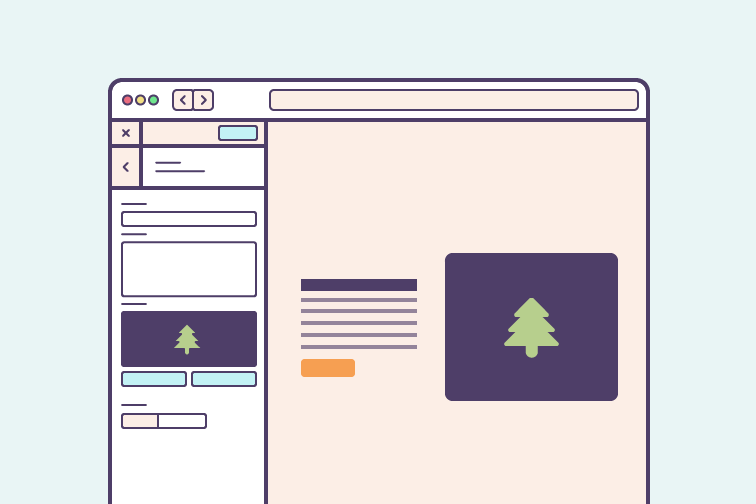
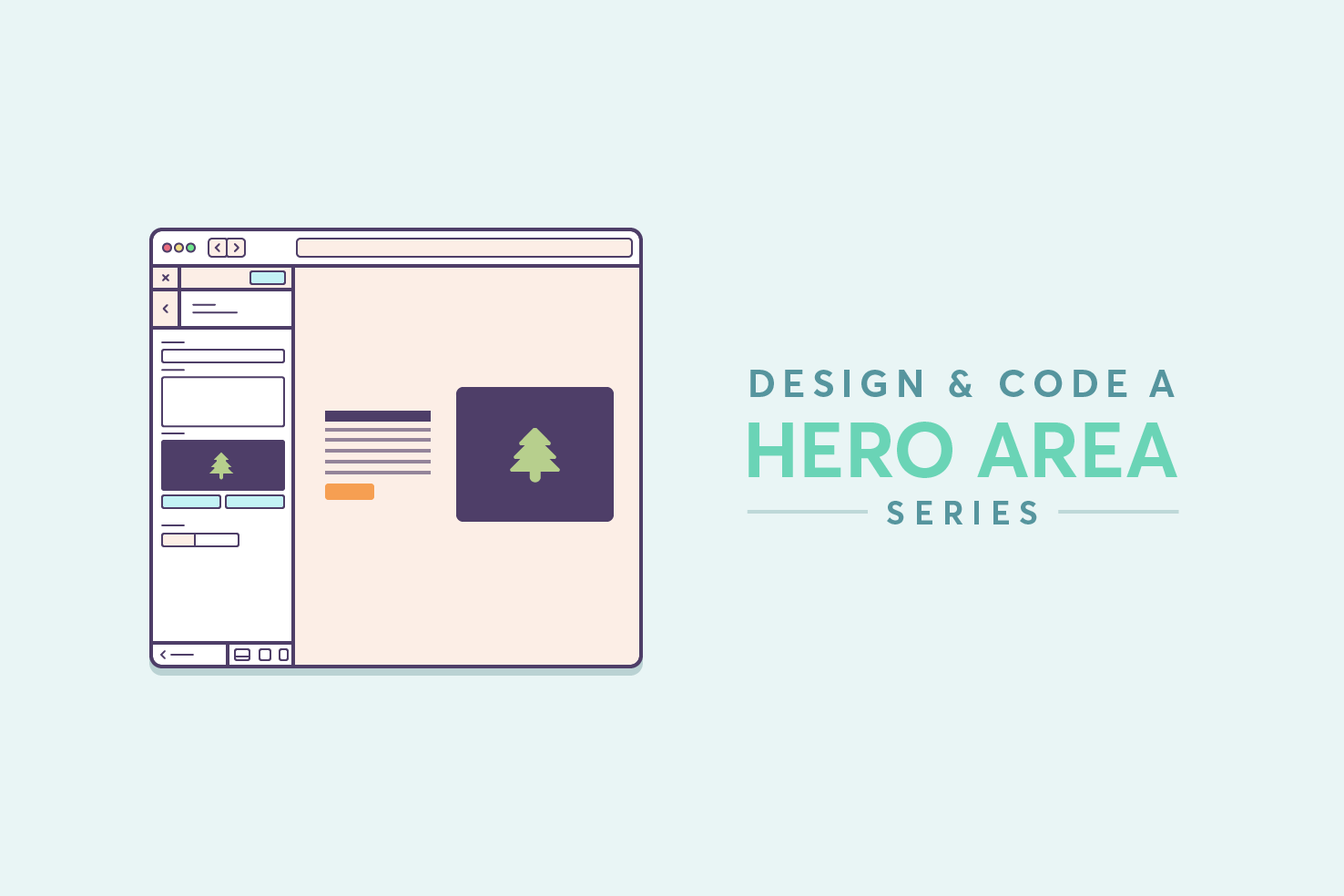
Coding the hero area using flexbox and making it responsive. A mostly mobile-first approach, applying CSS where it makes logical sense to avoid undoing it later.
Part two of the hero area series — adapting the desktop design for mobile screens. Only mobile-sized resolutions are covered, with tablet needing only minor adjustments.