Colour series: tweaking your palette
Part two of the colour series. Once you’ve picked your palette, this post guides you through refining it — testing combinations, checking contrast and colour blindness.
— views

This is the second part in this colour series. The topic I will cover in this post is tweaking your palette. Following the previous post, you will have selected a 5 colour palette, which should serve for the majority of your use cases. However, at this stage, it won’t be perfect. I’ll guide you through the process of tweaking your palette. From trying your colours in different combinations, to colour blindness. This post helps to refine your palette.
The initial colour palette
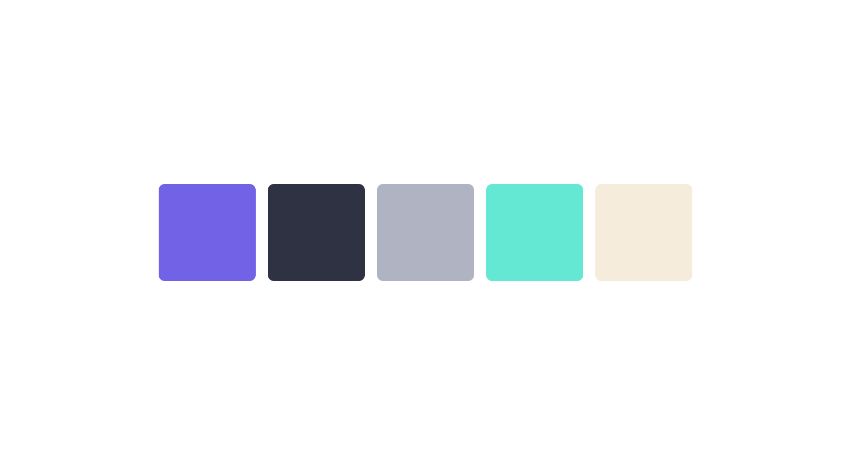
Along the course of the previous colour series post I guided you on how to choose a colour palette. At the end of the post, this is the one I was left with.
Try colours in combinations
The first step is to try the palette in different combinations. As you have selected colours that have thought towards the use case, but they haven’t been tried. Through doing this, we will identify weaknesses of the palette and see a truer representation of it. Sometimes colours can appear to bleed or be too harsh.
Combinations of backgrounds

Combining backgrounds is down to putting the colours near each other in large sections. Seeing colours at different scales and uses helps you to realise the strengths and weaknesses of your choices. Another reason I recommend doing this is because, if you have highly saturated colours near other they can be very harsh and appear to bleed (blend into each other). You will want to use this as a reference for what can and can’t be combined.
Fixing colour harshness

In the example, I have made the purple slightly more saturated and darker. The green is slightly less saturated and lighter. How I came to this conclusion was both colours were too similar in saturation and lightness. This makes for a good guide when you see colours bleed, it’s likely they will have too similar lightness and saturation.
Combinations of text
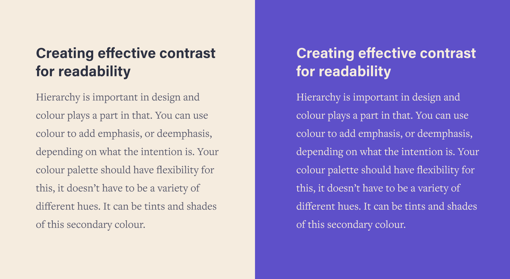
After you’ve tested more background combinations, you will have an idea now for text related. Similarly, see what works well and what doesn’t. Not every combination has to work for text, but if your main combination isn’t as good as it can be you can make the necessary adjustments.
The main thing you’re looking out for here is to see if your text is always legible. If you struggle to read the text over the background you use, then you can make the necessary adjustments.
Making better text combinations
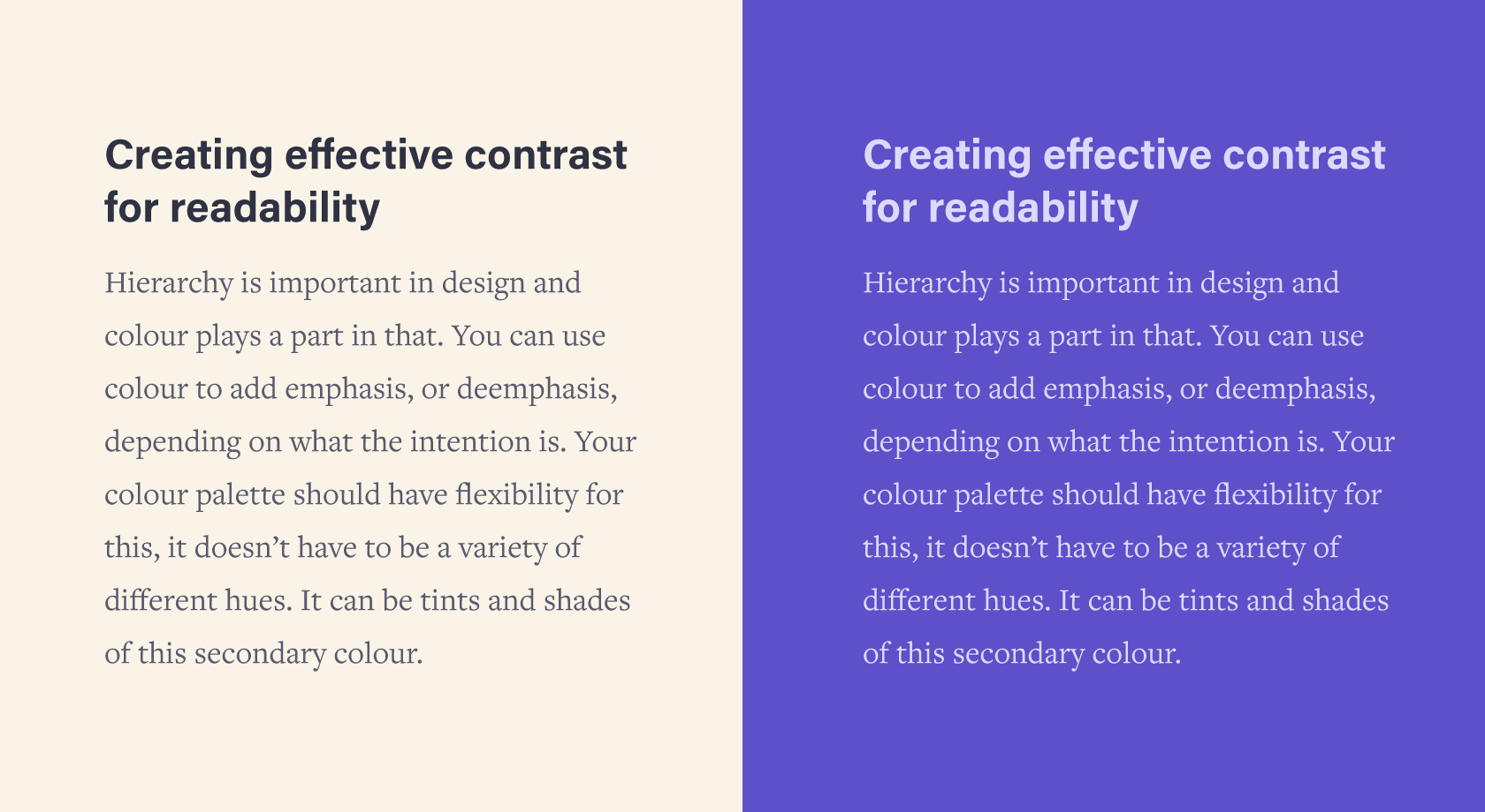
To make a better text combination it may be down to your background colour, in the first text combination example, I decided that the background was a little too dark for the left. I made it ever so slightly lighter and reduced the saturation.
Sometimes it can be down to the wrong text colour, in the right example I have changed the colour to be a lighter version of the background. It’s a small adjustment which I believe makes an improvement, through being easier on the eye. This means we’ve added an additional colour, this is fine. I’ll be going into greater detail about adding additional colours in another post.
Colour blindness
I’m not an expert on colour blindness, but it’s something you need to be aware of. Photoshop has colour proofing in more recent versions. Alternatively, you can use Bjango Actions. This set of actions has one for colour blindness testing. It’s slightly more extensive than what photoshop offers too.
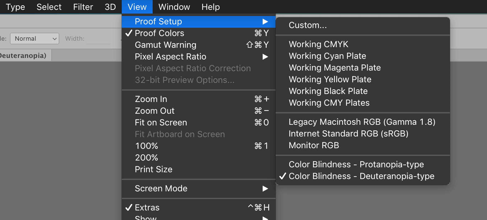
In Photoshop can change the colour mode by going to Window > Proof Setup > Color Blindness. Then make sure Proof Colours is on cmd y
As a result, you will find out if any colours look the same. It’s ideal to perceive the differences between colours. It doesn’t solve the problem, but you ensure that colours you intended to be different are.
How to fix colour blindness issues
It’s tricky to fix because you may make a new problem. The solution is to make sure that your colours don’t appear too similar. You can do this using different colour blindness testing modes. You’ll be able to identify if you have enough differentiation where necessary. If not adjust one of the colours that it looks too similar to, you may only need to adjust it slightly.
It’s also important you don’t use colour to signify anything that is critical, without text describing what the message is. If it’s an error, then that should be clear to anyone without colour.
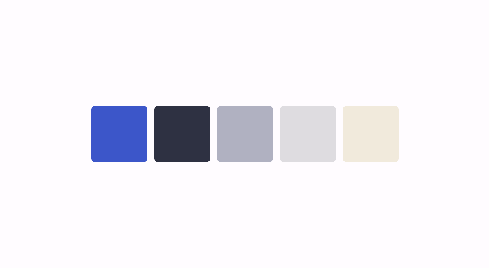
Checking value

A similarly related way to colour blindness is to check your colour palette based on value. Value refers to the amount white or black is in a colour. This checks if there is enough contrast. If you find that the colours completely blend together, this is a hint to adjust.
If you have low contrast between your colours nothing will stand out. It will also be very difficult to read the text over. As I have mentioned previously, your colours need to have variety in appearance. As each colour serves an individual purpose. Colours for text tend to be higher in contrast and bright colours tend to be lower. With this in mind, you should have a reasonably good contrast between your colours.
How to fix poor contrast
I use Bjango actions, in the colour blindness testing action, there is a layer for checking value. Turn the value check layer on to see if you have any problems.
Poor contrast is a sign that all colours are quite similar, aside from their hue (although hue can play a part). You will need to weigh up if the colours are going to be used near/on each other. As it’s fine because the hue will be different.
To fix any issues, like colour blindness it’s about adjusting the colours. You may need to do so more harshly here if you have contrast problems. The key is to make sure your colours have enough differentiation in saturation and lightness.
To conclude
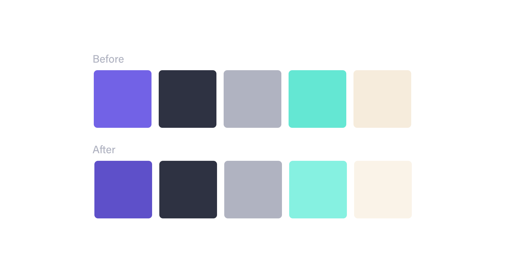
Here are the adjustments to the palette. You have gone through making sure your colours work well for text and background combinations. We have also made sure our colours differ enough in contrast and consider the different types of colour blindness.
Next to cover is how to make good choices for new colours. Which consider other elements of a website such as validation, alerts, hover, focus and active states.
View on Github