Colour series: adding new colours & tips
Part three of the colour series. Practical tips for selecting colours that I wish I'd known earlier — covering pitfalls and how to add new colours to a palette.
726 views

Following on from the two previous posts which have more practical guidance on making a colour palette. This post will cover things I have learnt about selecting colours over the years. These tips are the sort that when starting something new, you wish you knew, ahead of time. The majority of these tips will stand true, at least 90% of the time, and help to make the right decisions.
Palette reminder
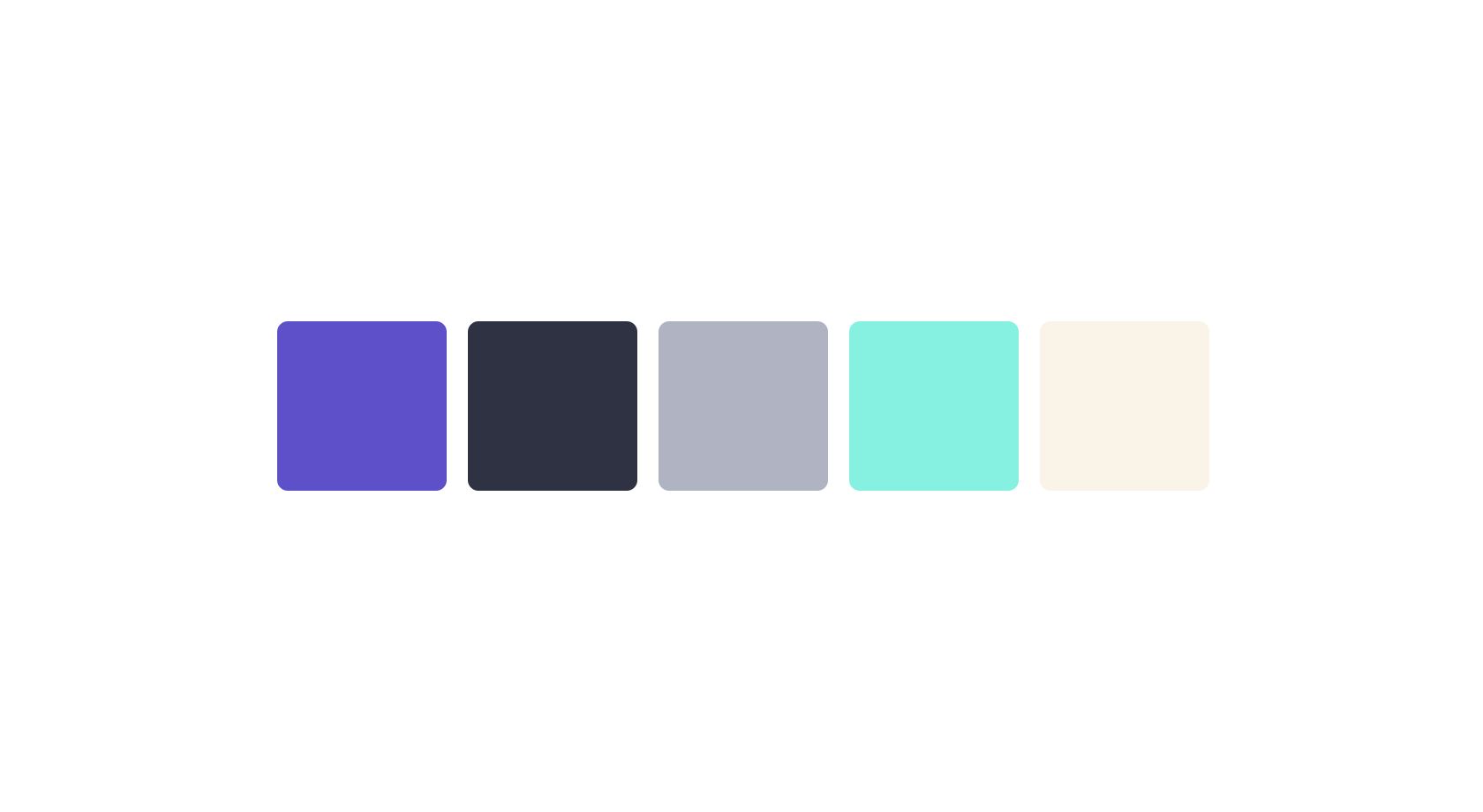
Adding new colours
You may feel like the choices you have made so far is enough, but with a website, there are a few other things where colour a new colour needs to be introduced regardless.
I covered briefly adding a new colour for text on a bright background. Through our trialling of different situations, it’s easy to find new additions in this sense. However, these are considered tints & shades.
Adding completely new colours
There are times where new colours are justified. When you need to communicate a certain message to a user, usually there is already a colour associated with that. In these cases, it can be hard to harmonise them with existing choices. The good thing is these colours tend to be used sparingly, but I will show you now.
Choosing a new colour

Taking the example of red, I want to alert the user something is wrong. When I refer to my palette I look at the main purple colour. We have based all our other colours off of this main colour. I take this colour and change the hue to red. This direct switch doesn’t work initially.

However, if we refer to colour theory, an analogous choice would be more magenta/pink. So the change doesn’t have to be huge from our initial choice. It appears to be quite dark, so I’ve increased saturation and lightness. We have a good match.
Tints, shades & tones
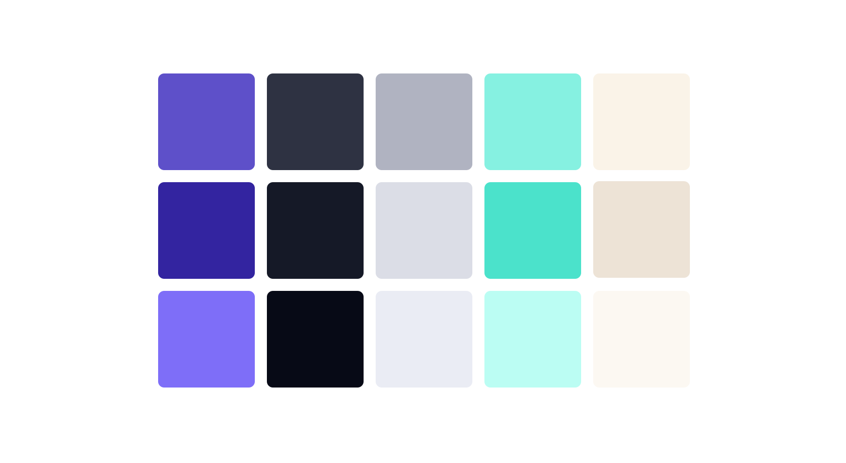
Next are tints, shades and tones. A tint is adding white and a shade is adding black. A tone is increasing or decreasing saturation.
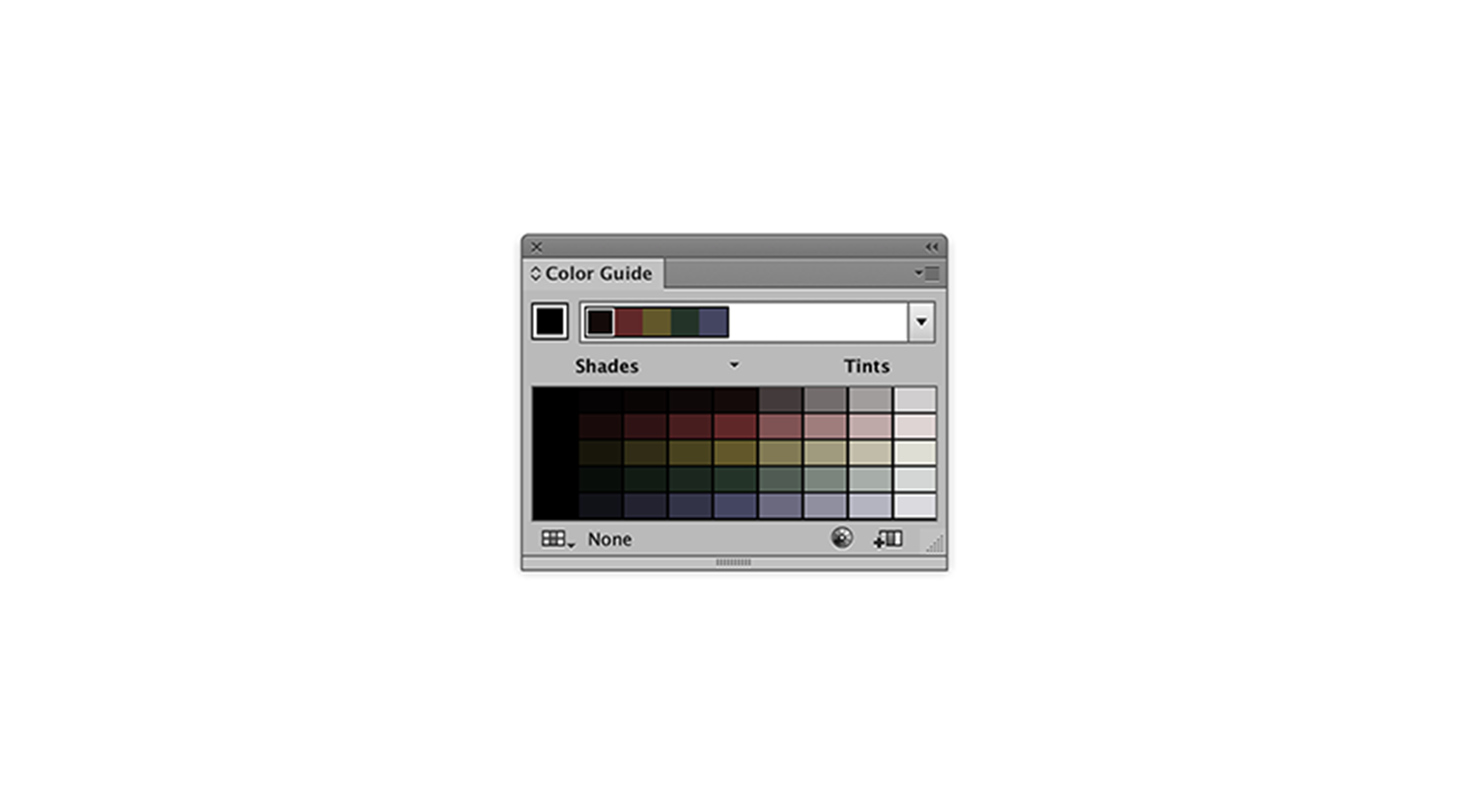
There is a traditional way of doing this where it’s essentially incrementing the colour until it’s almost white and black. I mostly rely upon trial and error. Sometimes you can have a tint and it be too saturated. The same as you can have a shade and it be too unsaturated.
This is especially true for our more colourful choices. I find on average I need around 5 tints and shades of the darkest colours. The other colours I tend to add one tint and shade. The process of trial and error is when you’re using them. I have mentioned this in the previous post, it’s very difficult to select colours without using them first. So make initial picks, remove and tweak as necessary.
50% lightness
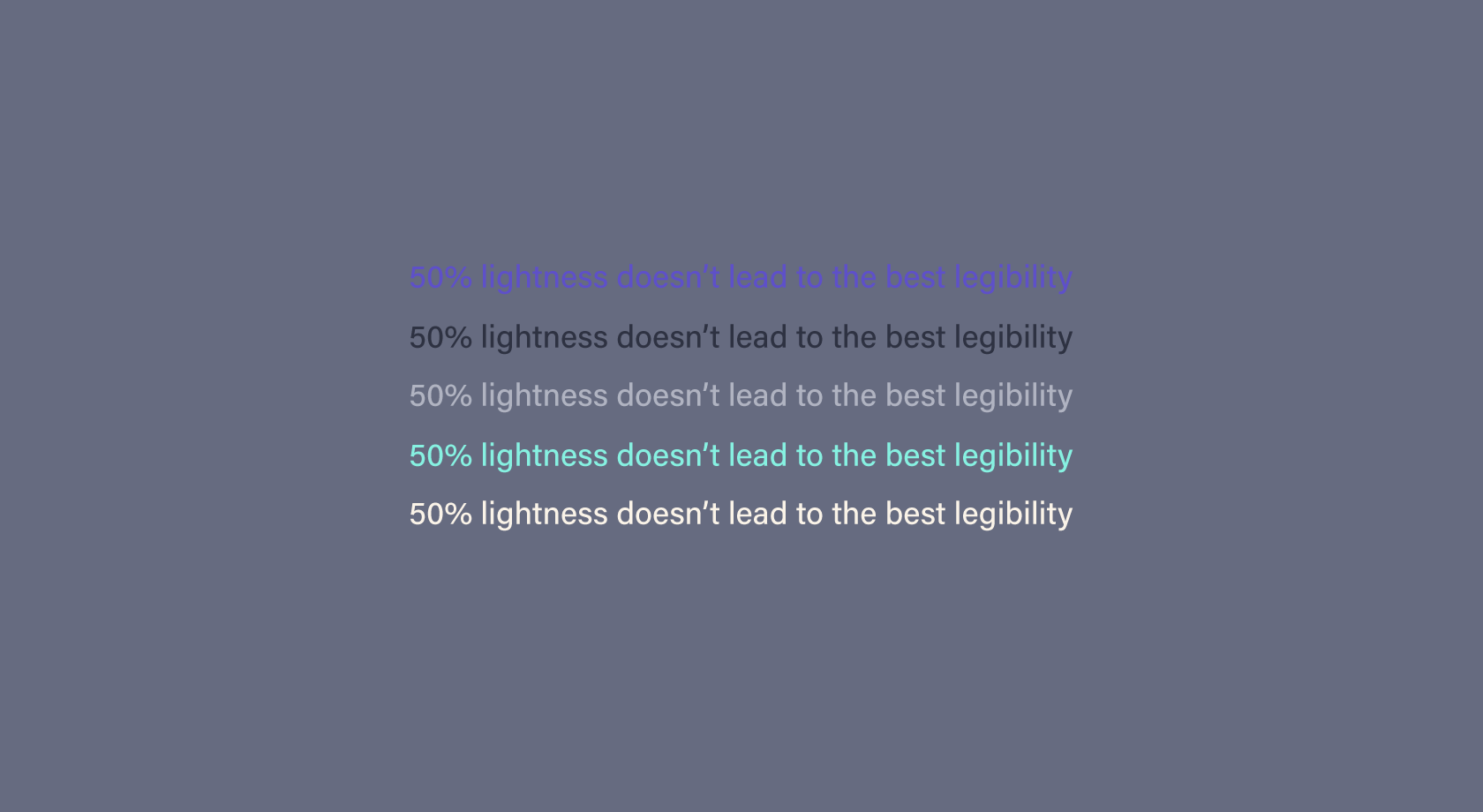
Having a colour that’s 50% in lightness, it can be a tricky colour to work with. The reason for this is because it sits right in the middle, it’s hard to contrast with this type of colour. To work your colours have to be really dark, or really light.
In the example, most colours are legible, but it’s hard to achieve a visual hierarchy through colour. Our attention grabbing colours, don’t work as well as they could. For this reason, I try to avoid colours that sit directly in the middle on lightness.
Yellow
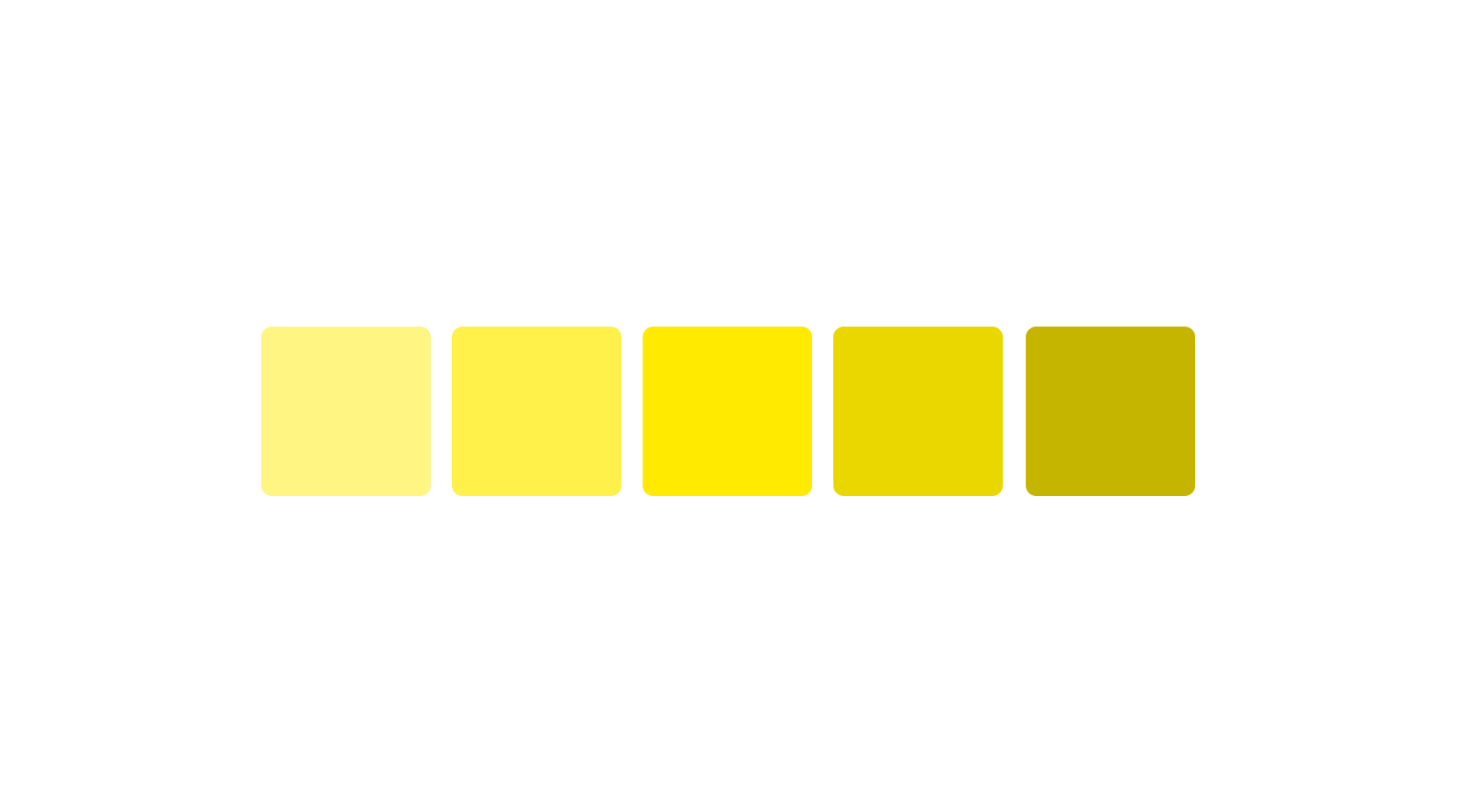
Yellow is a colour that is particularly difficult to work with. To base your palette round yellow, you will have a hard time with tints, shades and complementary colours. Tints tend to need a lot of white to be noticeably different. Shades look like they have been darkened more than they have. Once yellow goes too dark, it doesn’t really look yellow. This is the main issue for me.
Yellow as your primary colour is very hard to work with. Purple is the main complementary colour, when you look down the analogous route, you have greens and oranges. You can end up with a clown like colour palette, that has to be highly saturated to gain some harmony.
There are other colours that fare similarly to this, such as lime greens, but you have a much wider variety of green hues. This is another downside of yellow, the hue range crosses over into orange and green very quickly. Of course, that doesn’t mean not to use yellow, but it’s something I’m always aware of when presented with the option of using yellow.
Final tip
I came across this tip a little while ago by Erica Schoonmaker. When you struggle to find harmony with your colours this can give you the boost you need. You can find the video over on Method & Craft.
To conclude
You know how to add new colours, which can be tricky. Using your colour theory knowledge and other colours as a basis, you have a way of adding them. You understand the value of tints and shades, which isn’t as straight forward as just adding white and black, they may need to be higher or lower in saturation. You understand the difficulty in using yellow and colours that have 50% lightness. There’s much more to learn, but I believe these things will get you on the way to making great colour palettes. There is much more to colour, but this is a good point to end this series.
View on Github