How to: datepicker using Illustrator
How to design a datepicker efficiently in Illustrator. The grid layout makes alignment tricky — this post uses split into grid and align tools to tackle it.
— views


In this post I’m going to show you how to make a datepicker efficiently. A reasonably common user interface element, but can be a source of frustration, to make in design applications. Due to the grid, and amount of items in that grid it can be difficult to align everything quickly in an application like Illustrator.
The purpose of this post, is to use it as an opportunity, to show use cases of the split into grid and align tools. If you have ever wondered how to align something in place in Illustrator, read on.
Feel free to download the document
This won’t be focusing on the more visual style and implementing hierarchy, in this post, next week I will cover that. If you would like to skip ahead, you can download the template.
Make a new document
The first step is to setup a new document, the size isn’t too important, but I’ve made an 800⨉800 web artboard.
Make the main rectangle
Press m or select the rectangle tool. Then click anywhere on the artboard, you will be presented with a window to add dimensions.
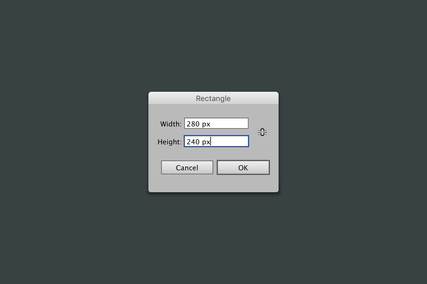
Make the rectangle 280⨉240, you can make this larger if you like, but the width must be able to be divided by 7 and the height divided by 6. The values must end up being whole numbers. In this case 280⨉240 each square ends up being 40⨉40.
Fill the rectangle for visibility
Your rectangle may have drawn with a black stroke by default, remove that by pressing x, this should activate selection of the stroke, then press /.

An alternate method is to double click on the fill and choose a colour, then click the fill and box with the red line through it just below.
Split into grid
This is such a powerful tool within Illustrator and is by far the quickest method. Select your rectangle then go to Object > Path > Split into Grid.
Add 6 rows and 7 columns
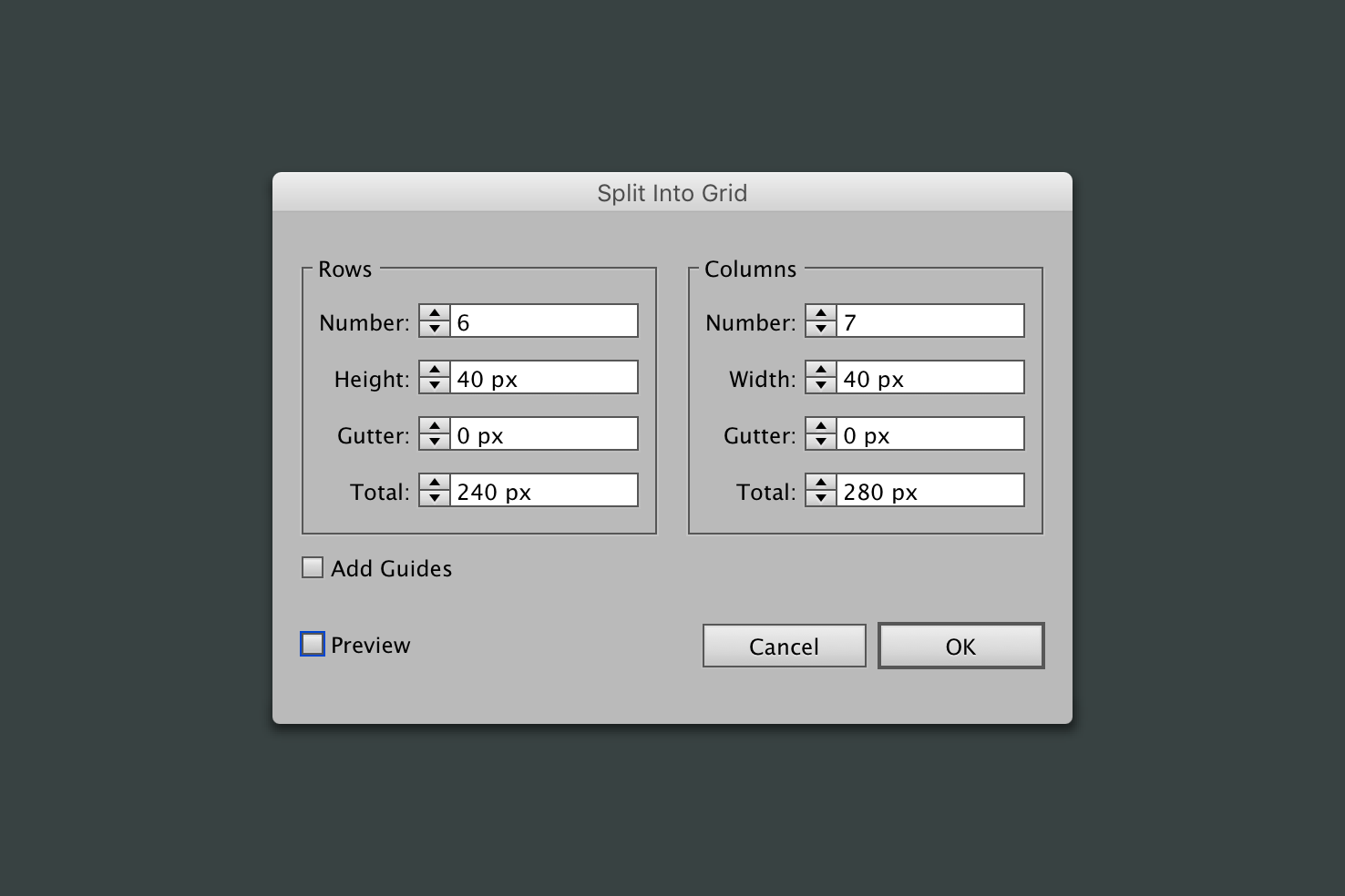
As the image demonstrates adding 6 rows and 7 columns allows both the width and height to be 40px.
Maintain the selection
One thing that happens when you split into grid, is the amount of similar items it creates. So you will want to press cmd + g. This makes it easier to move in the future.
Then with it still selected, add a stroke. This will add visibility for aligning text later on.
Day numbers
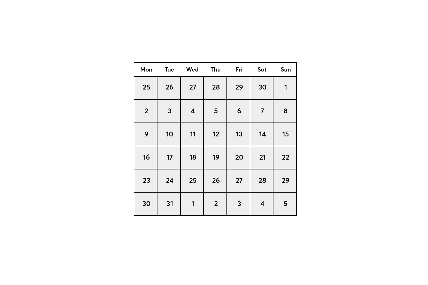
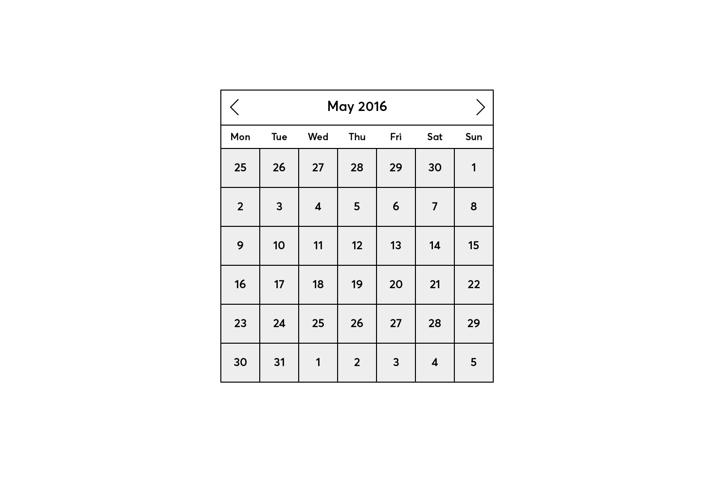
The basis for the view in this date picker is May, with a view into April and June. This step is quite tedious, but the technique for aligning the numbers should be helpful. At this stage the numbers don’t need to be placed accurately.
Add text layers and align centre
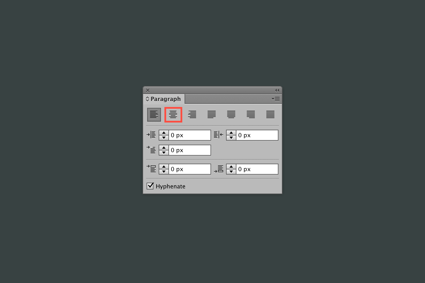
By pressing t or selecting the type tool, click without dragging and type each number. Once you have added a type layer, open Window > Paragraph. Click ‘Align Centre’ because if any changes to weight or font size are made this should keep them vertically centred.
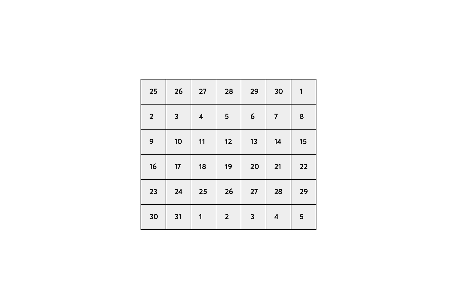
Add 6 numbers of the previous month from 25 to 30, 1 to fill the final day of the first row. As the first day of the month is Sunday, this is most favourable.
Fill in the rest of the days from there with 2–31, and finally the last row will finish with the first 5 days of June. Of course you can pick any month, the day setup will likely differ.
Aligning the day numbers
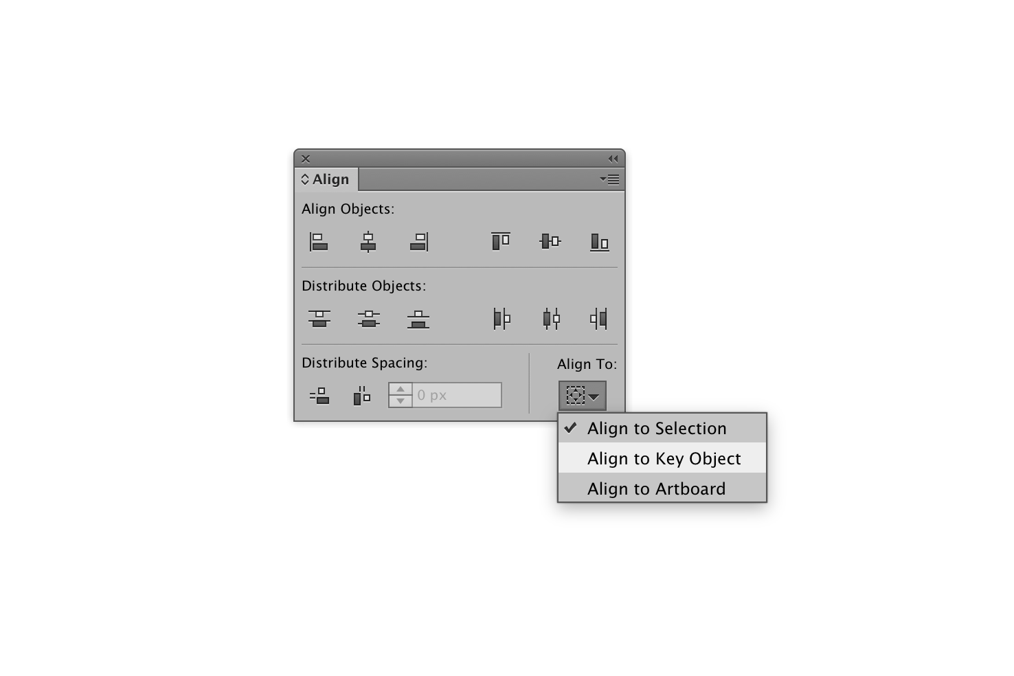
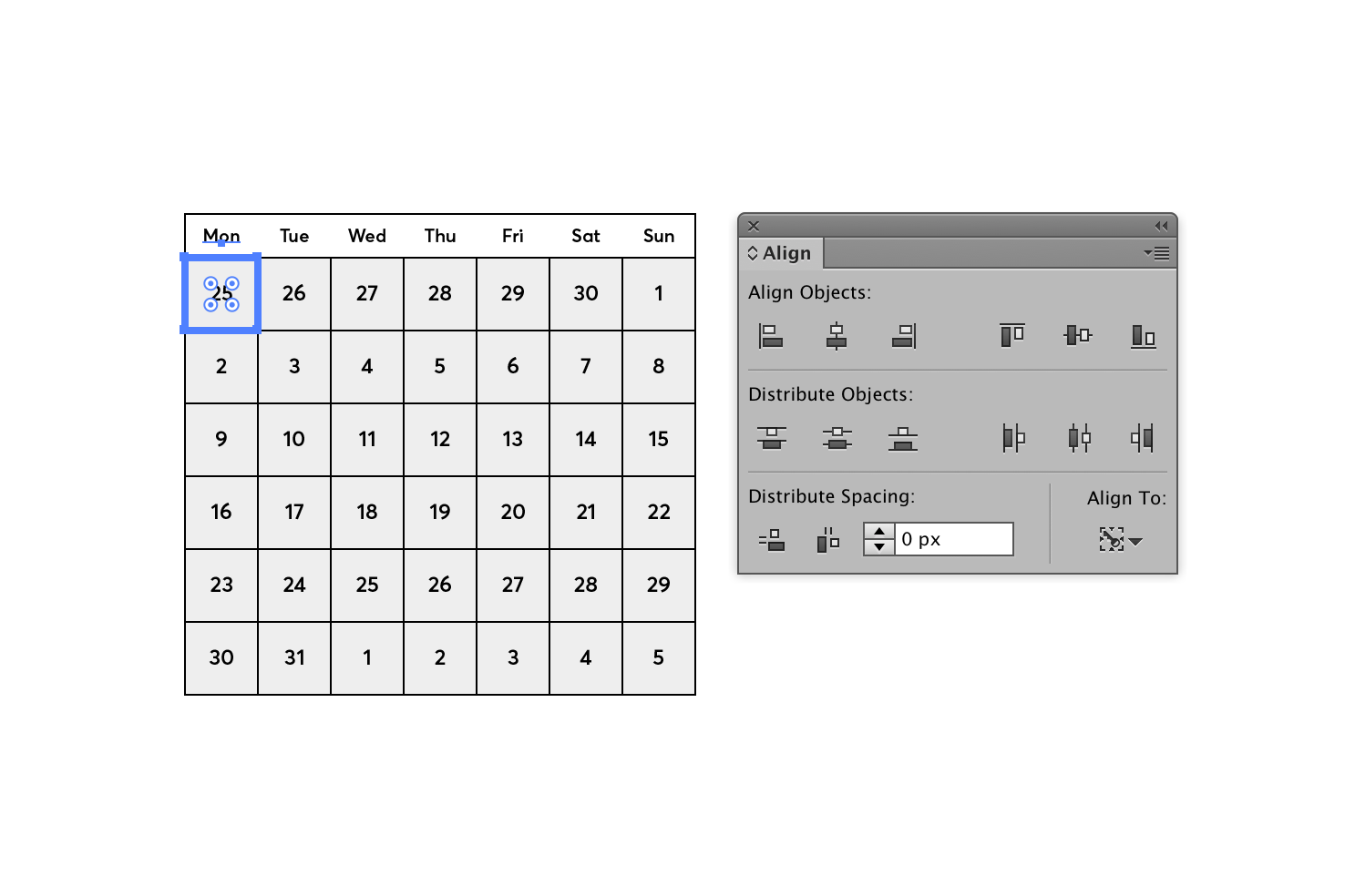
To align each number we’re going to align to key object. This will take some of annoyance out of aligning so many items centrally within boxes.
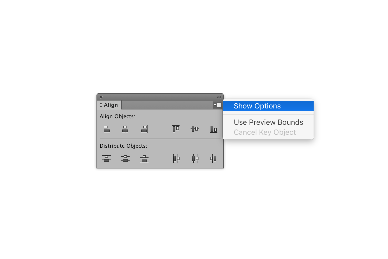
Open the align window, by going to the menu Window > Align. Then you need to click the icon in the top right below the double left arrows to expand the window. Once you have revealed the menu, click ‘Show Options’.
Before you skip ahead, there is a process to doing this. Instead of individually selecting and aligning each item, if you do it by row then or column, you can drastically reduce the amount of clicking you need to do.
Aligning by row
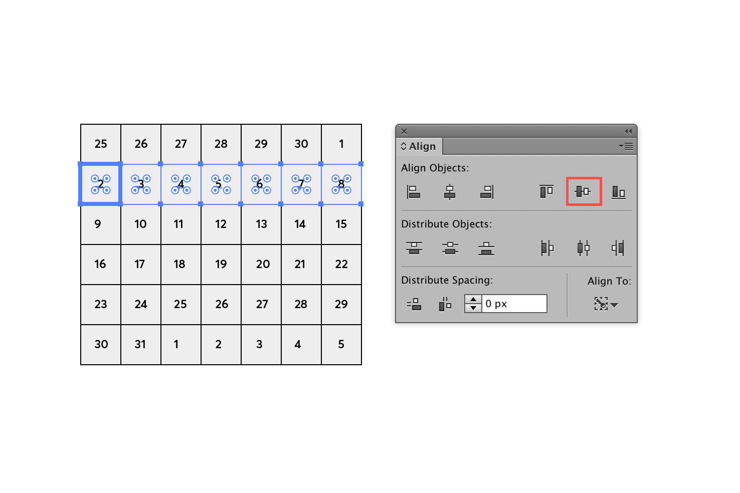
Select a row of squares and numbers. With the items selected change align to ‘Align to Key Object’. Now click a square within the row that you have highlighted. Do this without holding shift, you may have a habit of doing that like myself.
Finally, you can ‘Vertical Align Centre’, in the align panel, repeating this process for each row.
Aligning by column
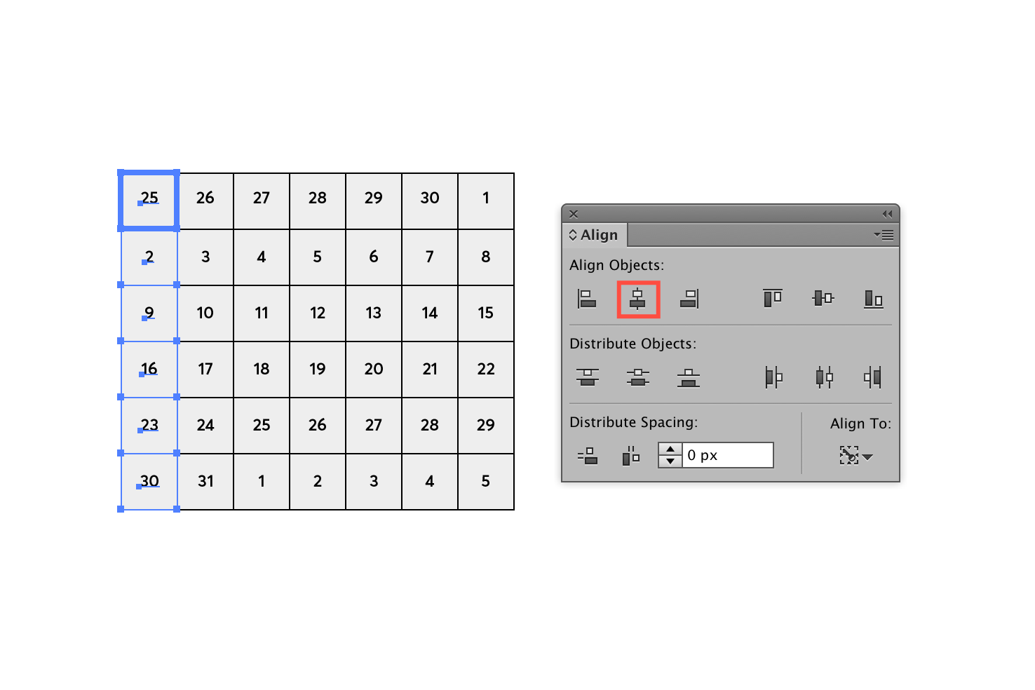
Similarly to aligning by the row select a column, change align to ‘Align to Key Object’. Click a square to make it your key object and click ‘Horizontal Align Centre’ in the align panel. Repeat the process for the remaining columns and you should have everything aligned.
Maybe you have a quicker way of doing this? I’d like to hear.
Days of the week
Press m to select the rectangle tool, and click the artboard and add a rectangle that is 280⨉24. This will offer a sufficient space for the days of the week. The height of this is debatable, I prefer to make the height smaller, as it’s not the main focus. The next post will cover the finer details on visual hierarchy.
Press t or select the type tool and add individual type layers for the days of the week. They should also be aligned centrally like the day numbers and placed very close to the right location.
Aligning the days
Now you will want to align each of the days, again the most accurate way to do this would be to align to a key object like earlier.
However, this time you will only need to select a day and one of the day number squares directly below it. After that, in the align panel, choose Align to Key Object. Then click your square to make it the key object. Finally to align the day use ‘Align Horizontal Center’.
Current month and year
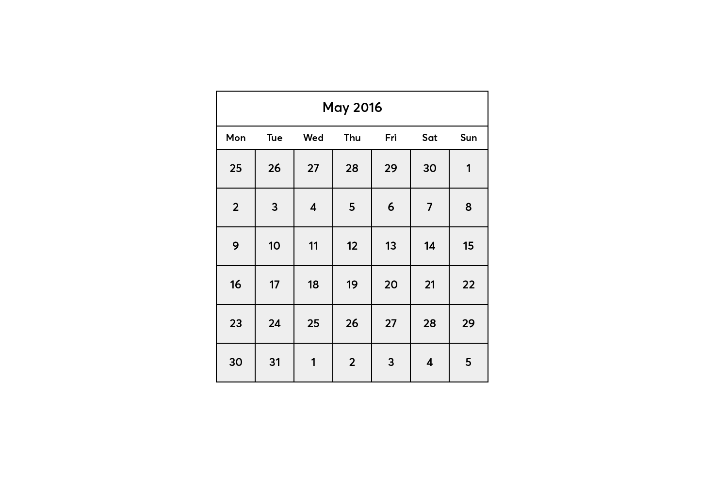
Now to add another rectangle to accommodate the current month and year, select the rectangle tool, click the artboard and add a rectangle with the size 280⨉32. Position this above the days.
Press t or select the type tool and add the month and year.
Next and previous months
With a datepicker, you will need to navigate months, more often than not. So you will need some arrows, which are reasonably easy to make in Illustrator.
Making an arrow
Press \ or select the Line Segment Tool. Click on your artboard and set the length to be 12px with a 0° angle. Repeat this process, and make another line that has a 90° angle.
Choose a reference point
Now we need the correct alignment. To do this most accurately, in this particular case you need to select the bottom left reference point. To do this open the transform panel by going to Window > Transform.
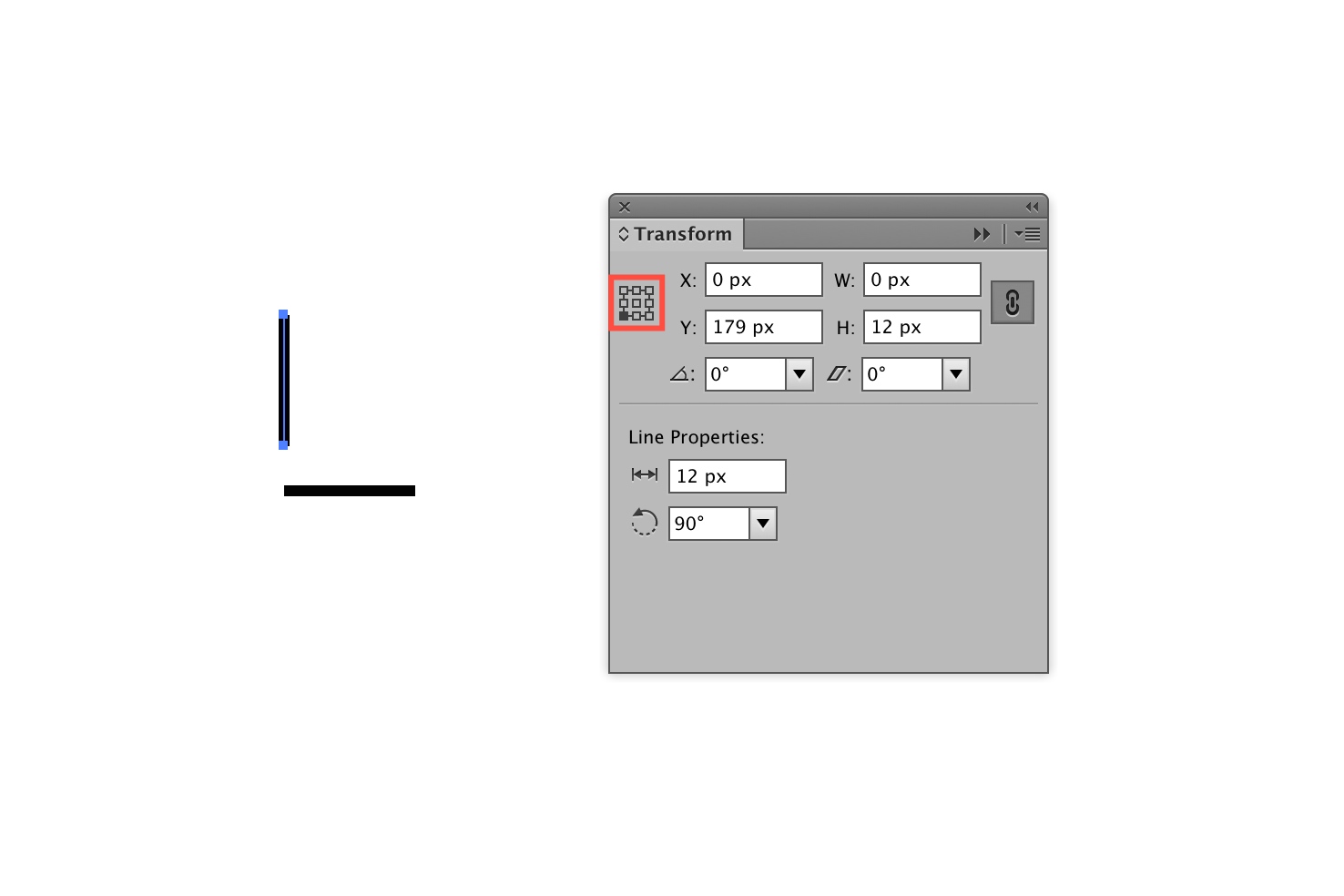
Once you have selected the bottom left reference point your horizontal line should have the same x and y coordinates.
I use this method because I always find snapping points to be hit and miss. However, you can drag the lines to the correct locations and see how you go, but this technique removes any doubts.
Joining and rotating the lines
Now to make sure both of the lines are part of the same path. Using the direct selection tool (by pressing a) you can grab both points without selecting the whole path.
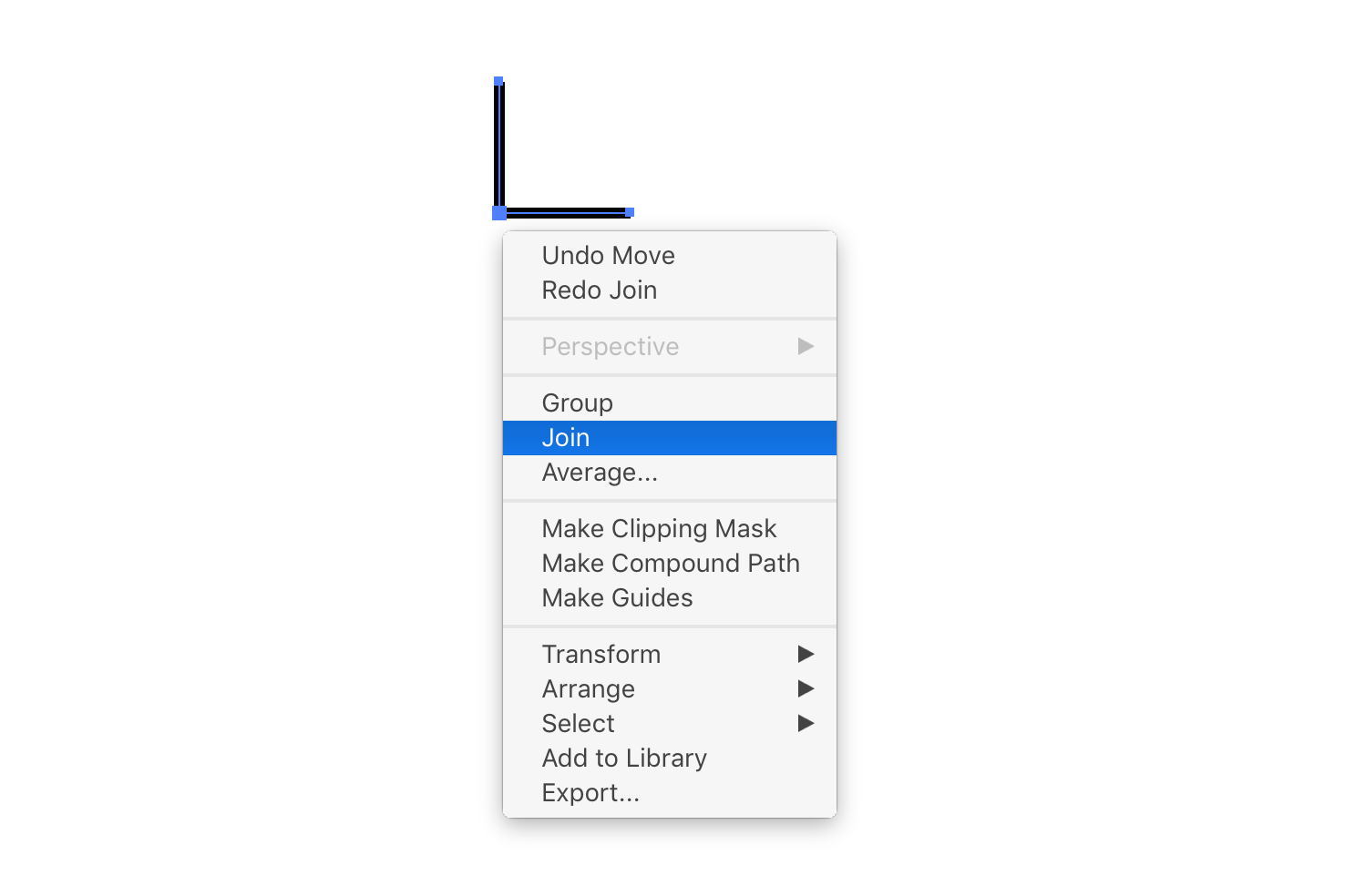
Drag and select the corner where both paths meet. Then right click the points that you have selected and select join.

Now that we have the basic path, it needs rotating. With the path selected, highlight near one the points, and you should see the cursor change. Hold shift, click and drag until it snaps into the position needed for an arrow.
Positioning
Position the arrow to the left side of the datepicker month. Copy the arrow and paste in place with cmd + shift + v. With the arrow still selected nudge it over a bit and rotate until it faces the opposite side. Position on the opposite side to the first arrow.
Finishing
So this is where this post finishes. There is no visual style in this post, the focus has been on the techniques for getting the elements in place. There has been a few things done in laying the groundwork for making it look better and clearer visually.
View on Github