How to: datepicker styling using Illustrator
Part two of designing a datepicker in Illustrator. After the structural basics, this post focuses on styling — clarity, aesthetics, and a better user experience.
— views


Following on from the datepicker post where it was more about getting the basics in place and focusing on some important Illustrator techniques that allow for accuracy and efficiency. This post will focus on guiding you through the process of making the datepicker easy to understand and have better aesthetics.
As well as adding the visual style, there will be a few techniques within Illustrator that can make your life easier.
Download to carry on
If you want to catch up download the wireframe.
Picking up from the previous post
There was very little in the way of visual design done in the previous post, aside from the text. So there are many changes that need to be made to make this easier to understand.
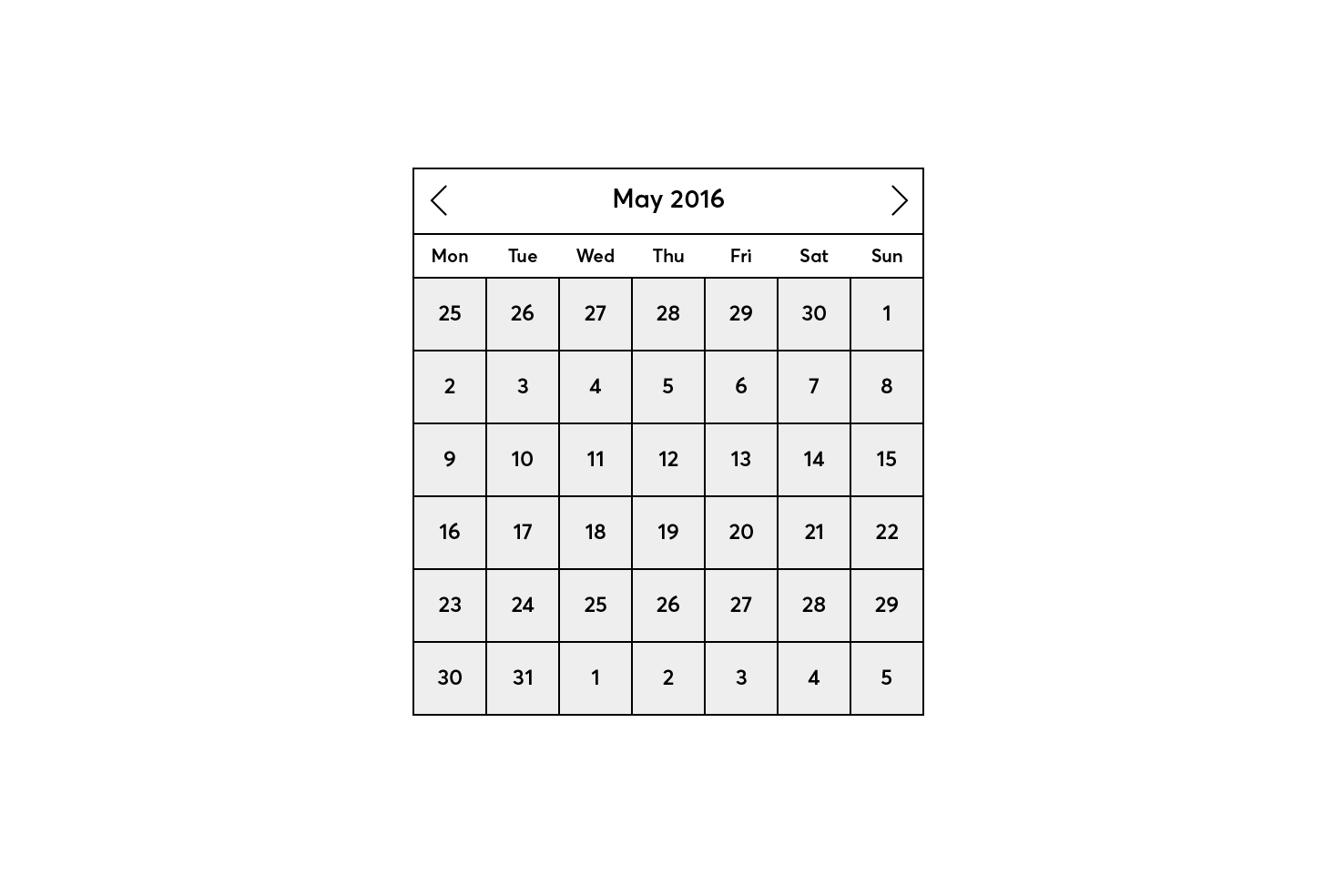
What you’ll end up with
If you want skip the post altogether download the completed file.
Preparing the design
At the moment the visual hierarchy isn’t clear, this is one of the first things I look to improve, then build upon the style further.
These are the following things that will be added or improved:
- Colour palette
- Visually separate the current month area from the dates
- Deemphasise the previous and next month days
- In turn bring focus to the current month days
- Increase the weight of the arrows and reduce size slightly
- Hover and selected states
Colour palette
I’m going to use a simple colour palette made up of 3 colours with a few tints and shades. A blue, green and white.
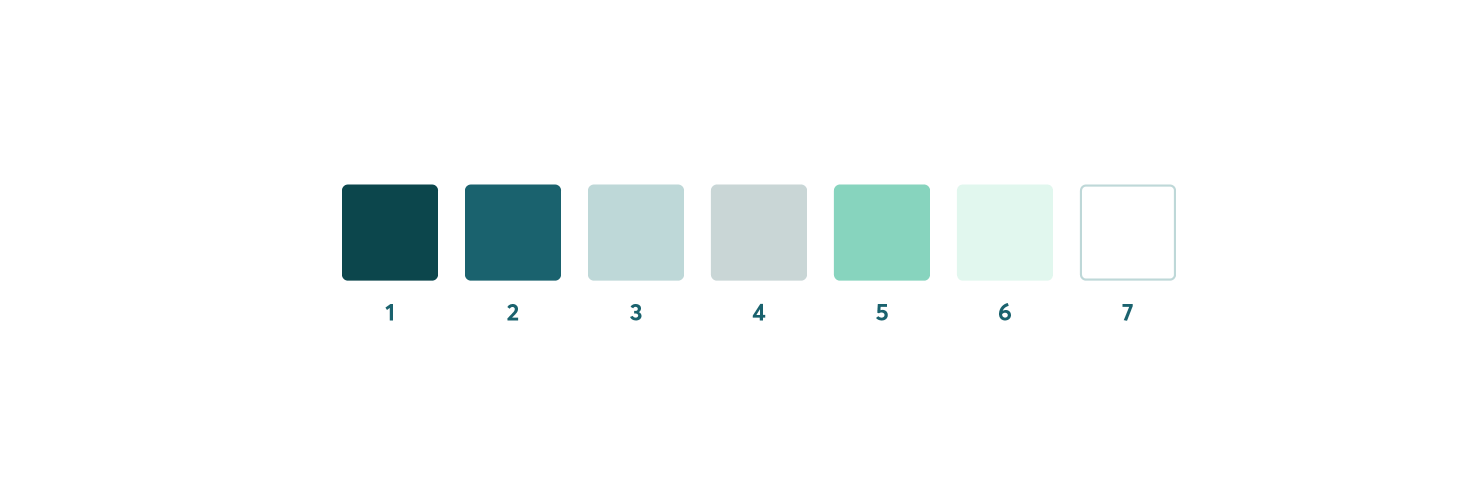
I have numbered the colours for easier reference. 1: #0c464c, 2: #1a626e, 3: #adc9c8, 4: #c9d6d6, 5: #87d4be, 6: #e1f7ee, 7; #ffffff.
The colours complement each other well and will not be too overwhelming for where a datepicker is used. Of course, if you have your own colour palette in mind, I encourage you to use that. It should feel part of the website, but be recognisable once the interaction to show it has happened.
Deemphasise the previous and next month days
Firstly you want to select the day numbers of the previous and next months. Once those are selected make them a reasonably light colour. In this case #hex.
Bring focus to current month days
Next select the remaining days and make them a darker colour. In this case #hex. Now you should be able to see that it’s clearer to work out which is from the next and previous month.
Reduce the border prominence
By doing this it will get rid of the eyesore the current borders, but importantly draw focus back to the numbers themselves.
Selecting items quickly
It can be frustrating to have to select so many items and try avoid other items. Fortunately you can select by certain properties.
First select a square, in which the days and boxes behind the days should be grouped together. Double click the group, this should isolate that area.
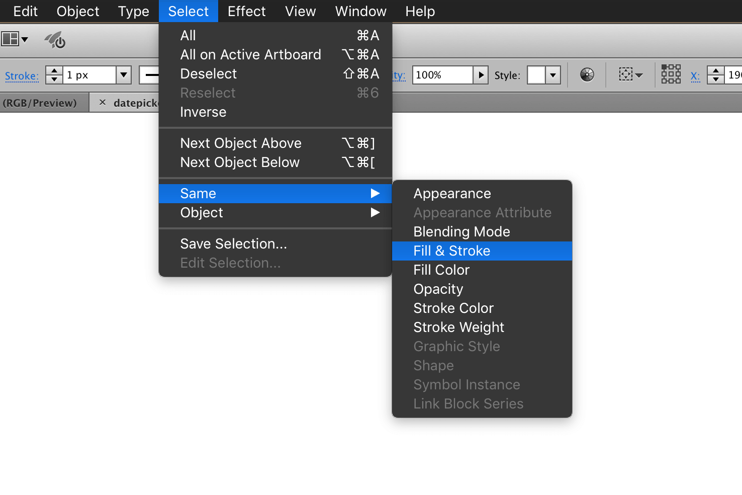
Then in the menu find Select > Same, then choose Fill & Stroke. The relevant items will now be selected.
Changing the fill and stroke
Change the fill to white (#ffffff) and the stroke to colour 4 (#c9d6d6). This will keep the visual separation of the area the days occupy, but not as intense.
Changing the text colour
Still in isolation mode, select one of the day numbers. Then again go to Select > Same, this time choosing Fill Color. Changing their fill to colour 2 (#1a626e).
Reduce prominence of previous and next month
Now finally here, you need to select the days of the previous month and the next. As there is a smaller amount of them I select them manually.
Once selected change their fill to colour 3 (#adc9c8). Double click the artboard to exit the isolation mode.
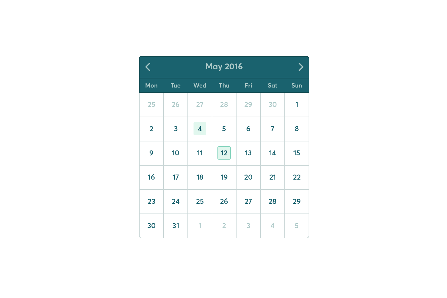
Where you should be
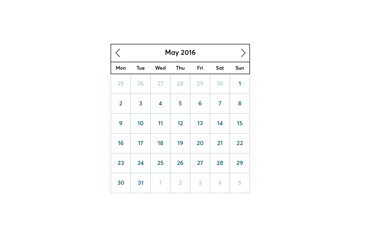
Visually separate the current month area from the dates
The next step is to work on the area above the days. Select both rectangles that are behind the text and change their fill to colour 2 (#1a626e) and their stroke to colour 1 (#0c464c).
Changing the text/arrow colour
Select each day of the week and the month, change the fill to colour 3 (#adc9c8). Then select the arrows and change their stroke to colour 3 also (#adc9c8).
There is now a nice contrast between the two areas, aside from a few more refinements, this is almost complete.
Increase arrow weight
While the arrows were put in place considering size to an extent, their weight is too thin. Increasing the weight will help make them more visible.
Select both arrows and open the stroke panel. In the menu find Window > Stroke, if you don’t have it open already.
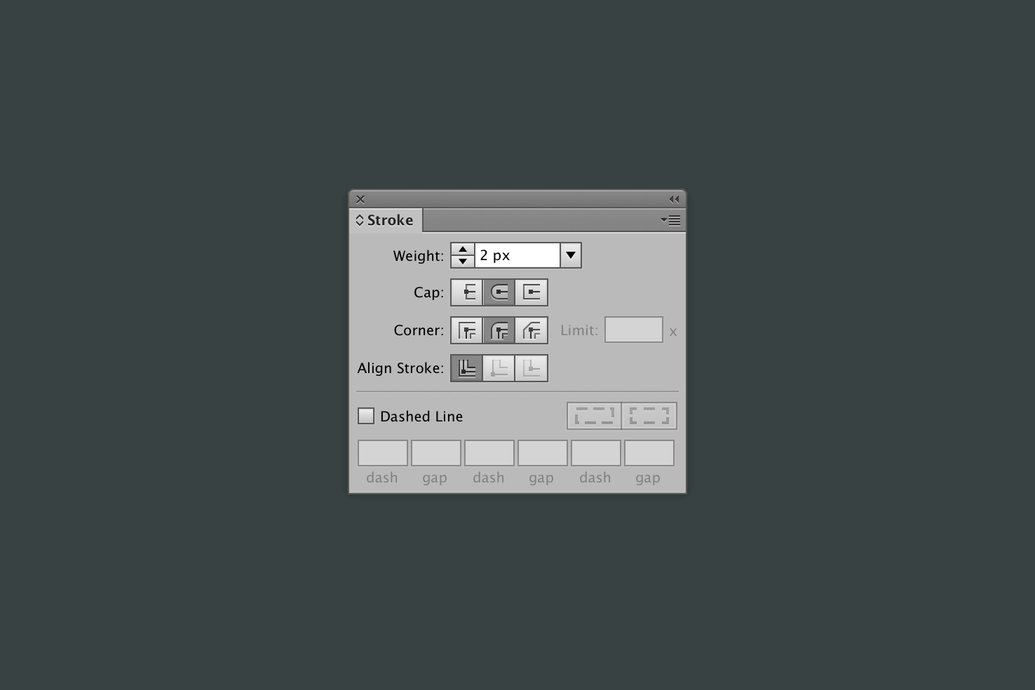
Increase the stroke to 2px and change the cap and corner to round.
Reduce arrow size
Change your selection to only having one arrow. Then open the transform panel, in the menu find Window > Transform.
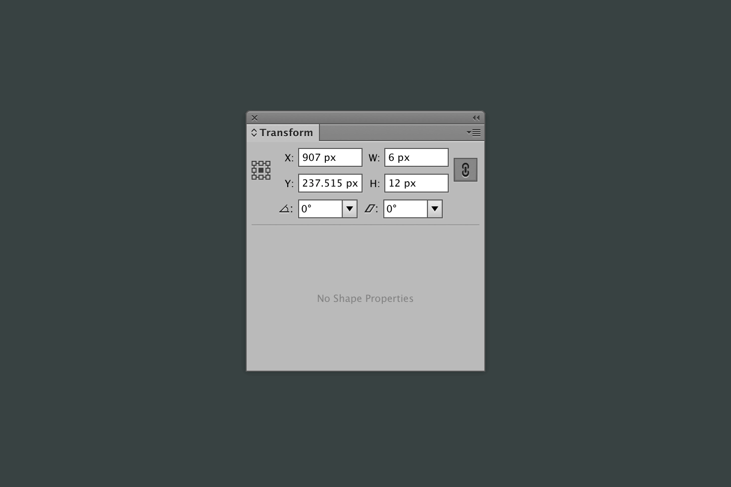
Change your reference point to the middle and make sure you constrain the proportions. After that reduce the height to 12px.
Repeat the process for the other arrow. The weight and sizing of the arrows feels much better now. The reason for this is, the wireframe has a different contrast, dark on light, rather than light on dark.
Rounding the corners
For this step it will involve applying rounded corners to the necessary corner most objects.
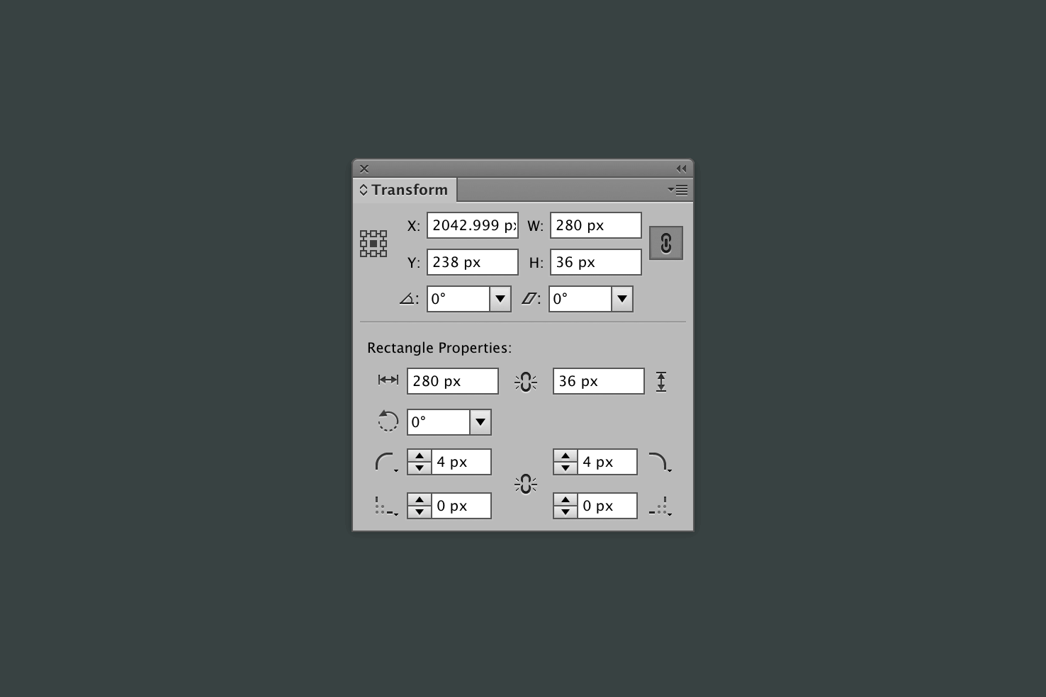
Open the transform panel, with your shape selected and you should see ‘Rectangle Properties’ below the usual options. Individually add 4px (or a radius you prefer) to the top left and right corners.
Sometimes when selecting an object the options won’t show, I’m not sure why this is. To get around this, you can use the direct selection tool, by pressing a. Then select an individual point at the corner you want to round.
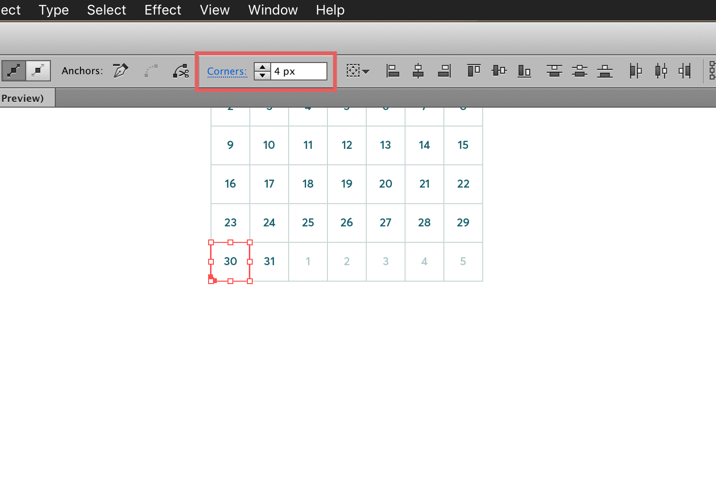
Repeat this for the very last day within the datepicker.
Hover and selected states
It’s important that when interacting with a datepicker it’s clear what’s selected and what isn’t. This can be through a mix of background colours, borders, shadows, etc.
Firstly if you haven’t already ungroup the day numbers, by pressing cmd + shift + g.
Hover state
For the hover state we’re going to draw a new rounded rectangle with a fill using colour 6 (#e1f7ee). Select the rounded rectangle tool. Which you can get to by clicking and holding the rectangle tool, and a menu should pop out from the toolbar.
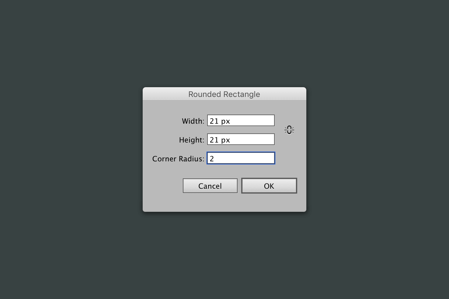
Next, fill using colour 6 (#e1f7ee), then drag the rectangle towards a number of choice. It should be covering the number, to stop this use cmd + [ until it goes behind the number.
Aligning to key object
Then using the technique to align from the previous post. Select both the hover and background shapes. Then open the align panel, in the menu go to Window > Align.
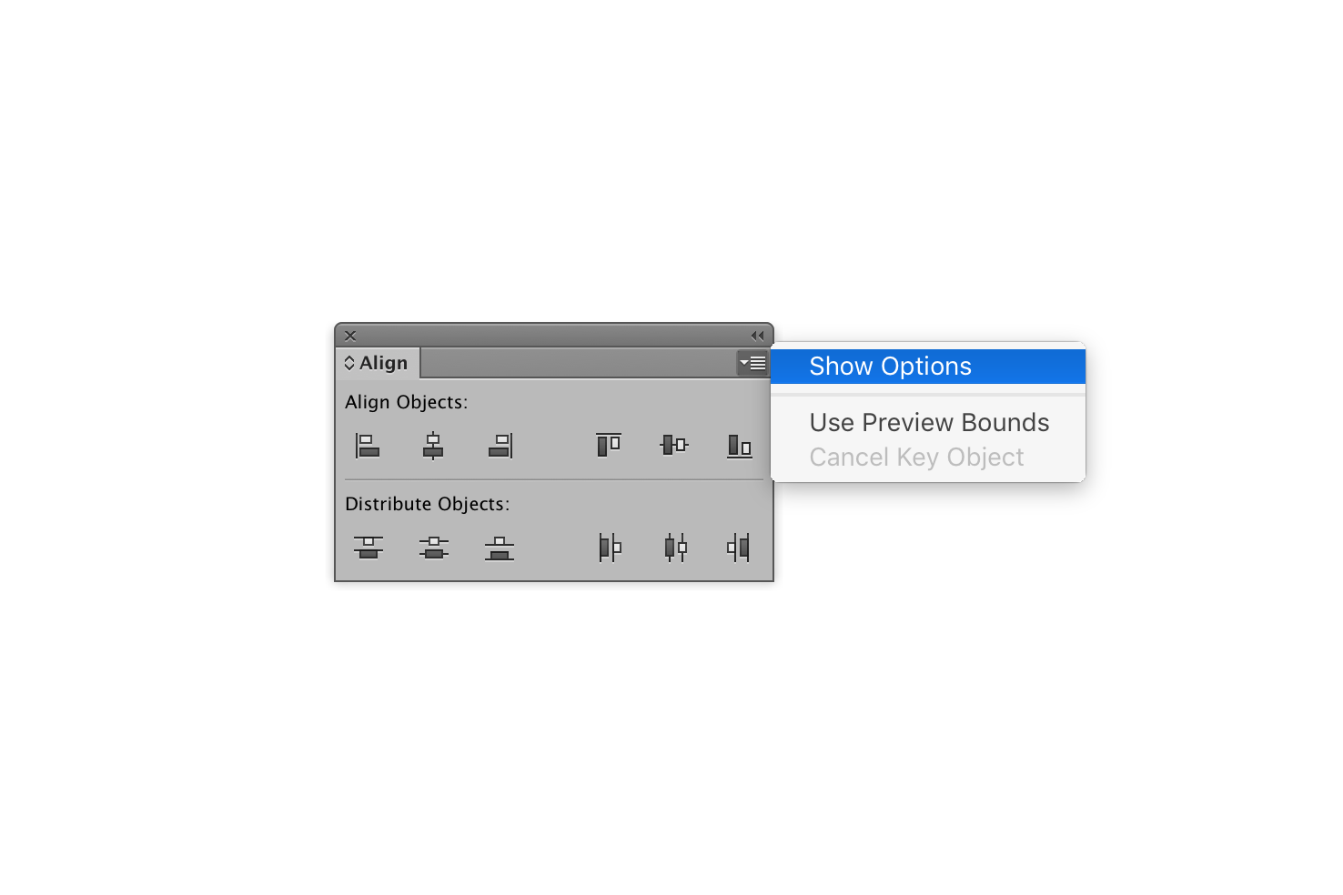
Open the align window, by going to the menu Window > Align. Then you need to click the icon in the top right below the double left arrows to expand the window. Once you have revealed the menu, click ‘Show Options’.
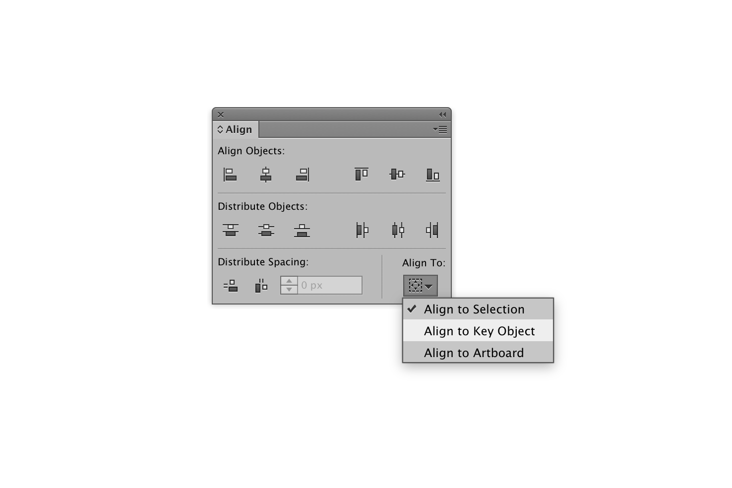
With both objects selected choose ‘Align to Key Object’, then click the background square. The blue border should get thicker, showing that the key object is selected.
Back to the align panel, align the objects by clicking both vertical and horizontal align centre.
Selected state
A good selected state should build upon the hover state, for this I’m adding a 1px stroke with colour 5 (#87d4be).
You can do this by duplicating the original square and following the same alignment process. To duplicate an object you can copy and paste in place with cmd + shift + v or selecting the object and holding alt and dragging.
That’s it
If you’re newer to Illustrator, over the course of these two posts hopefully you have learnt a good few techniques that help make designing a bit more efficient.
View on Github