3 ways to export SVG in Illustrator
Here’s a quick tip of all the ways you can export SVG in Illustrator. Each have their conveniences, advantages and disadvantages. It’s entirely up to you which you use, there isn’t really a bad way.
Tips and tutorials about the design and build of web interfaces
Here’s a quick tip of all the ways you can export SVG in Illustrator. Each have their conveniences, advantages and disadvantages. It’s entirely up to you which you use, there isn’t really a bad way.

How to use JSON-LD in Wordpress to replace Microdata for structured data. Easier to implement and keeps all schema markup in one place rather than scattered through templates.

An introduction to CSS shapes level one — polygon, circle, inset and ellipse. Covers use cases, strengths, and how to wrap text around shapes using shape-outside.

The inline-block method is an effective float based layout alternative. It’s easier to align and removes the need to clear floats.

How to enhance horizontal scrolling navigation with flickity.js. Adds touch and mouse drag support, making the pattern work well on Windows too.

How to maintain a perfect square in a responsive layout using CSS padding. A quick tip covering the technique and how to handle content within the square.

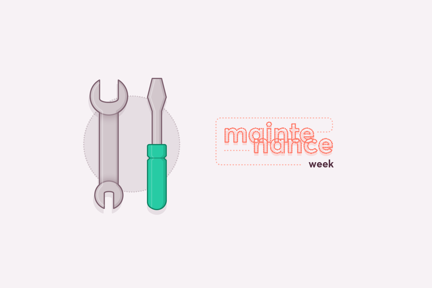
Maintenance week #2 was focused on the server side — adding SSL, updating the CMS, and tidying things up rather than updating posts.

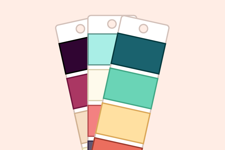
Following on from the colour series I have a selection of websites that can help inspire your colour palettes. There is a variety between inspiration, resources and tools to pick colours.
A Finder-inspired pattern for toggling between horizontal and vertical scrolling layouts. Built with flexbox, making it easy to switch between compact and expanded views.
It’s been a year since I started writing weekly. This is the 52nd post, so it’s fitting to reflect upon the experience of writing over the past year. I hope to inspire you, to take it upon yourself, to write regularly. As I’m certainly not the best writer, but I believe if you’re knowledgeable of a subject, you should be sharing what you know.
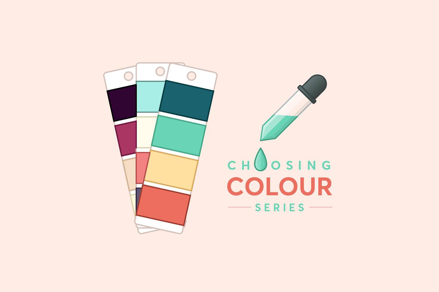
Part three of the colour series. Practical tips for selecting colours that I wish I'd known earlier — covering pitfalls and how to add new colours to a palette.
Part two of the colour series. Once you’ve picked your palette, this post guides you through refining it — testing combinations, checking contrast and colour blindness.