
‘Atomic’ font size management with Sass
In a responsive world, managing font sizes can be tricky. So how can an atomic approach help?
Dive deeper into the powerful and versatile styling language that can transform your interfaces.
In a responsive world, managing font sizes can be tricky. So how can an atomic approach help?
With horizontal scrolling, submenus are quite challenging to make work. Due to the CSS you have to use, a CSS only solution isn’t viable. In this post I show you how to utilise JavaScript.

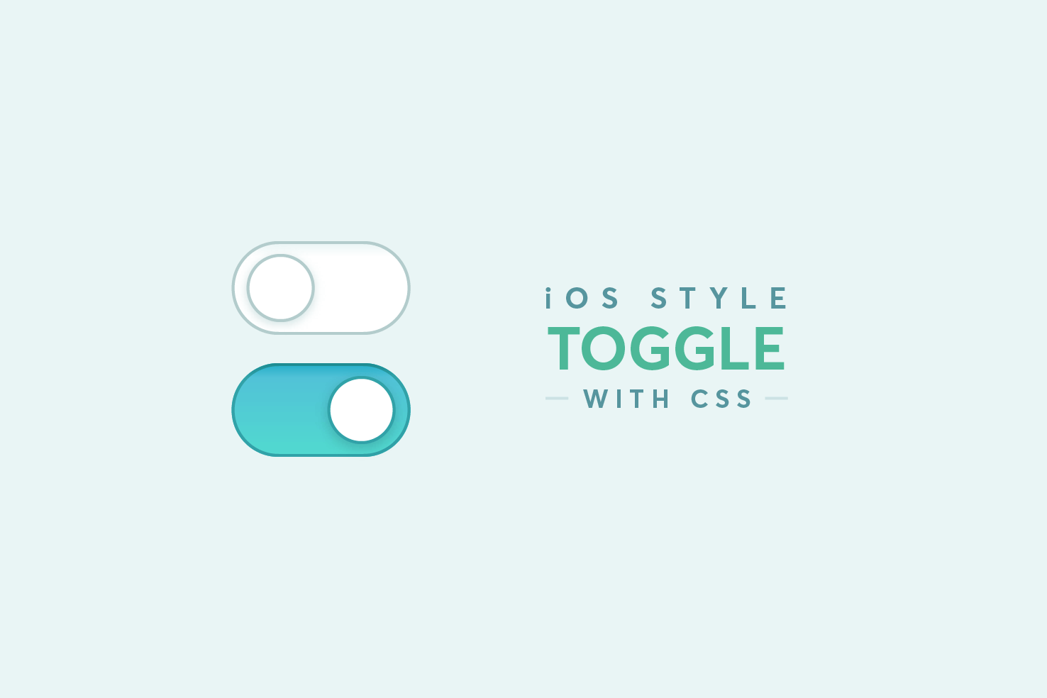
A CSS-only iOS-style toggle using a hidden checkbox and the :checked pseudo class with the adjacent sibling selector. No JavaScript required.

The inline-block method is an effective float based layout alternative. It’s easier to align and removes the need to clear floats.

How to maintain a perfect square in a responsive layout using CSS padding. A quick tip covering the technique and how to handle content within the square.

Styling form elements consistently across browsers is tricky. This post covers using the appearance property on text, button and select elements as a base.
Using CSS mix-blend-mode to apply vintage-style photo filters, much like you would in Photoshop. Includes a live demo to test the different filter options.

If you’re looking for an alternative approach to responsive navigation, which doesn’t involve the ‘hamburger’ this may be for you.
Why not to add a base level of styles that are defaults for the majority of elements.
object-fit is like background-size but for inline images. Combined with viewport units, it lets you size images without distortion — no more awkward workarounds.
An updated look at Sass, covering newer features like maps, @each, and using the Breakpoint extension for managing media queries more effectively.
A simple CSS technique for managing text colour on different background colours, without writing a separate selector for every combination.