This post was published 10 years ago
There’s a chance things are out of date or no longer reflect my views today
Get up to speed with CSS shapes
An introduction to CSS shapes level one — polygon, circle, inset and ellipse. Covers use cases, strengths, and how to wrap text around shapes using shape-outside.
— views
I’ve wanted to explore CSS shapes for a little while now and get a good understanding of it. Find potential use cases, strengths and weaknesses. In this post, I’m going to cover the level one properties. At the time of writing level two is in the editors draft and looks to be bringing much more power to them.
Currently, we have a reasonable set of flexibility with shapes, and understanding what’s available now will give you a leg up on future additions to CSS shapes.
Introduction to shape properties
All shape properties throughout this article rely on the use of floats to work. In future expansion to CSS shapes this won’t be the case, but for now, it’s floats.
shape-outside
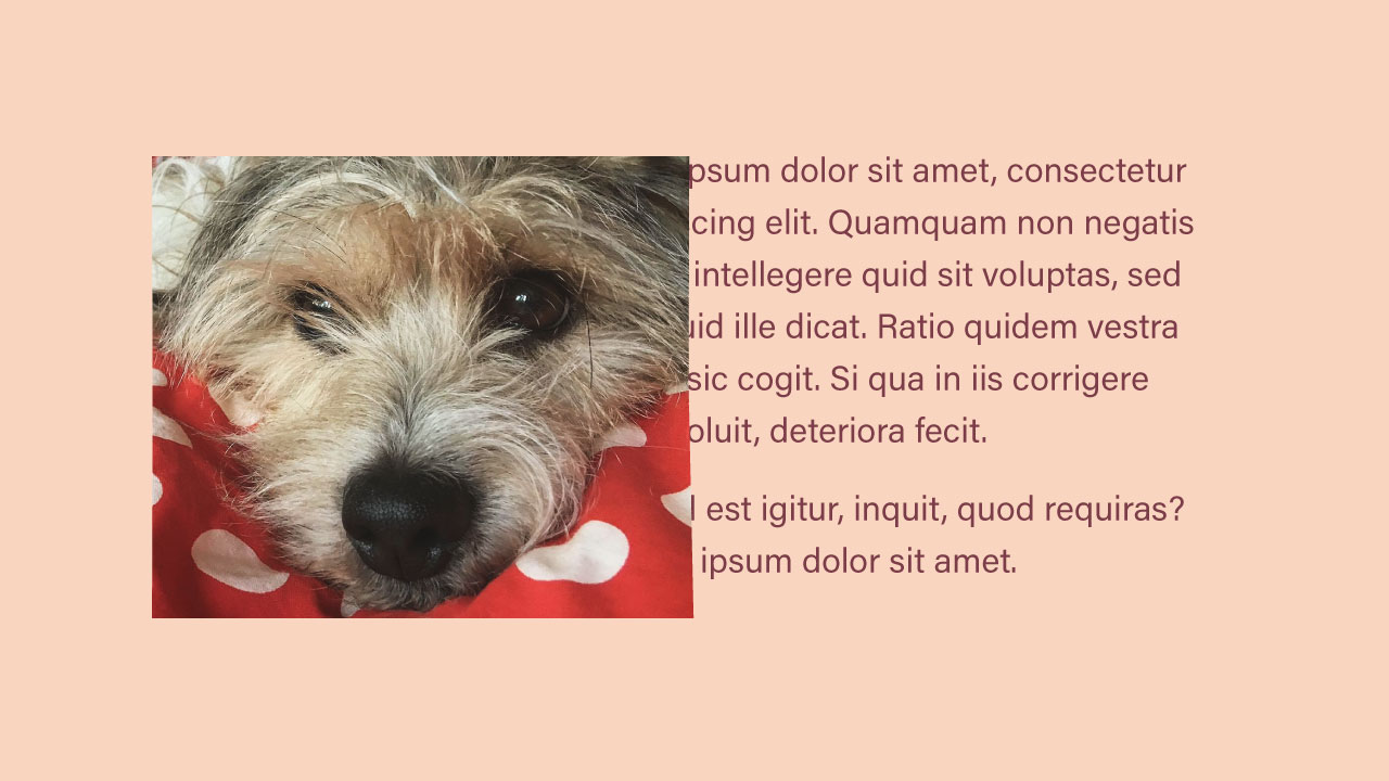
It’s the property you will use for creating shapes. Through shape-outside you define the basic-shape, shape-box and an image. You can’t set these individually currently. Additionally, you have properties shape-margin and shape-image-threshold.
.shape {
  shape-outside: circle(50%) border-box;
}

.image {
  shape-outside: url(path/to/image.png);
}
Clipping the shape
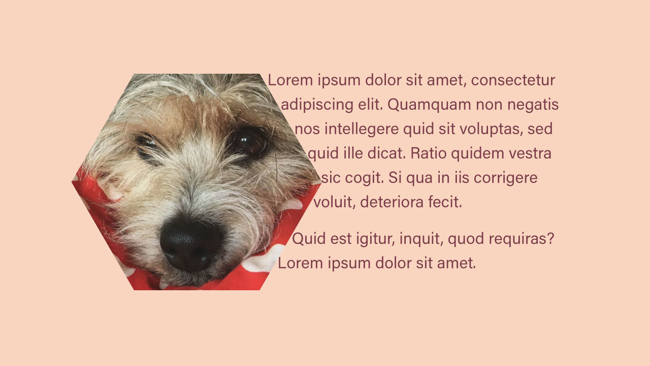
If you have a square image it will remain square, despite the shape being set. If you want it to appear that shape, you can use clip-path, border-radius (if circular), or save the image as the shape you want.
shape-box
This works similarly to properties like border-box and background-clip. The values that can be set are margin-box, border-box, padding-box, and content-box.
.shape {
  shape-outside: circle(50%) border-box;
}
shape-margin
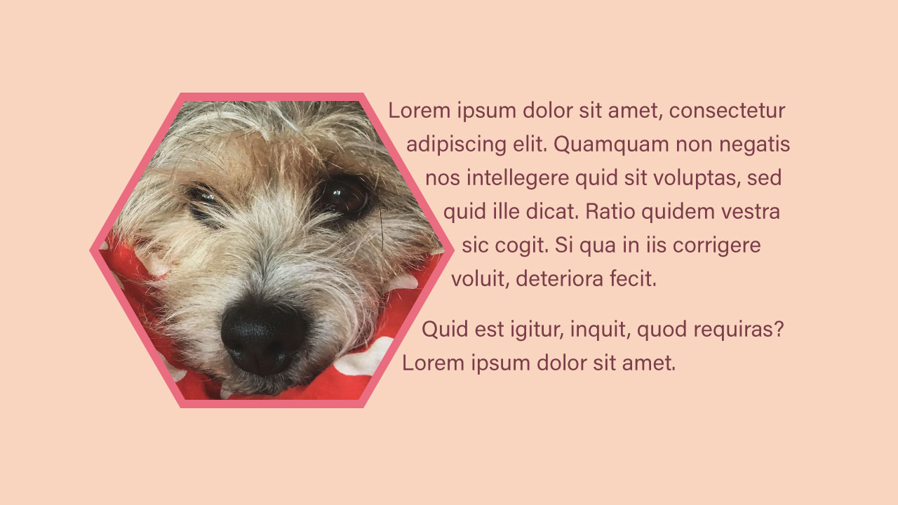
It will add a margin to the shape that takes into account all the points and draws it directly outwards from those points. As circles do not have points, it will draw it from the centre.
.shape {
  shape-margin: 12px;
}
My success with this is mixed. I found that most of the time, adding a regular margin to the image was more favourable in positioning the text.
Shape options
There are four ways you can create a shape.
- polygon
- circle
- inset
- ellipse
Polygon
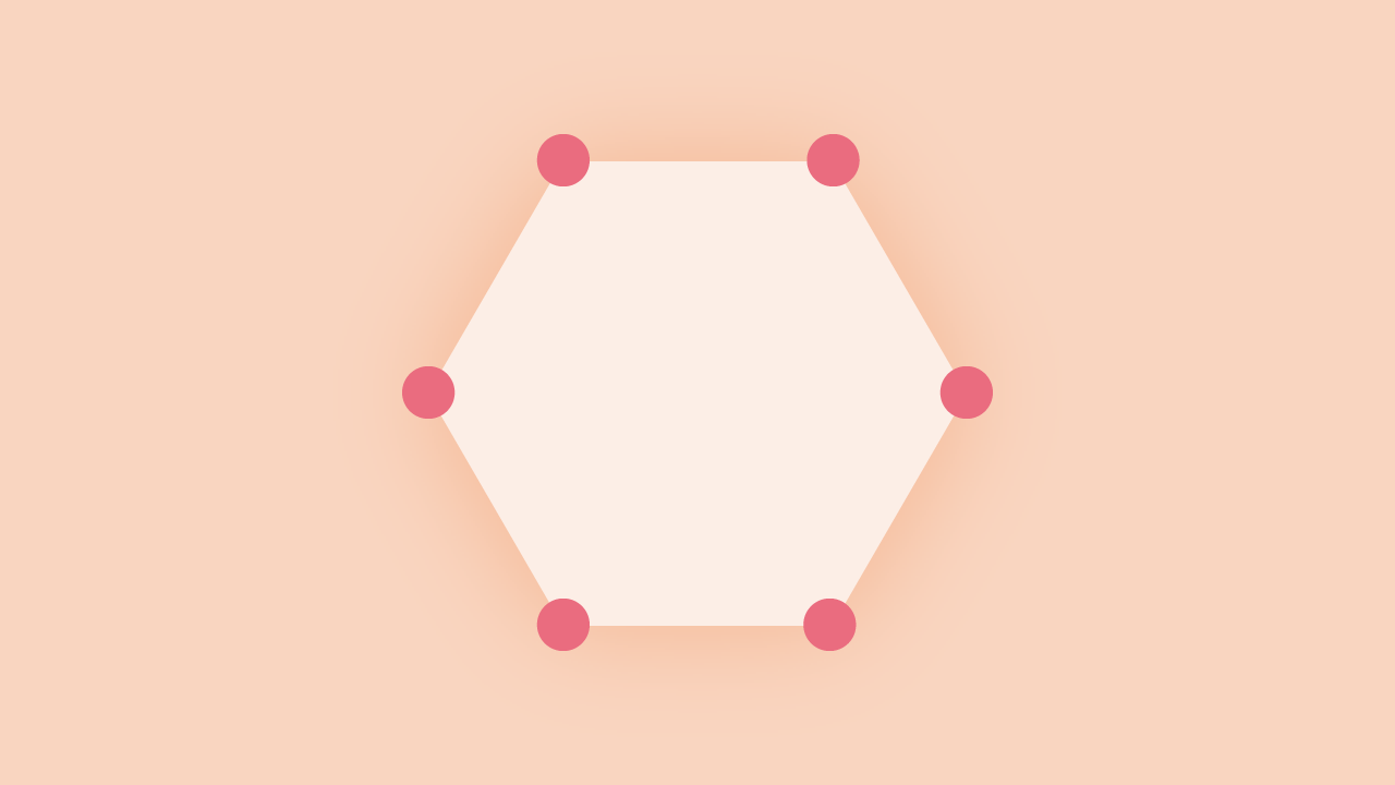
A polygon can create the most complex shapes. It requires, at least, three points. Each point requires two numbers.
To create a triangle
.triangle {
  shape-outside: polygon(50% 0%, 0% 100%, 100% 100%);
}
To create a hexagon
.hexagon {
  shape-outside: polygon(50% 0%, 100% 25%, 100% 75%, 50% 100%, 0% 75%, 0% 25%);
}
Circle
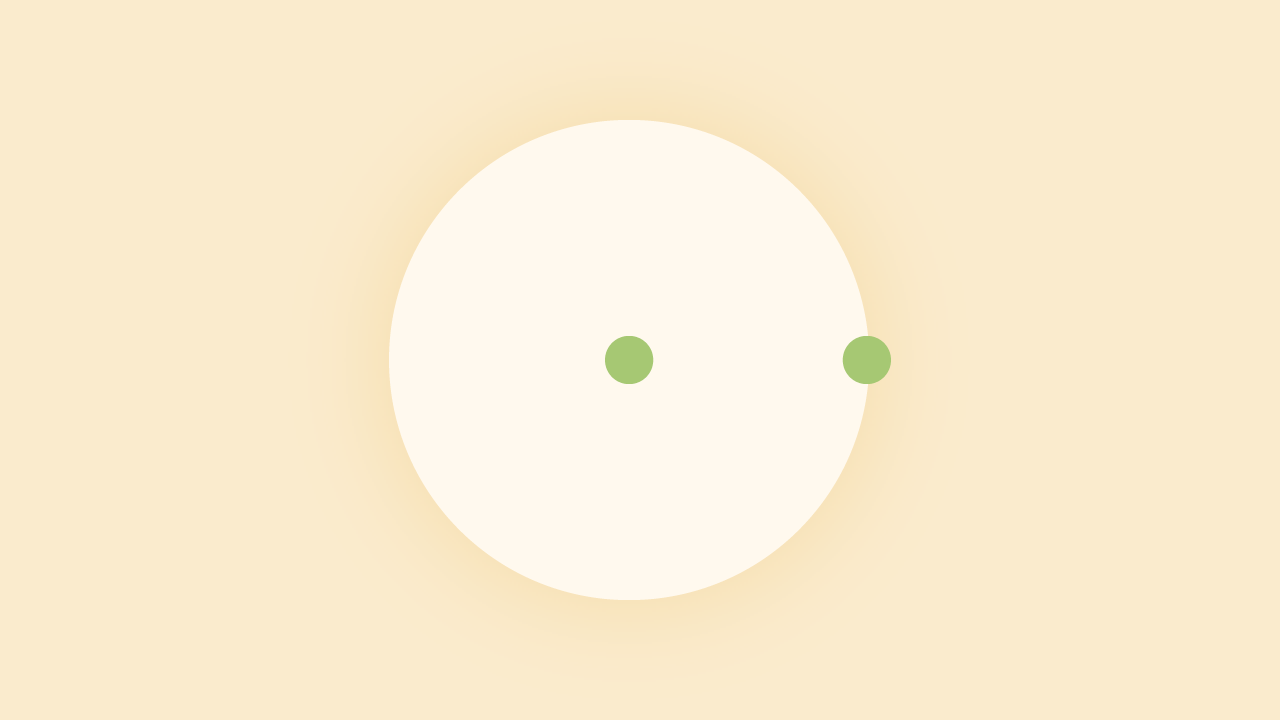
You can base a circle only on the radius. The outermost point will define this. The centre point determines the position. The syntax is similar to that of gradients and background positioning.
.circle {
  shape-outside: circle(50%);
  shape-outside: cricle(at right 12px top 25%);
}
Inset

Inset works by creating a rectangular shape. The values work in a familiar fashion: top, right, bottom and left. There is an optional border-radius parameter, which can’t be negative.
.inset {
  shape-outside: inset(5% 10% 20% 10% round 6px);
}
Ellipse
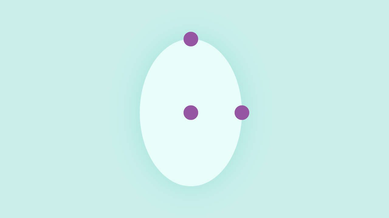
An ellipse is similar to a circle in the sense you set the position to form the shape from the same way. However to get the ellipse shape two points are passed.
.ellipse {
  shape-outside: ellipse(25% 50% at right top);
}
Tips for creating shapes
When using one of the shape options, on an image or element, (if part of the text flow), it’s best to accompany it with the equivalent clip-path. This way you will get the desired effects.
It’s quite difficult to make shapes without seeing, I recommend using Clippy by Bennett Feely. It’s for
clip-path, but it’s the same idea.
Image
There are two methods for using an image. One isn’t supported, and the other is one we’re already familiar with. To get images to work, I found it very tricky and didn’t work as I’d expected more often than not.
The most important thing I can tell you is that the image must be on the same server. It requires a CORS enabled server, to be hosted elsewhere. While I was trying to create a demo on CodePen, I found this not working for that reason.
Using a URL
This method is like any image we would use.
.image {
  shape-outside: url(path/to/image.png);
}
Using the image src attribute
The method uses the reference image src attribute. This will add some convenience, it’s not supported currently.
.image {
  shape-outside: attr(src url);
}
shape-image-threshold
When using an image, you can set the threshold to a value between 0 and 1. If you have a threshold of .5, the shape will form around pixels that are more than 50% opaque. As you would expect this leaves us only using png or gif images. From what referencing caniuse resources gif isn’t supported, yet.
.image {
  shape-image: url(path/to/image.png);
  shape-image-threshold: 0.5;
}
If you have a particular part of an image, you want the text to flow around. Take the image and delete the area that isn’t the area you want the image to flow round. Once you have done that, make the remaining area black.
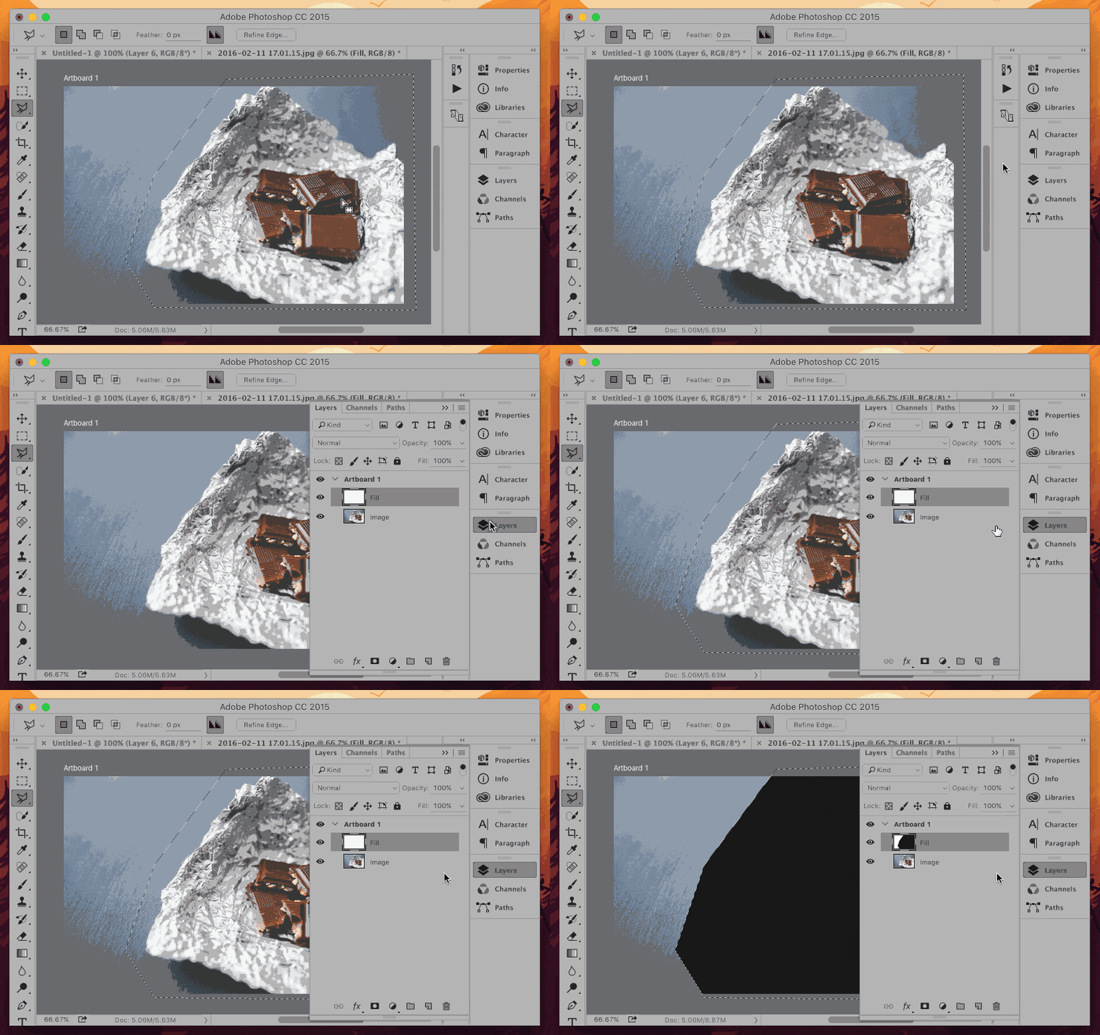
Things I found that may not be obvious right away
- If your shape has space on both sides, your text won’t flow around it
- Text flows on the opposite side of the float
- In most cases it will make sense to use an actual shape over an image
- You have to take care to make it work across all screen sizes
- Again if you don’t have a CORS enabled server, make sure your images are on the same server
- Use a
clip-pathalong withshape-outside - Combining
clip-pathandshape-outsidecan help make more interesting layouts - Use Clippy by Bennett Feely it will save you time
Thoughts
My opinion on this initially is it’s very limiting. While I have seen other examples out there that work well, these are only within an article itself to complement the page better. There isn’t currently any use cases that I have found myself that can benefit layout.
However, this isn’t the intention of shape-outside. Soon, exclusions will be more beneficial, to do what I was hoping. I had too high expectations. It was certainly worth exploring this topic and it’s something I’m going to think about more while designing. The ability to clip and have layout flow round shapes is something to experiment more with.