Pixel perfect templates in Illustrator
How to set up Illustrator to stay pixel perfect. Using snap to grid and saving a template means you won’t accidentally export on half pixels for logos and icons.
— views
Illustrator being a vector application means it can be easy to overlook the export process and making things pixel perfect. It’s easy to do, so you don’t notice it. It’s particularly important that you try to retain this for logos and icons.
Why is it important?
The importance comes down to the export process for assets that require crisp edges. If icons and logos aren’t pixel fitted, it can make them look poorer.
Good logos and icons will already account for this. Sometimes. unintentionally you can knock things slightly out of alignment in Illustrator. Due to the vector nature of the application. You’re not as aware of things looking off.
It starts with the right document setup
However, once you have the document setup correctly in illustrator it’s generally set and forget. It will also help you achieve a more consistently spaced design.
Firstly, decide upon a grid
This isn’t a traditional columned grid, it’s the overlay that is built into Illustrator.
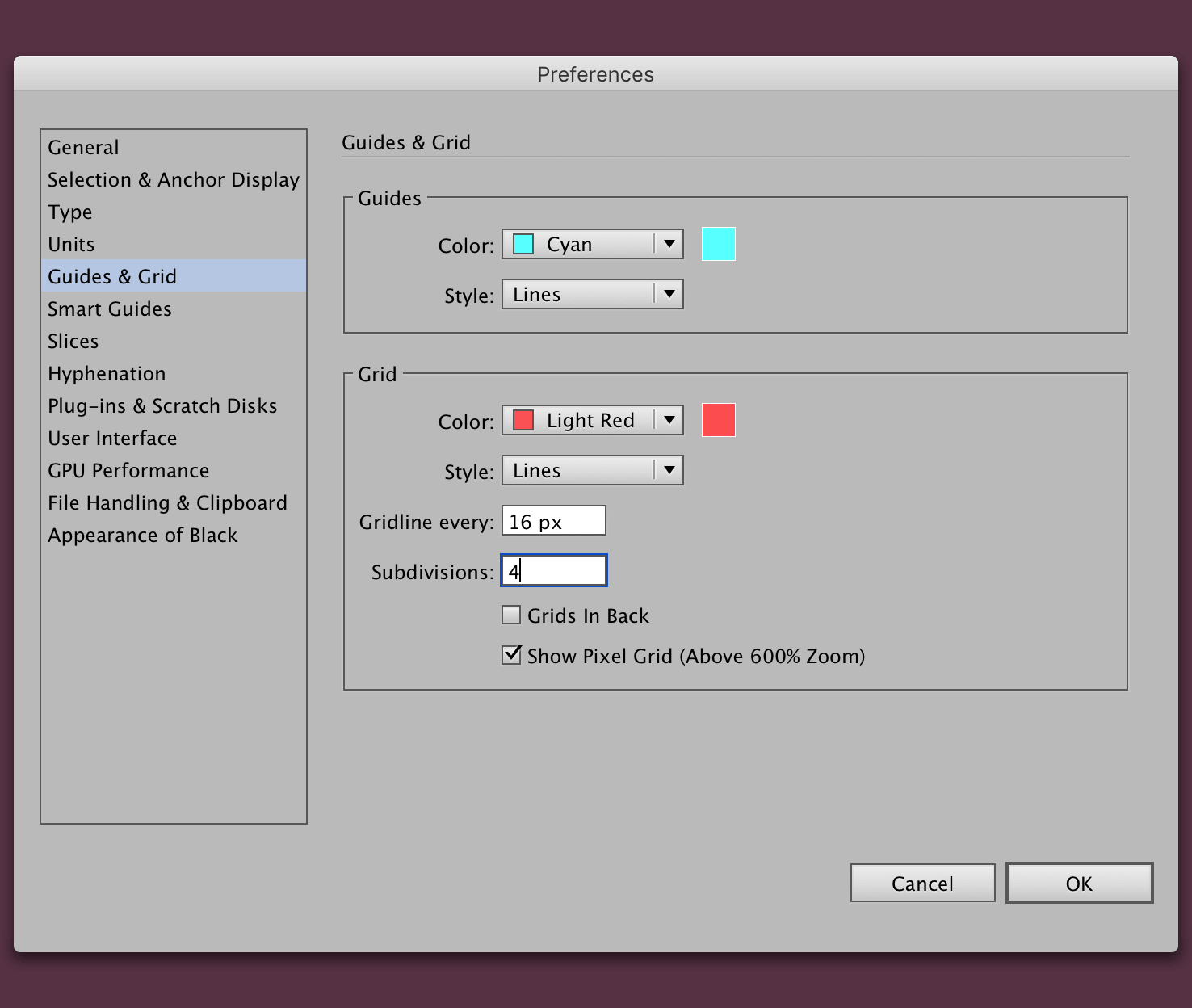
Go to Illustrator > Preferences > Guides & Grid. From here set a gridline as a multiple of 16, with the subdivisions to equal a whole number too.
Why multiples of 16?
Icons and screen resolutions typically scale up from values that are multiples of 16. 16, 32, 64, 128 for icons. 1024, 1280, 1680, 1920 for screen resolutions. I recommend you follow this.
Aside from this you can depend on the number to always be whole when divided by 2.

Generally people will default to multiples of 10. I would strongly advise against this, you can quickly end up with a number that isn’t whole. With a 16px grid you can divide by 2 until you’re at 1px.
Make a new document
You can make any document size, as long as it falls within your gridline choice. In this instance it’s 16. If your document size follows screen resolution patterns, they will fall within the 16px grid.
After adding your dimensions, click advanced and check ‘Align New Objects to Pixel Grid’.
This can be the reason you will have trouble doing this with an existing document. It’s for new objects.
Enable snap to grid
The next step and possibly most crucial is to enable snap to grid. You can find in the menu View > Snap to Grid or the keyboard shortcut cmd + shift + ’ (single quote).
This will make aligning things much easier.
Toggling the grid
To toggle the grid you can do this with cmd + ’ (single quote).
Things to be aware of
With the accuracy you introduce within the document sometimes pasting items in that are not already a whole pixel will be troublesome to align. You will have to resize the object and align drag into place again.
You’ll likely be aware of ‘Snap to Point’ or come across it, I don’t recommend enabling this, as it’s very unpredictable. If you need to move things by the pixel change the grid settings.
That’s it
If you’re a long time user of both Illustrator and Photoshop, but tend to use one more for designing websites, you’ll probably share similar frustrations to what I have. They’re both great, but they both miss things from each other, that would make life much easier.
From here you can set up a regular grid using guides and then save as a template for future documents.
View on Github