Monthly design roundup #1
Monthly design roundup #1 — eight well-designed websites I found this month, with notes on what makes each one worth looking at.
— views

This is the start of a monthly series of a roundup of well designed websites, and articles I found helpful. There is no particular theme, other than inspirational, which I hope you find is the case. I’ve added a few notes and summary to give my take.
Starting with websites
Here’s eight websites, there’s a lot of illustration and great use of colour throughout this set.
Riyo
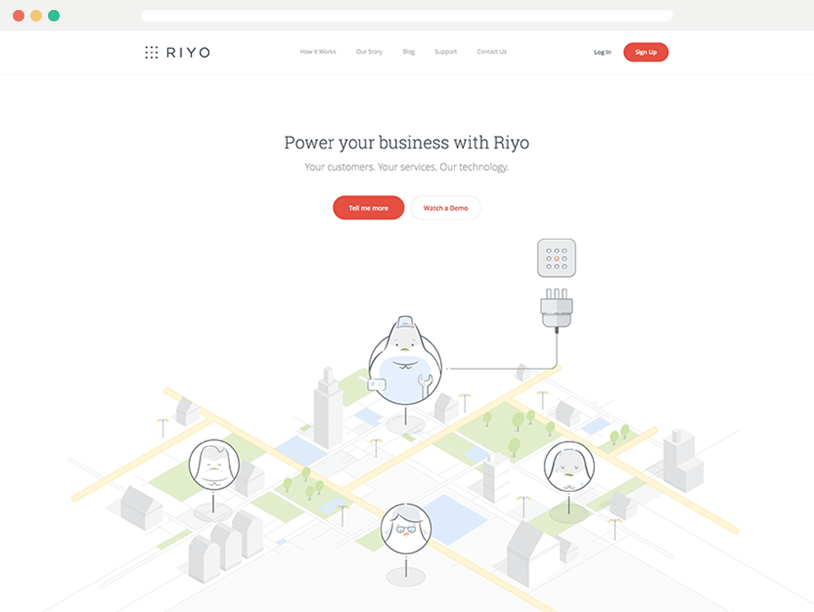
The top to bottom use of illustration, calming and soft colours used throughout make this a really nice design. It really builds a level of trust and reassurance. The main colour used is red, most people would get scared off using red, but it shows confidence.
Nuage
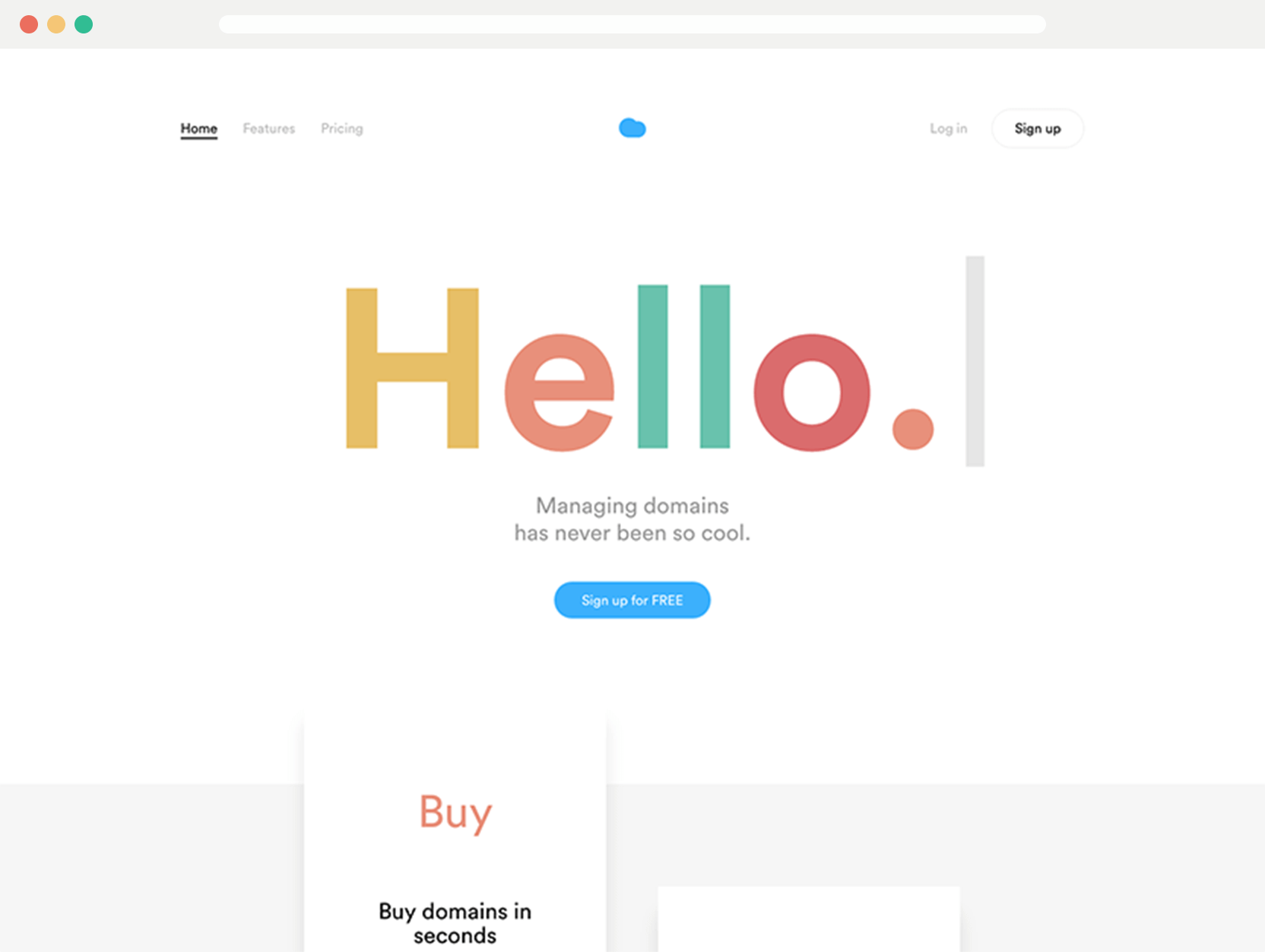
There is some stunning attention to detail throughout this website. It’s minimalism, done right. Lots of personality throughout. Great use of whitespace and clarity, which really sets itself apart from other domain vendors.
Billdogg
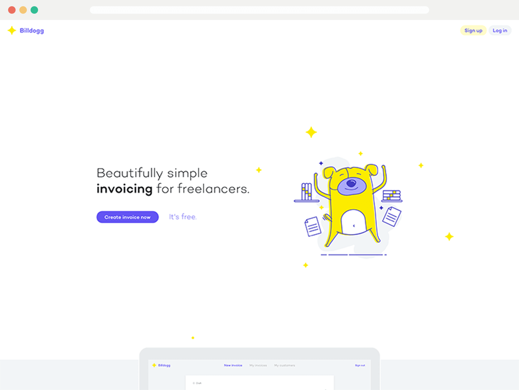
Simple straight to the point, and you know what you’re going to get without having to shove a massive image in the background. The colour choice is vibrant but not overwhelming. The illustration style really adds to the page. With little splashes of colour throughout the page it really ties it all together.
Mess Hall
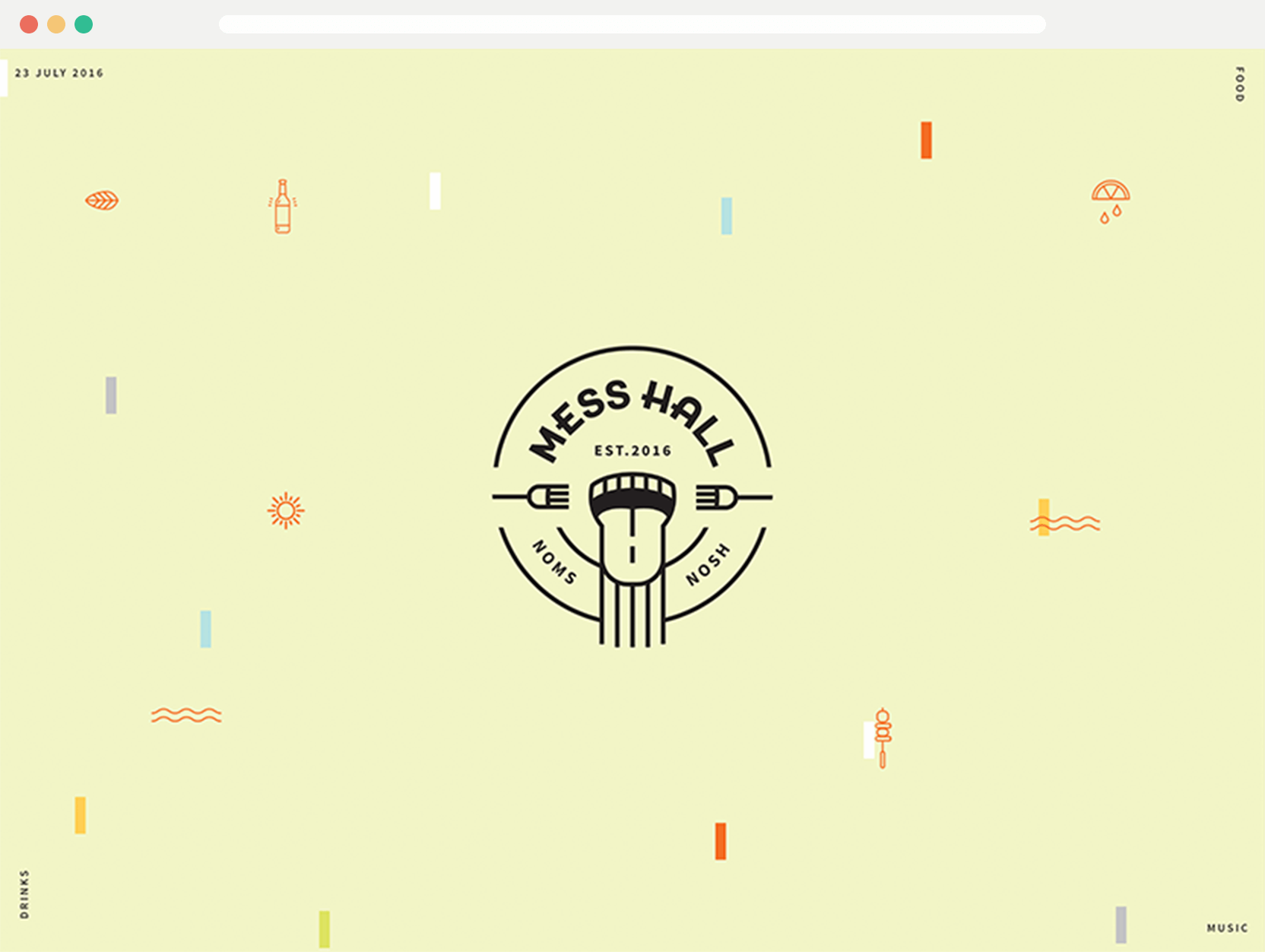
I particularly like the full viewport intro screen, that has a nice badge. It’s really well done. Which transitions smoothly into what it’s all about. There are some further nice transitions in the carousel just below.
Tasting Table
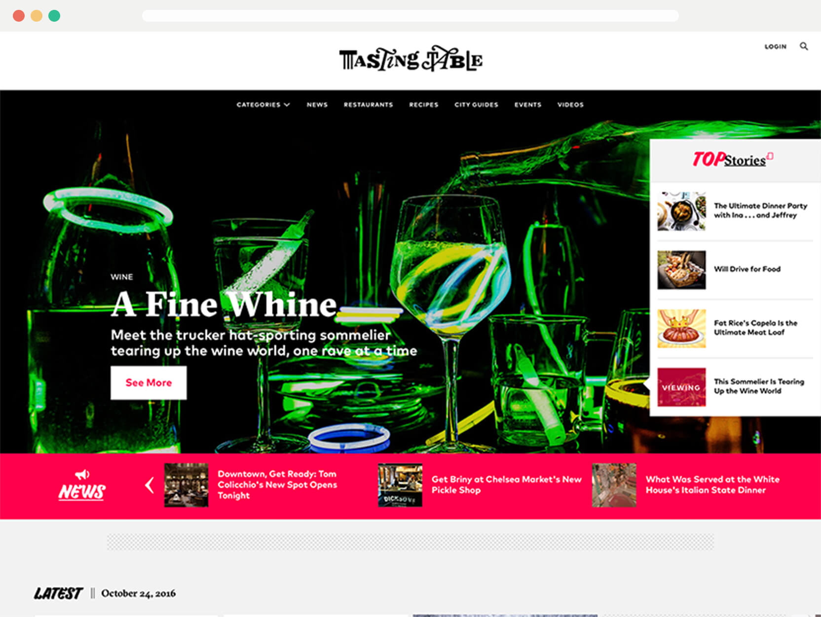
I really like the way so much information is presented in this website. There’s a variety of ways to browse and scroll through content. It’s engaging and a refreshing design for today’s world.
Waaffle
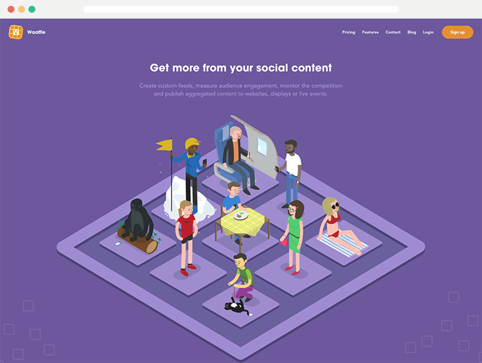
Again another page without having to have a random stock photo as the background. The illustration and animations throughout are superb. I particularly like the logo, which also is used for the loading indicator.
I really like the use of purple, orange and yellow throughout—a tricky combination to use—which is pulled off nicely.
Ambassador Watches
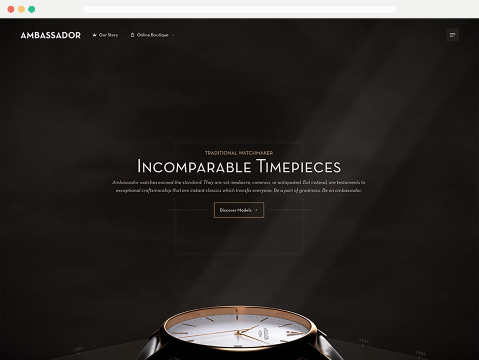
If you’re looking for a way to communicate luxury, look no further. I like how the headings are using small caps, but genuine small caps. The website is spot on to match the style of the watches.
When I first viewed this website and to get through to a watch page, I was surprised at how little the watches cost. Great design throughout.
Mylo
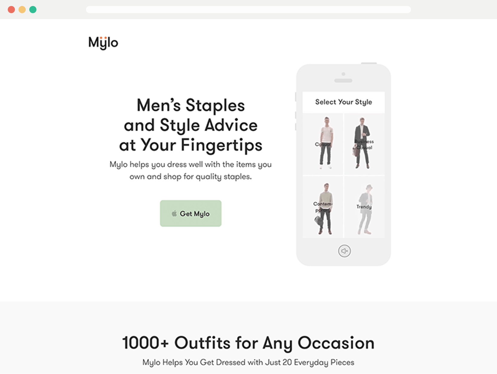
Sometimes I think the huge type thing is overdone, but that’s probably because it’s done poorly. Mylo does it well. You really get a sense that you’ll be getting good fashion choices and what the app is all about. It details and presents the app really well outside of the stereotypical page, it is possible.
Articles
Here’s some articles that I have found a good read.
How to make your portfolio actually get you clients
There’s some good advice in the article, but I’m not sure I agree with it all.
However, the main takeaway I gained was is there actually a good portfolio? I’ve read so many ‘do this, do that’ articles, which led me to: it depends on your situation. Are you trying to find a new job or get client work?
The way that you present the work if you’re in either situation will be different. Then inside that there are ways you could tailor that further.
I’ve never had a goal
I relate to this article in the sense I find it hard to set goals. I don’t know where exactly I want to be in 5 years. In fact over the past year or so, I’ve been more unsure than ever. I feel like you’re looked upon wrongly if you don’t.
I’m happy designing, writing this blog and learning. I have a rough idea of where I want things to go, but I mostly take it week by week.
Digging into cart abandonment emails
Really Good Emails is a huge source of email knowledge. This is a great article on cart abandonment. Email is a valuable tool used right and this was an area of curiosity for me.
Marketing is something I know is skill I need to learn more about, as a designer it’s important. Without it you don’t sell things. I want to learn, but approach it by not being a forceful annoyance.
Comprehensive guide to font loading
I’ve been looking into a way to load fonts better. Considering the flash of invisible/unstyled text, but maintaining performance.
I purposely load the body font asynchronously here as it slows down page load times dramatically. I want to improve this further as the sans serif, albeit less, still slows down things. This guide helps, but I’m still wrapping my head round it!
View on Github