This post was published 10 years ago
There’s a chance things are out of date or no longer reflect my views today
CSS only iOS style ‘toggle’
A CSS-only iOS-style toggle using a hidden checkbox and the :checked pseudo class with the adjacent sibling selector. No JavaScript required.
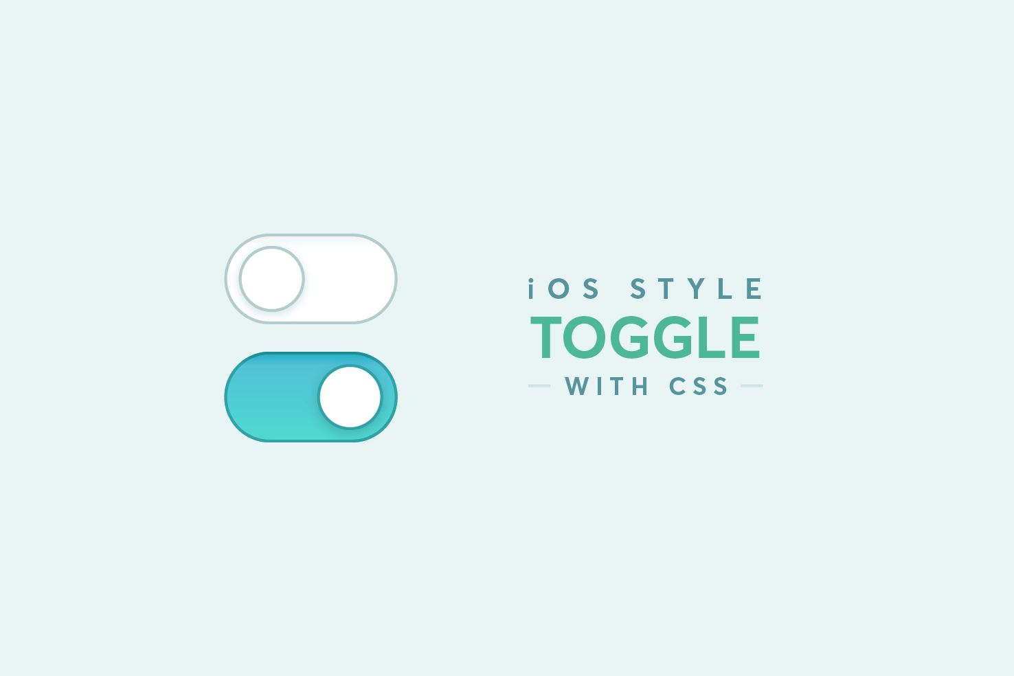
Since they appeared in iOS it’s been a trend to recreate these using CSS only. The technique uses the adjacent sibling selector and a “hidden” checkbox to retain use of the :checked pseudo class. In this post I wanted to take a look at this myself and recreate the toggle style.
Skip ahead
Here’s what will be explained in the coming paragraphs. Feel free to explore the code and skip ahead if necessary.
Identifying elements in the design
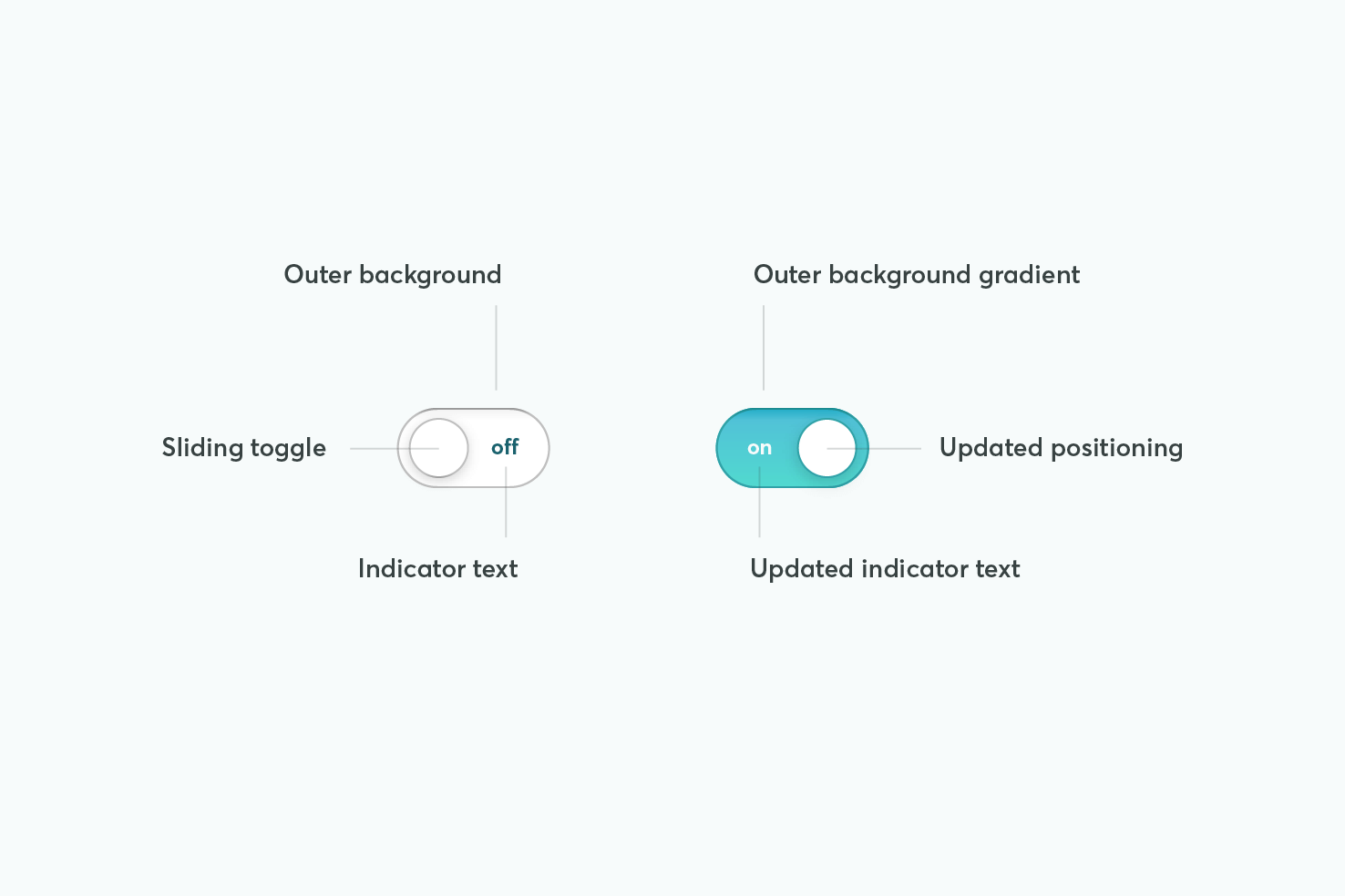
To understand what happens with this toggle, it’s more ‘faking’ the element. It’s still a regular checkbox, but to make the toggle work you need to retain the behaviour.
Depending on your stylistic choices it determines how you will setup your markup. As everything involved in this design changes with the checked state, it means careful consideration is needed.
Markup
Knowing that each part of the toggle style needs to change that means these elements will all need to follow the checkbox.
<label class="label label-toggle" for="night-mode">
  <div class="input-toggle">
    <input class="input-checkbox" id="night-mode" type="checkbox" />
    <span class="input-toggle-handle"></span>
  </div>
  Night mode
</label>
The markup follows a common pattern for using checkbox inputs. It’s contained within the label, to increase the area it can be interacted with.
A span for the styling must follow the checkbox, this will become clearer once you get on to CSS. These elements are then contained by a div, this will be used for positioning and spacing.
Get some basics in place
The basics here are what allow you to get the correct positioning, alongside label text and the correct positioning of the checkbox.
.input-toggle {
  position: relative;
  display: inline-block;
  vertical-align: middle;
}
Next is to position the checkbox to fill the toggle area, and remove its visibility with opacity. This is the ‘faking’ part.
.input-toggle input {
  position: absolute;
  top: 0;
  right: 0;
  bottom: 0;
  left: 0;
  opacity: 0;
}
Toggle background
For the background it needs to be fixed in width and height. It’s got to contain the area clearly, and invite interaction. As there is going to be a transition in the background, the styles need to be applied to .input-toggle-handle.
.input-toggle-handle {
  display: block;
  width: 84px;
  height: 44px;
  transition: 0.4s ease;
  background-image: linear-gradient(#51c2d7, #51dacf);
  border-radius: 10em;
  box-shadow: inset 0 1px rgba(0, 0, 0, 0.15), inset 0 0 0 1px rgba(0, 0, 0, 0.15),
    inset 0 1px 2px rgba(0, 0, 0, 0.15), inset 44px 44px #fff;
}
All styling here can be tweaked to your own liking, except for the box-shadow and background-image. They’re crucial to this particular style, as later on the line with inset 44px 44px #fff will transition out the to reveal the gradient. If you want to modify it this is something to consider.
Toggle handle
As you’ve had to use the class to form the background, now you’re left with using a pseudo element to make the handle.
.input-toggle-handle:before {
  content: '';
  position: absolute;
  z-index: 1;
  top: 6px;
  left: 8px;
  width: 32px;
  height: 32px;
  transition: 0.4s ease;
  border-radius: 10em;
  background: #fff;
  box-shadow: inset 0 -1px rgba(0, 0, 0, 0.2), inset 0 0 0 1px rgba(0, 0, 0, 0.15),
    0 1px 2px rgba(0, 0, 0, 0.1), 0 6px 12px rgba(0, 0, 0, 0.1);
}
The positioning values are based upon the size of the toggle and what fits best within the background area. The box-shadow and background can be tweaked as necessary. You may want to tweak the transition values too.
The :checked state
In the next steps it becomes clearer why the checkbox is positioned the way it is. As the only way to change the appearance of the toggle is to use the :checked pseudo class.
Reveal the background
If the input is checked, style the adjacent sibling (~). Essentially the element that follows this one, this is why source order is crucial.
.input-toggle input:checked ~ .input-toggle-handle {
  box-shadow: inset 0 1px rgba(0, 0, 0, 0.15), inset 0 0 0 1px #31a2a8;
}
Firstly, some adjustments to the box-shadow, this makes for a nice transition from white background to gradient. The choice of colour reflects the gradient, as #31a2a8 is a darker shade of blue.
Move the toggle over
.input-toggle input:checked ~ .input-toggle-handle:before {
  left: 44px;
  box-shadow: inset 0 -1px rgba(0, 0, 0, 0.2), inset 0 0 0 1px #31a2a8,
    0 1px 2px rgba(0, 0, 0, 0.1), 0 6px 12px rgba(0, 0, 0, 0.1);
}
Finally, move the toggle over and adjust the box-shadow. The left value here is subject to tweaking, if you change the size of the elements.
It would be ideal to use pseudo elements on the input itself, but it’s necessary to use
appearanceto be able to. Which works in different ways in different browsers, that makes this approach the most practical.
Improving clarity
Generally with these types of toggles you have to make the shift in state very clear. The position of the toggle and colour certainly indicate this. It’s not ideal to rely only upon colour in your interface, if the action is something critical.
.input-toggle:before {
  content: 'on';
  left: 0;
  color: #fff;
}

.input-toggle:after {
  content: 'off';
  right: 0;
  color: #1a626e;
}

.input-toggle:before,
.input-toggle:after {
  position: absolute;
  top: 50%;
  transform: translateY(-50%);
  padding: 12px 16px;
  font-size: 12px;
  z-index: 0;
}
The bonus of the containing element allows you to add the state text on this element. Using both :before and :after you add the relevant content, and both need positioning similarly.
The important property here is the z-index ensuring that it remains positioned behind the toggle at all times. This means each transition will nicely hide the relevant text.
The padding, font-size and color can be tweaked here.
Demo
Again, here is the complete demo, I recommend forking it on CodePen and having a look around.
View on Github