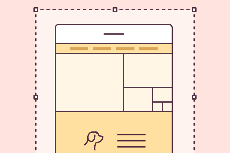
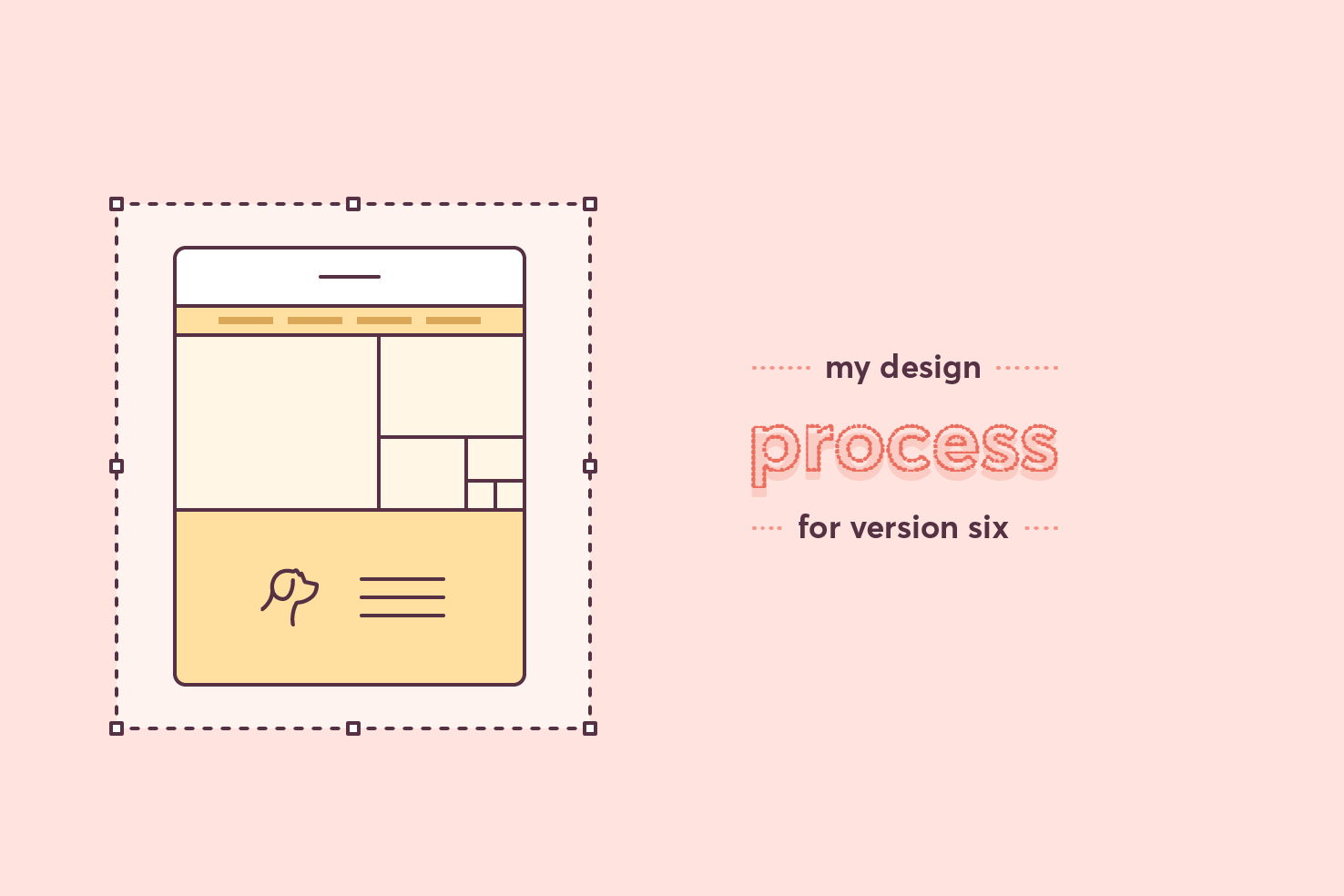
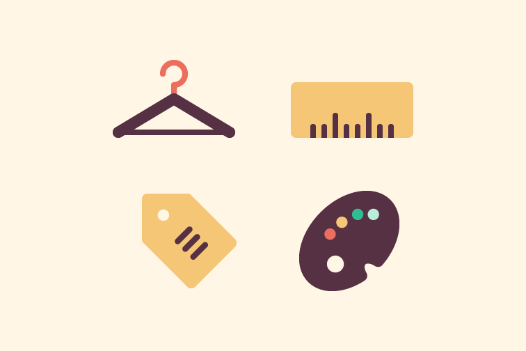
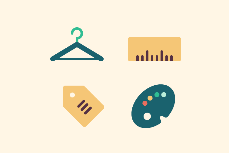
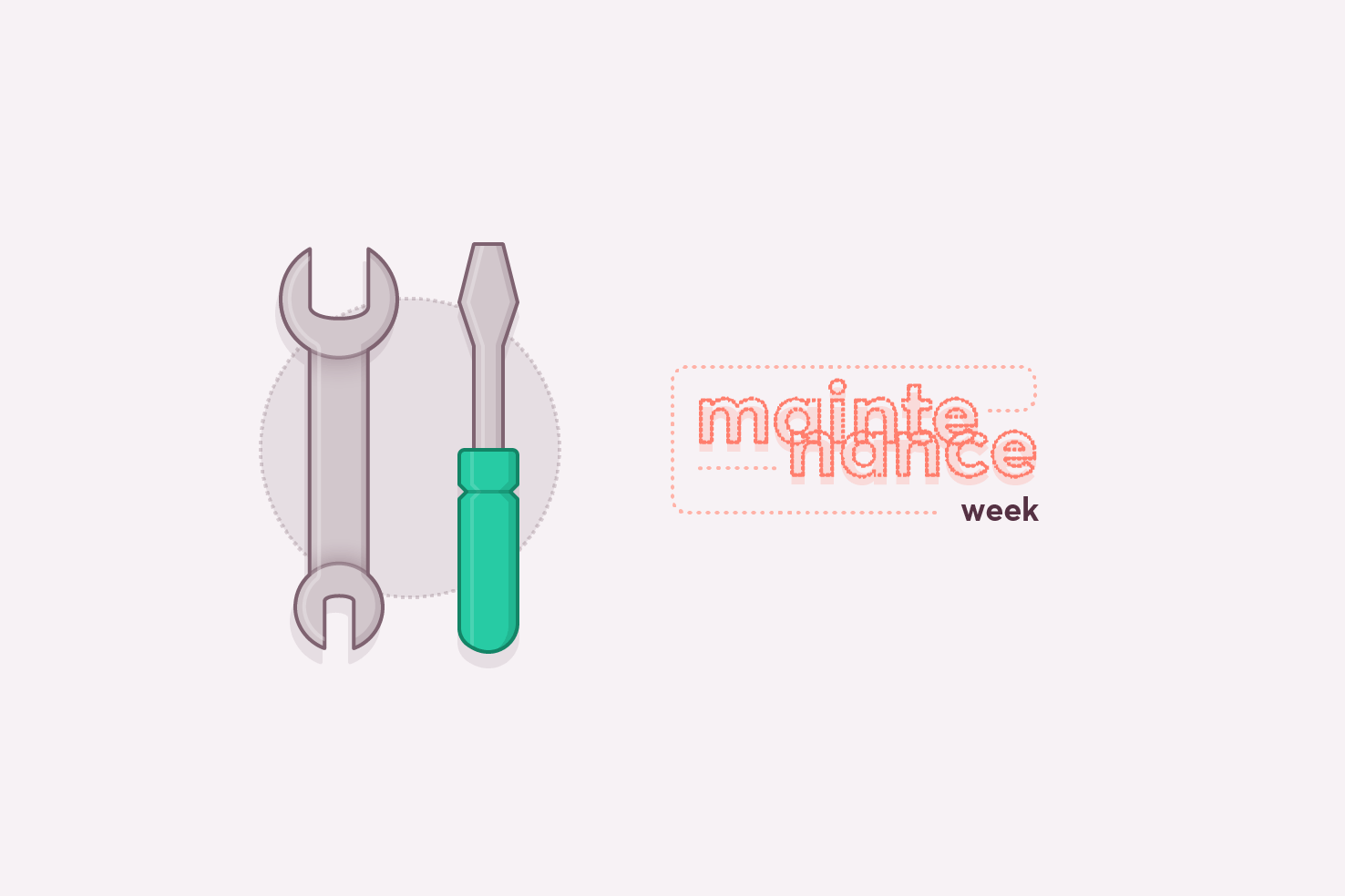
Blog

Tips and tutorials about the design and build of web interfaces

My design process — v6 case study

My design process — v6 case study

The redesign of this website has been needed for some time. Overall the website is quite small in terms of templates required. I wanted to put the effort into making the website feel like it is a growing source of content. There is much to cover in this, as I start with the new logo briefly, sketching, wireframes and design.

Alternatives to Circular

Alternatives to Circular

Circular is very much in the spotlight at the moment. It has a distinct look to it that so many huge companies are using. From Google to airbnb, it’s everywhere. If you’re looking for alternatives, with different prices and through a different service, this post is for you.

Shop filter series: visual style completion

Shop filter series: visual style completion

In the last post the basis for the visual style was set. In this post it will continue with that to complete the filters. There are some challenging areas like colour selection, as it can look overwhelming.

Shop filter series: visual style

Shop filter series: visual style

The previous post in the series completed the wireframes. They’re a solid basis for adding visual style. The content and interface elements required are all there. Further layout refinements, colour choices, typography and clarity improvements will be made throughout this post.

Maintenance week #5

Maintenance week #5

Maintenance weeks are where detail website tasks, instead of a regular post. I spend time fixing bugs, updating grammar and posts in general, as well as adding featured images. It varies what I will do, and this posts serves as detailing what has been done.

Shop filter series: completing the filters

Shop filter series: completing the filters

Continuing from the last post, which looked at the initial sketching and wireframe. This post will focus on the completion of each of the filters.

Shop filter series: sketching & starting wireframes

Shop filter series: sketching & starting wireframes

Filtering is a huge part of online shops, it’s an effective form of navigation. In most cases it’s an area which is overlooked on small screens. I have seen some good implementations and many lack the ease of a larger screen. In this post I want to explore the idea of it being a tab bar, starting with sketching & wireframes.

Pixel perfect templates in Illustrator

Pixel perfect templates in Illustrator

Illustrator being a vector application means it can be easy to overlook the export process and making things pixel perfect. It’s easy to do, so you don’t notice it. It’s particularly important that you try to retain this for logos and icons.

About version six

About version six

I’ve finally done the redesign of this website! Version five lived for longer than I ever intended. This post is going to be a shorter summary of the changes. I’ll be posting a full case study over the coming weeks.

Illustrator quick tip: evenly distribute objects

Illustrator quick tip: evenly distribute objects

It’s likely you know how to align things in Illustrator, but you can never remember how to space things equally, so you resort to the tedious way of spacing them individually. If you want to align objects with an equal space between them, this quick tip will show you how.

Websites using alternatives to the ‘hamburger’

Websites using alternatives to the ‘hamburger’

It’s been proven as apps have shifted away from the ‘hamburger’ navigation, to a bottom bar, engagement and browsing metrics have increased. Over time these findings have an impact on the thought process of those designing websites. In this post I detail a list of websites that are using the tab bar navigation.

Maintenance week #4

Maintenance week #4

Maintenance weeks are where detail website tasks, instead of a regular post. I spend time fixing bugs, updating grammar and posts in general, as well as adding featured images. It varies what I will do, and this posts serves as detailing what has been done.