Designing a pricing table in Illustrator
Pricing tables are reasonably common for various types of services, they serve as a way to give the user an anchor. Generally meaning that you’ll be able to direct the customer into the package the company really wants to sell most of. While this post won’t cover the psychological side of that, it will focus on clarity and visual style. It’s an interesting website element to take a look at, so let’s start.
1,209 views


Pricing tables are reasonably common for various types of services, they serve as a way to give the user an anchor. Generally meaning that you’ll be able to direct the customer into the package the company really wants to sell most of. While this post won’t cover the psychological side of that, it will focus on clarity and visual style. It’s an interesting website element to take a look at, so let’s start.
What you’re making and download
Choose your content
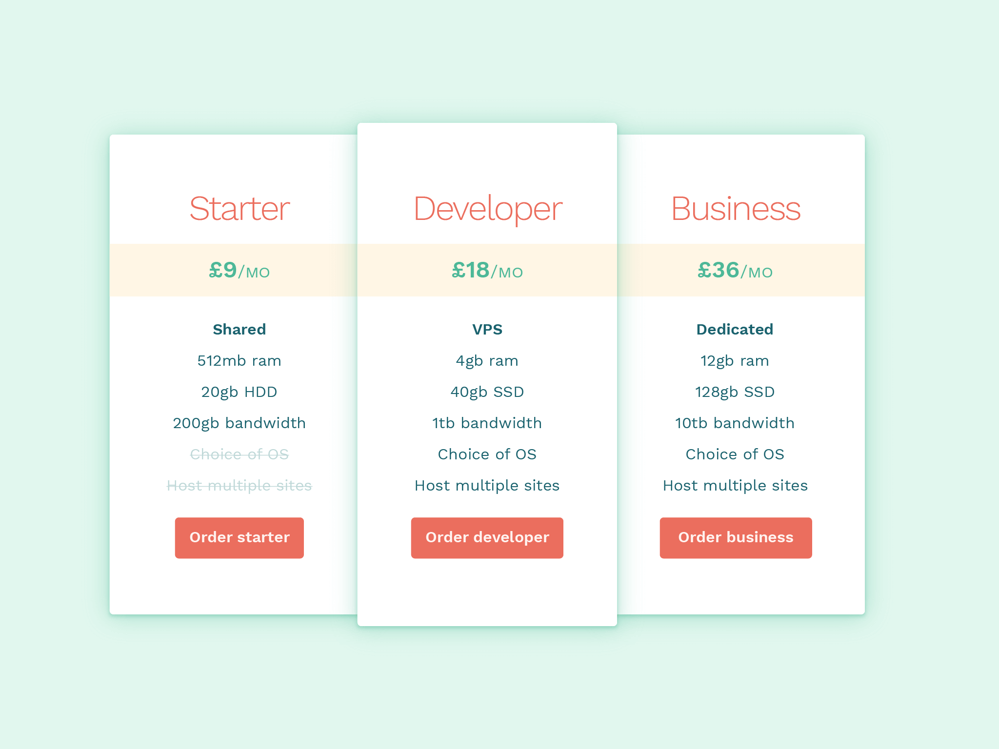
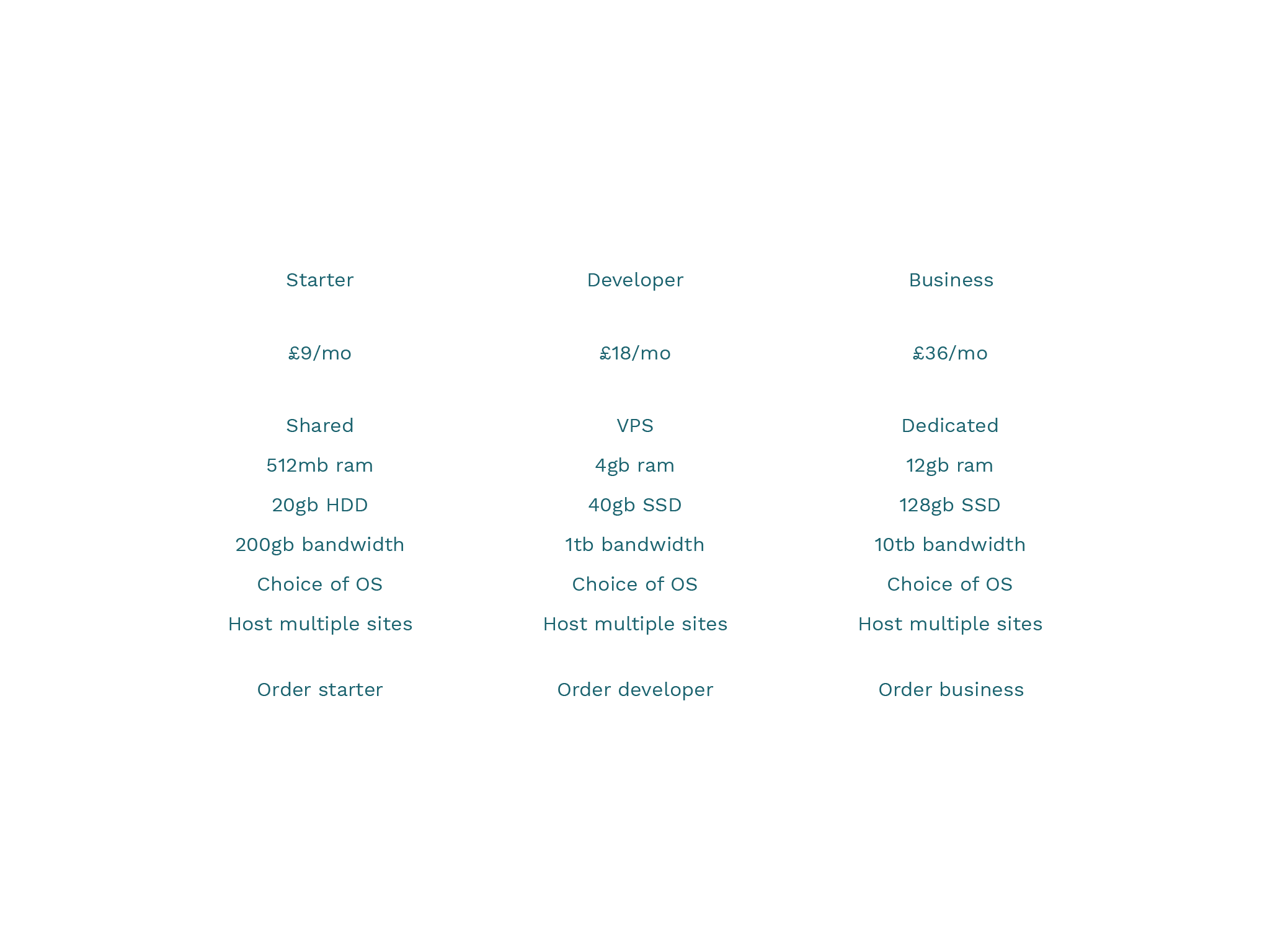
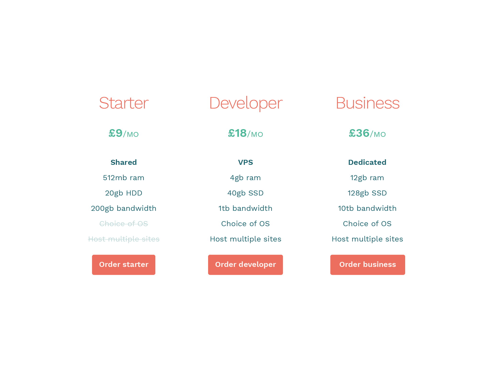
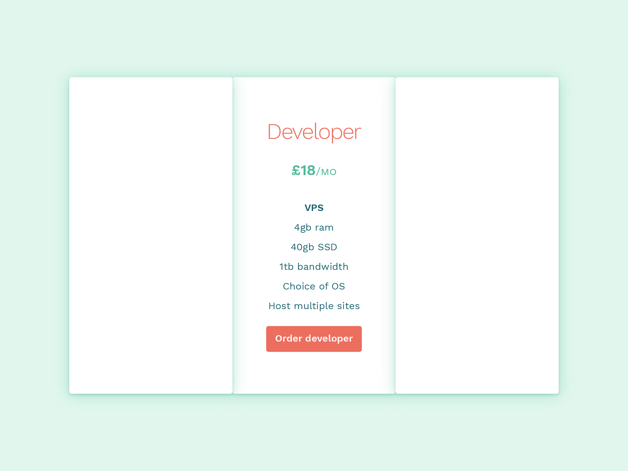
You may have a real world use, which I would suggest using, but I’m going to use a fictional web hosting service as an example, with developers/designers with the ability to host side projects on different domains.
| Starter | Developer | Business |
|---|---|---|
| £9/mo | £18/mo | £36/mo |
| Shared | VPS | Dedicated |
| 512mb ram | 4gb ram | 12gb ram |
| 20gb HDD | 40gb SSD | 128gb SSD |
| 200gb bandwidth | 1tb bandwidth | 10tb bandwidth |
| Choice of OS | Choice of OS | |
| Host multiple sites | Host multiple sites | |
| Order starter | Order developer | Order business |
I’ve added a line through parts of the service that are not available in others. This will be important for clarity later.
Design decisions
A 3 column layout is a must, so that offers an immediate constraint. The decisions to be made are round highlighting the most important features. All the information is important in the table but the deciding factors would likely be based around price and what type of server.
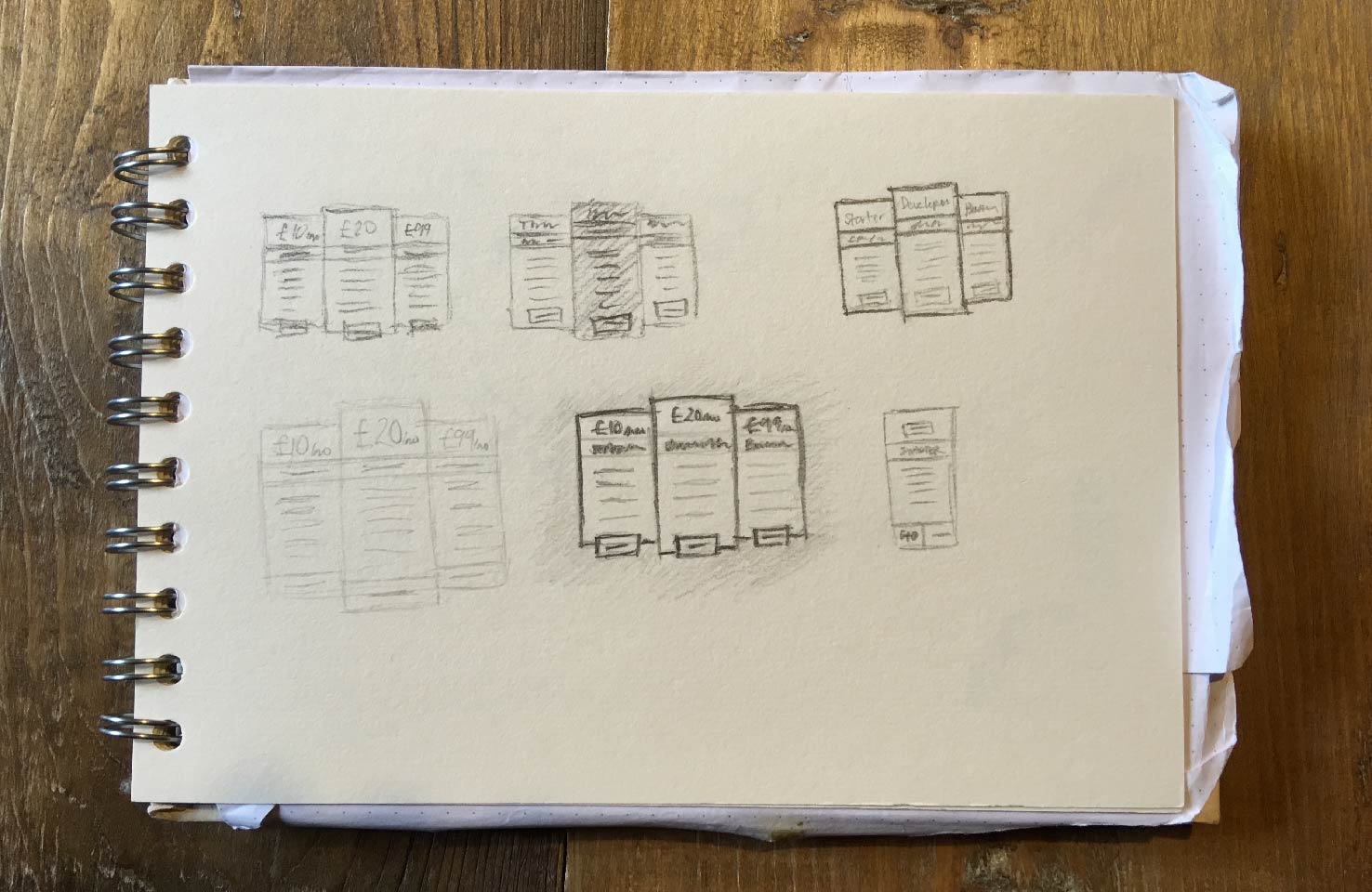
Initially I tried a couple of smaller sketches, and decided the name being larger is the best route. This is a common practice simply because price is always a hurdle, an important part, but you don’t want to emphasise it too much. The developer plan will have attention drawn to it through a slightly different size. The reason for this is the intention for it to be the most popular package.
Choose a typeface
To get into more design choices, through the typeface, I’m going to use Work Sans. It offers good legibility and has a good options at the bolder and lighter ends of the scale.
You can find it on Google Fonts, however, you may like to make your own choice.
Choose a colour palette
If you want to choose your own palette, I encourage you to, however this is the one I will be using.
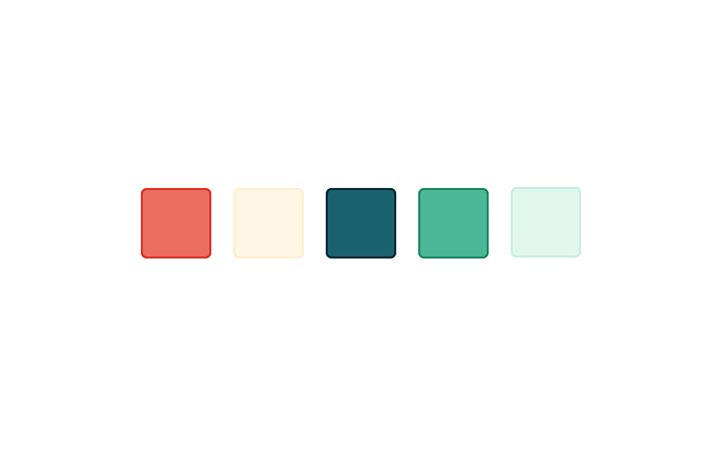
| Colour | Hex |
|---|---|
| Red | #eb6e5e |
| Light yellow | #fff6e5 |
| Dark blue | #1a626e |
| Green | #4db898 |
| Light green | #e1f7ee |
Position the content
For this particular element it makes sense to get the rough layout defined by type only. This will allow for the sizes of each of the containing rectangles to be determined easily and changed less.
Start by typing out in separate type layers, spacing the items and groups, in the following order:
- Title
- Price
- Features
- Button text
Content styles
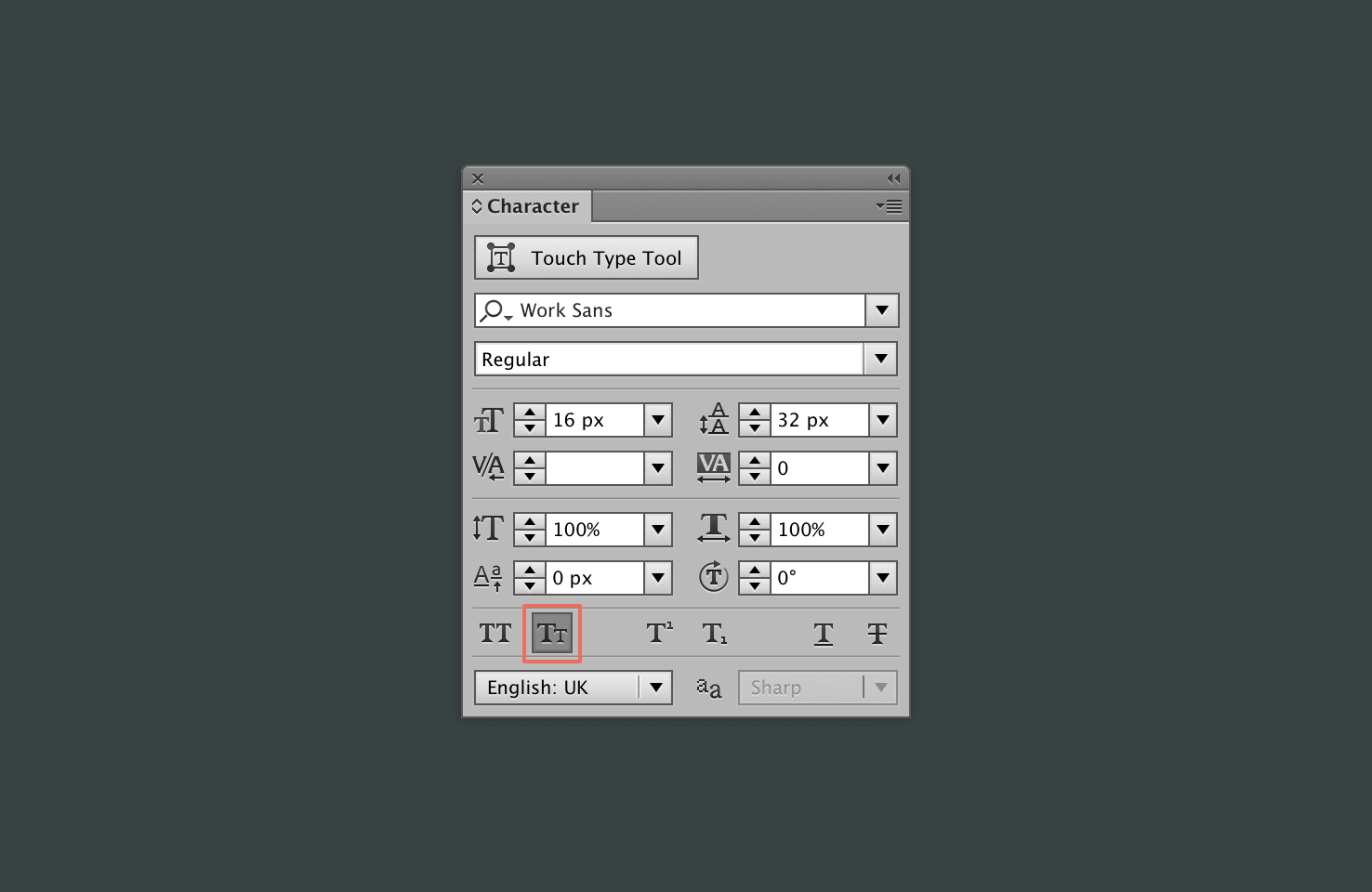
The majority of the styles applied will be through using the character panel. This may be open by default, but if not go to Window > Type > Character or press cmd + t
Title
For the title of each I have chosen to make them red, as they will be quite relatable for the user and size them appropriately.
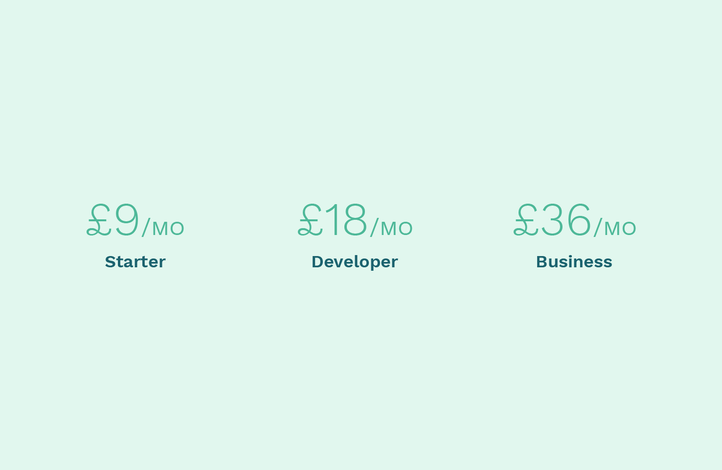
Price
The price doesn’t need to be too emphasised, but it allows you the opportunity to provide some good visual separation, between the title and details.
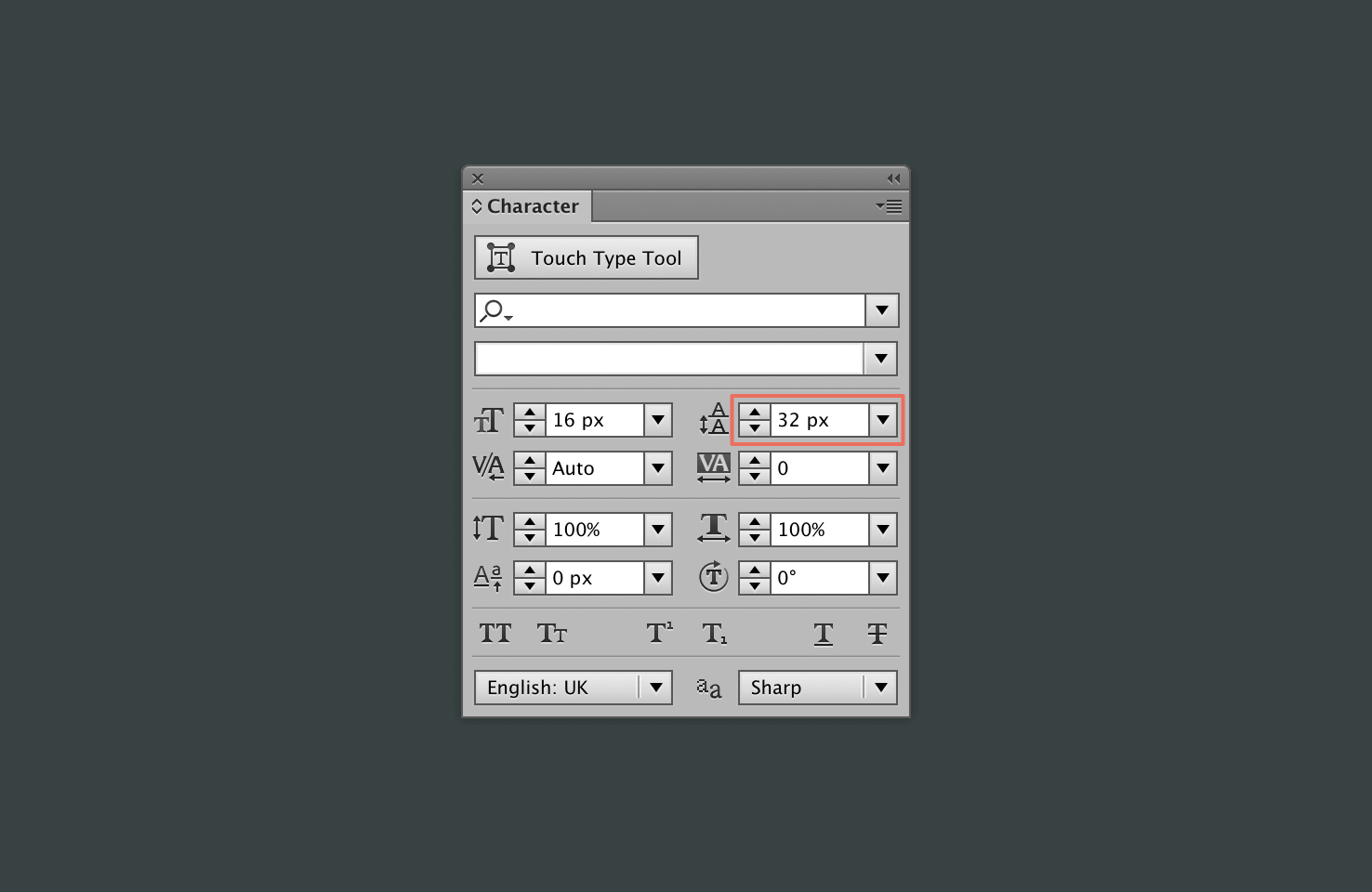
For now make the value semibold and increase the size to 24px. Next change the ‘/mo’ to small caps keeping that at a regular weight and increasing the font size to 18px.
The small caps in comparison to numbers aren’t very small, hence the choice to decrease the size.
Finally make change the colour to #4db898.
Features
For the features, the server type is the most important factor. With a little knowledge you can immediately work out the quality you’ll get. So to add emphasis here is ideal, increase the weight to semibold.
Change the colour to #1a626e and increase the leading to 32px. This will give sufficient space between each item.
Reducing emphasis on features not included
The final step for the features is to have a way to show that they’re not included. For this select in starter the ‘choice of OS’ and ‘Host multiple sites’ and change the colour to #bed8d8.
Button
The button text should be semibold and have a red background. Add a rounded rectangle, select it by finding the rectangle in the toolbar. Click and hold to reveal the extra items.
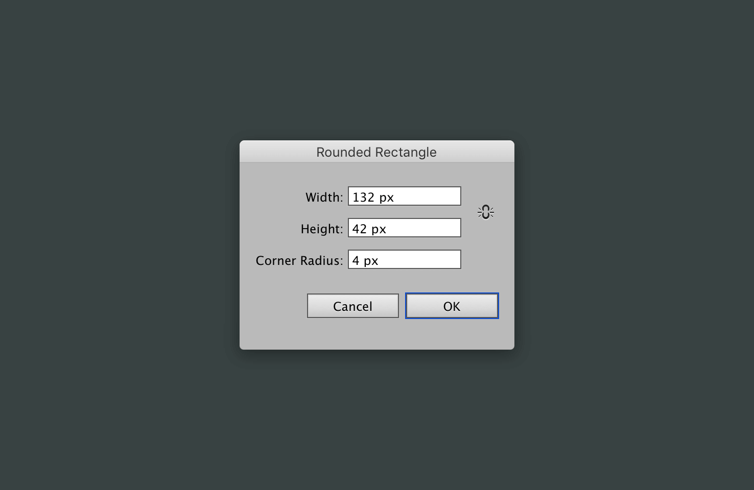
For the ‘Order starter’ dimensions will be 132 width by 42 height. The corner radius will be 4px. Repeat this process for the other buttons, keeping the same height.
Button text colour
Finally, as the text colour won’t be very readable on this background colour change it to #fff3f0. It’s not quite white, but a very light shade, this creates a nicer contrast.
Check in
Now that you’ve applied all the text styles, and a background for the buttons you’re not far from complete.
Making each section clear
In these next steps you’ll make each section clearer. Firstly, select everything and press cmd + g and then open the align panel from Window > Align. Next change ‘Align to:’ to Align to Artboard.
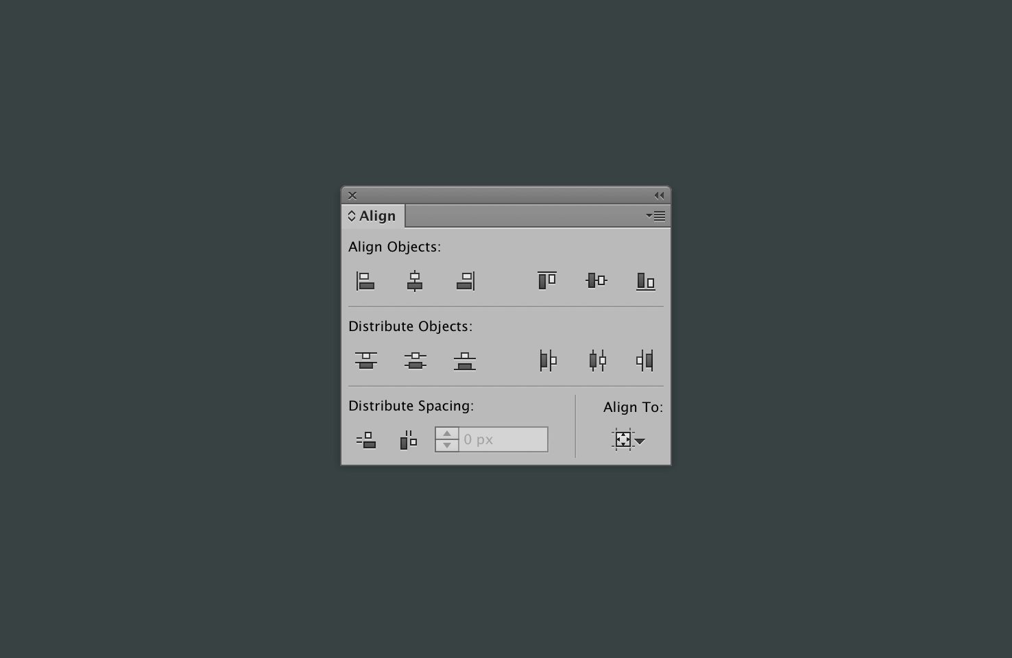
Align everything to the vertical centre, this sets everything up nicely for later alignment.
Background
Press m to select the rectangle tool, click the artboard and draw a rectangle the size of the artboard. Following that cut it cmd + x, and paste it in the background cmd + b.
Now change the background to #e1f7ee. With the layer still selected press cmd + 2, this should lock the layer. This will ensure you don’t select it later as there is no further changes needed.
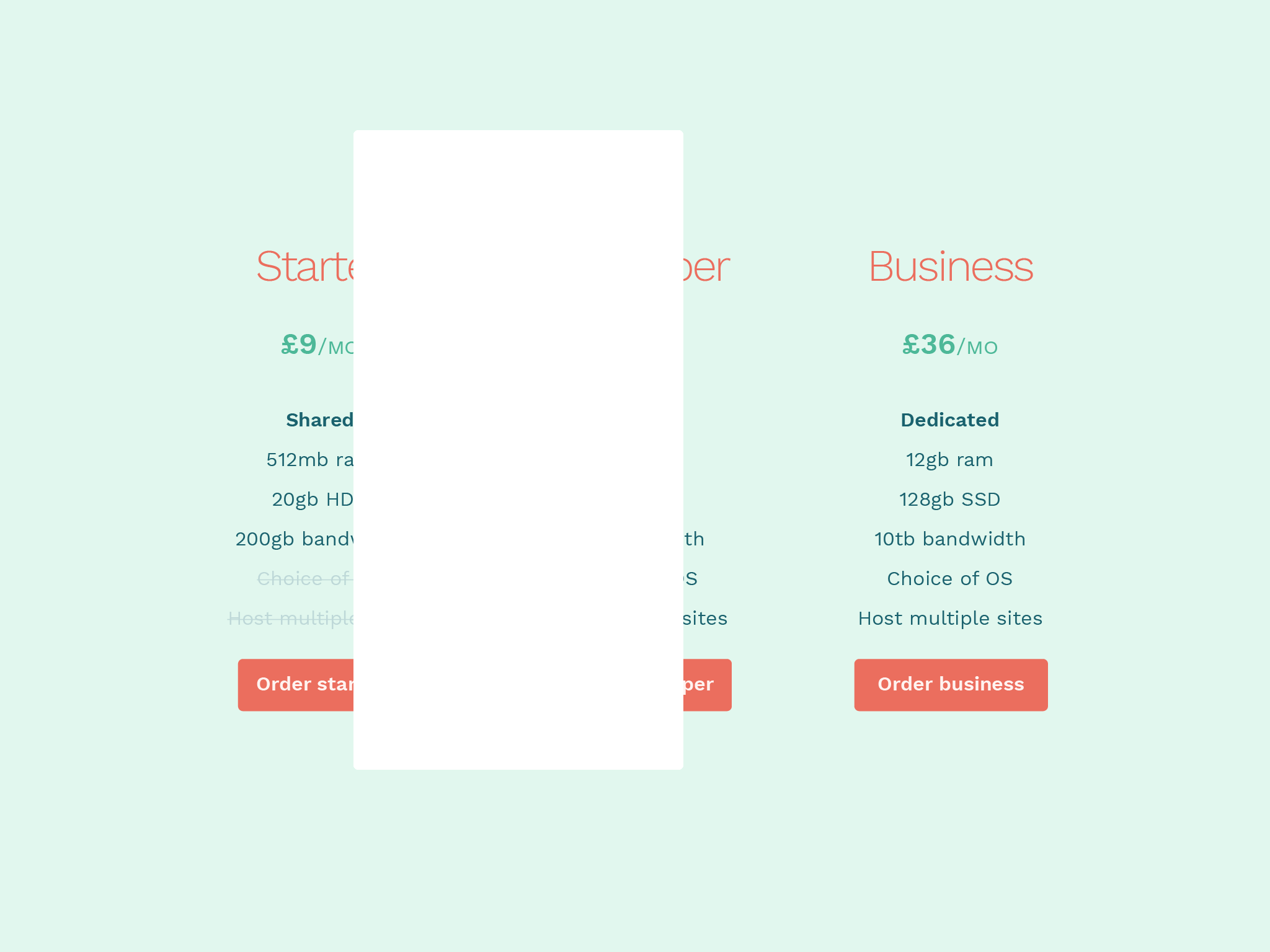
Sectioning
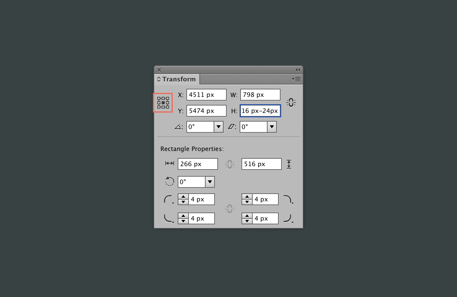
Find the rounded rectangle tool, then click the artboard and add dimensions 266px width by 516px height with a 4px radius.
Once in place, press cmd + [ until it has gone to the back of the text.
Alignment
With the shape still selected using the align window from earlier, align it both horizontally and vertically on the artboard.
Things will be a little out of place with the central column, select everything in the central column, and align to the horizontal centre.
Add a shadow
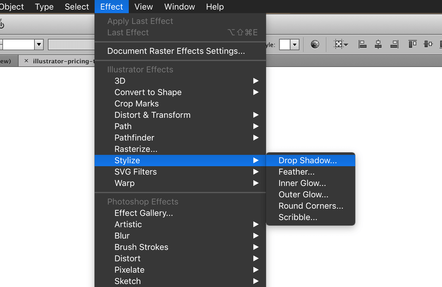
Next with the shape still selected, in the menu go to Effect > Stylize > Drop Shadow.
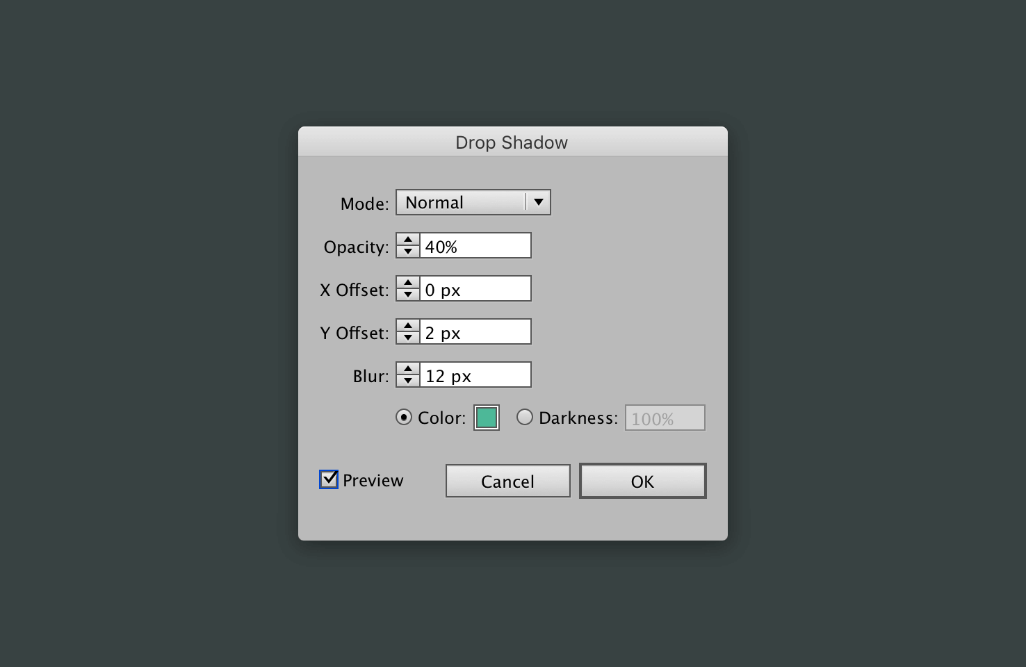
With the drop shadow window open, add the following settings:
| Setting | Value |
|---|---|
| Mode | Normal |
| Opacity | 40% |
| X Offset | 0 |
| Y Offset | 2px |
| Blur | 12px |
| Color | #4db898 |
The shadow colour
When choosing a shadow colour it should take on some of the colour around it. Hence why the shadow is a darker green, if you were to use black, it’s less true to how shadows behave. Ideally it would be different colours for the central column, this is something that is for a post of it’s own as it’s difficult to achieve without multiple layers.
Add a different shadow
Copy your original shadow layer, paste it in place with cmd + shift + v.
In the appearance panel, which can be found under Window > Appearance, click the drop shadow to modify it. Change the shadow blur to 2px, and move it behind the text layers with cmd + [.
Group and duplicate the shadows
Select both of the shadow layers and group them with cmd + g.
Duplicate
With the group still selected, paste in place cmd + shift + v. Then nudge across until it lines up nicely at the side. Repeat this process again.
Resize
Now you should have two rectangles at either side. Select both of them and subtract 24px from their height.
Making sure your reference point is in the centre, and constrain width and height proportions is off.
Send to back and more alignment
Using cmd + [, send the two resized rectangles to the back. Now at this stage some alignment may be off, select each column and click the rectangle layer. The line should become bolder, now in the align panel use ‘Horizontal Align Center’.
This is aligning to a key object, repeat the process for the other side. Then take each side individually and nudge it in 12px.
Adding visual separation to the price
After getting this far, there is only improving the visual separation of the price. Add a rectangle that is 266px width by 54px height, with the fill colour #fff6e5. Place it roughly behind the price, then using the align to key object technique
Duplicate and align in each section
Copy, paste in place and then position it with the other price. Repeat this process for the third column and you’re done.
Final thoughts
There are ways to build upon this add further dimension to buttons and such things. To keep the tutorial shorter I opted against this.
Feel free to download the finished files.
View on Github