Hero area series: designing for small screens
Part two of the hero area series — adapting the desktop design for mobile screens. Only mobile-sized resolutions are covered, with tablet needing only minor adjustments.
— views
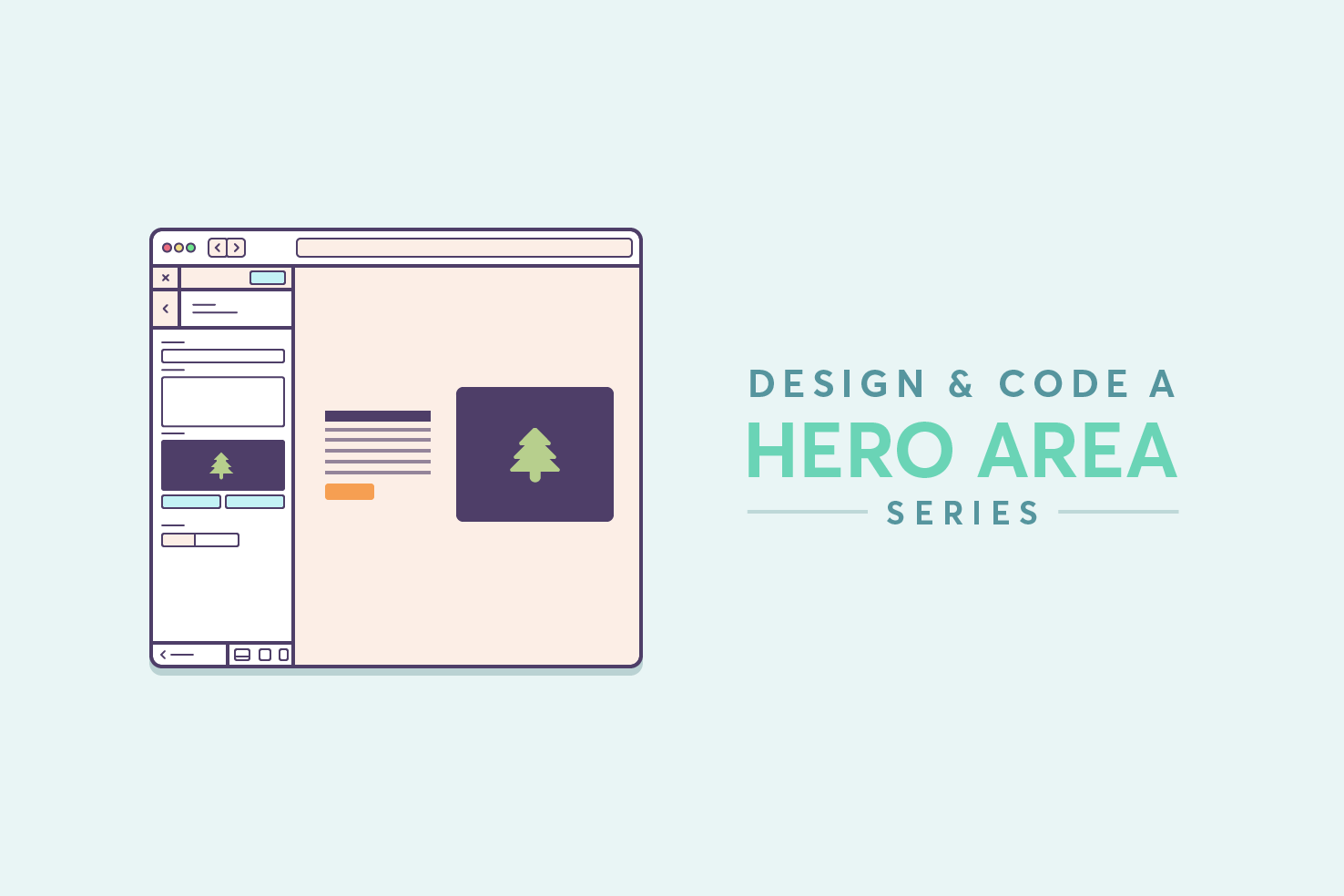
The second post in this series the focus switches to small screens. The previous post was primarily on desktop so far, but considerations have been highlighted throughout for smaller screens. I will only cover ‘mobile’ sized resolutions, as for this particular layout you will only need to make minor adjustments for ‘tablet’ sized resolutions.
What we’re designing
Don’t want to do the tutorial?
If you’d like to skip ahead, download the completed Illustrator file.
Refresher on the sketches
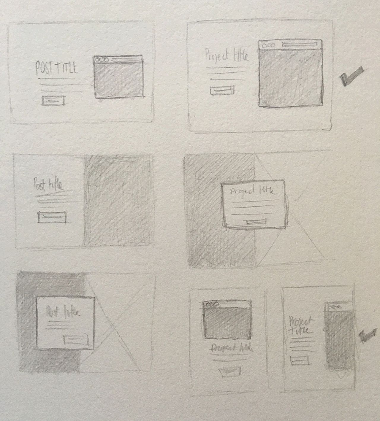
Referring back to the sketch, the aim is to keep the same kind of layout. It will be tricky to achieve for the 320px to 380px wide screens, you will have to use the space efficiently.
New artboard
You will want to create a new artboard shift + o. Modify the size to be 320px by 568px.
I’ve chosen the iPhone 5s resolution size, at 320px wide it gives us a minimum to work with. Like earlier with our main artboard, it’s just an estimation and serves as a guide.
Add a background layer
If you’re carrying on from the previous post. You added a ‘small-screen’ layer, add the same blue background as our ‘large-screen’ layer, appropriately sized to the artboard.
Copy your title, description & button
In the ‘small-screen’ layer we made earlier, copy the text layers and paste them with the layer selected. Drag them over to the left of the artboard.
Title
Change the font size and leading to 24px. The width shouldn’t need to be adjusted.
Description
Change the font size to 12px and the line height to 18px. The width of this text area needs to be adjusted to closely match the width of the title.
Button
Similarly the button needs adjusting, it needs to feel apart of the layout proportionally. The width I ended up with was 108px and 30px height. This should equate padding to around 9px at the top and bottom and 24px left and right. The font size is also adjusted to 12px to match the description.
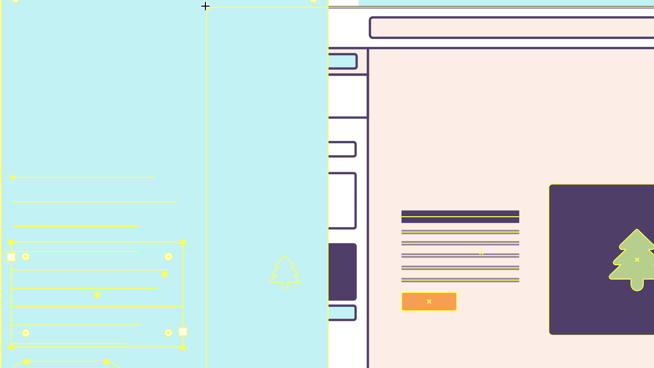
Where you should be
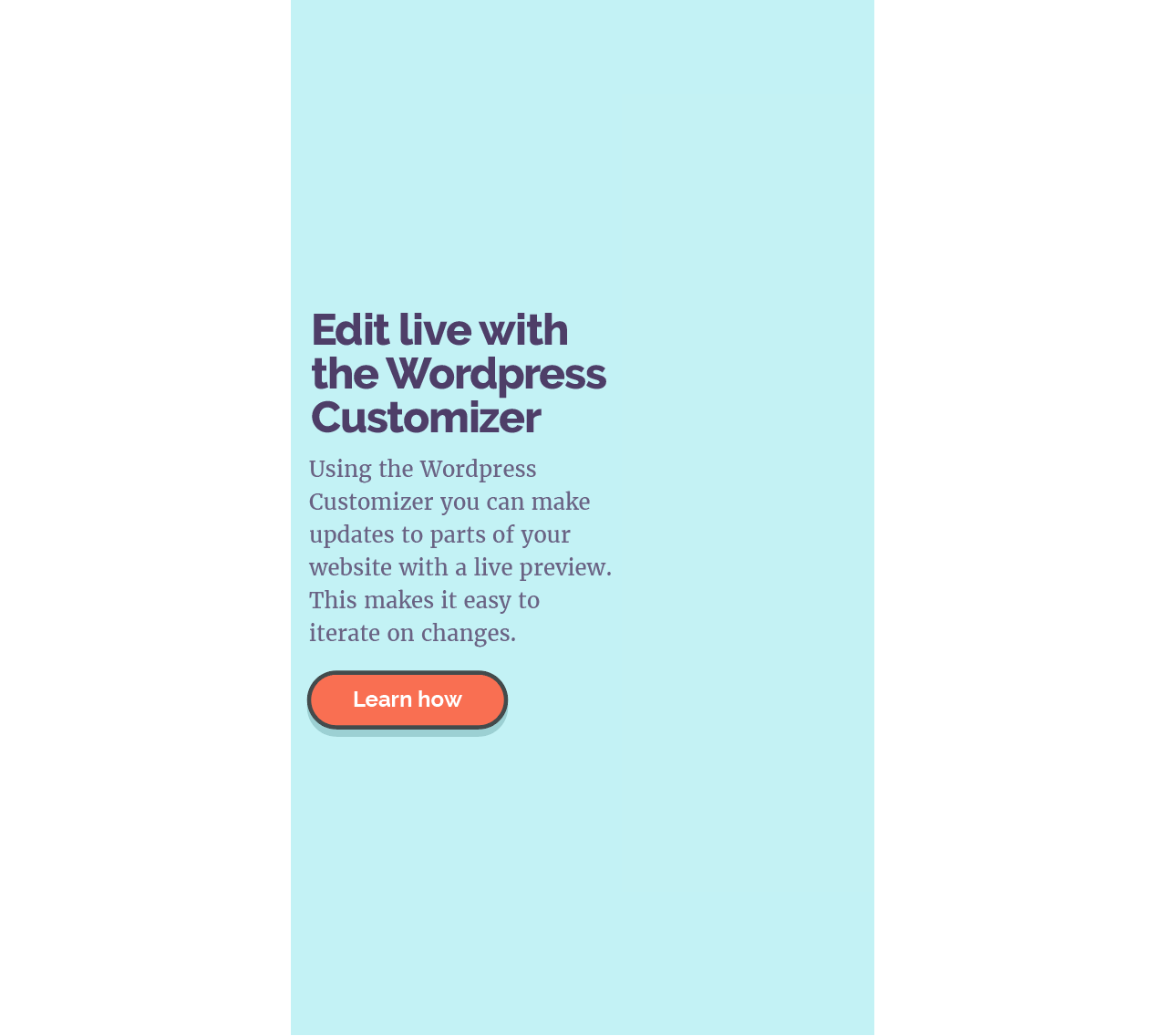
We’re aiming for the text and button to occupy just over 50% of the space. For such a narrow screen, it’s important to maintain some kind of line length. The image will occupy enough of the space to be purposeful too.
Adjusting the image
The image doesn’t seem straight forward, but if you think the whole of the image isn’t 100% crucial to be shown. It’s a complement to our text and post. So you can afford to crop some off, and that’s what we will do in this case.
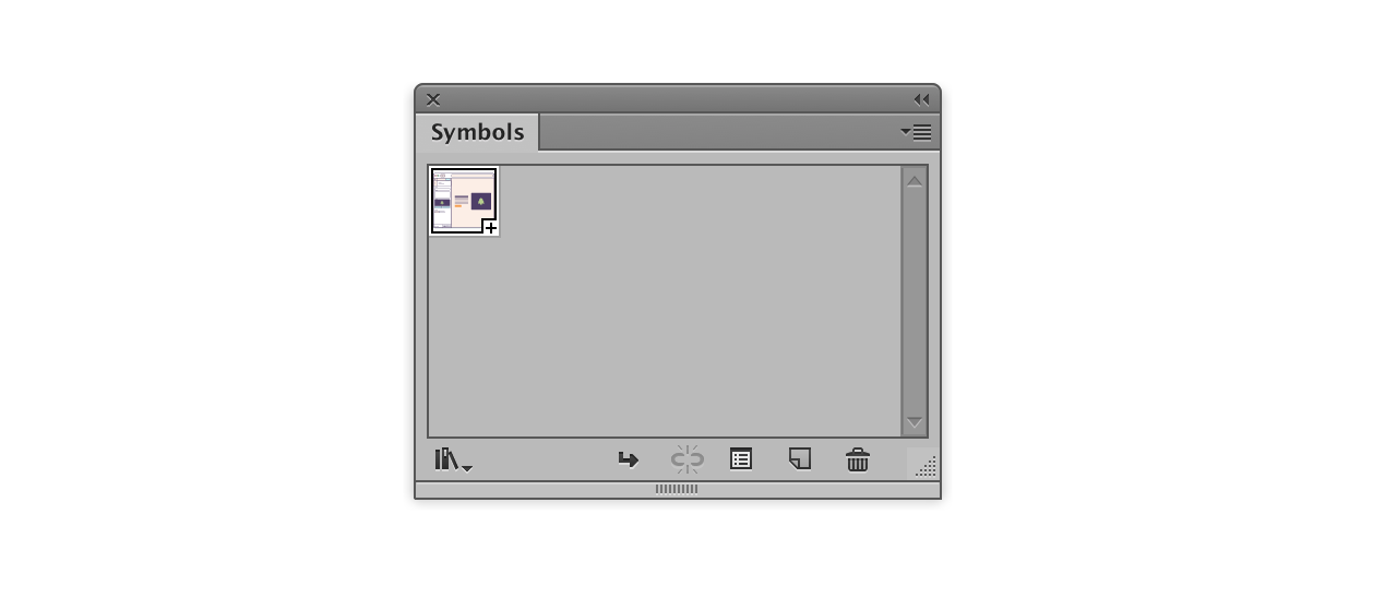
Make a symbol
Making a symbol allows us to make adjustments to both images from one place, should we need to in future. Go to Window > Symbols, select the image from the larger artboard and drag it into the Symbols panel.
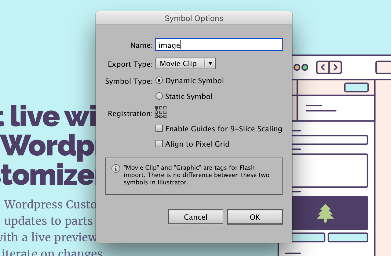
You’ll be presented with Symbol Options, give it a name, and change the registration by clicking the top left. Finally, click OK.
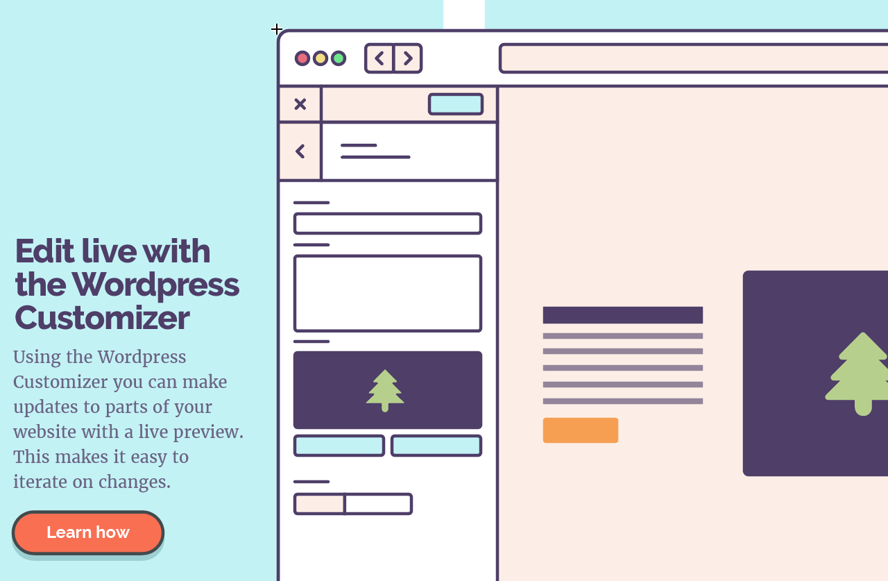
Adding the symbol
With your ‘small-screen’ artboard selected, drag the symbol into your document to your small screen artboard.
Masking the artboard
You’ll have the image roughly positioned. For completeness, we want that to only show. The easiest way to do this is with a mask.
Paste the background layer on top
Select the background layer, and paste it in place by pressing cmd + shift + v. Now select everything on that artboard by clicking and dragging to select.
Finally, press cmd + 7 this makes a mask.
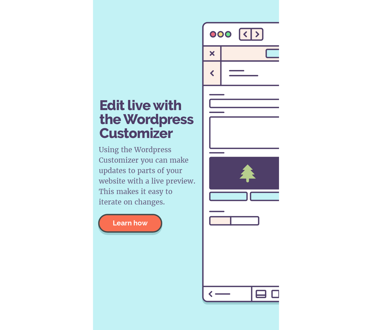
What you should end up with
As the image demonstrates the Customizer UI is still showing. This is a nice balance of image against text. It won’t always work this favourably, however, if we try, our layouts are much more coherent.
In the next post
The next post we will look at writing the necessary CSS and HTML to make it usable.
View on Github