This post was published 11 years ago
There’s a chance things are out of date or no longer reflect my views today
Remove letter-spacing from last letter
The letter-spacing property adds space after the last letter, which causes misalignment on centred or right-aligned text. Here’s how to fix it.
— views


One of the frustrating things about the letter-spacing property is the addition of the letter-spacing you apply to the last letter of the text. This is fine when you have left aligned text, however if you right align or centre the text, you’re left with a little bit of space.
The problem
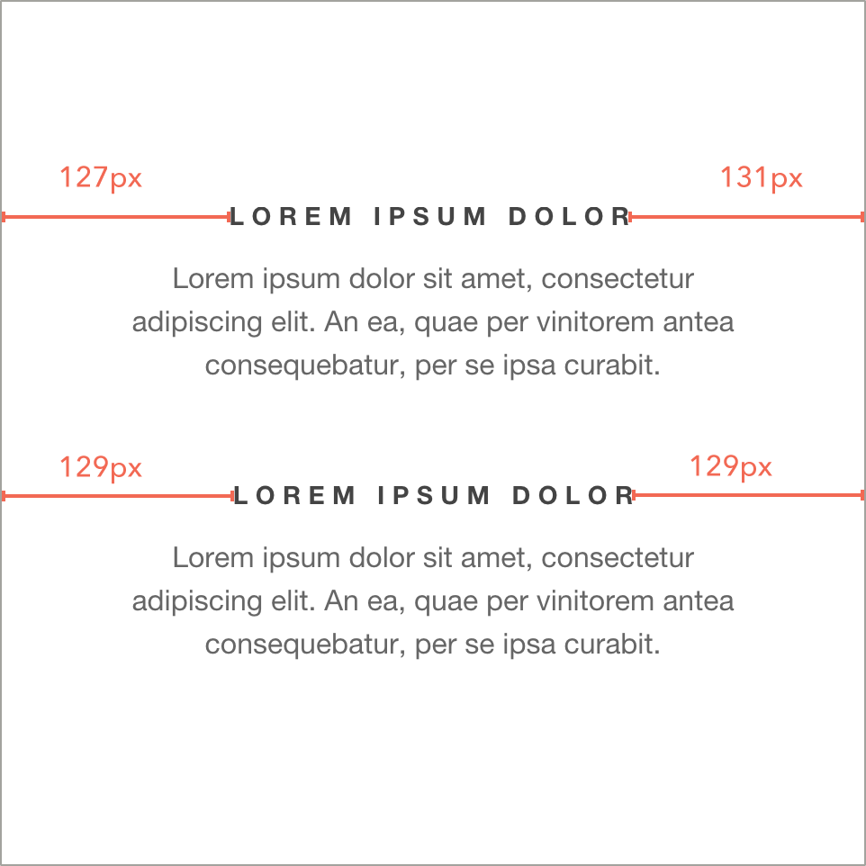
The top set of text shows you the additional space that is added due to letter-spacing. The bottom shows the corrected text with the margin-right applied.
The solution
The solution is just one line of CSS. A margin-right equal to the letter-spacing you apply.
margin-right: -0.3em;Additional tip
Set up a reusable class for any text that you want to apply letter-spacing to in em’s this means you don’t have to recalculate the additional spacing offset and can apply letter-spacing to any size text with it being proportional to that size.
.letter-spacing {
  letter-spacing: 0.3em;
  margin-right: -0.3em;
}
Removing the excess underline from letter spacing
To remove the extra underline from text with letter spacing, the solution is not too elegant, nor is the extra underline. So it balances itself out. There are two solutions to this problem, however they’re not perfect. Both involve pseudo elements and a mix of positioning.
Method one: cover with a small box
The first one involves using a pseudo element and positioning a small box so it covers up the excess. The element has background colour that matches the one behind the element.
.one {
  display: inline-block;
  letter-spacing: 3px;
  position: relative;
  text-transform: uppercase;
  text-decoration: underline;

  &:after {
    content: '';
    width: 4px;
    height: 4px;
    position: absolute;
    bottom: 1px;
    right: -1px;
    background: #eee;
  }
}
To understand how this works, I have a small square that is 1px wider than the letter-spacing. It’s positioned 1px outside of the element. I found that there was a half pixel or so that was still visible when you precisely match the excess.
Method two: create your own underline
.two {
  display: inline-block;
  letter-spacing: 3px;
  position: relative;
  text-transform: uppercase;
  text-decoration: underline;

  &:after {
    content: '';
    position: absolute;
    z-index: -1;
    left: 0;
    bottom: 2px;
    right: 3px;
    height: 1px;
    background: #444;
  }
}
To understand how this works, the right value must be equal to the letter-spacing amount. In this case it’s 3px. The colour of the underline is controlled by the background. This could also be a border.
Things to be aware of
- They do not account for multiline
- They must be inline-block to work effectively
- It doesn’t work well with block elements