Bento grid layout with CSS grid and container queries
Bento grids offer a unique layout challenge for CSS. With the use of Tailwind you can create a flexible layout with modern CSS grid and @container queries.

Bento grids are an interesting layout pattern, and CSS grid handles them well. This post covers building a bento with CSS grid and @container queries to make subtle adjustments throughout. The idea was inspired by the discussion around whether masonry is needed in CSS at the time of writing.
For this example, masonry isn’t required — we have a known number of items with predetermined sizes, so CSS grid is all we need.
I make the assumption that you’re comfortable setting up Tailwind for your project
The bento design
The design showcases a rough idea of an app I wish existed. Each section displays a different feature with larger sections having an illustration of the feature.
Considerations
- Content spans different column widths
- Icon plus title style in unpredictable width containers
- Rows with equal height content and imagery
- Images will need to retain or change aspect ratio
- Image masks will need to change with different image crops
Project files
The design is available through Figma’s community and the code is available through Github. There’s two layout options in both.
HTML structure
First, it’s necessary to get the structure of the bento grid. Then it makes sense to cover the rest of the layout and visual style with Tailwind.
Create a container
Everything needs to be contained within a <div> with this you’ll apply the grid styles to it.
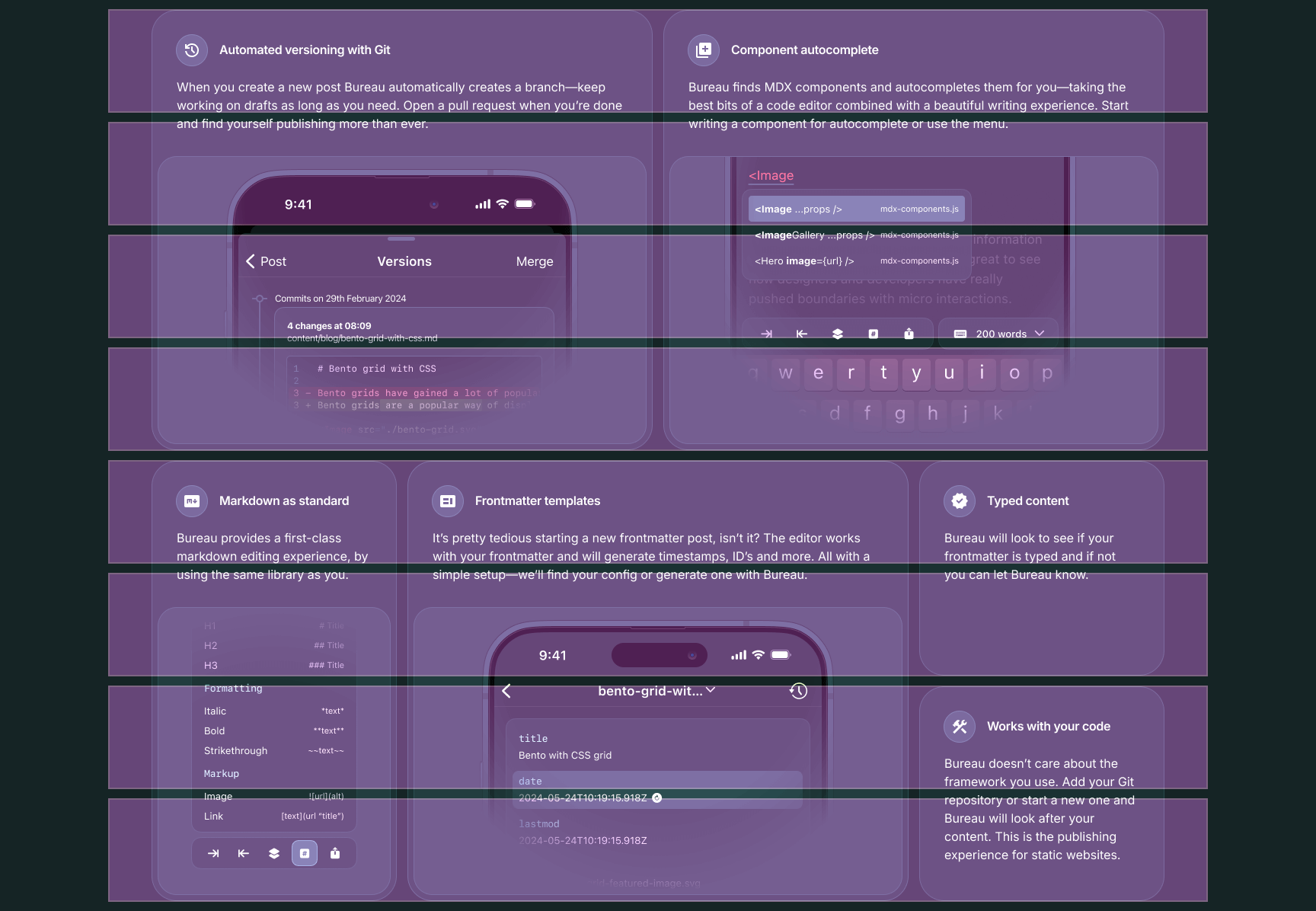
12345678910111213<section> <header> <h2>Publish from anywhere with your frontmatter blog</h2> <p> Why should you be left out of a cross device writing experience because you’re using a static site? Bureau takes away the pain of manually moving posts to your codebase and gives you the writing experience you need. </p> </header> <div class="bento-container"> <!-- sections here --> </div></section>Basic structure for each section
As the design features sections with different sizing and visual weight through use of imagery your markup for each will differ slightly.
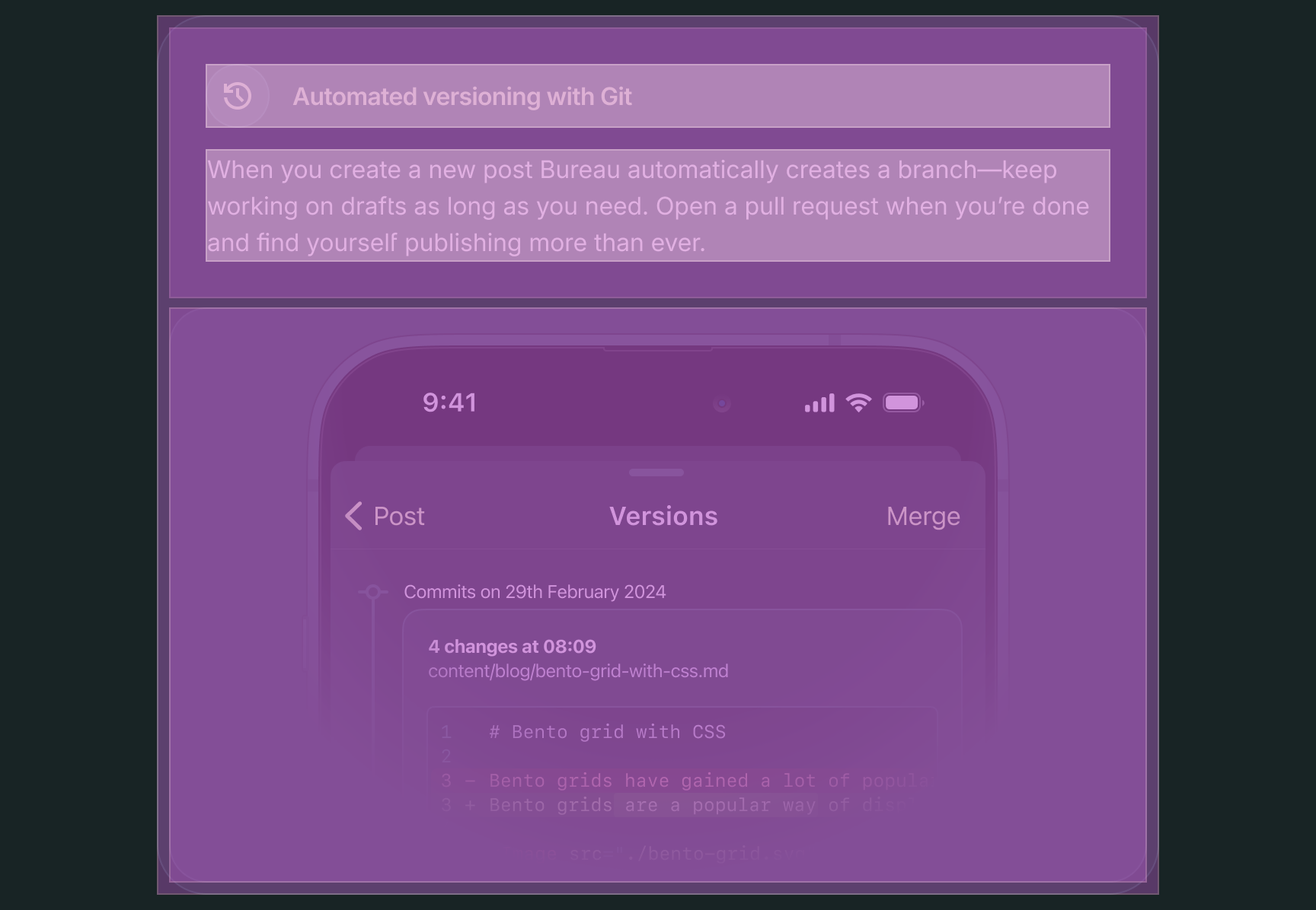
123456789101112<section class="bento-section"> <div class="bento-body"> <h3> <span aria-hidden="true"><svg width="24" height="24"><use href="#automated"></svg></span> Automated versioning with Git </h3> <p>When you create a new post Bureau automatically creates a branch—keep working on drafts as long as you need. Open a pull request when you’re done and find yourself publishing more than ever.</p> </div> <div class="bento-image-container"> <img srcset="../images/git-versioning.png 1x, ../images/[email protected] 2x" width="468" height="376" class="bento-image"> </div></section>Grouping the text based content together and applying a container around the image allows you greater control later when adding style and layout.
Putting all the HTML together
Overall for this design there’s 6 sections. Some sections will have an image others without. Some will span more columns and some will span more rows. For layouts like this tailwind is perfect to manage these variations.
If you’re working in an environment that allows for a components, each section could be a single component with some properties for customisation.
1234567891011121314151617181920212223242526272829303132333435363738394041424344454647484950515253545556575859606162636465666768697071727374<section class="features"> <header class="features-header"> <h2 class="features-title">Publish from anywhere with your frontmatter blog</h2> <p class="features-description">Why should you be left out of a cross device writing experience because you’re using a static site? Bureau takes away the pain of manually moving posts to your codebase and gives you the writing experience you need.</p> </header> <div class="bento-container"> <section class="bento-section bento-section-primary"> <div class="bento-body"> <h3 class="bento-title"> <span aria-hidden="true"><svg width="24" height="24"><use href="#automated"></svg></span> Automated versioning with Git </h3> <p class="bento-description">When you create a new post Bureau automatically creates a branch—keep working on drafts as long as you need. Open a pull request when you’re done and find yourself publishing more than ever.</p> </div> <div class="bento-image-container"> <img srcset="images/git-versioning.png 1x, images/[email protected] 2x" width="468" height="376"> </div> </section> <section class="bento-section bento-section-primary"> <div class="bento-body"> <h3 class="bento-title"> <span aria-hidden="true"><svg width="24" height="24"><use href="#autocomplete"></svg></span> Component autocomplete </h3> <p class="bento-description">Bureau finds MDX components and autocompletes them for you—taking the best bits of a code editor combined with a beautiful writing experience. Start writing a component for autocomplete or use the menu.</p> </div> <div class="bento-image-container"> <img srcset="images/component-autocomplete.png 1x, images/[email protected] 2x" width="468" height="376"> </div> </section> <section class="bento-section bento-section-secondary"> <div class="bento-body"> <h3 class="bento-title"> <span aria-hidden="true"><svg width="24" height="24"><use href="#markdown"></svg></span> Markdown as standard </h3> <p class="bento-description">Bureau provides a first-class markdown editing experience, by using the same library as you.</p> </div> <div class="bento-image-container"> <img srcset="images/markdown-menu.png 1x, images/[email protected] 2x" width="232" height="342"> </div> </section> <section class="bento-section bento-section-primary"> <div class="bento-body"> <h3 class="bento-title"> <span aria-hidden="true"><svg width="24" height="24"><use href="#contextual_token"></svg></span> Frontmatter templates </h3> <p class="bento-description">It’s pretty tedious starting a new frontmatter post, isn’t it? The editor works with your frontmatter and will generate timestamps, ID’s and more. All with a simple setup—we’ll find your config or generate one with Bureau.</p> </div> <div class="bento-image-container"> <img srcset="images/frontmatter-templates.png 1x, images/[email protected] 2x" width="468" height="376"> </div> </section> <section class="bento-section bento-section-tertiary"> <div class="bento-body"> <h3 class="bento-title"> <span aria-hidden="true"><svg width="24" height="24"><use href="#typed"></svg></span> Typed content </h3> <p class="bento-description">Bureau will look to see if your frontmatter is typed and if not you can let Bureau know.</p> </div> </section> <section class="bento-section bento-section-tertiary"> <div class="bento-body"> <h3 class="bento-title"> <span aria-hidden="true"><svg width="24" height="24"><use href="#automated"></svg></span>Works with your code </h3> <p class="bento-description">Bureau doesn’t care about the framework you use. Add your Git repository or start a new one and Bureau will look after your content. This is the publishing experience for static websites.</p> </div> </section> </div></section>On to the grid’s CSS
The CSS required to create a bento grid is surprisingly minimal. You could also use subgrid for your columns, if your grid is defined on a parent element. It’s worth noting that subgrid would be particularly useful for aligning the internal content of each card — icon, title, and description — consistently across cards without extra CSS. That’s a worthwhile next step if you’re building this into a component system.
123456.bento-container { display: grid; grid-template-columns: repeat(12, minmax(0, 1fr)); grid-auto-flow: dense; gap: 1rem;}The important bit of CSS here is grid-auto-flow aside from defining the 12 column grid itself. This tells the grid algorithm to fill in gaps where possible with smaller grid items.

789101112/* optional */@media (min-width: 1280px) { .bento-container { grid-auto-rows: 1fr; }}Another important part to the design is grid-auto-rows. As this affects the two smaller square items they need to occupy an equal amount of rows. Only applying this to larger screens ensures it doesn’t create excess space on smaller screen layouts. This is a deliberate design choice — achieving a true bento style layout on smaller screens is difficult with the space constraint, so rows size to their content on mobile and are forced to equal height on desktop where the grid has room to breathe.
When a grid is overlayed onto the design you can see what to aim for. Each section aligns with a row and each row is of an equal height.
Grid sections CSS
This is a matter of setting how many columns and rows you wish for each section to span. As part of the design there are 3 different sizes for sections.
1234567891011121314.bento-section-primary { grid-column: span 6; grid-row: span 4;}.bento-section-secondary { grid-column: span 3; grid-row: span 4;}.bento-section-tertiary { grid-column: span 3; grid-row: span 2;}What this looks like
Without the content you’re left with a shell that matches the initial design.
Tailwind setup
For this I have used Tailwind 4, which changes from using tailwind.config.js to using CSS for most configuration.
In this CSS file we’ll setup the type as well, for which I’m using Inter Variable.
1234567891011121314151617181920212223242526272829303132333435363738394041424344@font-face { font-family: 'Inter'; src: url('/fonts/InterVariable.woff2') format('woff2'); font-display: swap; font-weight: 100 900;}@theme { /* color */ /* general */ --color-zircon: rgb(154 205 203); --color-cream: oklch(97.3% 0.086 120.3); --color-bittersweet: rgb(254 95 85); --color-lavender: rgb(204 201 220); /* gunmetal */ --color-gunmetal-900: rgb(24 36 37); --color-gunmetal-850: rgb(32 48 50); --color-gunmetal-800: rgb(40 60 62); --color-gunmetal-750: rgb(48 72 75); --color-gunmetal-700: rgb(43 78 81); --color-gunmetal-650: rgb(64 96 100); --color-gunmetal-600: rgb(72 108 112); --color-gunmetal-550: rgb(80 120 124); --color-gunmetal-500: rgb(88 132 137); --color-gunmetal-450: rgb(95 144 149); /* mask */ --image-mask-bottom: radial-gradient( 125% 85% at 50% 15%, #000 65%, transparent 100% ); --image-mask-top: radial-gradient( 97.5% 80% at 50% 80%, #000 65%, transparent 100% );}:root { font-family: 'Inter'; font-feature-settings: 'dlig' on, 'ss03' on;}If you’re looking for a standard CSS application you can take the variables here too or the compiled CSS.
Applying layout
You can get the complete markup on Github—there’s a lot to get through but I will run through what’s needed with Tailwind to create this layout.
1234567891011121314151617181920<section class="w-full px-4 md:px-14 py-16 flex flex-col items-center gap-10"> <header class="flex flex-col gap-4 items-center max-w-[612px]"> <h2 class="text-cream text-center text-balance text-4xl md:text-[3.5rem] leading-[.9285714286] font-medium tracking-[-.03em] m-0 optical-size-32" > Publish from anywhere with your frontmatter blog </h2> <p class="text-white text-center m-0 max-w-prose"> Why should you be left out of a cross device writing experience because you’re using a static site? Bureau takes away the pain of manually moving posts to your codebase and gives you the writing experience you need. </p> </header> <div class="w-full max-w-[1328px] grid grid-cols-12 grid-flow-dense xl:auto-rows-fr gap-4" > <!-- sections here --> </div></section>What was bento-container earlier now contains all of those same styles within. In addition to setting a max-width to the container.
Section breakdown
Now to apply all of the style and additional layout adjustments. Highlighted are the lines which affect layout.
1234567891011<section class="@container/section flex flex-col col-span-full md:col-span-6 xl:row-span-4 gap-2 p-2 bg-gunmetal-850 ring ring-gunmetal-750 rounded-2xl"> <div class="p-6 flex flex-1 flex-col gap-4"> <h3 class="text-cream font-semibold flex flex-col @[17.5rem]:flex-row @[17.5rem]:items-center gap-4 [font-variation-settings:'opsz'_32]"> <span class="bg-gunmetal-750 ring ring-gunmetal-650 w-10 h-10 flex flex-[0_0_auto] items-center justify-center rounded-full" aria-hidden="true"><svg class="fill-cream" width="24" height="24"><use href="#automated"></svg></span> Automated versioning with Git </h3> <p class="text-white text-pretty max-w-prose">When you create a new post Bureau automatically creates a branch—keep working on drafts as long as you need. Open a pull request when you’re done and find yourself publishing more than ever.</p> </div> <div class="flex justify-center items-end rounded-lg bg-gunmetal-800 ring ring-gunmetal-750 overflow-hidden aspect-100/66 md:aspect-square xl:aspect-640/376"> <img srcset="images/git-versioning.png 1x, images/[email protected] 2x" class="object-none object-[center_1rem] w-full h-full mask-(--image-mask-bottom)" width="468" height="376"> </div></section>Setup the @container
There’s adjustments that need to be made based on the containers size for images and titles which will be covered shortly. You can scope this container as well with a container-name or use Tailwind’s / syntax.
123<section class="@container/section flex flex-col col-span-full md:col-span-6 xl:row-span-4 gap-2 p-2 bg-gunmetal-850 ring ring-gunmetal-750 rounded-2xl"></section>Here the container has further adjustment on column width throughout the standard Tailwind breakpoints.
Spacing is another crucial element. It’s applied to the outer edge of the container and between the content and image.
Ensure content fills the available space
On line 2 you’re using flex-1 or flex: 1 1 0% to have the text content to expand fill any remaining space. It ensures when content differs in height images will be in alignment.
2<div class="p-6 flex flex-1 flex-col gap-4"></div>This could be seen as optional or applied to the image container. It depends on your preference.
Section title
Within each of titles there is an a <span> with an <svg> referencing a sprite icon with the fill colour applied as a class.
345<h3 class="text-cream font-semibold flex flex-col @[17.5rem]:flex-row @[17.5rem]:items-center gap-4 [font-variation-settings:'opsz'_32]"> <span class="bg-gunmetal-750 ring ring-gunmetal-650 w-10 h-10 flex flex-[0_0_auto] items-center justify-center rounded-full" aria-hidden="true"><svg class="fill-cream" width="24" height="24"><use href="#automated"></svg></span> Automated versioning with Git</h3>Each title will switch its layout to row when the space available is 17.5rem or greater. You could do this automatically with flex-wrap—but I have opted for greater control here so that all titles will wrap at this point.
Art directed images
Lines 8–10 are ensuring each image is tailored for the container it’s in. Each image uses object-none or object-fit: none to ensure the image doesn’t scale down.
891011121314151617<div class="flex rounded-lg bg-gunmetal-800 ring ring-gunmetal-750 overflow-hidden aspect-340/376 @md:aspect-640/376"> <img srcset="images/git-versioning.png 1x, images/[email protected] 2x" class="object-none object-[1rem_1rem] @md:object-[center_1rem] w-full h-full mask-(--image-mask-bottom)" width="468" height="376" /></div>Bear with me, this may seem a little backwards from what you may be used to with responsive design. If these images scale you begin to lose detail—so the aim with object-fit is to keep it. And by using object-position you can align the image more favourably.
And by setting an aspect-ratio on the container it allows more precision for the image size. Managing this with @container queries applies the aspect-ratio in a better way than @media queries.
This does differ for each image. The alignment of each image does change. A freedom we’re allowed in this demo at least.
Finishing up
Well this post is longer than I had anticipated—hopefully it’s clear enough to follow. There’s a lot to go through to get through with the slight differences between sections—and that’s why I enjoy using Tailwind. This could be easily created with components in mind, whether that’s using a React framework or Web Components.
I’ve also not covered too much in terms of implementing the visual design here—again due to the length of the post.
View on Github