Visual design tips you can apply immediately
Add a little extra polish to any of your designs with these tips.
— views

When designing there are techniques for applying colour, typography, spacing, you can rely upon regardless of the situation. These are things which add extra polish, and are generally hidden to the untrained eye.
1. Shadows respect their surroundings
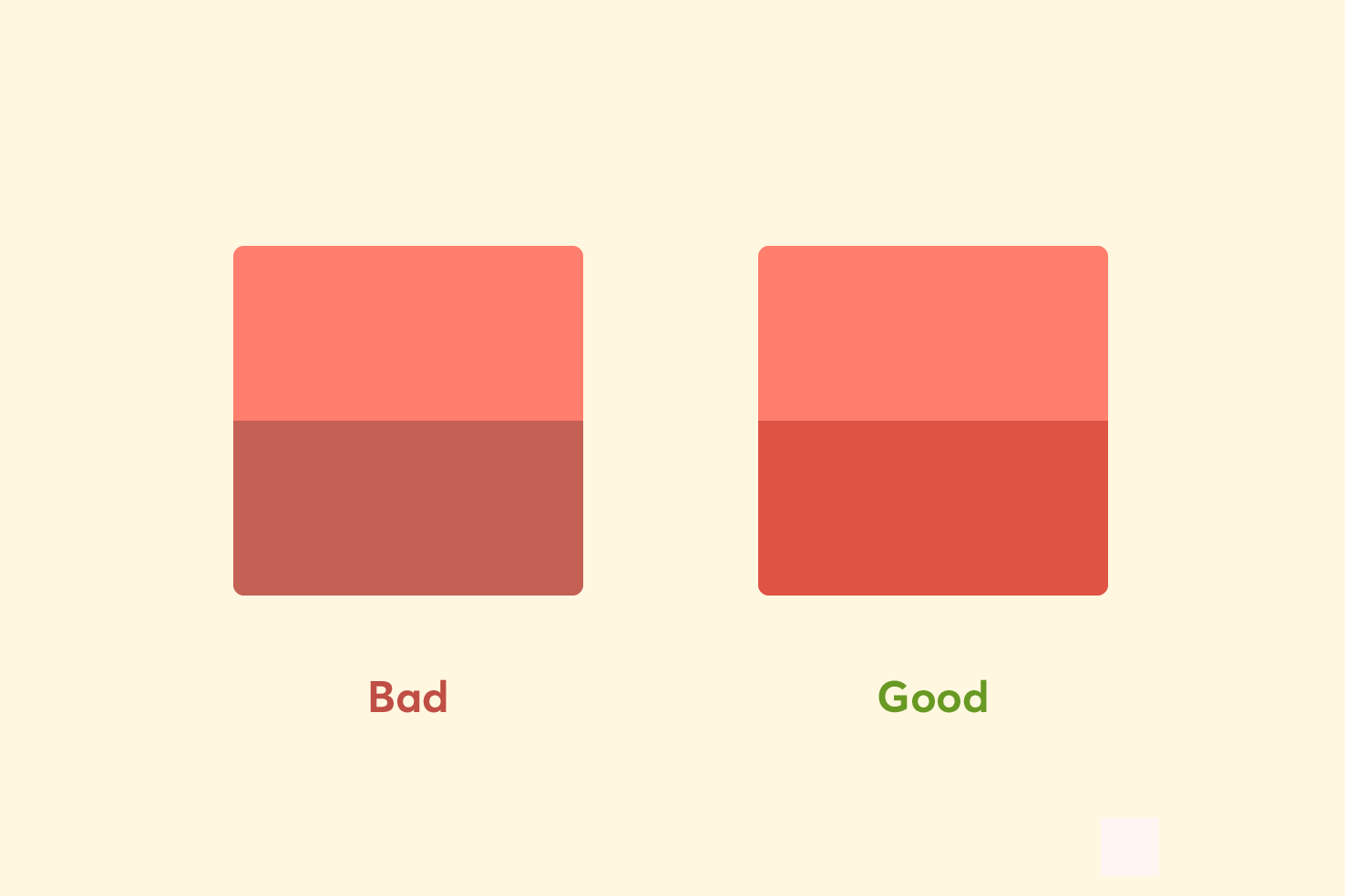
One of the most common issues with shadows I see is they don’t respect the background they are on.
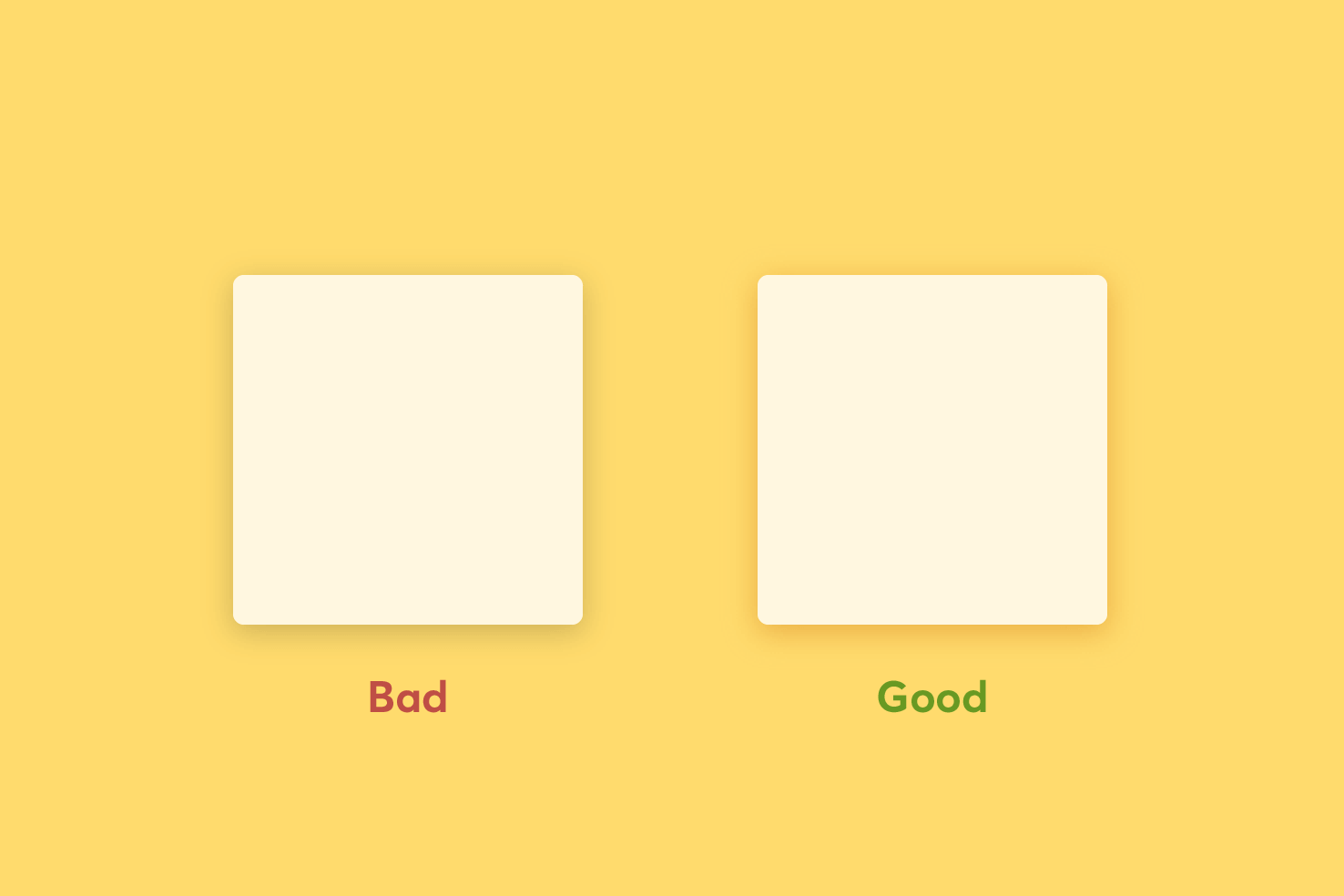
The ‘bad’ shadow uses 20% opacity black. The ‘good’ shadow uses #DBA758 at 60% opacity.
In the example, the ‘bad’ uses a black shadow. When a transparent black is placed on a coloured background, the overall colour appears muddier. Whereas if you take the background colour and make it darker and more saturated it will feel more intentional.
This is true of how real shadows behave, they’re the absence of light. So while this is on a screen, it makes your design better if you remain true to this.
How about blending modes?
Alternatively, you may find a blend mode more accurate. Using a black shadow with an overlay or soft light blending mode can be equally effective.
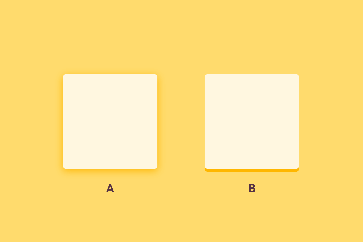
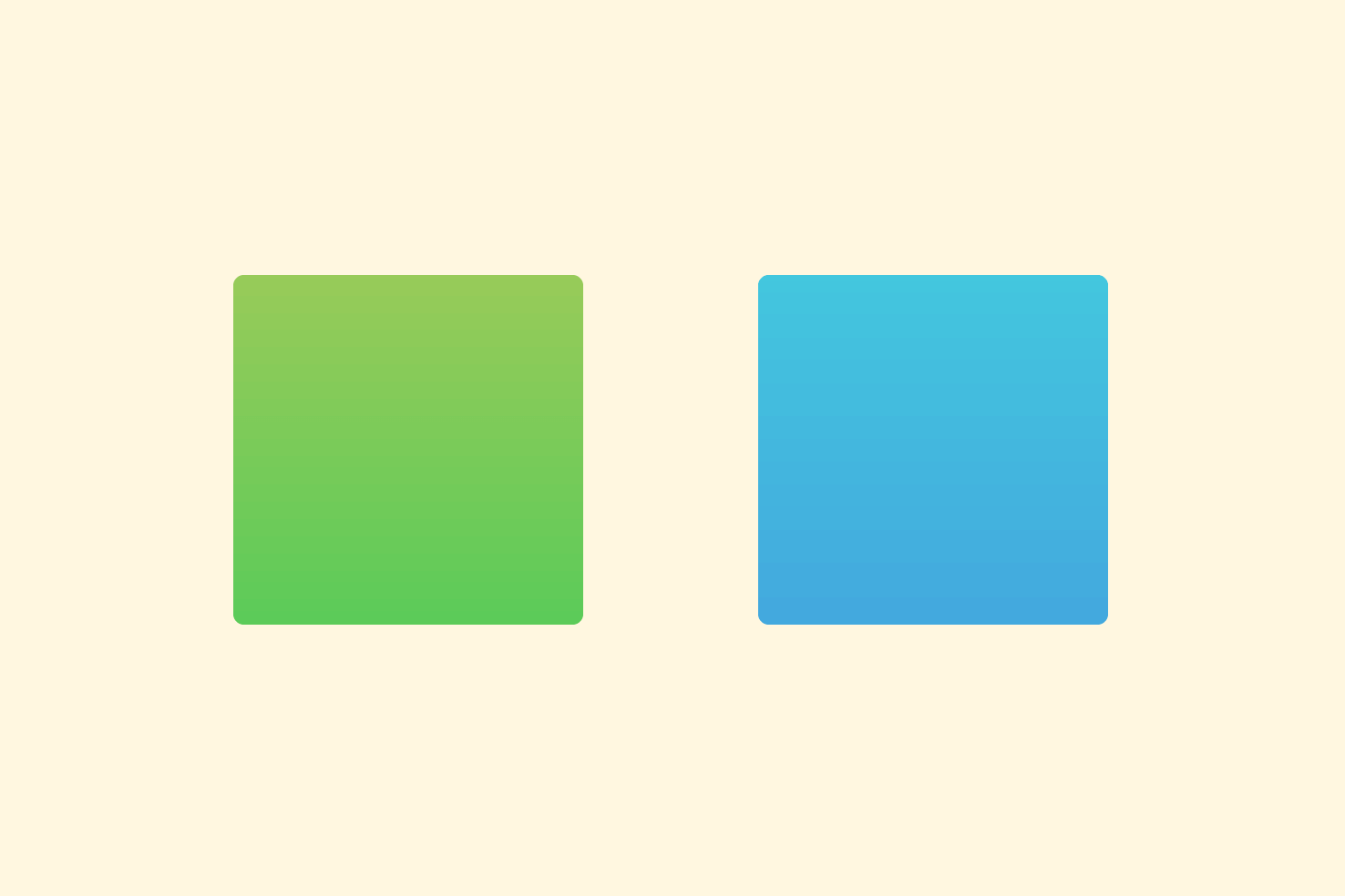
Shadow ‘A’ is a softened shadow using an overlay blend mode. Shadow ‘B’ isn’t softened to demonstrate the colour.
In the example image, the shadows both use black with an overlay blending mode. This can be a great way to apply shadows which fit better. If you were to replicate this in CSS or without the need for a blending mode based shadow ‘B’ allows you to pick the colour and use it.
2. Your shadows shouldn’t look like a ‘glow’
On to another shadow tip, which can be tricky to control, is when the shadow makes the object look like it’s glowing. It commonly happens with dark objects on a light background.
It can take a bit of tweaking but you need two shadows, both of the same colour. You should keep your original shadow, but reduce the opacity and increase the Y axis slightly. The idea is this shadow should be subtle.
Next, duplicate the layer to add a second shadow. This shadow is 0 x axis, 1px y axis and 1px blur shadow. The opacity should be higher, around 60%. Essentially you’re creating a border for some additional contrast.
3. Gradients should feel harmonious
When you want a light to dark transition of colour in a gradient, usually you’ll take your base colour and make it darker. That’s fine, but sometimes it can feel off. Why? You may wonder.
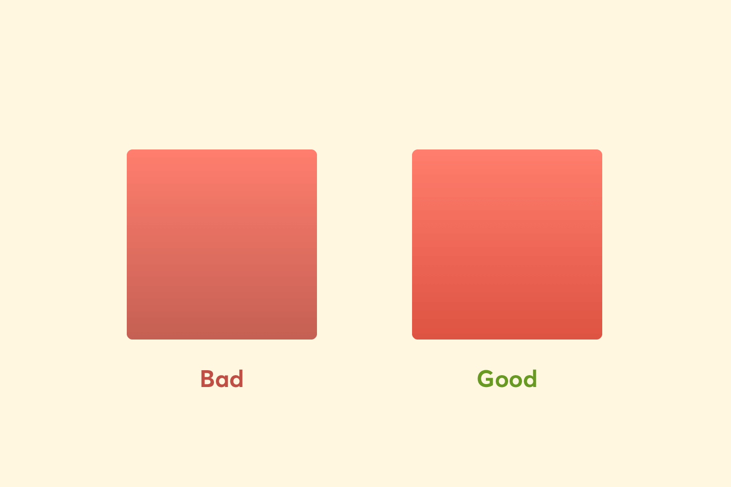
This is similar to the earlier shadow tip. A gradient applied to an object is adding depth. So similar rules apply, when darkening a colour, don’t only add black.
In the image you can see a breakdown of the colours used. Comparing the examples the differences are more apparent. The good example uses a more saturated red.
Use a different hue
Saturation doesn’t work as well for some colours, in those instances it can work to adjust the hue. Here are a couple of examples using hue adjustment only.
By adjusting the colour on the hue of the colour, by around 10–20 degrees you perceive the colour as being darker.
4. Use hanging punctuation
It’s not supported in many apps (aside from InDesign) and CSS (yet). However, it’s an important consideration for improving your reading experience.
Bulleted lists
When you indent your bullets at the first level you remove the left edge of the content. Your reader will have to adjust to the bullet points then again. It’s important to keep the left side consistent for the best reading experience.
Quotes
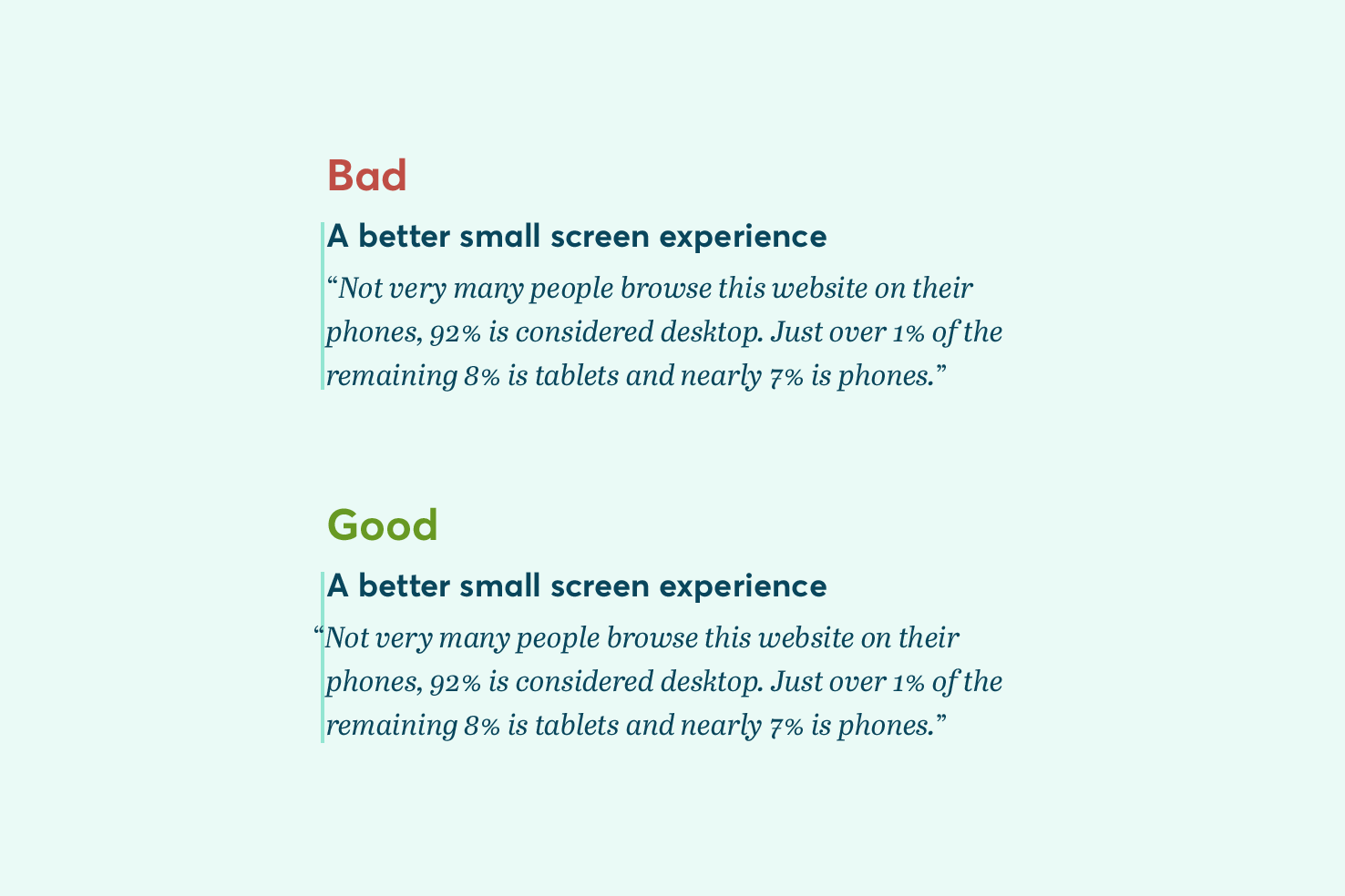
The same applies to pull quotes, as seen in the image. If you’ve ever felt like your text feels off with quotes, this is why. It’s a subtle improvement.
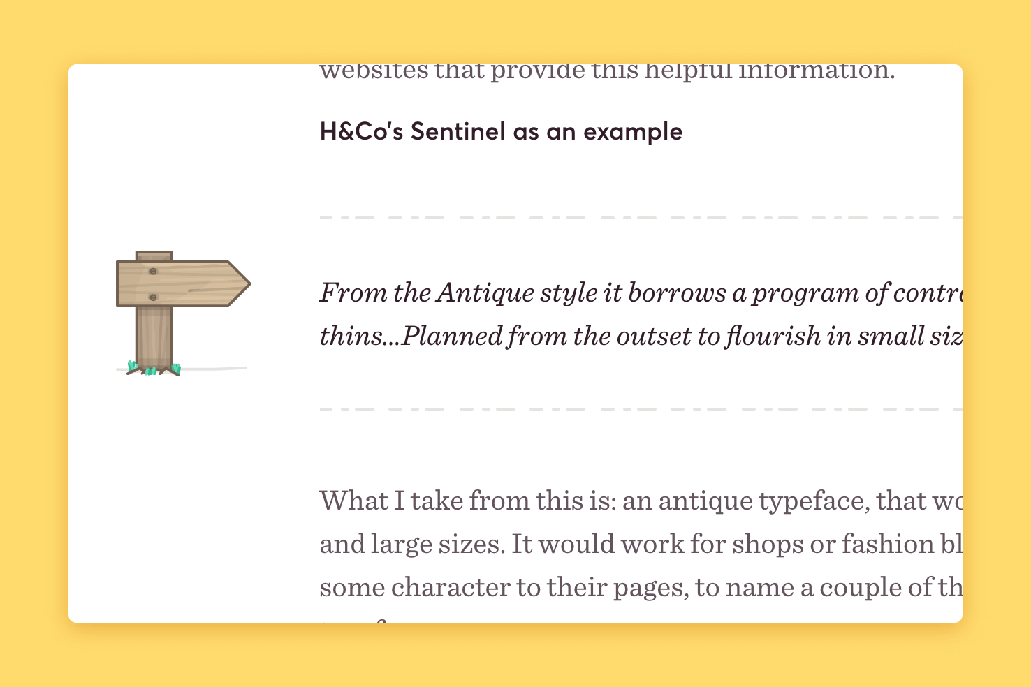
Of course your style may vary, and you may apply something more stylistic, as shown in the example for the design of this website.
5. Text always has an ideal line length
Having an ideal line length means content can be read easier. The eyes don’t have to work harder tracking from side to side.
Typically this is 55-75 characters, it depends on the typeface you use but this can be approximately 30em in CSS.
6. Balance titles & avoid widows/orphans
To avoid widows and orphans this means when you have a paragraph or title you avoid short lines of text. In the instance of titles it would be to avoid a single word. It can be difficult to control on a website, but being aware of it helps.
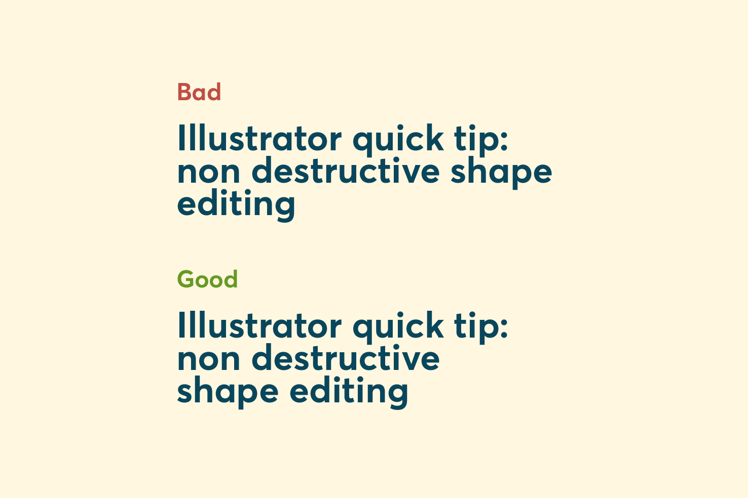
It’s considered bad in terms of typography, because it looks like there is excess white space. Excess whitespace can interrupt the flow of reading and balance of a particular area of your design.
How to fix or prevent?
When making a website there are a lot of variables to control this (eg: responsive). The best way I have found is to use on the areas you can control.
The title in the example would look like the following:
Illustrator quick tip: non destructive shape editing7. Keep spacing consistent with using multiples
This is something I’m passionate about, using one multiple as a basis for all spacing. For example, using multiples of 8, this is a good number to use as it will divide/multiply and never hit a decimal placed number.
There are a few good reasons you should be:
- Improves speed of designing
- Improves decision making
- Helps collaborating with developers
- Improves consistency and hierarchy
- Helps with maintaining a vertical rhythm
Having your Illustrator templates setup correctly means this is a breeze to stick with.
8. Make sure icons and logos are pixel fitted
A subtle but important aspect of design is ensuring your design assets remain sharp. Sometimes you may feel like something is off with an icon or logo, it most likely it looks ever so slightly blurry.
This is quite the topic in itself, but pixel fitting your icons and logos is an important skill to acquire. It’s essentially hinting them to make sure they appear sharp and retain their original clarity.
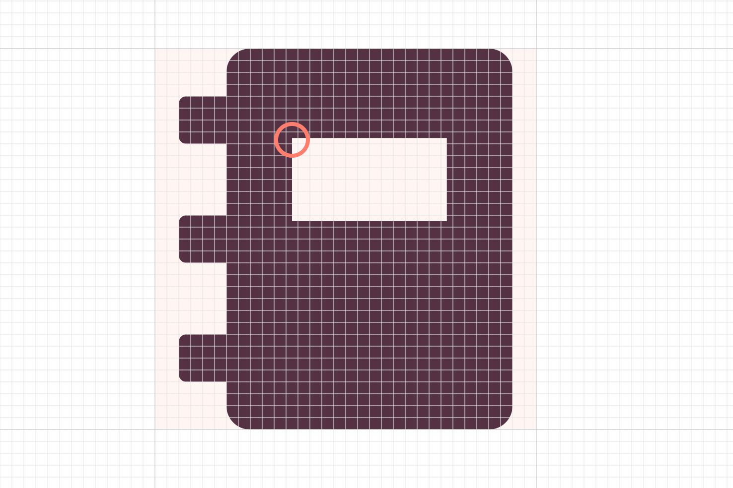
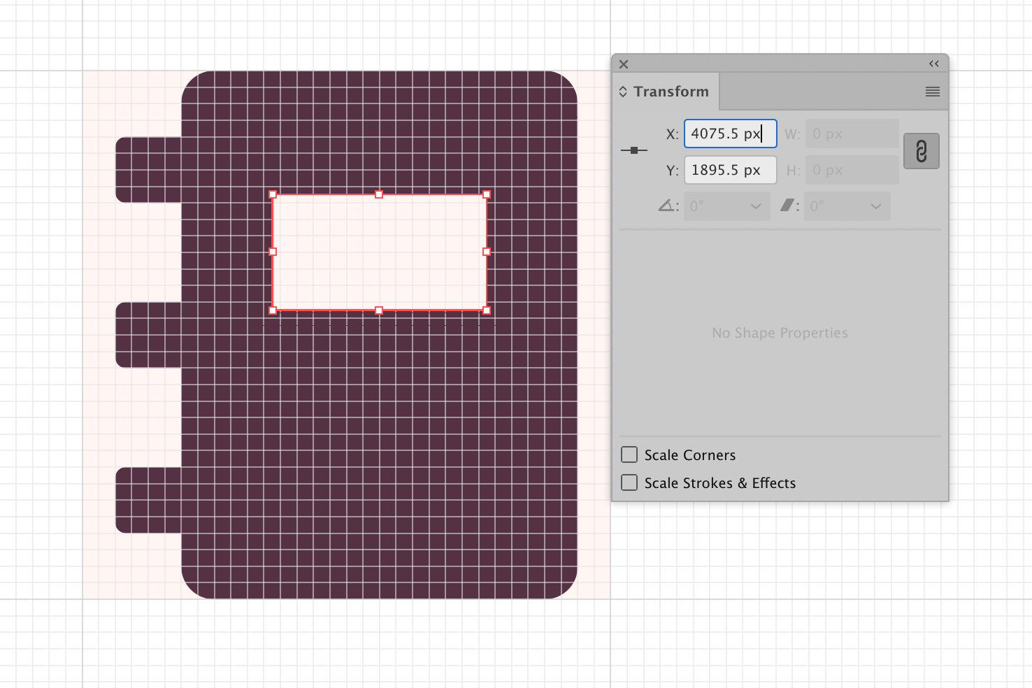
Take this notebook icon, the central rectangle is off the pixel grid. If you were to enable pixel preview cmd + Y and toggle it back and forth you would notice the fuzziness. This is what I mean when making sure things are pixel fitted.
You don’t see it in vector applications, but when you export and view it on screen normally you will see the difference.
Making things pixel fitted
With the transform panel open, you use the direct selection tool a to select the individual points. Referring to the transform panel you will see which points are off a whole pixel.
You can either add or subtract the pixels after the decimal place. The main thing is the numbers should be whole eg: 16px. Not 16.5px or 16.12325px, you get the point.
Make Pixel Perfect is a feature which was added in Illustrator 2017 (Nov 2016 update). Make sure snap to pixel is on by going to View > Snap to Pixel and then select your object and go to Object > Make Pixel Perfect. It’s not fantastic, but it does do some heavier lifting.
9. Use a type scale
Like picking a consistent value to base spacing off; having a type scale is important too. A type scale means your font sizes are based upon a ratio.
I pick a scale that has the smaller font sizes you need and shows a clear difference with the larger sizes. As you need a variety at small sizes but more differentiation.
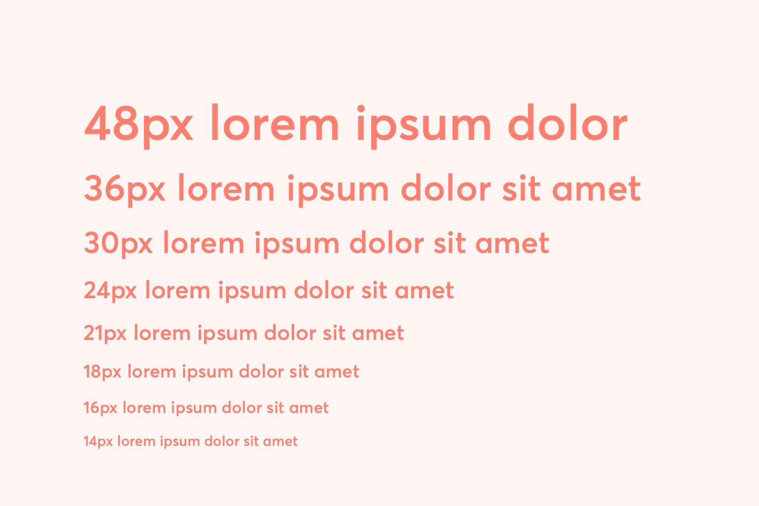
I would recommend using between 6–8 different type sizes. This should be more than enough for a website. Using more than this may make things feel inconsistent.
Modular Scale
I recommend using this website to help determine your type scale. You can add multiple base values, this will give you a wider variety of smaller font sizes. It offers many sizes, but as mentioned I would select between 6–8.
10. Use the correct quotes
A simple one but using the correct quotes can make things look more elegant aside from being typographically correct. They vary in their look between typefaces, it could even be a factor in why you use that particular typeface.
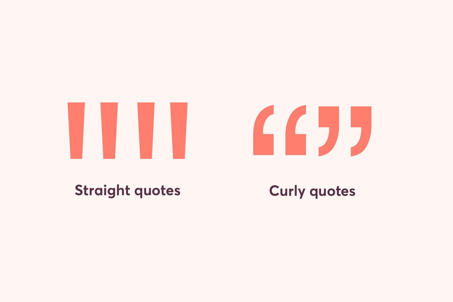
Straight quotes have very few if any uses outside of code. Some applications will automatically convert to them for you like Illustrator, Photoshop and some other text editors like iA Writer.
Shortcuts
On a Mac the shortcuts are fairly straightforward, Windows and Linux require more effort. A good reference website for all shortcuts and entities is Smart Quotes for Smart People.
Markdown
Markdown is a great way to write it’s simple to format text and one of the benefits of using markdown is the ability to enable quote conversion. If you write a lot in your CMS you may be able to enable it.
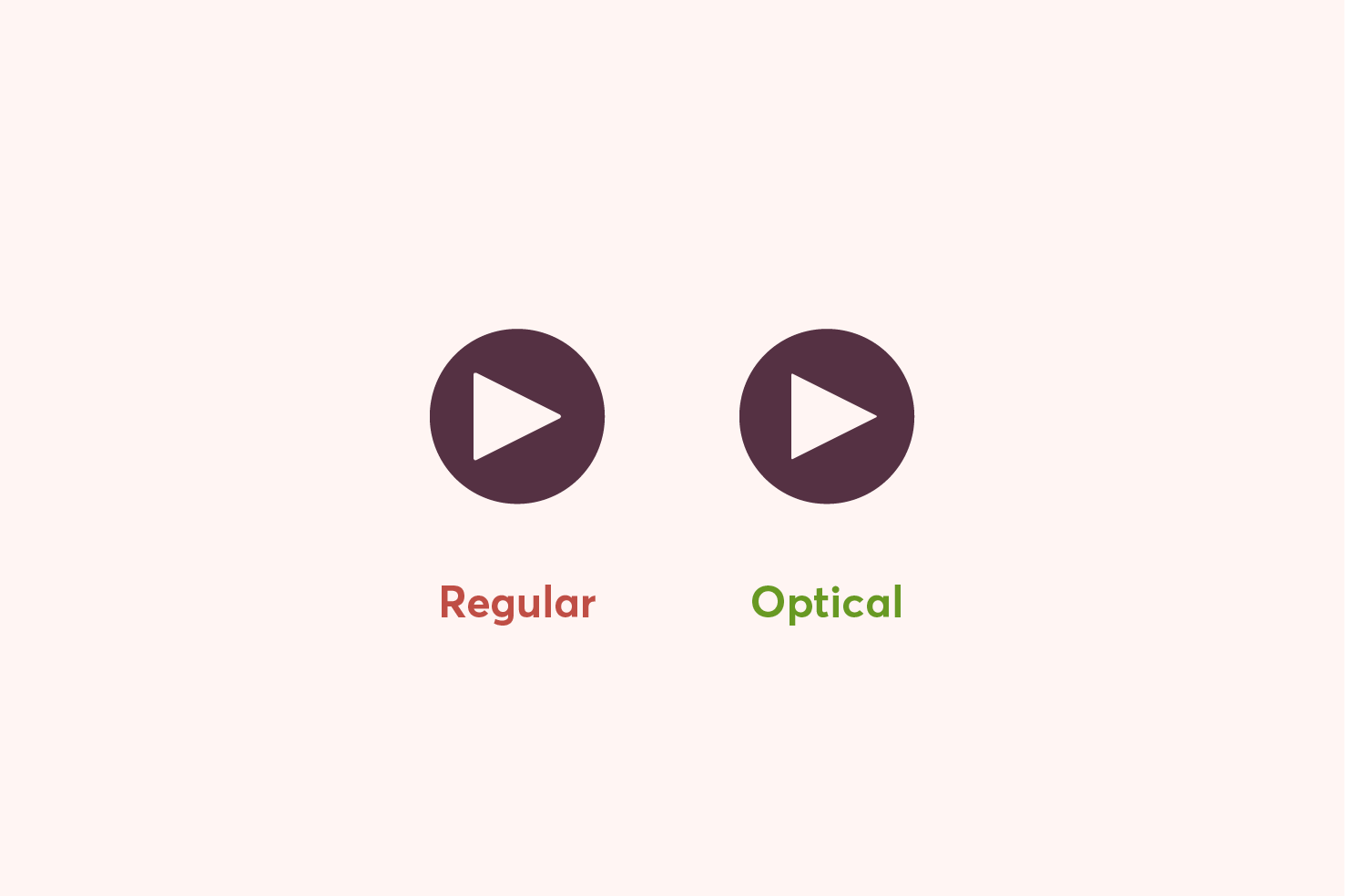
11. Optical alignment — aligning for your eyes
You’ve got a set of icons, you add a background colour in a circular shape, you align it and it looks off. The align tool isn’t broken surely?
It’s not broken, sometimes align tools don’t work in certain areas. The easiest way to get round this issue is to eyeball things, and that’s fine.
The play icon
This particular icon is the most common example used when demonstrating optical alignment. As it’s really clear what the issue is.
Optical alignment comes in many forms
I’m only covering this topic briefly, but it applies to typography too. Being aware of when something is mathematically correct, but feels off from an optical view, will allow you to make the subtle tweaks needed.
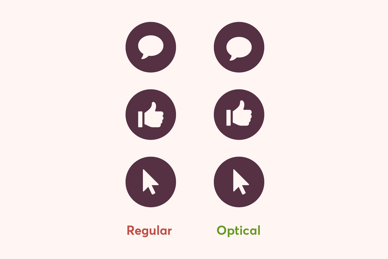
It’s a subtle, but noticeable difference, to the way things appear when aligned.
12. Make sure your nested corner radius account for the outer radius
When you have two rounded rectangles nested within each other you need the corner/border radius to feel consistent.
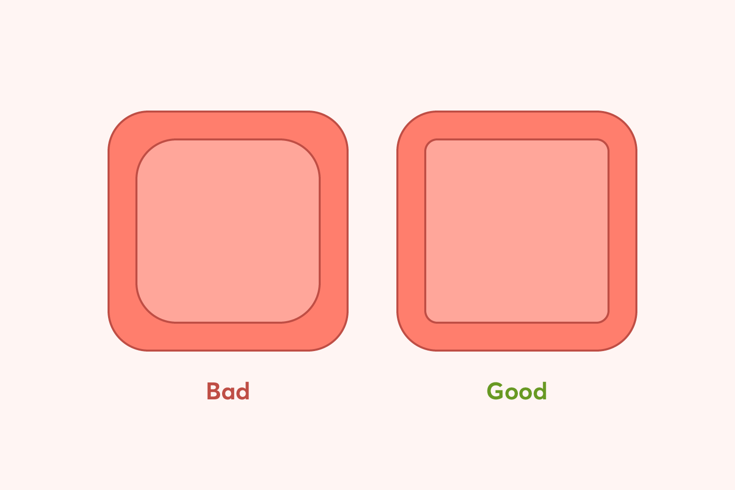
There is a fairly simple calculation for this, the outer radius - the space between = inner radius. In the example above this would be 40px - 28px = 12px. There’s a handy tool to help you calculate this.
That’s it
Hopefully there are some tips you didn’t know here and they’re useful. I’d like to know have I missed any? Let me know on twitter).
View on Github