This post was published 11 years ago
There’s a chance things are out of date or no longer reflect my views today
Using flexbox for horizontal scrolling navigation
How to build a horizontal scrolling navigation using flexbox. A follow-up to the inline-block method, covering the advantages flexbox brings to this pattern.
— views
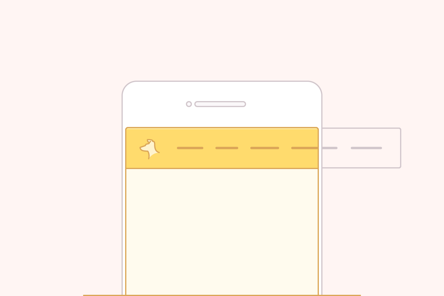
This post is a follow up to a different method for horizontal scrolling navigation which used inline-block. In this post, I want to cover how flexbox can be used to achieve the same thing and the benefits over the inline-block method.
As a design pattern, it is one that is beginning to be used much more. It’s great for touch devices, as horizontal scrolling feels more natural. It’s great on a Mac too, with a trackpad or Magic Mouse it’s just as easy as vertically scrolling. That’s potentially a good chunk of your audience, you can improve the user experience for and utilise space better.
Demo
Have a quick look through the code, then let’s get into the explanation.
The implementation
The implementation is flexible to work with your layout. Whether you have it positioned by your logo, or underneath it will be fine. Just apply the styles, to whichever element you prefer.
CSS: for the container
Aside from making the element containing your navigation items a flex container, you need to make sure they don’t wrap. This is achieved with the flex-wrap property. The final necessary property is to allow the container to overflow. You can use scroll or auto, however, I would recommend auto as it will only scroll if absolutely necessary.
/*
[1]: Make a flex container so all our items align as necessary
[2]: Automatic overflow means a scroll bar won’t be present if it isn’t needed
[3]: Make it smooth scrolling on iOS devices
[4]: Hide the ugly scrollbars in Edge until the scrollable area is hovered
[5]: Hide the scroll bar in WebKit browsers
*/
.scroll {
  display: flex; /* [1] */
  flex-wrap: nowrap; /* [1] */
  overflow-x: auto; /* [2] */
  -webkit-overflow-scrolling: touch; /* [3] */
  -ms-overflow-style: -ms-autohiding-scrollbar; /* [4] */
}

/* [6] */
.scroll::-webkit-scrollbar {
  display: none;
}
The next set of properties aren’t mandatory, but do make the usability nicer, particularly -webkit-overflow-scrolling. On iOS devices, this makes scroll areas have momentum and ease of use. Many sites don’t seem to use this, so please do! Android devices by default are easier to scroll.
You can also hide the scrollbar completely by targeting the ::-webkit-scrollbar pseudo element and this will improve the appearance for Windows. However, from some brief testing on Windows, it can make it trickier to scroll. Although, it could depend on your mouse, so you may want to use this cautiously. Sadly with Firefox it seems you’re out of luck.
CSS: for the items
Each item needs a flex-grow and flex-shrink value of 0. The flex-basis property can be a percentage or pixel value if you for some reason need items to be of a specific width.
.item {
  flex: 0 0 auto;
}
HTML
<header class="scroll">
  <a href="http://iamsteve.me">Logo</a>
  <nav>
    <a href="http://iamsteve.me/blog">Blog</a>
    <a href="http://iamsteve.me/portfolio">Portfolio</a>
    <a href="http://iamsteve.me/downloads">Downloads</a>
    <a href="http://iamsteve.me/about">About</a>
    <a href="http://iamsteve.me/contact">Contact</a>
  </nav>
</header>
Depending on which area you want to scroll, you can apply the styles to the header or navigation.
Benefits over using inline-block method
Admittedly the benefits aren’t too obvious when looking, the behaviour is the same. However the couple of things I mention below make it worthwhile.
No set widths required
Paying attention to example two in the Codepen, you no longer need to set widths. Whereas in the inline-block method you had to. Albeit I have put one in the flex property of the logo, this is used throughout all examples.
This is useful if you want your logo to remain a specific size. If it was a percentage through the inline-block method it would resize. Which is fine, though it will take you so far before you need to adjust at another breakpoint. Flexbox allows you to avoid that and keep things more managable.
The code is tidier
In the previous method I used font-size: 0, this isn’t great. If you use this on a larger scale, it’s possible it can trip you up in the future. Although it isn’t a bad method, it’s just not quite ideal.