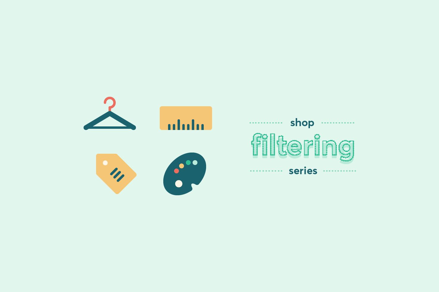
Shop filter series: completing the filters
Continuing from the last post, which looked at the initial sketching and wireframe. This post will focus on the completion of each of the filters.
— views
Continuing from the last post, which looked at the initial sketching and wireframe. This post will focus on the completion of each of the filters.
Catch up

This is where the post was left previously.
File download
There were two file downloads relating to the previous post.
Sketch recap
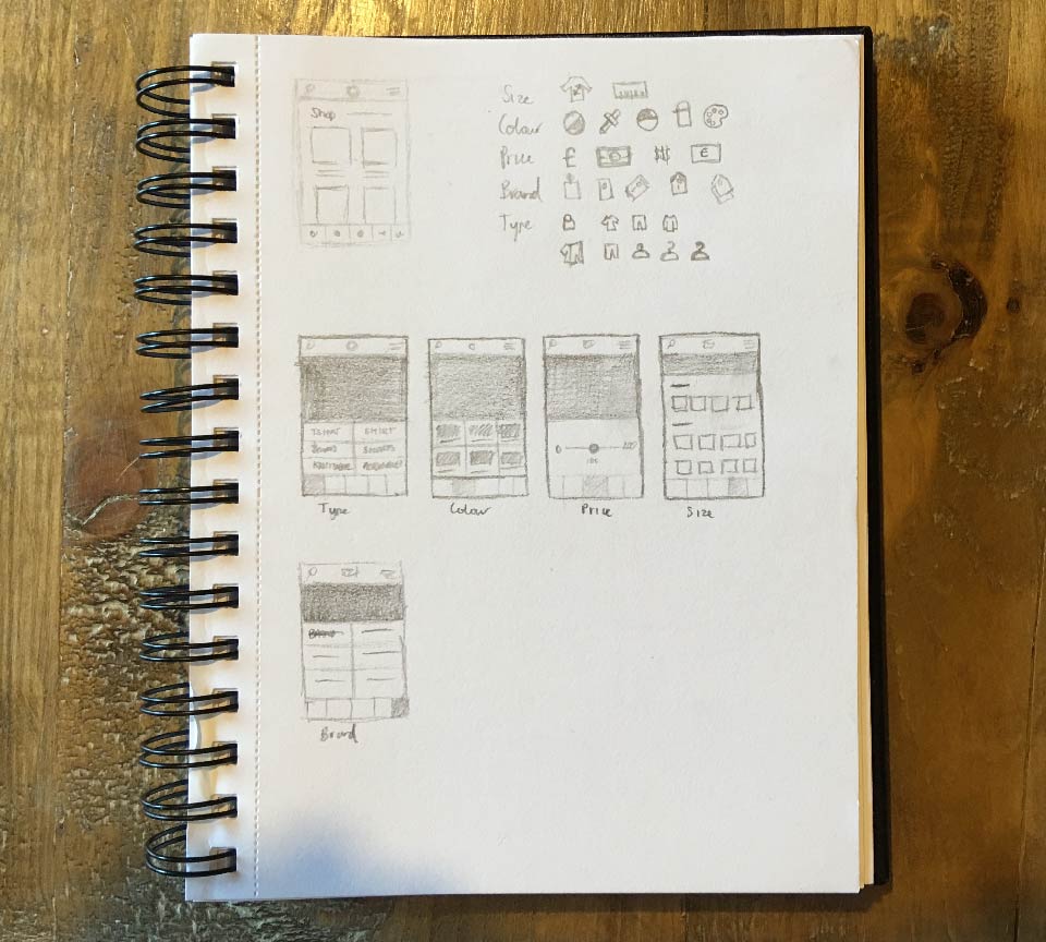
The sketches for each of the filters are what will be referred to as a basis for this.
Add an overlay
Draw a rectangle by pressing m that’s 320x524px. Fill with a very dark grey colour, and change the opacity to around 60%.
Position that to the top of the artboard, so the filters are not obscured.
Add additional rectangle
On top of that draw another rectangle that is 320x236px. Positioning this time flush with the top of the filters so they are not obscured.
Add an obvious way to close
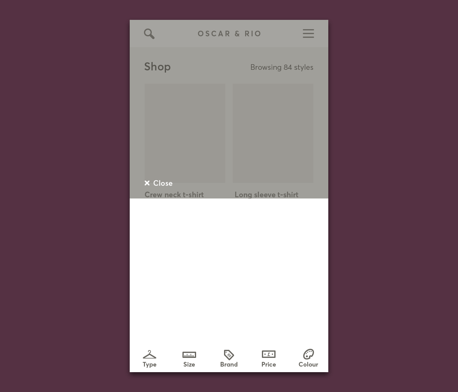
From the icons grab the small close icon. Paste it in the document and add a text layer with the word alongside. Using the content in the background as a guide, position it to the left and above the filters.
Paste across all artboards
Now that all the additional common elements are complete, select the additional elements. Press ⌫ backspace to delete, then press cmd + shift + alt + v (yep).
Type
The first step for the type section is to use split into grid to help make alignment easier.
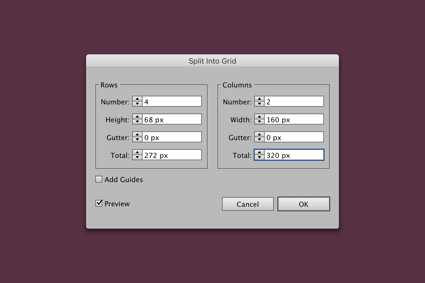
2 columns and 4 rows are added with the row total being increased to 272px. The reason it’s increased is to allow for affordance. It will overlap the filters, this is handy for now.
Add types
Type out 8 types of clothing, using a 16px font size. This will allow good space for items spanning two lines. Make sure that the text is centrally aligned too.
Here’s a list of types to grab:
- Jeans
- Tshirt
- Coats
- Shirts
- Knitwear
- Loungewear
- Suits and blazers
- Accessories
Align types
Select a type, then click a rectangle to align it to. Click the rectangle again to use that as the basis to align to.
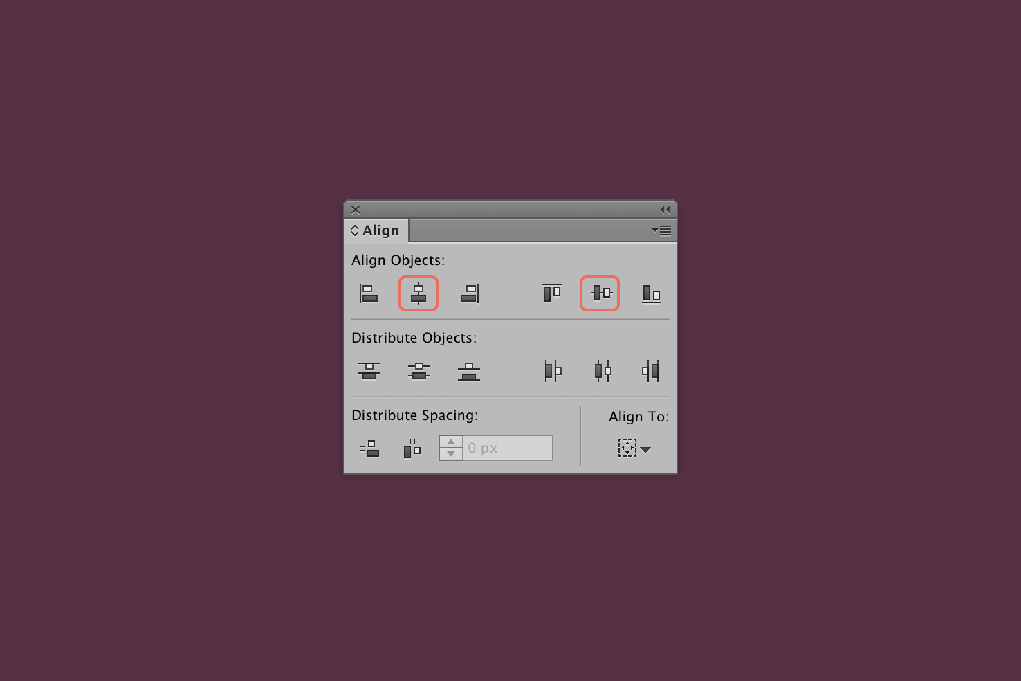
In the Align panel, horizontally and vertically align it.
Select types and move backwards
All the things that you have made now, select and group with cmd + g.
Finally select the filters below the types and move them forwards with cmd + ].
Brand
Brand is similar to types, so delete the white background layer and copy the grouped types. Use cmd + f to paste in front. Again being at the front now means easier selection.
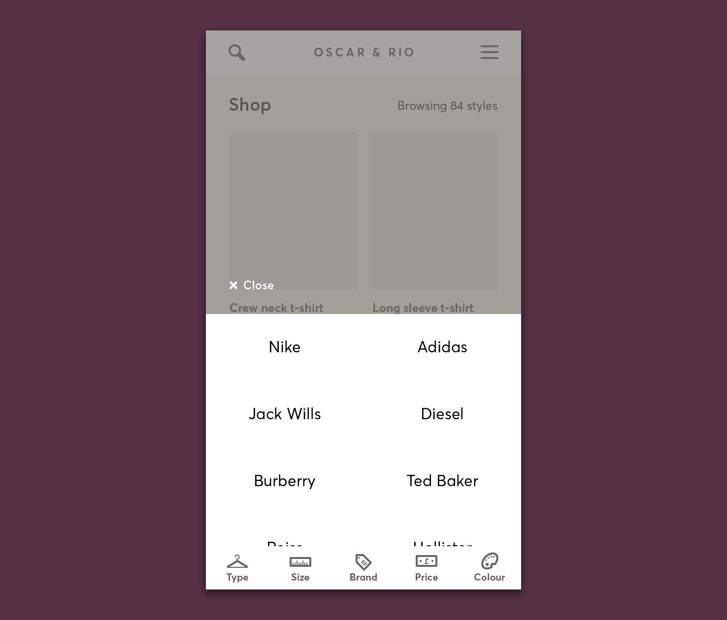
Rename, and then you should be able to select the filters at the back and move forwards with cmd + ].
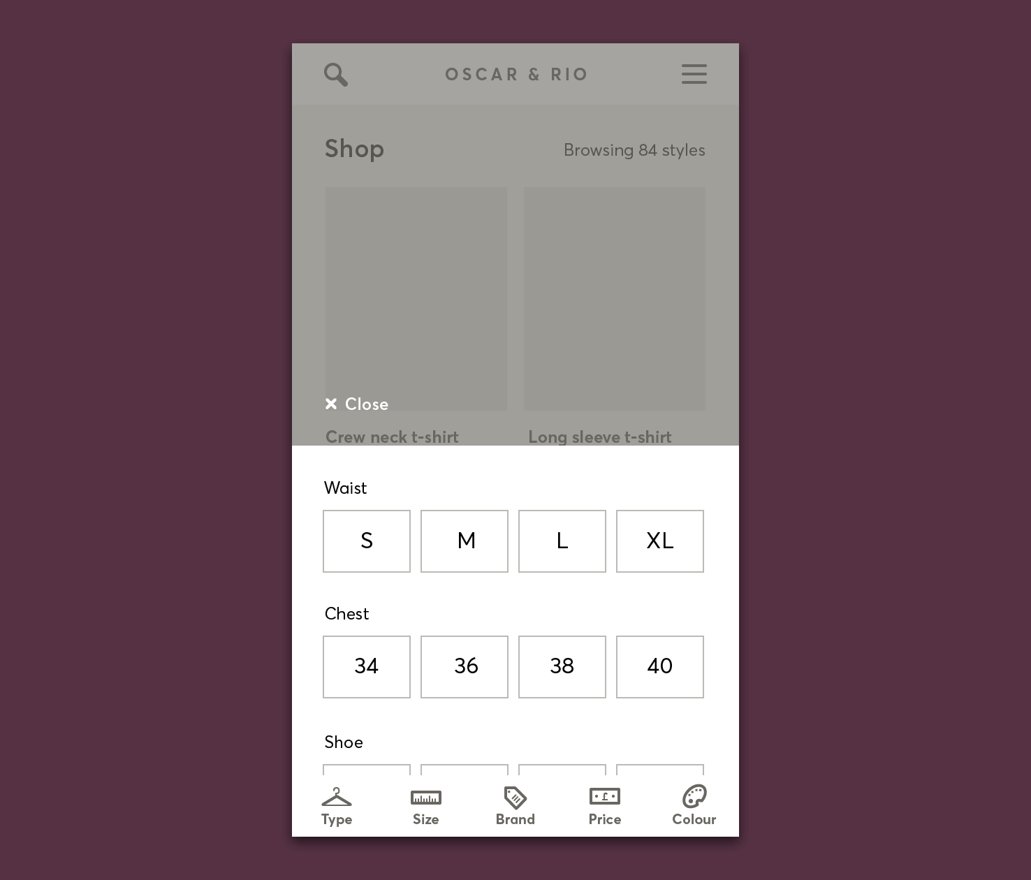
Size
Size is interesting, there are lots and it takes time to find yours. It’s difficult to identify whether they relate to the type or not. Categorising headings should help this for those who choose to review by size first.
Defining sizes
First you want to draw a rectangle that is 272x44px. Align it to the horizontal centre of the artboard, positioning isn’t too important vertically right now.
With the rectangle still selected go to Object > Path > Split into Grid.

Adding 4 columns with an 8px gutter gives you a nice selection and reasonably flexible area to work with.
Add a border, fill and duplicate
Fill them with white and a grey border, to define their bounds.
- Add a type layer t
- Type out the first size ’S’
- Press cmd + enter
- Eyedrop i the brand style
- Duplicate the ’S’ layer to add additional sizes
Repeat this for chest and shoe
Chest generally follows an inches measurement generally starting from 34 and going up incrementally in 2s. Shoe size, stick with the UK/US style, 6, 7, 8 etc.
- Copy
- Paste in place cmd + f
- Nudge down to give plenty of space
- Modify type layers
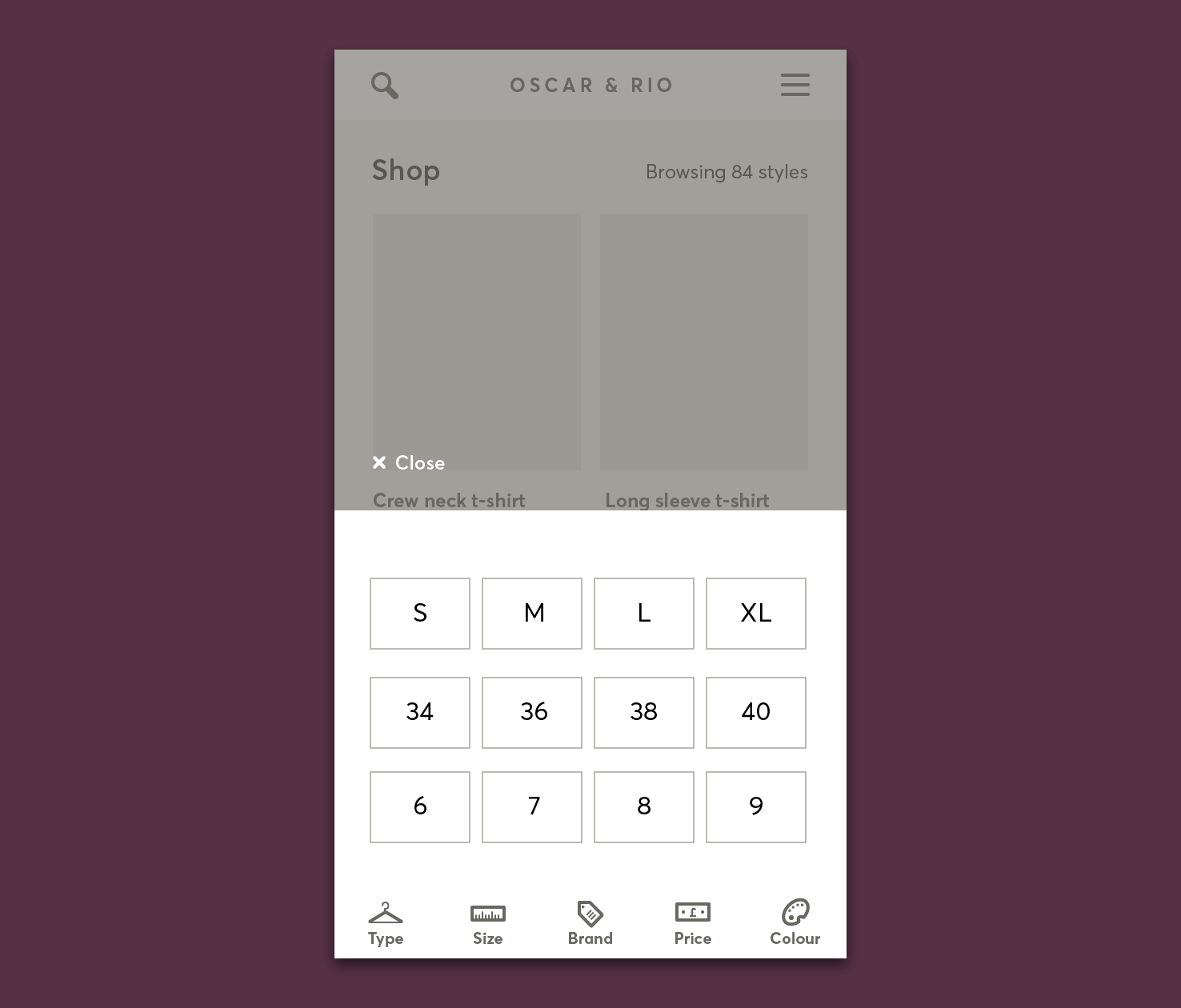
This has led to a very limited amount of sizes, that’s fine. You can see there is good room for sizes like XS, XL and more.
Add categorised titles
Type each title with a 12px font size, this is sufficient to break them up but not outweigh the selection.
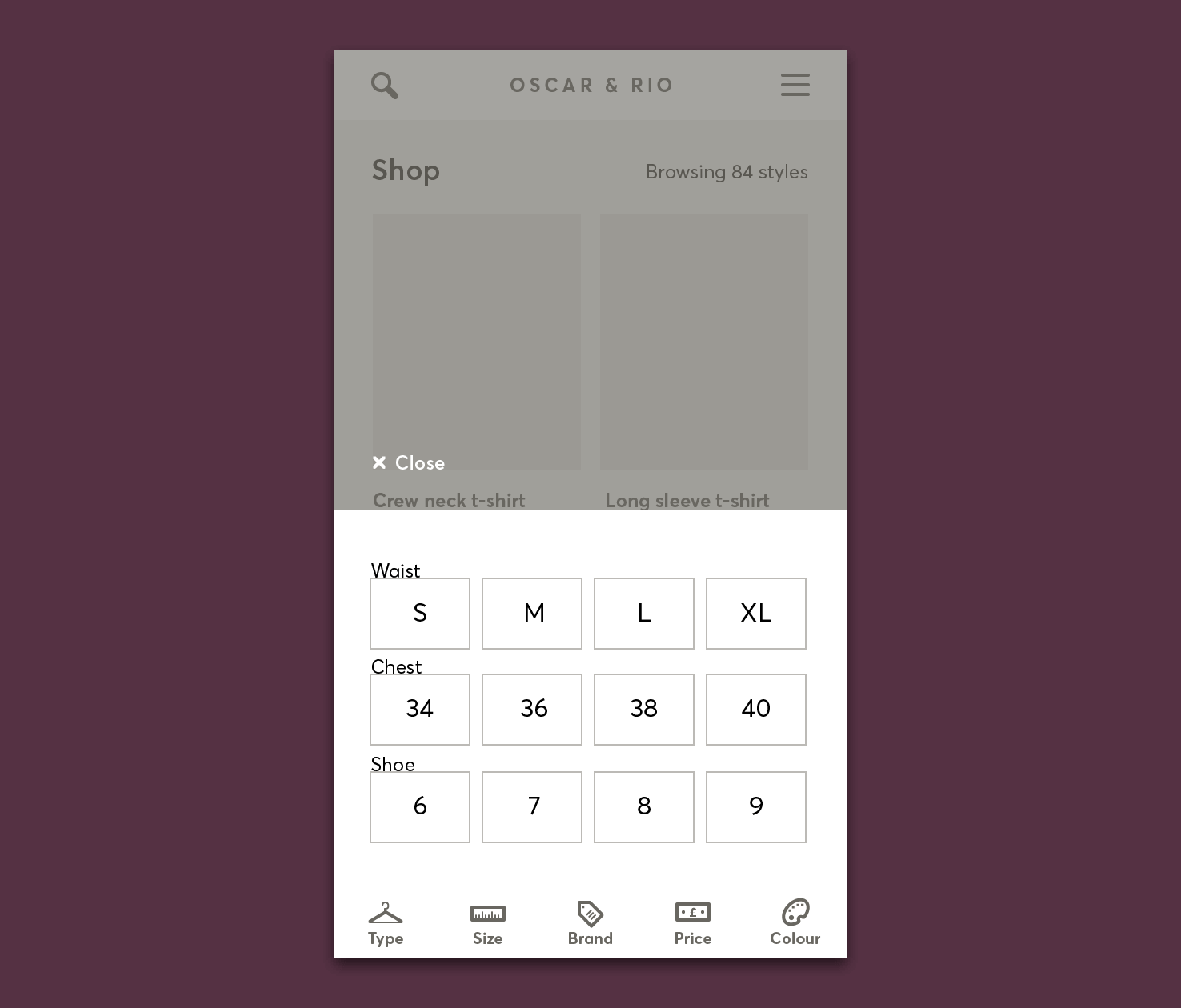
Next will be to improve the alignment further.
Better alignment
Building upon the alignment that’s already been done, open the transform panel under Window > Transform.
- Select the ‘waist’ title and change Y to 312px
- Select waist sizes and change Y to 338px
- Select the ‘chest’ title and change Y to 402px
- Select chest sizes and change Y to 424px
- Select the ‘shoe’ title and change Y to 494px
- Select shoe sizes and change Y to 516px
Adjust the navigation placement with cmd + [ or cmd + ] to bring forwards or backwards as necessary.
After all that alignment, you should have something similar to this.
Price
A range slider tends to be most convenient for choosing price. It’s the most flexible for users to get a somewhat accurate range.
Add a rectangle
Click and hold the rectangle to get the pop out menu. Add a rounded rectangle that is 272x12px, with a 6px radius.
With the rectangle added, align it centrally to the white rectangle.
Add a circle
You need two circles for handles. Add a 24px circle by pressing L. Give it a white fill and grey border for now.
Duplicate this circle by copying and pasting in place cmd + f.
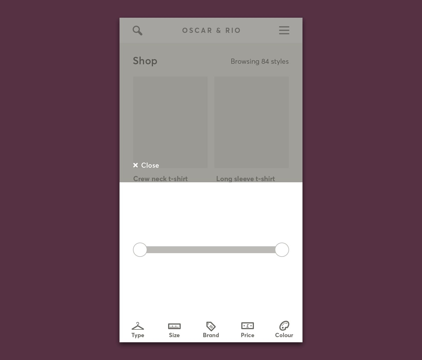
Align both circles centrally with the rounded rectangle, and one at either side.
Add text to show range
As the price will go from one to another. Adding a text layer that has ‘£10 to £120’ will indicate this.
Using the eyedropper tool to pick the type style from sizes earlier will help to keep a consistent style.
Align range text
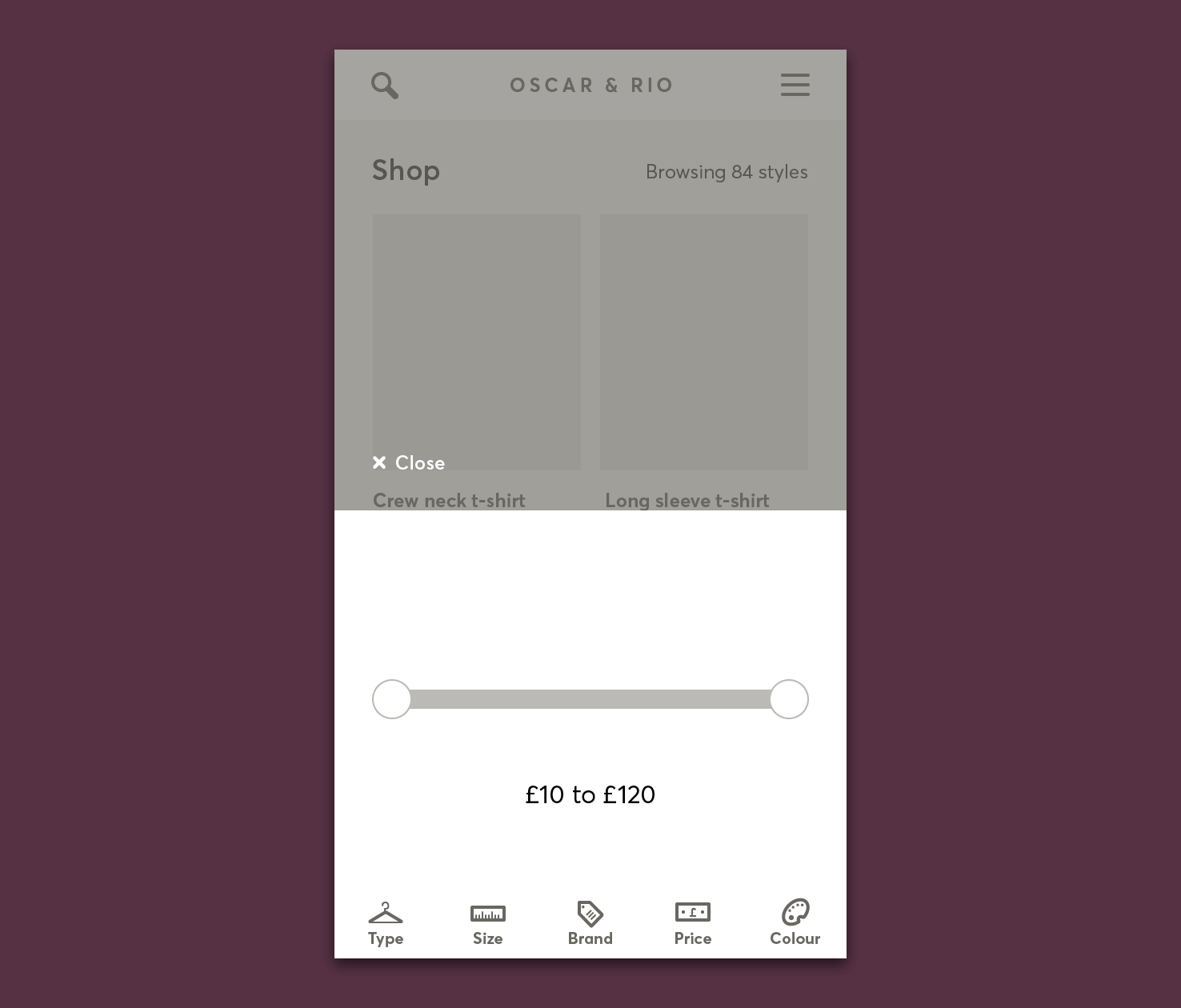
Using the align panel to align it centrally, then nudge it up until it sits below the range slider. Not too close though.
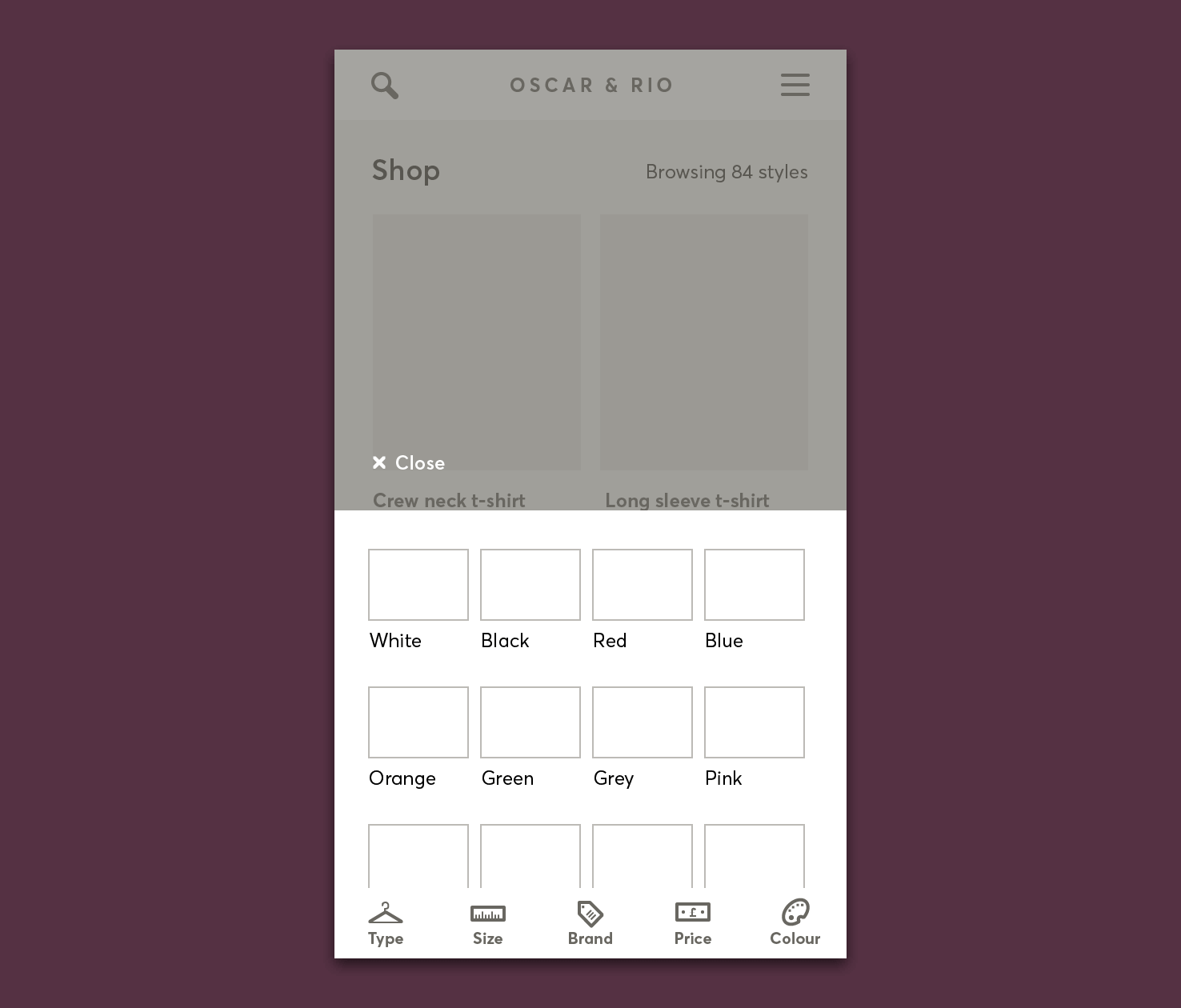
Colour
Colour shares some similarity with size in terms of the shape size.
Copy size rectangles
Copy 4 of the rectangles from sizes, and place them over the final artboard. Using the transform panel, place the Y coordinate of all rectangles to 312px.
Add titles below
Copying ‘waist’, which is one of the size type headings for the basis.
- Duplicate it 4 times
- Align each to the left of the rectangle
- Then duplicate those 3 more times
- Align nicely
A word on whitespace
Much of this post has been based around alignment and whitespace. Generally it’s a tricky subject what the correct amount of whitespace is. It comes down to several points:
- Vertical rhythm or grid
- What feels right based on that vertical rhythm
- The space available
- Tap/click targets
- Importance of the element
- Visual hierarchy
- Readability/legibility
Completed wireframe download
Feel free to download the completed file.
That’s it for this part
So now all the filters have been made in wireframe form, you know the layout is pretty accurate now. You can also see how helpful symbols can be for repetition.
There are other areas that symbols could be used certainly, particularly the close button.
View on Github