This post was published 10 years ago
There’s a chance things are out of date or no longer reflect my views today
Multiple level horizontal scrolling navigation
With horizontal scrolling, submenus are quite challenging to make work. Due to the CSS you have to use, a CSS only solution isn’t viable. In this post I show you how to utilise JavaScript.
With horizontal scrolling, submenus are quite challenging to make work. Due to the CSS you have to use, a CSS only solution isn’t viable. In this post I show you how to utilise JavaScript.
Getting into the example
Firstly start out with what you’ll end up with at the end of this post. Then onto why this solution was reached.
It’s tricky
The difficulty with making this function as a multilevel/submenu is purely based on how it’s achieved. If you follow the traditional markup pattern it’s not really possible without complex JavaScript.
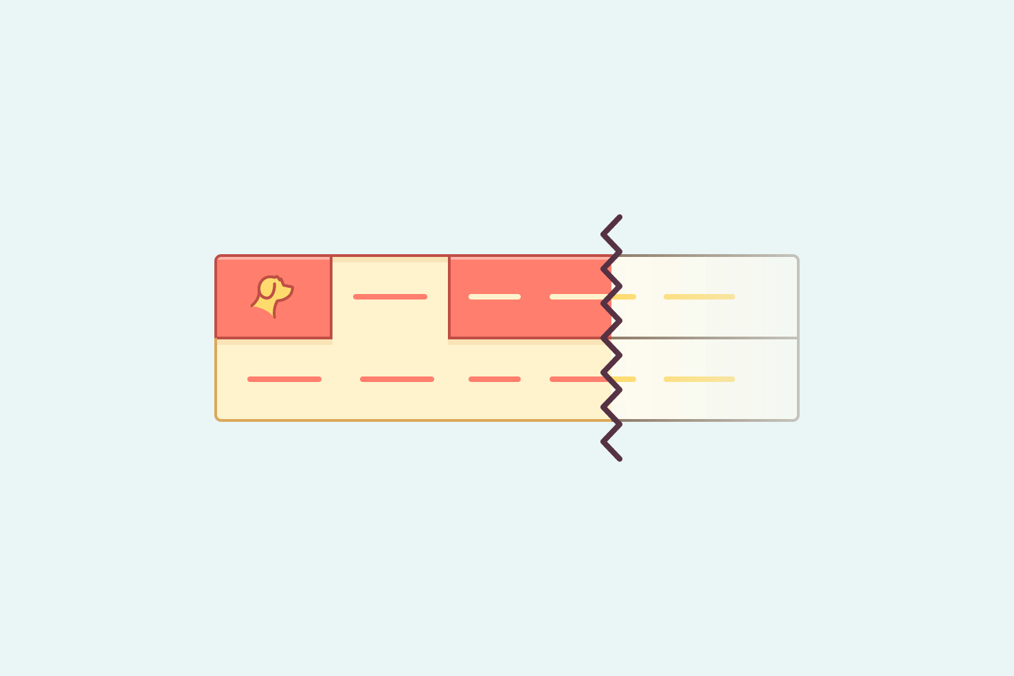
Overflow means typical methods don’t work
Rightly so, you keep the related markup together using a list. Then positioning through CSS, means you can’t show the submenu. The overflow ensures it remains hidden.
As the example shows, the biggest problem is you won’t be able to get the correct width or positioning. So how is it solved?
The approach unfortunately doesn’t cater too well to Wordpress. You’d have to set up a
wp_nav_menuwalker.
You need to use JavaScript
Anyway less of the can’t, you will need to use JavaScript. Which isn’t a huge problem, you just need to ensure pages can be navigated to when it’s disabled.
HTML setup
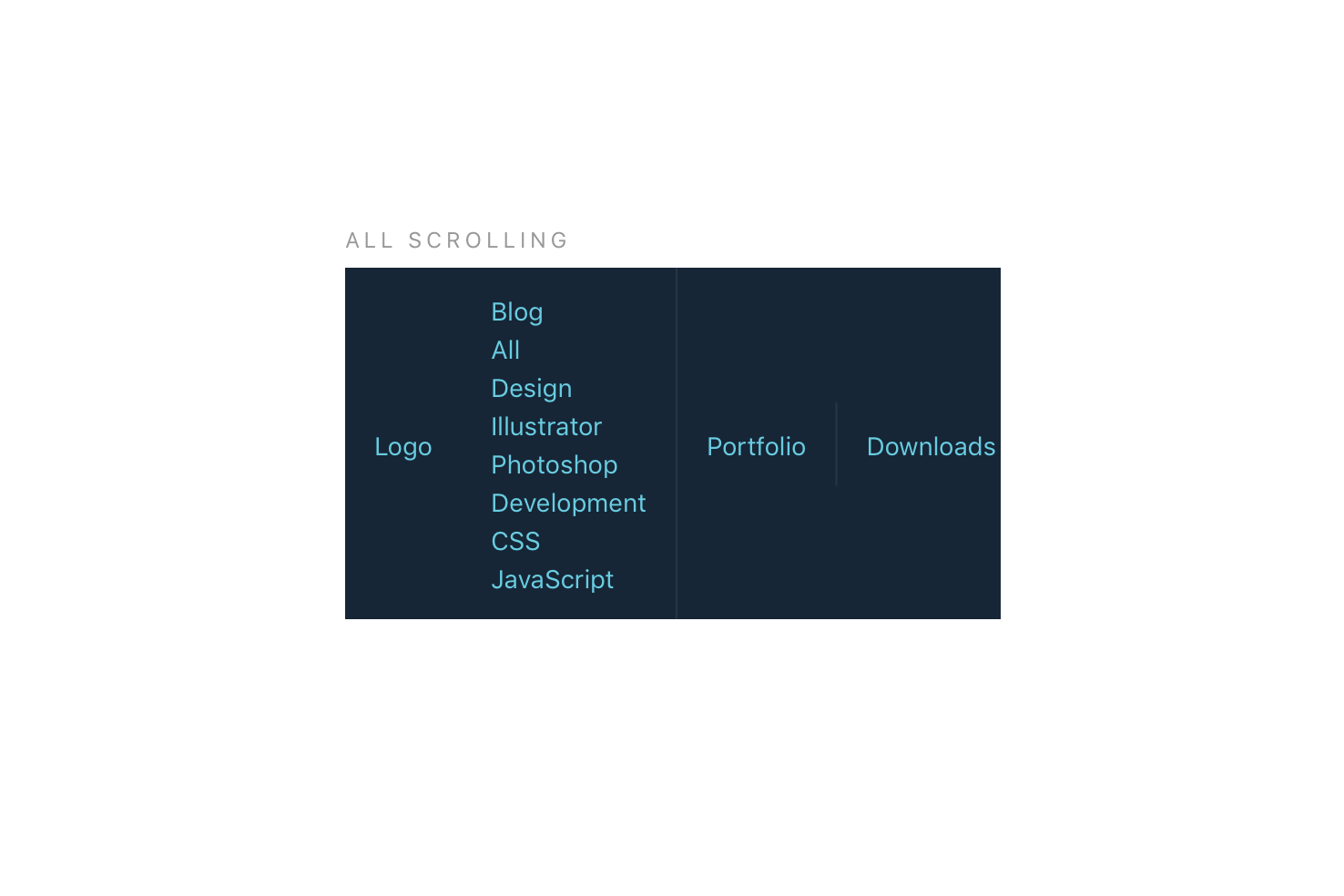
You may have more submenus, but for the sake of brevity I have included the markup here for one.
<header>
  <nav class="nav scroll">
    <a href="#" class="logo">Logo</a>
    <a href="#" class="nav-item active" data-id="blog">Blog</a>
    <a href="#" class="nav-item">Portfolio</a>
    <a href="#" class="nav-item">Downloads</a>
    <a href="#" class="nav-item">About</a>
    <a href="#" class="nav-item">Contact</a>
  </nav>
  <div class="submenu scroll" id="blog">
    <a href="#" class="nav-item">All</a>
    <a href="#" class="nav-item">Design</a>
    <a href="#" class="nav-item">Illustrator</a>
    <a href="#" class="nav-item">Photoshop</a>
    <a href="#" class="nav-item">Development</a>
    <a href="#" class="nav-item">CSS</a>
    <a href="#" class="nav-item">JavaScript</a>
  </div>
</header>
Adding an additional submenu means repeating the submenu div but changing the links to the relevant ones.
The same markup pattern for the submenu
As you can see, the submenu has to be separate from the actual navigation, but uses like for like markup.
You can use the exact same markup pattern for each submenu, so CSS doesn’t need to be different. It’s just lacking the semantic nesting that you would normally expect.
data-id and id for JavaScript reference
Each top level navigation item has a data-id. This is to reference the actual submenu which has an id later on with JavaScript.
CSS setup
The CSS required doesn’t need a huge increase to accommodate multiple levels. Each submenu will share the same scroll based CSS. The additions are for active states.
.scroll {
  white-space: nowrap;
  overflow-x: auto;
  -webkit-overflow-scrolling: touch;
  -ms-overflow-style: -ms-autohiding-scrollbar;
}

.nav-item.active {
  color: #fff;
  box-shadow: -1px 0 #727c87, 1px 0 #727c87;
  background-color: #727c87;
}

.submenu {
  height: 0;
  opacity: 0;
}

.submenu.active {
  height: auto;
  opacity: 1;
}
.scroll controls the scrolling behaviour when needed. .active states for both navigation items and submenus. Importantly .submenu is hidden through the height.
This makes it have the ability to be transitioned, but I decided against it. The result is an ugly transition and to improve it, is out of the scope of this post.
If you would like a more in depth understanding of this approach, referring to the original horizontal scrolling post is best.
JS setup
The most important addition to making this work. Without JavaScript, your top level item will link through. So that should be a suitable alternative.
;(function (window, document, undefined) {
  'use strict'

  // Select nav items that have submenus
  var hasSubmenu = document.querySelectorAll('[data-id]')
  var active = 'active'
  var i = 0

  // Show the submenu by toggling the relevant class names
  function showSubmenu(event) {
    // We lose reference of this when filtering the nav items
    var self = this

    // Select the relevant submenu, by the data-id attribute
    var submenu = document.getElementById(self.dataset.id)

    // Probably best to prevent clicks through
    event.preventDefault()

    // Referring to the submenu parentNode
    // find all elements that aren't the submenu and remove active class
    var otherSubmenu = Array.prototype.filter.call(
      submenu.parentNode.children,
      function (child) {
        if (child !== submenu) {
          removeChildClass(child)
        }
      }
    )

    // Referring to the the nav item parentNode
    // find all elements that aren't the submenu and remove active class
    var otherItem = Array.prototype.filter.call(
      self.parentNode.children,
      function (child) {
        if (child !== self) {
          removeChildClass(child)
        }
      }
    )

    self.classList.toggle(active)
    submenu.classList.toggle(active)
  }

  // Remove the active class
  function removeChildClass(el) {
    // Check if it exists, then remove
    if (el.classList.contains(active)) {
      el.classList.remove(active)
    }
  }

  // On clicks show submenus
  for (i = 0; i < hasSubmenu.length; i++) {
    hasSubmenu[i].addEventListener('click', showSubmenu)
  }
})(window, document)
The summary of this code is to check for all elements with a [data-id] and loop through them. Adding an event listener that will use the showSubmenu function. This uses the [data-id] to find the element by ID. Finally, toggling the active class on the element and off any elements that may have it.
In summary
You must separate out the submenus from the item. This means breaking a setup you’re used to, but it’s really the only way. Otherwise, you would need to JavaScript to heavily manipulate things.
Then each navigation item needs to be related to the relevant submenu. You use JavaScript to tie that together and apply the relevant class names. Toggling the visibility of each submenu.
Watch out for touch screen usability
Dropdown menus on smaller screens aren’t hugely favourable. If your intention is to link to the top level item then a slightly different solution will be needed.
In the solution above you prevent clicks on the top level item. In terms of the blog submenu, you would have access to ‘All’ as another way to get to the blog. That’s the easiest way to get round it and keep things clear.
touchstart instead of click
I’ve only accounted for clicks in this instance, but it should work equally as well here without the need for touchstart.
You would change the following line from
hasSubmenu[i].addEventListener('click', showSubmenu)To the following
hasSubmenu[i].addEventListener('touchstart', showSubmenu)Accessibility issues
I don’t know a huge amount about accessibility, but from my understanding it is possible using the correct aria attributes. I don’t have enough knowledge to fill the gap accurately.
Example
That’s everything, it’s possible that you could use a more regular setup and modify the source order with JavaScript. I didn’t want to get into that, but it may be something I revisit in the future.
View on Github