This post was published 10 years ago
There’s a chance things are out of date or no longer reflect my views today
How to use inline-block for layout
The inline-block method is an effective float based layout alternative. It’s easier to align and removes the need to clear floats.

I originally published this article on . It has since been completely rewritten to have much more practical application and address the many techniques surrounding it.
The inline-block technique is a really handy alternative to a float based layouts. It has a few decent advantages, as float based layouts suffer from needing to be cleared and if height varies it can have undesired effects. With inline-block you don’t need to worry about the height or clearing of elements. However, there are still some things to watch out for, which I will cover in this post. There’s also a Sass inline-block grid for you to use in your projects (should you need one).
Why use inline-block over floats?
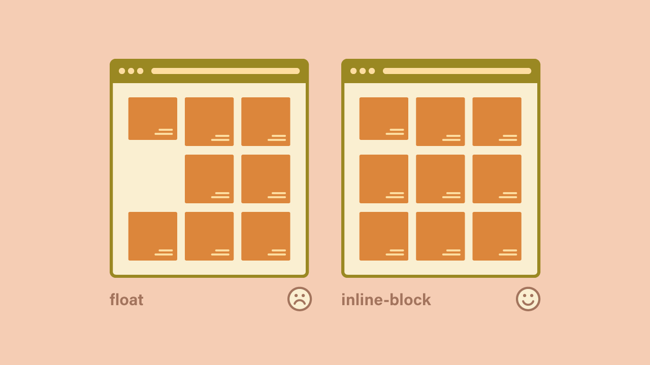
It’s easy to say floats were never intended for layout, but that doesn’t stop you from using them. The main benefit to using inline-block over floats is your elements don’t require any kind of clearing and the layout doesn’t break when you have multiple items of different height.
The inline-block approach is quite dependable in that sense. The only issue is with the elements still technically being inline, any spaces in your code will appear to break the layout. I will cover solutions to fix that. It’s a method I have come to rely on to get ‘divs side by side’.
General usage
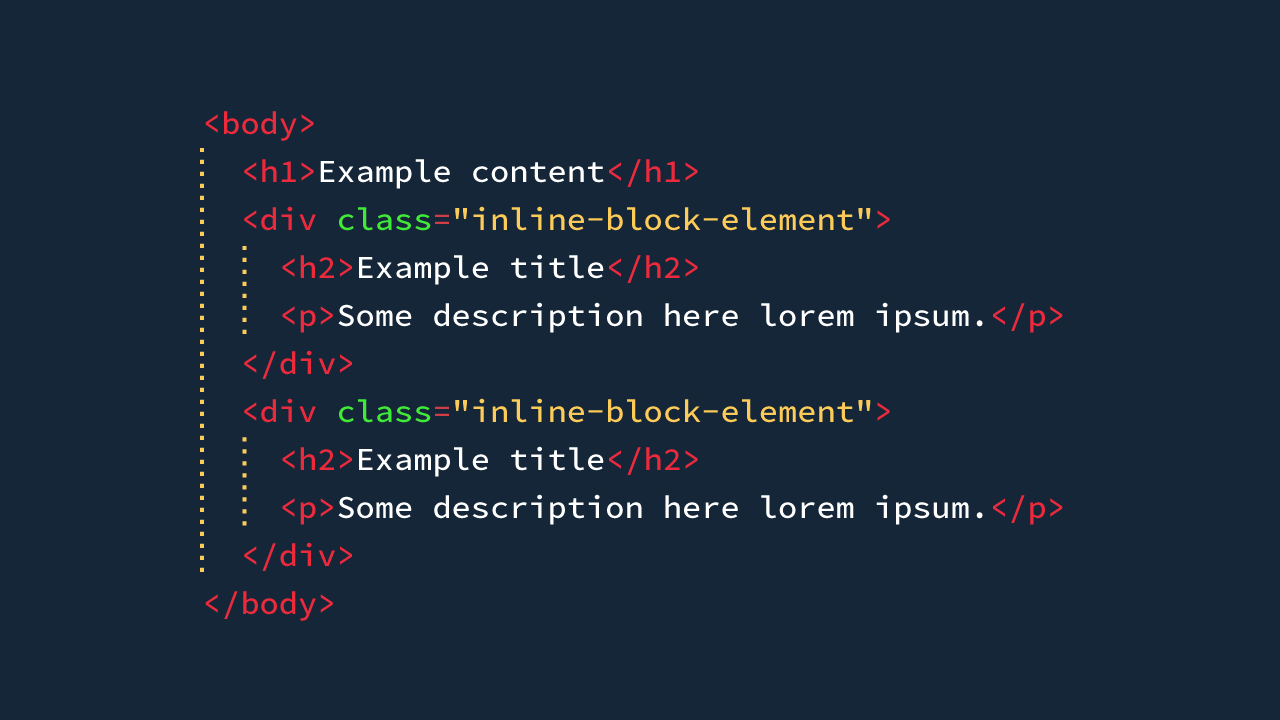
Usage is just a matter of changing the display property of the element. A width will be necessary to size your elements appropriately.
.inline-block-element {
  display: inline-block;
}
Vertical alignment
The flexibility of this method comes in with vertical-align. With this, we can change the how the layout is displayed when items aren’t the same height. A different alignment may be favourable. The are many values, for vertical-align. The ones that tend to favour grid layout are top, middle or bottom. More information can be found on MDN.
.inline-block-element {
  display: inline-block;
  vertical-align: top;
}
Adding width
If your element has enough content to span 100% width, then it will. So if you have two elements that have a bunch of content in and you want them in two columns, you can add a width.
However, unless your code is minified, the elements will be 50% width, but not side by side. I’ll explain how to fix that shortly.
.inline-block-element {
  display: inline-block;
  vertical-align: top;
  width: 50%;
}
Using inline-block to align to the left, right or centre
Another benefit to using this method is alignment tends to come without the issues of floating. You can easily align an element elements to the right or centre by using the relevant text-align value. However, this has to be applied to the parent, so our markup and CSS would look like the following:
<div class="“parent”">
  <div class="“inline-block-element”">Some content here</div>
</div>
.parent {
text-align: right;
}
.inline-block-element {
display: inline-block;
vertical-align: top;
text-align: left; /* optional */
width: 50%;
}The important thing to note about the CSS is you’ll find text also aligns to the right. So you may need to add text-align: left to counter this. I’d recommend setting up reusable class names for each text alignment, so you can apply them as and when.
.text-left {
  text-align: left;
}
.text-center {
  text-align: center;
}
.text-right {
  text-align: right;
}
How to deal with spaces
Elements which are inline-block recognise spaces around them, this causes layout to break. In rare cases you may intend to have these spaces, but in this context, your indentation is purely for code formatting.
In turn, there are a few ways to deal with white space with display: inline-block. All of them encounter possible user error with implementation and it’s determining which is best of a bad bunch.
Comments/minifying HTML
If you have the availability of minified HTML always, great you don’t need to worry about this. Although if there is the chance that unmagnified HTML can be introduced at any point you’ll need a solution.
<div class="inline-block-element"></div>
<div class="inline-block-element"></div>
The issue with removing space is it can make our HTML unreadable. So this is where comments can come in. However, it doesn’t really make it that much better.
<div class="inline-block-element"></div>
<!--
-->
<div class="inline-block-element"></div>
Overall, this approach isn’t very friendly. It relies on you knowing this is the approach when being involved in a project.
Negative margin
I would strongly recommend against this method. For completeness and as a last resort I mention it. The negative margin method involves adding a right margin that offsets the element the equivalent amount of a single space. This generally works out at -4px for all browsers except IE. Which worked out at -5px. I’ve not tested this recently as it’s not my go to method, but my past experiences proved this to be the case.
The fact there is a difference in space width, between browsers, is the major reason to not use this approach. Everything has to be 1px off to accommodate IE. It also means you have to be more vigilant in spotting spacing errors because of it.
.inline-block-element {
  margin-right: -4px;
}
font-size: 0 on the parent
This method involves setting the parent element to have no font size, which means any spaces, no longer exist. This is my preferred method due to it relying less on human error and browser annoyances.
The best thing about it is someone inheriting your code can just reference grids that have already been used and be good to go. Someone inheriting code that uses the comment or whitespace removed approach has to be aware of this. The same applies to the negative margin approach they need to be aware it could have impact visually.
Grid layout with Sass
Taking what has been explained in this post. I use Sass to generate my grid. I find it to be a reliable grid for me, with breakpoint adjustments. I have made everything have the ability to be changed without messing with the grid generation.
Sass
You can view the compiled version if you would like to just have the CSS.
Grid details
- 12 column
- 4 responsive breakpoints (0px, 540px, 640px, and 840px)
- 12px gutter
Usage: HTML
To start a grid it requires a containing element. With the class grid. If you wish to add spacing between elements add grid-with-gutter.
To create a layout, add an additional <div> inside that with the relevant class name. For example, a two column layout at the first breakpoint and 4 column at the medium breakpoint (640px and up).
<div class="grid grid-with-gutter">
  <div class="grid-cell grid-6 grid-medium-4">Content</div>
  <div class="grid-cell grid-6 grid-medium-4">Content</div>
  <div class="grid-cell grid-6 grid-medium-4">Content</div>
  <div class="grid-cell grid-6 grid-medium-4">Content</div>
</div>
Usage: Sass
The grid can be included with the defaults in your Sass by including the grid mixin.
@include grid;Overriding through the mixin
The grid mixin takes 3 parameters. $grid-columns which can be any number in reality. $grid-gutter a pixel value is recommended. $grid-map which is a map for your breakpoints.
@include grid(
  $grid-columns: $default-grid-columns,
  $grid-gutter: $default-grid-gutter,
  $grid-map: $default-grid-map
);
Modifying breakpoints
I have set up a bunch of defaults to make it easy to override. So you don’t need to call the mixin with parameters. The first step will be changing or adding breakpoints. This can be done by changing the $default-grid-map variable.
$default-grid-map: (
  small: 540px,
  medium: 720px,
  large: 1024px,
);
Remove !default from the variable and set it again with your other variables. You can also change the naming convention to more your liking too. It will generate grid classes based on the name. eg: grid-small-1, grid-anything-3.
Other variables to modify
You can modify the column amount and the gutter, with the following variables. The gutter number is half the value you want it to be overall.
$default-grid-columns: 12 !default;
$default-grid-gutter: 6px !default;
Example with modifications
Here is an example of a 6 column grid, with 24px gutter and 4 breakpoints named alphabetically.
$default-grid-columns: 6;
$default-grid-gutter: 12px;
$default-grid-map: (
  a: 320px,
  b: 480px,
  c: 720px,
  d: 1080px,
);

@include grid;
A dependable layout technique
So you know now how to handle the main ways to handle the issues with this technique for layout. Once you’re really familiar, you will find reliance on it for layout. Especially if you were using floats beforehand.
Hopefully, you find the grid useful too.
View on Github