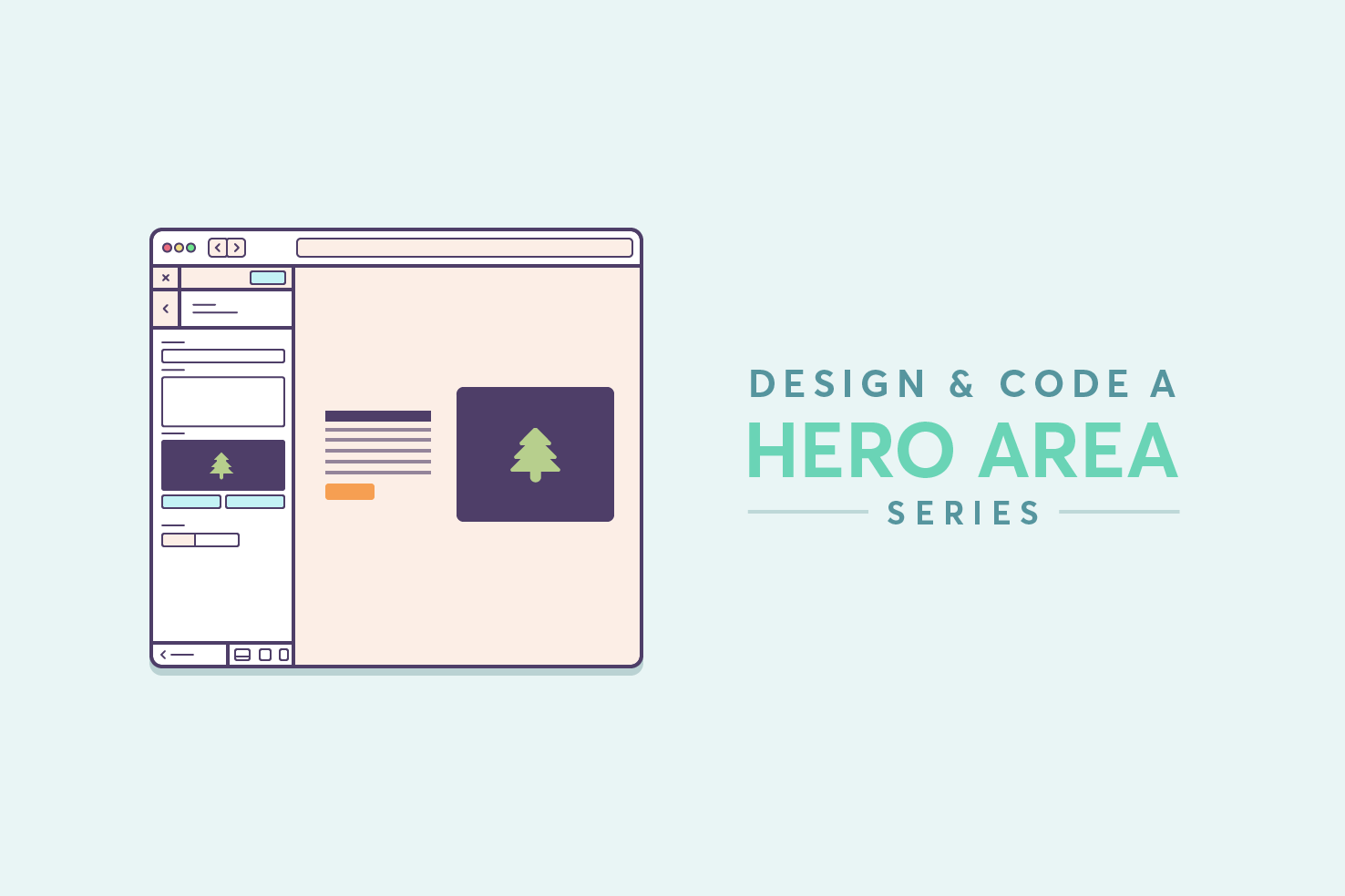
Hero area series: HTML, CSS & responsive
The second to last post in this series, coding the page. You’re going to build the page using flexbox and make it responsive. The method that will be used to make it responsive, is mostly mobile first, but it will be making logical decisions based on where CSS only needs applying. This saves you from having to undo it in another media query.
1,740 views
The second to last post in this series, coding the page. You’re going to build the page using flexbox and make it responsive. The method that will be used to make it responsive, is mostly mobile first, but it will be making logical decisions based on where CSS only needs applying. This saves you from having to undo it in another media query.
Skip ahead if you want
You can grab all the HTML, CSS, and images on Github.
Exporting assets & colours
The first part to beginning to code any website should involve getting all the assets, typefaces and colours gathered.
Image export SVG
To export your image, copy and paste it outside of the artboard. This is purely to avoid having to change artboard sizes, removing background layers. If you have followed along with using a symbol, any edits will be kept up to date everywhere.
Next, select the artboard tool or press shift + o. Then click the image, this should draw an artboard to the exact dimensions of the image. This should be the third artboard.
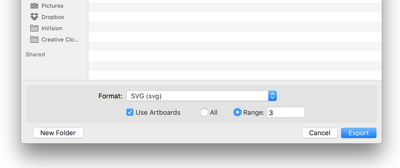
Finally, go to File > Export. You’ll be presented with this window, check Use Artboards and check Range and make that 3. This should be the hero image, if not with the artboard tool selected, you should be able to see, in the top left of each artboard, a number like ’03’. Enter that in the range and click export.
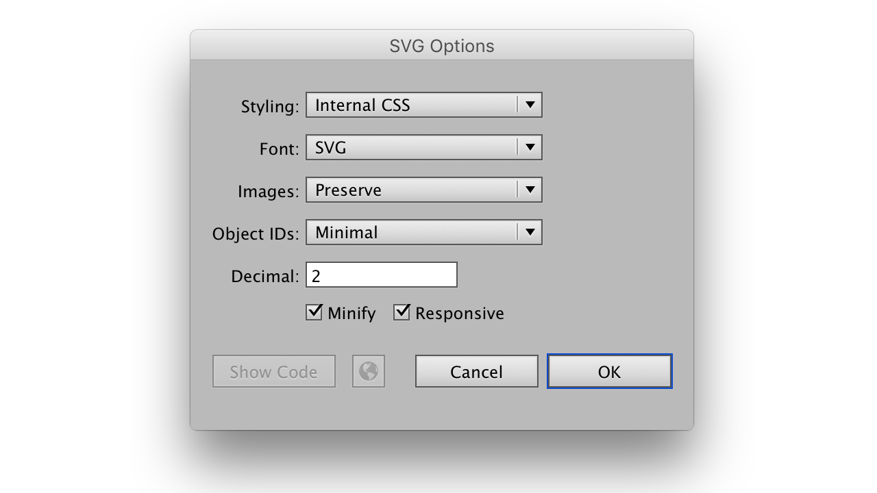
After you’ve clicked export, you will be presented with a window to customise your export. Generally everything that’s there is fine, except make sure ‘Minify’ and ‘Responsive’ are checked.
Fonts
The fonts are Raleway and Merriweather from Google Fonts. The weights being used for Raleway are 900 (black), 800 (extra bold), and bold (700). Merriweather needs 400 (normal).
The following code will be in the HTML you will need next.
<link
  href="https://fonts.googleapis.com/css?family=Raleway:900,800,700|Merriweather"
  rel="stylesheet"
/>
Colours
These colours will later be used as reference in our CSS.
- light blue: #c3f2f5
- dark purple: #4e3e68
- light purple: #6a6384
- orange: #f96f52
- shadow: rgba(0, 70, 75, .2)
Starting with HTML
The HTML consists of the basic HTML requirements, CSS, fonts and the markup required for the hero area. Add this to an index.html file.
<!DOCTYPE html>
<html lang="en">
  <head>
    <meta charset="utf-8" />
    <title>Customizer Hero</title>
    <meta name="viewport" content="width=device-width" />
    <link
      href="https://fonts.googleapis.com/css?family=Raleway:900,700|Merriweather"
      rel="stylesheet"
    />
    <link rel="stylesheet" href="style.css" />
  </head>
  <body>
    <div class="hero">
      <div class="container">
        <div class="hero-content">
          <h1 class="hero-title">Edit live with the Wordpress Customizer</h1>
          <p class="hero-description">
            Using the Wordpress Customizer you can make updates to parts of your
            website with a live preview. This makes it easy to iterate on
            changes.
          </p>
          <p><a href="#" class="button">Learn how</a></p>
        </div>
        <div class="hero-image">
          <img src="images/hero-image.svg" />
        </div>
      </div>
    </div>
  </body>
</html>
Make style.css
To start your CSS, make a file named style.css. This is already in place using the example HTML.
Beginning CSS with a reset
It’s always important to start from a fresh without any browser styles that are going to trip us up later. It’s a small reset that takes away much of the default styling and resets to a base level that we build upon later.
/* Reset
 * --------------------------- */
html {
  -ms-text-size-adjust: 100%;
  -webkit-text-size-adjust: 100%;
  box-sizing: border-box;
}
*,
*:before,
*:after {
  box-sizing: inherit;
}
body {
  margin: 0;
}
a {
  background: transparent;
  text-decoration: none;
}
a:active,
a:hover {
  outline: 0;
}
img {
  border: 0;
}
input,
button,
textarea,
select {
  -webkit-appearance: none;
  -moz-appearance: none;
}
h1,
h2,
h3,
h4,
h5,
h6,
p {
  margin-top: 0;
}
Important things to note are that you’re setting box-sizing: border-box everywhere. Each heading and paragraph will have their margin-top removed. At this stage there is no need to undo anything else, this will be done later.
Adding a colour reference
When writing CSS it’s important to have a reference of colours. Add this after your reset. Each colour is here, including the shadow.
/* Colour reference
 * --------------------------- */
.light-blue {
  color: #c3f2f5;
}
.dark-purple {
  color: #4e3e68;
}
.light-purple {
  color: #6a6384;
}
.orange {
  color: #f96f52;
}
.shadow {
  color: rgba(0, 70, 75, 0.2);
}
Basic setup
The first thing that needs doing from here is to add CSS that covers the majority of areas. So this being colour, background colour, font and line height.
/* Basic setup
 * --------------------------- */
body {
  color: #6a6384;
  background-color: #c3f2f5;
  font-size: 100%;
  font-family: 'Merriweather', Georgia, serif;
  line-height: 1.5;
}
This code is somewhat planning for the future, should you build upon this hero area. All body copy should be the .light-purple colour, and use Merriweather, with fallbacks to Georgia and serif.
The line-height is one that covers the majority of cases. Unitless values are the best choices, because if you set this to a pixel value, in every breakpoint we adjust font size, you would need to adjust line-height too. For the description this line-height equates to the 27px in Illustrator. It’s about finding a balance based on the line length.
The background should be .light-blue.
Getting the right layout
Our initial layout is very similar across all screens. Using flexbox you can do much of the heavy lifting and only need to tweak specific content values.
/* Hero
 * --------------------------- */
.hero {
  display: flex;
  flex-flow: row nowrap;
  align-items: center;
  justify-content: center;
  min-height: 100vh;
}
The flex-flow is for extra security in making sure that the layout will not wrap at any stage. align-items and justify-content ensure our content will remain central; horizontally and vertically. Finally, the minimum height of the hero should be 100% of the viewport vh.
Content
The content container doesn’t need massive tweaks. This is a huge benefit of flexbox, initially we start with the content constrained to 192px. This works well to keep the design looking ideal. The initial flex value is fine, so it doesn’t need defining, later on you need to adjust flex.
/* Hero content
 * --------------------------- */
.hero-content {
  padding: 12px;
  max-width: 192px;
}

@media (min-width: 496px) {
  .hero-content {
    padding: 24px;
    flex: 1 1 50%;
    max-width: 416px;
  }
}
Image
The other part of the layout is with the image. Usually you would want images to be responsive, however, for this one it’s not ideal.
/* Hero image
 * --------------------------- */
.hero-image {
  flex: 1 1 40%;
  max-width: 540px;
  overflow: hidden;
}

.hero-image img {
  display: block;
  width: 540px;
  height: auto;
}
Firstly, we define our flex value and a max-width, that never exceeds the width of the image. With these the layout should look appropriate, no matter the screen size.
Next we add overflow: hidden, this is because our image will hide as the browser is resized. This approach takes minimal effort to go from the narrower to wider screens. As the image is going to remain a fixed width, the height could be set, and exceed this, so it should be set to auto.
Ideally the you would use CSS here to do the shadow too, but the image having rounded corners means a box-shadow would remain square. You could use a filter, as they take on the shape of the image instead. However, for balancing complexity of this tutorial I left this out. It’s worth a mention though.
Media query decisions
A quick note on media queries, I don’t tend to use a pattern for choices. I will resize the browser, and note where the content needs an improved layout. Areas that are one off, like this hero area, will need media queries tailored specifically to them. Other areas you will be able to find a pattern. It’s important that we do base the media queries on content, not device widths.
The title
Now the initial layout is setup, the content can now be worked on. To start, set the colour to .dark-purple. Then using the font shorthand property; you can set the weight, font size, line height, and typeface.
It’s contentious whether to use shorthand properties, but I find it convenient using font for particularly unique areas like this hero title. Finally, in Illustrator the tracking, or in case of CSS letter-spacing is a similar looking value in em units.
/* Hero title
 * --------------------------- */
.hero-title {
  color: #4e3e68;
  font: 800 24px/1 'Raleway', Helvetica, Arial, sans-serif;
  letter-spacing: -0.025em;
  margin-bottom: 12px;
}

@media (min-width: 502px) {
  .hero-title {
    font-size: 30px;
  }
}

@media (min-width: 560px) {
  .hero-title {
    font-weight: 900;
    font-size: 36px;
  }
}

@media (min-width: 720px) {
  .hero-title {
    font-size: 48px;
  }
}
In each media query, the font-size adjustments are based on keeping the lines as balanced as possible, but still retaining a sense of proportion. The aim is to not have the type feel oversized at very small screen sizes. The decision to bump up the font-weight is at a point where it doesn’t impact legibility.
Description
For the description because of the basic setup you only need to change font sizes and add a margin. However, the size is increased using the title as a guide. It’s also worth adding hyphenation because the area is quite small, longer words may cause unevenness in the lines that we can avoid.
/* Hero description
 * --------------------------- */
.hero-description {
  font-size: 12px;
}

.hero-description p {
  -webkit-hyphens: auto;
  hyphens: auto;
  margin-bottom: 12px;
}

.hero-description p:last-child {
  margin-bottom: 0;
}

@media (min-width: 502px) {
  .hero-description {
    font-size: 14px;
  }
}

@media (min-width: 720px) {
  .hero-description {
    font-size: 18px;
  }
}
Button
The button has quite a few things going on. Firstly getting the sizing correct, using display: inline-block and padding allows us to get the appropriate dimensions. I’m against setting height and width on buttons, I have found this method is much more reliable. After that, onto implementing the stylistic choices from the design.
/* Button
 * --------------------------- */
.button {
  display: inline-block;
  padding: 9px 24px;
  font: 700 12px / normal 'Raleway', sans-serif;
  color: #fff;
  background-color: #f96f52;
  box-shadow: inset 0 0 0 2px #4e3e68, 0 4px rgba(0, 70, 75, 0.2);
  border-radius: 40px;
  transition: 0.2s ease-in;
}

.button:hover,
.button:focus {
  background-color: #f9524e;
}

.button:active {
  box-shadow: inset 0 0 0 2px #4e3e68;
}

@media (min-width: 502px) {
  .button {
    font-size: 14px;
    padding: 11px 32px;
  }
}

@media (min-width: 720px) {
  .button {
    font-size: 18px;
    padding: 13px 36px 14px;
  }
}
Using the font shorthand again as this is somewhere that I wouldn’t expect too much change aside from sizing. Then set the necessary color and background-color.
The box-shadow is doing two things, adding a border in the .dark-purple colour, and adding the shadow actual shadow to the bottom.
It’s a preference of mine to use box-shadow to add the border in the majority of cases. There are two reasons I do this; when you have a border-radius for example 4px, with a border appears to be more like 6px. Border also affects the dimensions of the button, which is something I like to avoid.
To achieve the pill roundedness, you need to use a large border-radius value. The transition then allows that to smoothly move between, normal, hover and active states. The adjustments in those states are minimal.
The final part
There is quite a lot to take in here, with the justifications for the code. I hope you have been able to follow along and learn something. The next post will be moving this code into Wordpress. Using the Customiser API you will learn how to make things editable.
View on Github