Accuracy in wireframes
In this post I’m going to cover a process I’ve brought in for doing wireframes, I’m finding really useful lately. It involves taking back all the visual style and just focusing on the layout of elements — as a result creating accurate wireframes. Then you build up your visual style from there. The problem for me comes from wireframes that have too little detail, being used as the basis for the whole page.
199 views


In this post I’m going to cover a process I’ve brought in for doing wireframes, I’m finding really useful lately. It involves taking back all the visual style and just focusing on the layout of elements — as a result creating accurate wireframes. Then you build up your visual style from there. The problem for me comes from wireframes that have too little detail, being used as the basis for the whole page.
Highlights & takeaways
- I have a problem with wireframes not leading to the same layouts in the final design
- This tends to be a result of not being aware of the amount of items going into that space
- Get a list of every element and item that will be on the page first
- Sketching isn’t ruled out if this is your starting point
- Iterate in sketches to begin with
- The idea is start small and add more detail as you go along, similar to other skills such as lettering and illustration
- After sketching make an accurate sized document
- Follow your sketch as closely as you need to
- Make layout and typefaces as accurate as you can
- This work then doesn’t go to waste you can copy it into a new document then build upon it with your visual style
The problem
I like to sketch wireframes to begin with, but they only go so far. I did the majority of designs from sketches, then designed them from there. Only to find my overall design didn’t reflect that. So this post is based around my solution to that problem I have.
The reason is, layouts could be too ambitious for the space they were trying to be contained within. This leads you to try reinvent the layout, whilst trying to implement visual style.
Getting the basics
I think it’s absolutely important that you identify every section and element that will be on the page you’re working on. As well as have your navigation hierarchy and such defined too.
This way when you sketch sections and decide the order elements will go, you have no surprises later. How you identify these depends on the goals of the project, questions and so on.
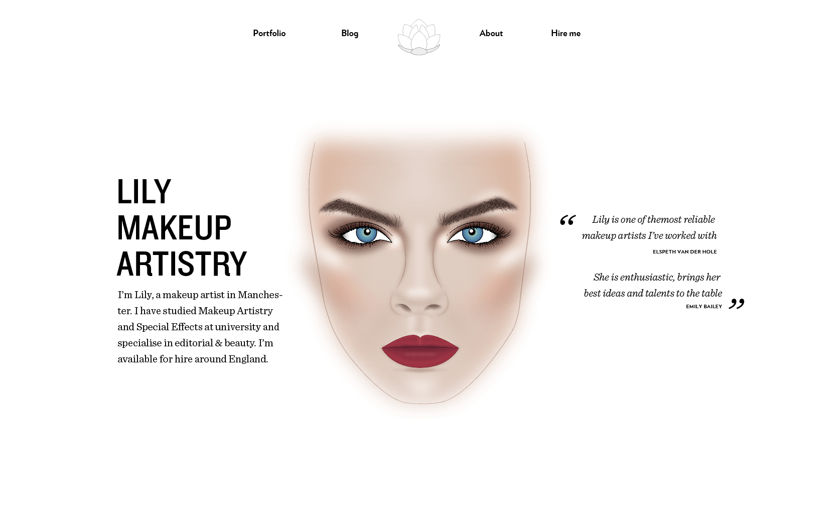
header — logo — navigation 4 items — portfolio — blog — about — hire me
(contact) introduction — company name — description — facechart about — image —
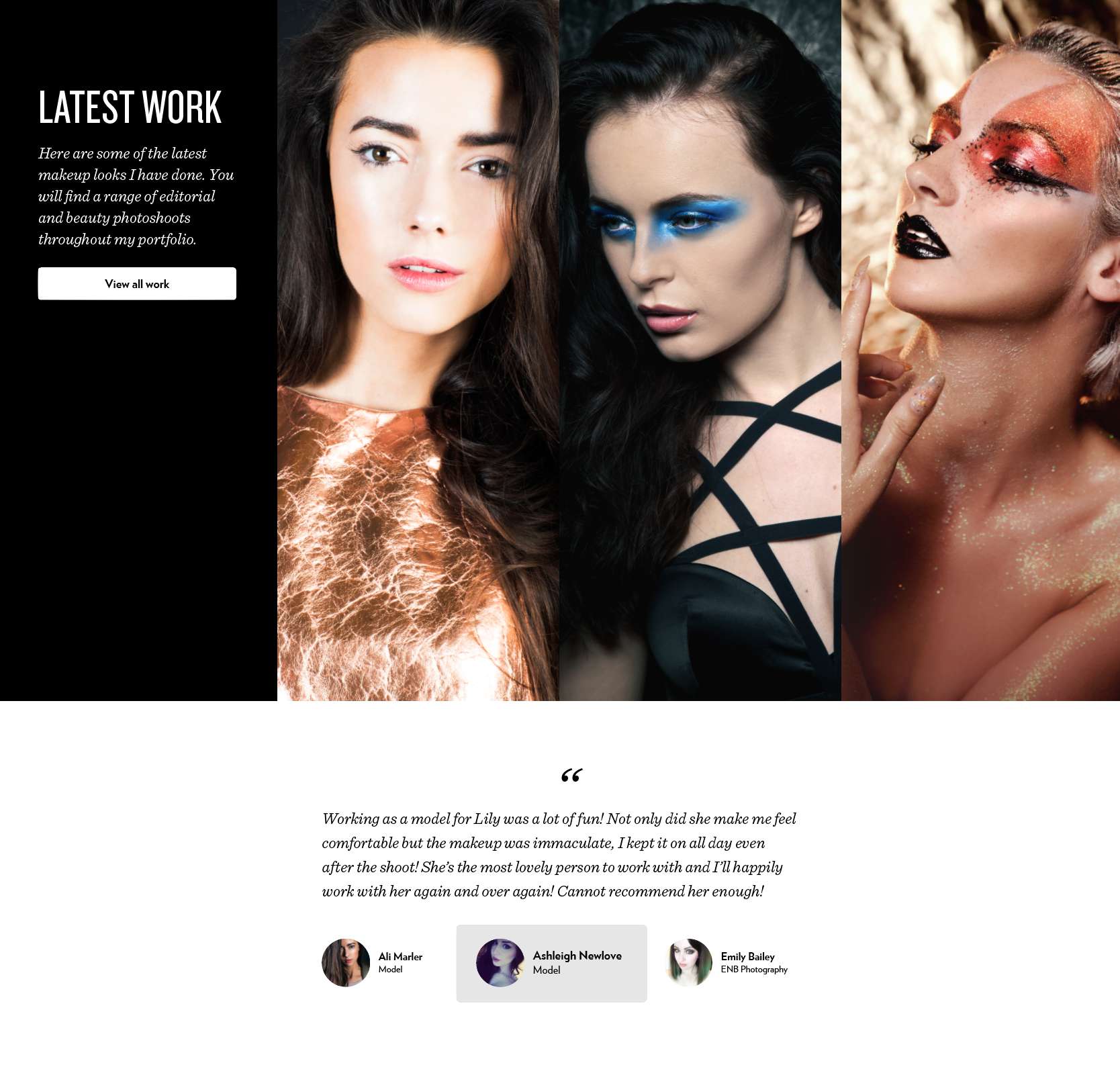
title — description — link to process/more about latest work — title —
description — call to action — 3/4 items of work? testimonials — 5 testimonials
— person name — role — image call to action ‘hire me’ — title — description —
button ‘work with me’ footer — newsletter — youtube — instagram — blog — social
profiles — copyrightSketching
I can’t see myself ever giving up sketching as a form of getting my ideas down. This is just the most frictionless way of me getting an idea, for the way elements will be arranged, on the page.
Usually I’ll range from 2–4 iterations, in sketch form. They can start smaller and get more detailed, as an idea progresses. I find it quite fun to carry out and it can lead to better layouts overall because you move quickly.

Transferring that to the wireframe
Traditional wireframes will resemble something that that you would produce in a tool like balsamiq, lucid chart or axure. These tools are great in their own right, however they don’t work well for me. They’re similar to the sketching phase for me (in that they’re inaccurate), with the exception that, I find them far too slow. This isn’t ideal when your ideas are just starting out.
As I mentioned earlier, the problem I want to address is accuracy. Too many times have I made wireframes to be designing and it not match up well enough.
Steps taken to improve wireframes
There are two crucial points to improve wireframe for me, creating an accurately sized document and avoiding any of the more visual styles such as shadows, texture and colour.
I will use my sketches as a guide, that include all of the sections mentioned in getting the basics and then follow the layout. This part will focus on getting proportions and layout correct, and identifying any issues with the sketches and adjusting them.
Typefaces
This is an important part, If you don’t do this already, I recommend you have your choices made early. Part of my process is that I choose them early so that they meet the project goals and what I believe helps in choosing the right typefaces.
This adds more accuracy to the wireframe. Parts of your design will depend on these typefaces being correct. If you use a single font like Helvetica and come to change that to something that is more extended or condensed, it could affect the layout.
Sections
If you break up sections with different background colours I use a combination of white on black and black on white. It makes your intentions very clear when you come back to add more detail.
Imagery & illustration
You want to aim to have the imagery, illustration and any icons to be representing the space that they will take up the very least.
Recap
The aim for this phase is to produce accurate layouts, without the focus on visual style. I find myself getting hung up on the visual styles and layout at the same time. This causes me to slow down and lose focus, chop and change layout. You need to separate the focus. In turn I have found this makes me much more efficient.
Not everything will remain completely the same, this is ok. You may find you need more spacing, different font sizes to complement the visual style better. Generally it should be pretty close to this wireframe. Rather than something dramatically different.
Finishing thoughts
I have done this for a couple of websites recently and have found it to be the right separation of concerns. There is a bandwagon, to get away from apps like Illustrator, Photoshop, etc, for making websites.
The way I like to approach a website now is to build up from a very low fidelity, up to a higher fidelity. With the aim that when I apply the visual style and on to code, I have to make as few decisions as possible.
After this you can copy the work into a new document where you can then add your visual style. Without worry about the layout of elements.
View on GithubHow do you approach wireframes and the accuracy, or does it even matter to you? Let me know @irsteve on twitter.