About version 4
A look through the design decisions for another of 2011’s redesigns.
— views


As the title states the obvious, I’m going to run through some of my decisions to redesign. Although I don’t feel this design is hugely different from the previous, it’s more of a refinement — although it doesn’t really look like it — confusing either way… Firstly firsts with this design.
Firsts
Typically personal websites are used for experimentation and a chance to have full control over what you do with your website. This is always the case with me.
Mobile first
This was the first site I’d taken a mobile first approach with, and by no means have I done it perfect really. I have always tried to keep the content cruft to a minimum on my personal website, so that’s never really an issue. I started from the bottom and generally worked my way up and I’m pleased with how the website changes to fit the viewport. Though my media queries are a little messed up I got that approach wrong, something I may work on correcting. It was a totally new approach starting from the smallest width to the highest. It’s definitely something to get used to and it slipped my mind on occasion that I was using a mobile first approach (as in I applied styles that should have been in larger width media queries instead of the base). Either way my mobile version has come out much better taking this approach.
CSS preprocessors
My other first was this was my first site I used Sass/Compass with. All I can say is I feel it’s a godsend, using compass’ mixins is such a time saver and allows less room for error. I’ve heard that it’s not all good with CSS preprocessors, such as performance and bloat. I purposely avoid nesting too deep as I hate being too specific and it makes it harder to organise your CSS (Not all my CSS is organised how it should be, but I do fairly well). I’ve generally focused on performance overall with this website. I’m fairly proud of the speed of most pages, they load under 2 seconds mostly! Back on track, I like how you can avoid adding presentational classes if you need to have something to use elsewhere with @extend. I think this is somewhat an Object Oriented CSS approach? I don’t have to remember class names, or where I need to apply them. I just extend a bit of code and it has worked well for me in most cases.
Design/content decisions
Most of this design is pretty flexible in the way that I can change it colour wise. It’s easy for me to make minor changes like that if I’m to get bored of the colours within the website. SASS makes this incredibly easy with variables and I can just change the required ones and done.
As always I go with a big opening heading on each page. I’m not sure why this always follows suit in my website throughout (any version), it just follows the design and consistency of it. A plan is to add an accompanying illustration of some sort to each of the main headings to add a bit more appeal to each page — it will be something I can use to practice illustration with anyway. My designs are generally always centred round the content. After all, it’s something I’m trying to sell, generally, my work/skills.
The idea for the design overall was minimal, easy to read (I’ll probably be making tweaks with the typography over time) and something new/fresh as always. I felt I was growing in understanding of how the content first approach worked with my last version that I was fairly pleased with how I’d trimmed the website down, that there wasn’t a large amount that got cut out this time. Just rework most of the content to be more to the point. I decided I would add my about page back, which is still in progress (I want to do something a little more adventurous with the layout and generally haven’t had time lately to do it). All content you find at the larger resolutions, you’ll find at the smaller resolutions. No hidden content here.
I can’t wait for the flexible box model/content regions
Something concrete that allows for more control over shifting your content about, to be final. I have used the old flexbox version on the home page, to see what I could do with it. I was pretty happy with how it worked, just not the extra markup I had to add as a container for the boxes that I wanted to be flexible. Although it’s nothing to add an extra container, I don’t think it should have to come down to that. Though the changes I used was for the mobile focused version, I have my availability and contact details the first lot of content you see as you scroll. It’s not this way in the markup.
Paged portfolio
I also went back to a paged version of my portfolio. As I felt that it’s my work and it deserves some explanation for each of the designs and the decisions behind them. It’s better than filling the page with images.
Media queries in action
Here are some of the differences between the mobile and desktop versions.
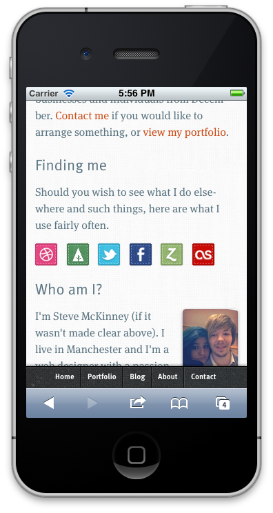
The navigation is positioned at the bottom of the viewport, like all iPhone apps they have their main navigation positioned at the bottom. I followed suit.
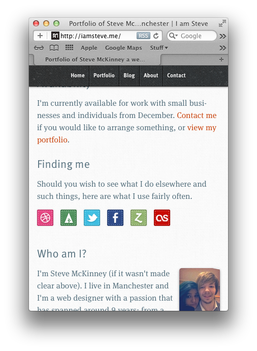
As you can see the difference here the navigation is positioned at the top. This is also the way for iOS versions lower than 5, as fixed positioning isn’t the same.
I think that’s it
I think that’s everything of importance really about this version. I think this version will be of many tweaks, changing and making it better with time.
View on Github