About version 2
A look at some of the design decisions and iterations for version two.
— views


This post is just about some thoughts and processes I make whilst designing a website, but this one is about one for myself. As the saying goes “you are your own worst critic.” It certainly stands true for this, many ideas went to waste but I’ve got something I’m relatively happy with. I hope you enjoy the read.
Well where do I start? Like everyone redesigning their own personal website, it takes a lot for you to design something you truly, truly are happy with. While I’m not truly happy with this redesign, I’m happier than the previous version. I think I went through around 10 different designs, while some may have done more. I completed a fair few in full code and the majority of the pages of that design.
Why this design?
Well it’s a pretty easy to answer that question. I came to this design through chance to an extent. I thought the idea of adding a 3D type depth, was a pretty cool idea. The other challenge I kind of set myself was, being able to do it in as few images as possible and replicating as much in CSS. Which I think I have done very well (just try zooming in and everything apart from the header will remain crisp).
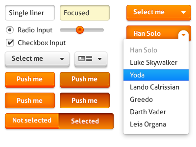
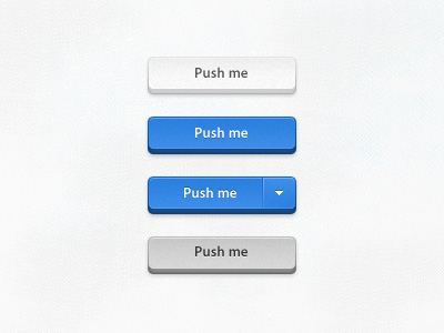
Inspiring buttons
Inspiring designs
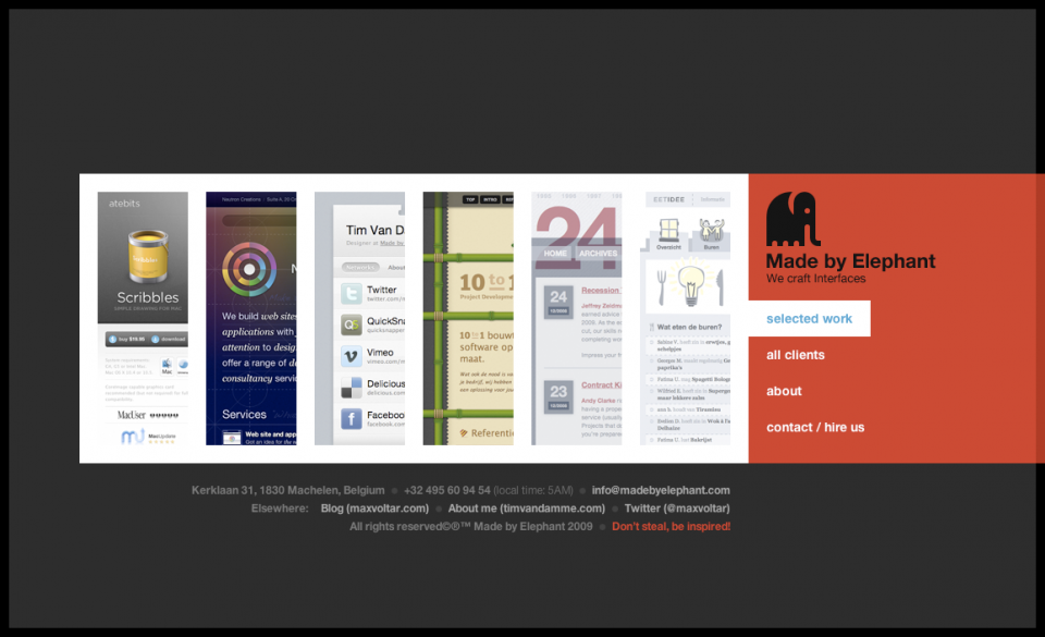
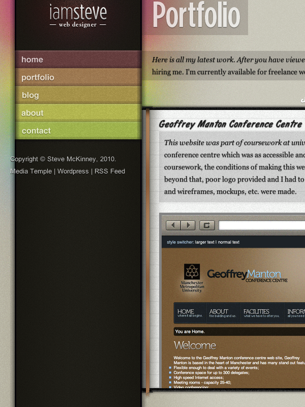
The vertical navigation and display of the work helped inspire the recent work on the home page.
Not enough inspiration?
While I have only noted a few examples, they are the ones that played quite a big part. Various websites, articles and such, helped me with ideas for content layout. As that was what the main focus was to me, I want to give users a good experience, a simple experience and not too much ‘blab.’ However I did do a rather large amount of sketches to get a rough idea, far too many to show just on here, as well as Photoshop mockups. Reason being I was trying to go for something that wasn’t really inspired from anywhere, though the overall design probably relates to many things, of course.
Sketches
Albeit poor quality, you will get an understanding as to where I was going!
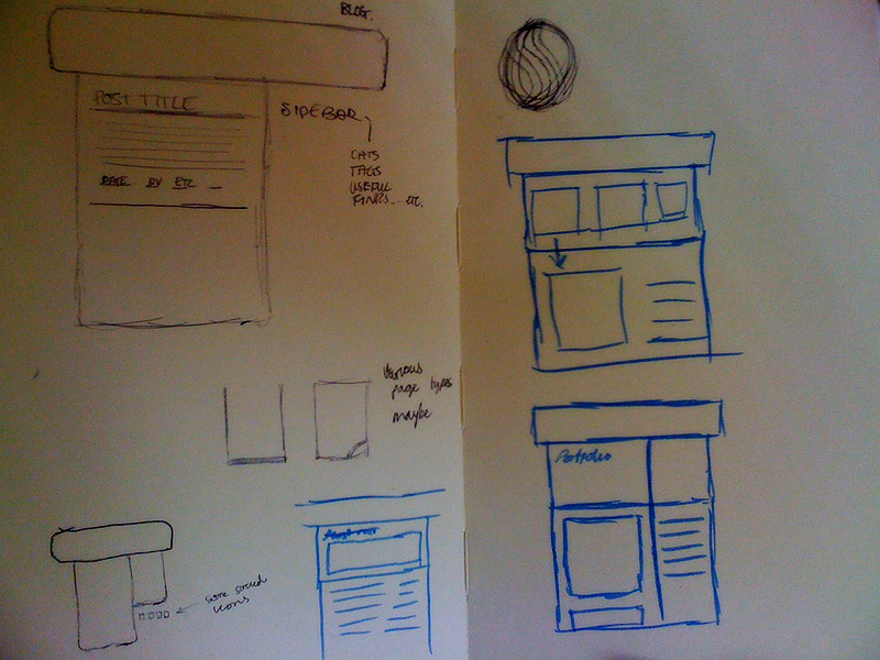
Firstly, this is what the final sketches look like in my book. The rest below will be of concepts and a couple went further and were almost what I ended up with.
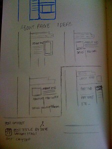
This one almost saw the light of day. I coded the majority of the pages.
A rough idea, which I thought wouldn’t work.
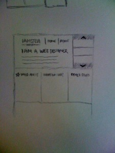
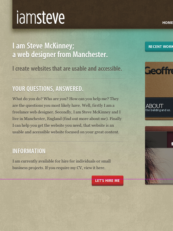
Actual designs
The two which I was most happy with before hand. Both of these examples are in the browser. So there is a couple of things that are out of place, like the pink line and misplaced footer text. Why didn’t I use them? This may be a question of yours but because they weren’t as adaptable/easy to work with for being responsive. This one is much easier to make responsive. While it isn’t at current it will be at some point. I will follow it up with a blog post when it is.
Wrapping up
Well, this turned out to be longer than I’d expected. I had so much to show of how I got to this design you see now and all that I’ve done leading up to it, the post could easily have been twice the length. Basically I wanted to achieve something that would work responsively (when I’ve got the correct CSS in place) and a design which could easily adapt from time to time to make easy changes for blog posts.
View on Github