Shop filter series: sketching & starting wireframes
Exploring a tab bar approach to shop filtering on small screens. Most filter UIs fall short on mobile — this post starts the series with sketches and wireframes.
— views
Filtering is a huge part of online shops, it’s an effective form of navigation. In most cases it’s an area which is overlooked on small screens. I have seen some good implementations and many lack the ease of a larger screen. In this post series I want to explore the idea of it being a tab bar, starting with sketching & wireframes.
Introduction
This post will be using Adobe Illustrator, but it could equally be done in others. You need to consider the most common options a user will need to filter by, but importantly the options to filter within them and presenting them.
This is the first part of this post, you’ll follow the design process, from sketch to wireframe, then onto visual design.
Skip ahead
Feel free to skip this entirely, if you would like to download the files and take a look.
Download icons to follow along
I’ve made a set of icons for this post. If you’d like to follow along you can download the icons. Alternatively you can make your own or use a different icon set.
Designing for a clothing company
You’re designing a website for a clothing company and at the stage of designing the small screen version of the shop page. The page where all products are listed, you have a few options to filter down the products.
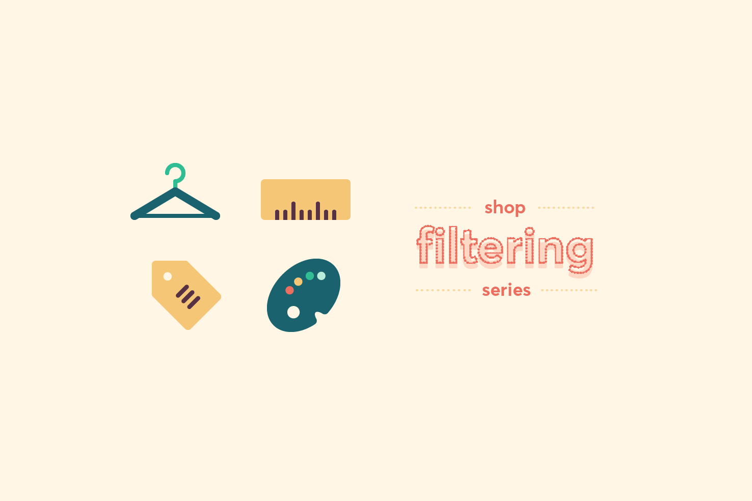
Type, size, brand, price and colour are filters which will allow you to refine your results best. A convenient way to clear filters needs to be considered also.
Sketching
With those types in mind and it being a ‘tab bar’ you’ll need to sketch several screens. Icons will be needed to provide a representation of what the filter is, you’ll pair this with text underneath the icon for clarity.
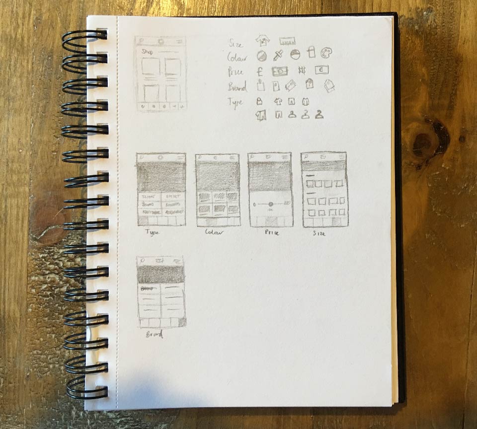
Sketching icons
The idea with sketching icons is to think of the best representation for that word, which is also the most simplest. Sketch as many ideas as you need to, get all the poor ideas out and see what happens.
Each icon is based upon a 24x24px square. As their creation is somewhat out of the scope of this post, you can download ones I’ve made.
Sketching layouts
A basic layout to get an idea of what you’re working with. Then going on to sketching each of the potential layouts for the filters and the icons they will need. Some will be trickier than others, such as size, as it’s different for different types of clothing.
For each filter I have selected a layout which occupies space well. Price and colour require different considerations to make them most effective. While size, type and brand will generally retain more list like appearance.
Wireframing
You’re going to start the process by wireframing everything. This will allow you to focus better on layout, then build up the visual style later.
Start a new document
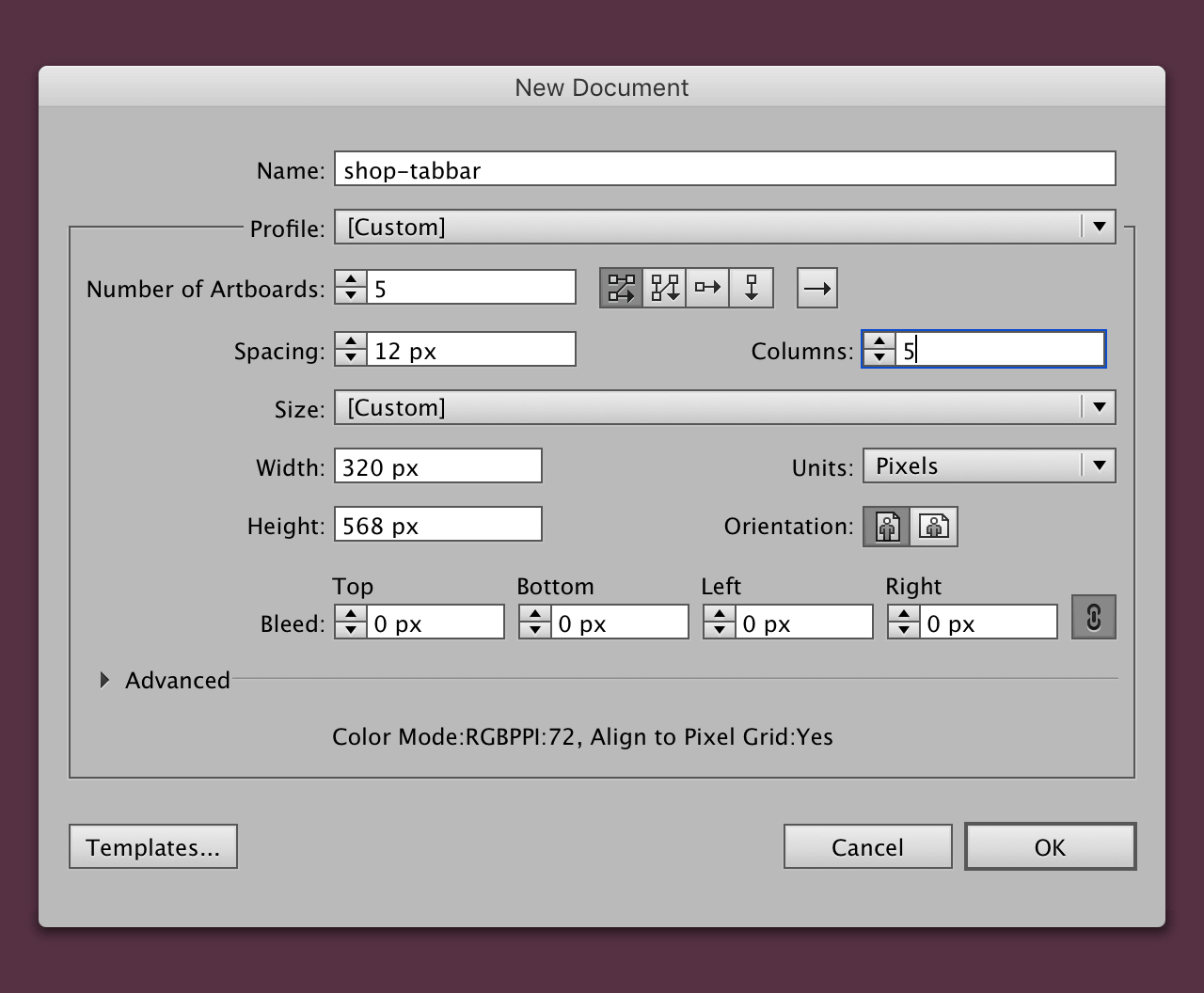
First you need to get the basics in place. You need a document with 5 artboards sized 320x568, based upon the smaller iPhone.
Add a background layer
Add a new rectangle by pressing m. Click the artboard and add the dimensions 320x568, so it fills the artboard and add the fill colour #f2f2f0.
Make a small grid
Add a new layer in the layers panel and name it ‘grid’. Copy the background layer, and click the grid layer, so it’s selected. Then press cmd + f, this will paste it in place.
Reduce the size
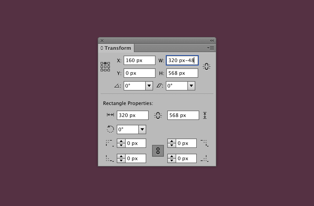
With the layer still selected, open the transform panel, which can be found in the menu Window > Transform.
With a central reference point and constrain proportions unchecked, subtract 48px from the width. The layer should remain selected and be central
Grid settings
With the layer still selected, in the menu bar go to Object > Path > Split into Grid.
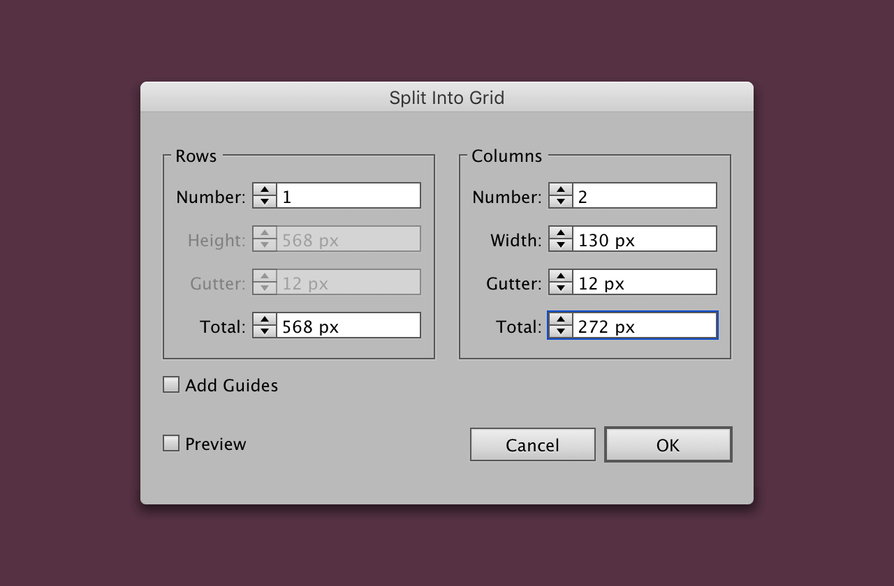
Once you have added those settings, click ok. Copy those layers, then click the artboard next to it and paste in place cmd + f.
Repeat this process for the other artboards. Then select all the grid columns in each artboard and press cmd + 5.
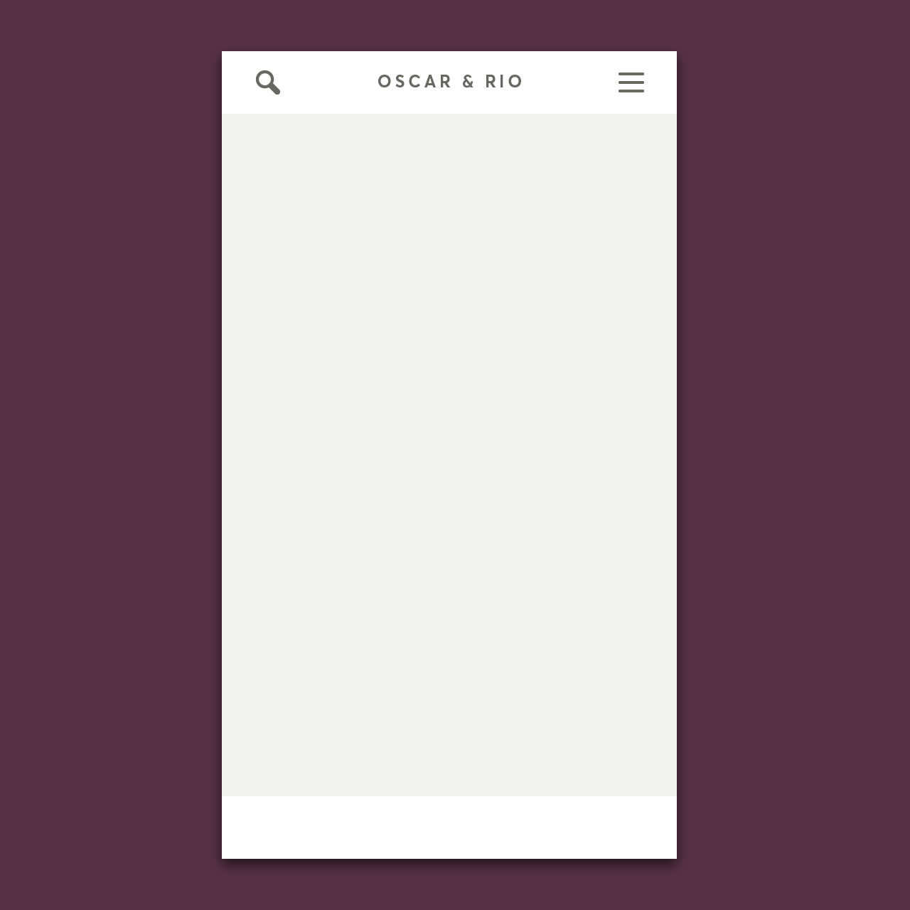
Add rectangles for header and filters
Add another two rectangles with the dimensions 320x44, fill them white. Align one to the top and one to bottom of the artboard.
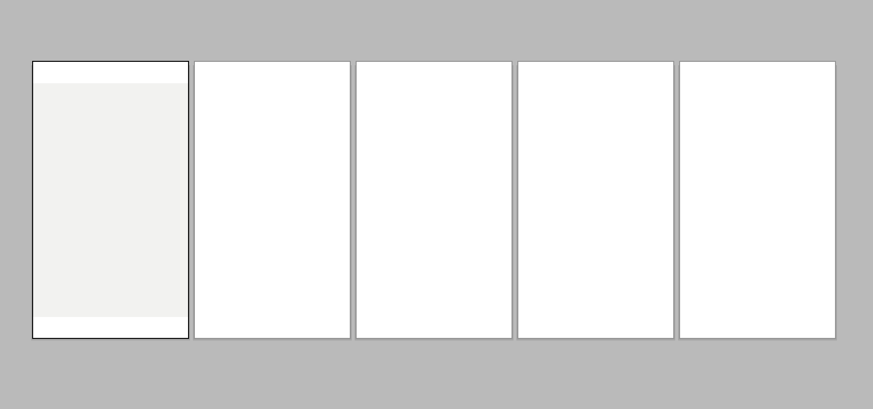
Header
The wireframe is now coming together. Using the icons mentioned earlier, copy the search and menu icons and paste them into the main document.
Add icons
Select the search icon and drag it to the left side of your guides, and repeat this for the menu icon, except to the right.
Add a logo
Next add a logo, which needs to be aligned to the horizontal centre of the header.
Align the icons and logo
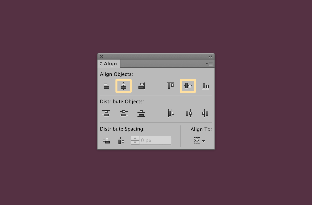
Select the header background, the icons and the logo. Then click the header background again, to align to a key object. Next, go to Window > Align to open the align panel.
Add content
Towards the top, make two text layers. One with ‘Shop’ and the other ‘Browsing 84 styles’. With this the filter has an additional indication to show the page has updated.
I have made the title have an 18px font size. The styles counter is has a font size of 12px.
Add products
Now to add content in the way of products. Using a rectangle as a placeholder image, adding a title and price to make up a product.
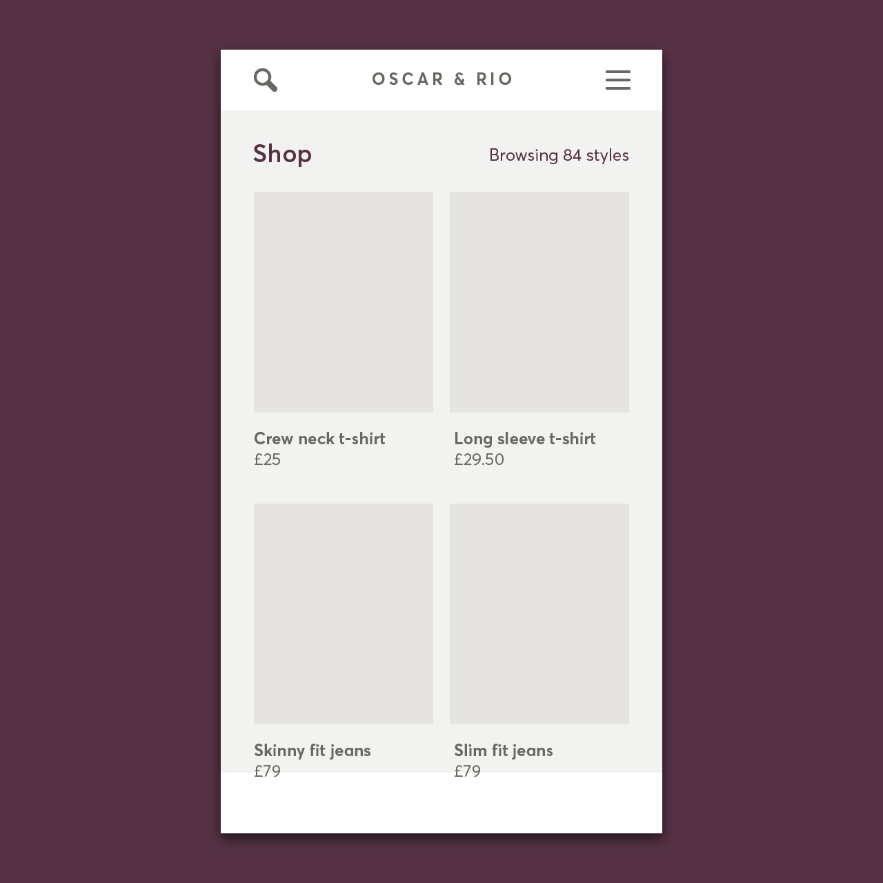
Adding a 130x160 rectangle m and below a product title and price. Both the title and price have a 12px font size, with the title being bold.
Select those 3 items and group them together with cmd + g. Then copy, paste and align an additional three. Taking care to align them within the grid columns and have a consistent space above and below them.
Making a symbol
At this stage you’ve made the bulk of the reusable layout. Making it into a symbol is a good way to go. Open the symbols panel by going to Window > Symbols.
Then you need to select all the elements except the bottom rectangle for filters. In the Symbols panel you should see the ‘New Symbol’ icon become active.
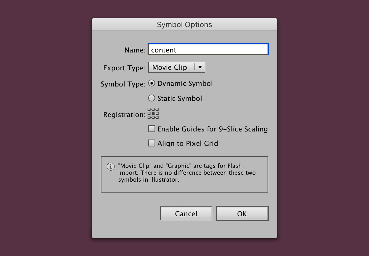
Click the ‘New Symbol’ icon and enter a name. No other options here are really important.
After clicking ok, this will move everything to the top, move it to the back with cmd + [.
Tab bar
Now that the content is completed you can move on to the navigation.
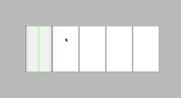
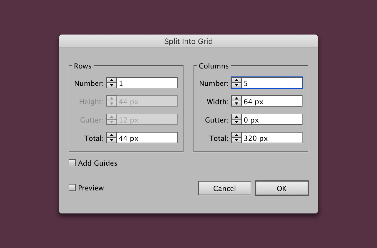
Split the rectangle into 5
Select the bottom rectangle, then in the menu go to Object > Path > Split into Grid.
Icons
As mentioned earlier in the post I’ve made a set of icons for you to download. Or of course you can use your own.
Place the first 5 icons (including text) into the document nearby the rectangle. It’s not too important where, the alignment process doesn’t depend on it.
Aligning icons
Making sure each icon and the text are grouped together cmd + g.
Select one rectangle and the grouped text and icon. Then click the rectangle again so that the border is thicker, aligning to the rectangle as the key object.
From earlier you should have the align panel open, if not go to Window > Align. Now vertically and horizontally align the icons.
Then taking care to make sure all the text aligns evenly.
Make it into a symbol
The final step for this part of the tutorial is to make it into a symbol. Making sure it’s dynamic, this will be particularly useful in the next post.
A good point to leave it

This is a good point to leave the post, the layout is essentially complete in terms of positioning. In the next post the individual filters will be made.
View on Github