Redesign progress update
A progress update on the v6 redesign — balancing writing with redesign work. Includes early iterations of designs and illustration from the process.
— views

One of my aims during redesigning this website is to keep the seamlessness between content output and redesign. It’s not the easiest of tasks, as any time spent writing, is time taken away from the redesign or vice versa.
It also means every post I work on, the redesign release gets pushed back, or it takes away from a potential queue addition. As I don’t want to stop the weekly output, I think it’s worth posting a progress update to think some things through.
Why redesign
As I haven’t announced in great detail that I’m doing a redesign (why would it matter?) I want to reflect on that. This site was last redesigned early 2012, which was the year I graduated from University. I prepared a portfolio, and setup the site to be very focused on getting a job. Now I’ve been in the industry for nearly 5 years, much has changed for me professionally, but this website has remained the same.
There is a level of complacency that happens with having a job. You get comfortable and don’t really update your portfolio, which can really leave you lagging behind. As a result of this I eventually removed the portfolio and made some tweaks. They were focused on moving the website in a direction of having an active blog. This made sense, as it was something I proved to myself, that I could do regularly.
A new logo then redesign the site
As mentioned in the logo redesign post, the full redesign is something I originally started in around 2013. I made good progress with the design, but the design world shifted to flat and what I made was heavily ‘skeuomorphic’. I was put off by that, I didn’t want to appear outdated. It had a negative effect, I wasn’t motivated to start again. I just couldn’t get behind ‘flat’ and the amount of time it takes to redesign a website in your personal time.
On more recent reflection that design still met criteria of a redesign, but the shift in direction means, that much of it in terms of layout, would need to change.
The scrapped design
I explored several other ideas, within a similar style. Some of these versions at the time were testing my skills of visual design. It was a fun design process.
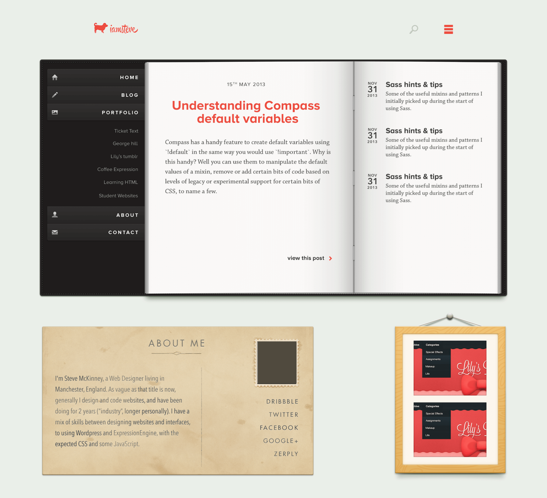
I tried various routes, and eventually reigned in the approach as I tried to balance the visual design with content and not make it too intense.
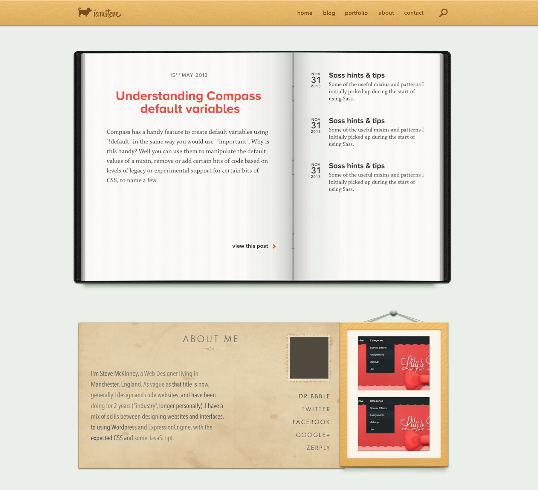
On to the actual redesign
I’ve mostly kept quiet about the process of the redesign as I’m documenting it along the way. A write up will follow with the redesign. I’m currently at a stage where I’m not too far away from completion. The homepage is done, and I’m working on the blog related pages.
Following my process, I identified a set of problems. These were as simple as the website is outdated and that I don’t feel as if I’m perceived as a designer. After that, I outlined a brief, to make a new ‘brand’ for this website, improve the blog, bring back a portfolio and bring focus to me being a designer.
Taking an idea and improving it
Getting into the design, I revisited what I had made previously in making a new logo and came up with a new solution. I visited wireframes and sketches briefly, whilst applying some illustration to the logo. I realised this wasn’t working and scrapped that idea.
Reworking an idea further
Determined to include illustration I went back to the drawing board and changed the idea. I tried to force them to be very closely based on the logo. Which was fine, it worked, but not with the layout. So I made them with a view to fit them in the design.
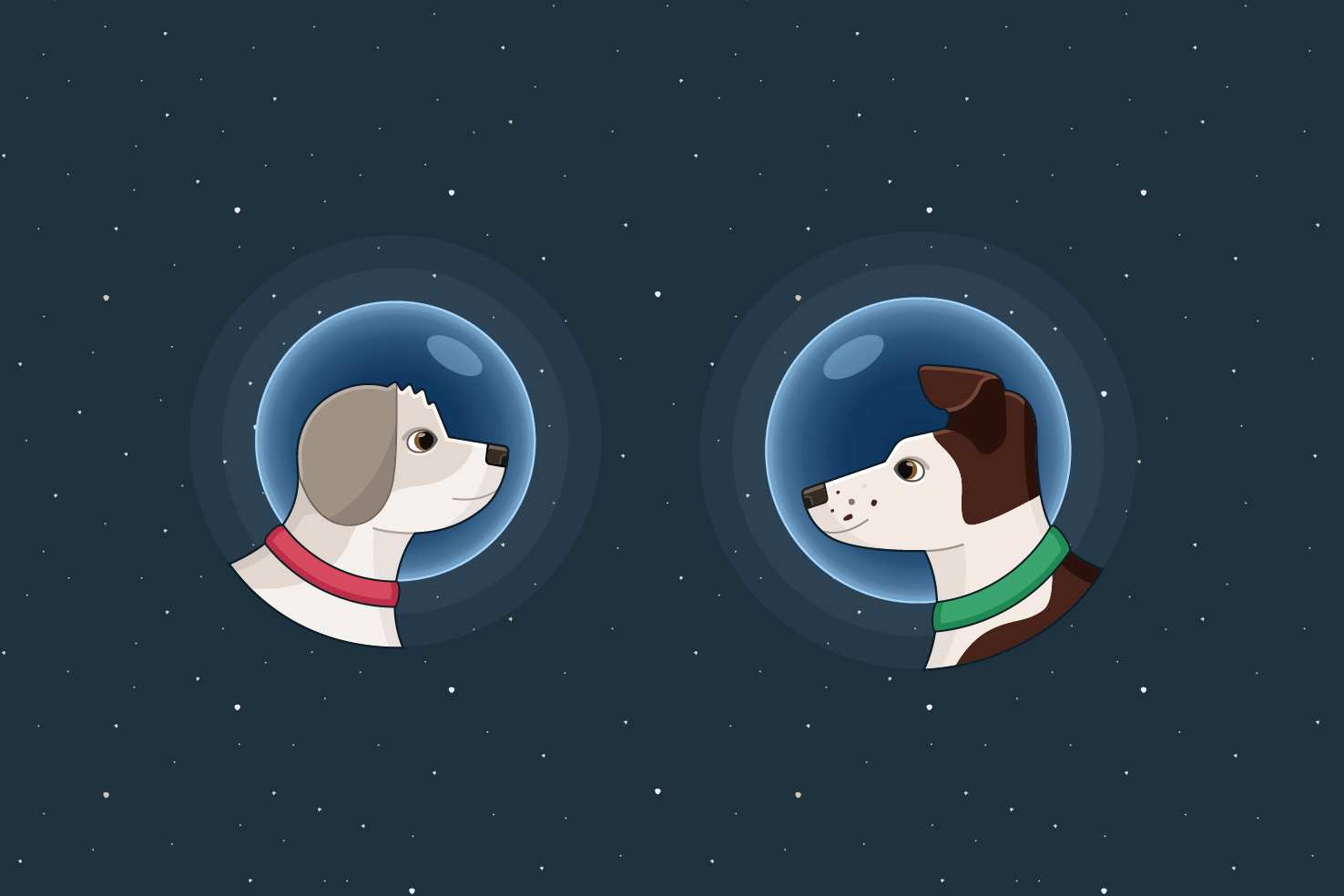
The illustrations are an area I spent most time. It’s an area I’m not as confident with, as I’m by no means an illustrator or good at drawing. It’s something I’m working on and I was determined to make it work.
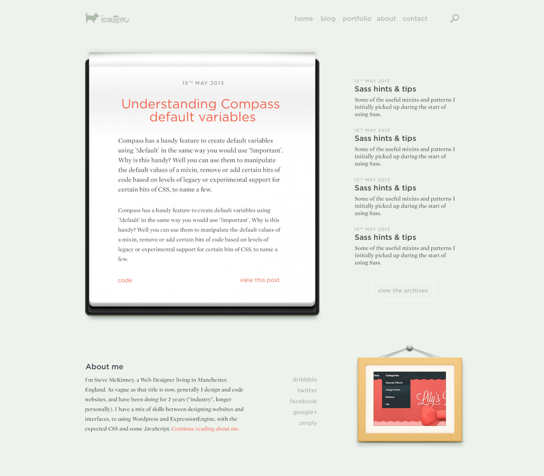
Following finalising the illustrations, I made initial colour and typeface choices, alongside sketching ideas and moving on to wireframes. I made wireframes for the homepage and blog. Which then I designed. I made the decision quite early on to stagger the approach, and have left the portfolio until a later date. I have since got around 70% of the way with coding. With the homepage complete and the blog pages a good way through.
The plan from here
The priority is to get to finish the blog related pages, finish off the download for the newsletter and an extremely simple contact page. Finally some testing and make it public.
From there I have a list of things to do to build up on the blog:
- Contact improvements
- Performance improvements
- Series highlighter
- About
- Design system
- Portfolio
Regarding the portfolio, it’s a really intense task to do right. I am considering using the likes of Adobe Portfolio, as it’s purely about the process and work. This service exists for a reason, so I believe it’s a good choice. I want to take my portfolio more seriously, and be able to keep it updated easily.
View on Github