My design process — v6 case study
The redesign of this website has been needed for some time. Overall the website is quite small in terms of templates required. I wanted to put the effort into making the website feel like it is a growing source of content. There is much to cover in this, as I start with the new logo briefly, sketching, wireframes and design.
364 views

The redesign of this website has been needed for some time. Overall the website is quite small in terms of templates required. I wanted to put the effort into making the website feel like it is a growing source of content. There is much to cover in this, as I start with the new logo briefly, sketching, wireframes and design.
I needed to first determine what it was I was looking to improve with the previous design. In reality this was easy to determine:
- I want to be perceived as a designer
- Design needs a stronger aesthetic
- Reflect me as a person better
- Make the blog more inviting
- Encourage browsing of the website
Some of these goals were achieved within the redesign. Some I will have to work at long term.
- Improve visual design
- Introduce more colour
- Add more images to posts
- Have images in the post archive
- Write more design content
Essentially, when I looked at the website, in its current form, it felt embarrassing. Which is a good thing, I designed it 4–5 years ago.
It needed a stronger visual element to it. I need to come across as if I know what I’m talking about, but also be fun, inviting and not too serious.
I want to teach that design should be fun as well as solving problems.
I started the process off small with a new logo and tweaks to the website. It had its own set of requirements. It set the ground work for the redesign.
I have wanted to include a bit of illustration throughout my designs for a long time. For one reason or another I backed out. Usually down to the time and my skill level.
I’ve always liked the idea of a ‘mascot’. I’ve started small, but it allows me the opportunity to build upon these further as time goes on. I think it helps us to get past that all websites look the same feeling.
I wanted to use this opportunity, to try something I don’t do often. I enjoy illustrating, but it isn’t my strongest skill. I reminded myself that it’s the only way to learn.
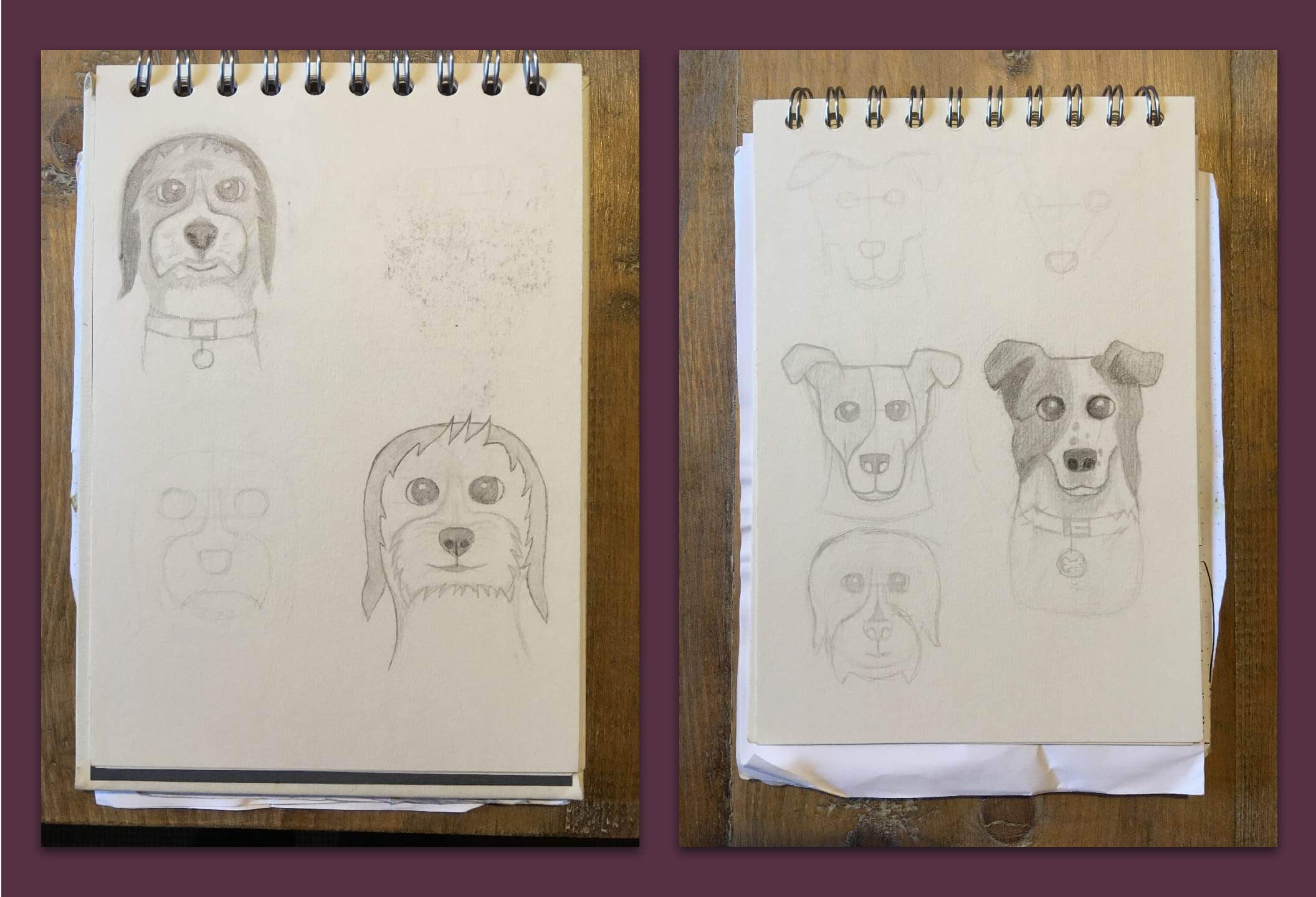
Some of the sketches for both illustrations. Illustrator can be very forgiving in the overall outcome.
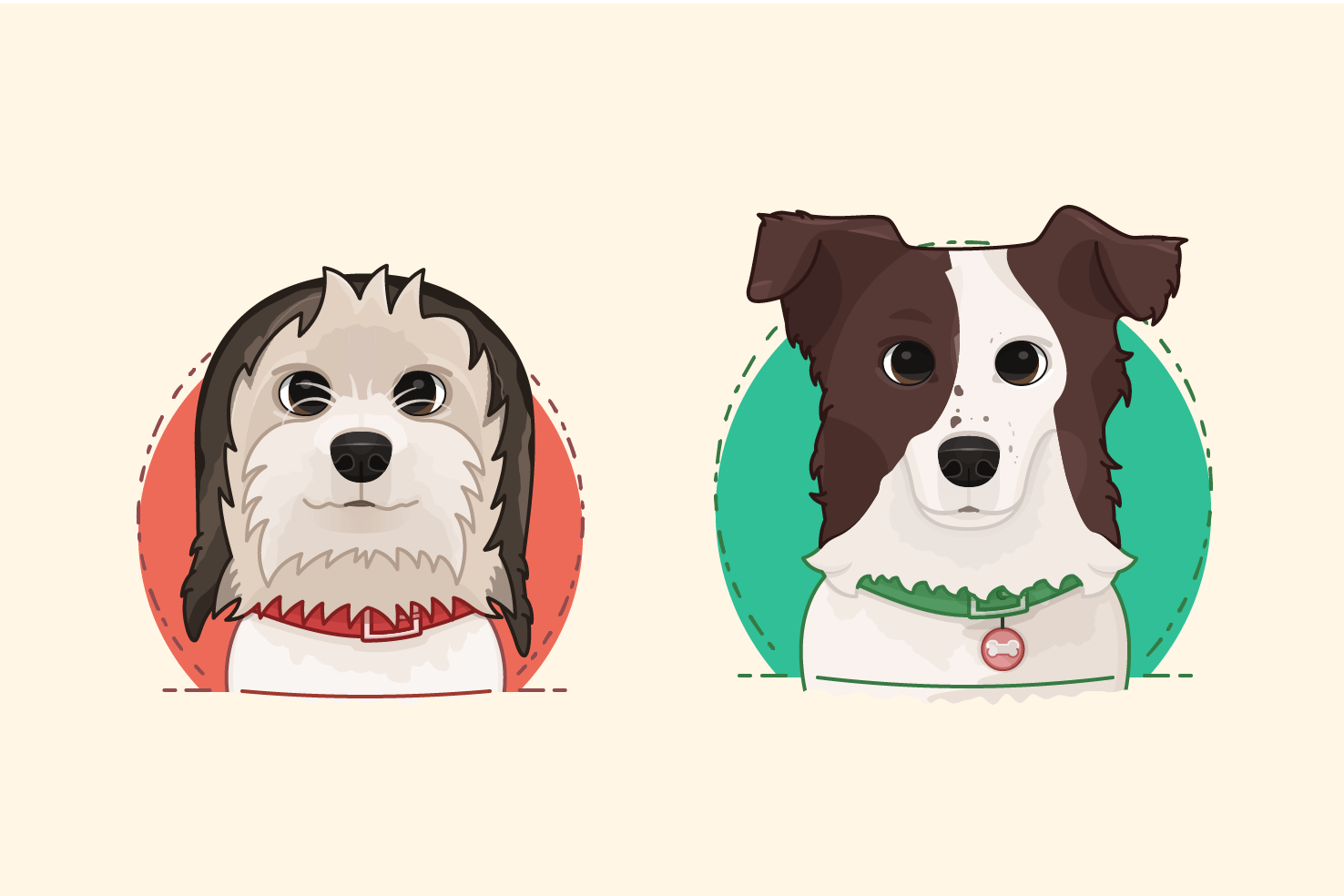
I’m really proud of these, it was a lengthy process of iterating on shading, and reshaping, to make them look right. I feel like I have made something good.
There are things I would redo and do differently, now that I’ve completed them. It’s these things that keep me going as a designer, something that is a genuine challenge and I always aim to have that with my side projects.
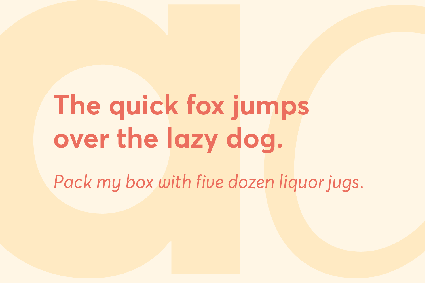
To begin with I always start with an initial colour palette that I iterate on during the design phase. The reason for picking initially is so that I have thought about what I want it to communicate. Iteration must happen due to the array of use cases.
The main goal towards usage of colour is to appear confident. When I look at other designers websites I admire, there is always great use of colour within those.
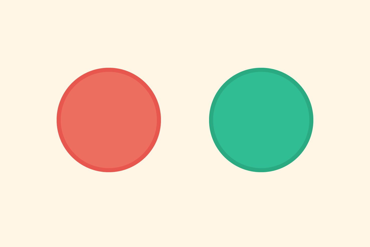
Red is a confident colour. Green is more neutral, which evens things out.
I was initially drawn to shades of red and green. Typically this is seen as a difficult colour combination to work with. Which is why I went for a green shade which had more blue feel, and a red that was more orange.
The relation to that was in the illustrations of the collars on my dogs. Which was down to it suits their fur colour, as strange as that may sound.
I paired that with yellow, dark purple and dark blue. These additional colours contrast, complement and give me a selection to work with for featured images and text.
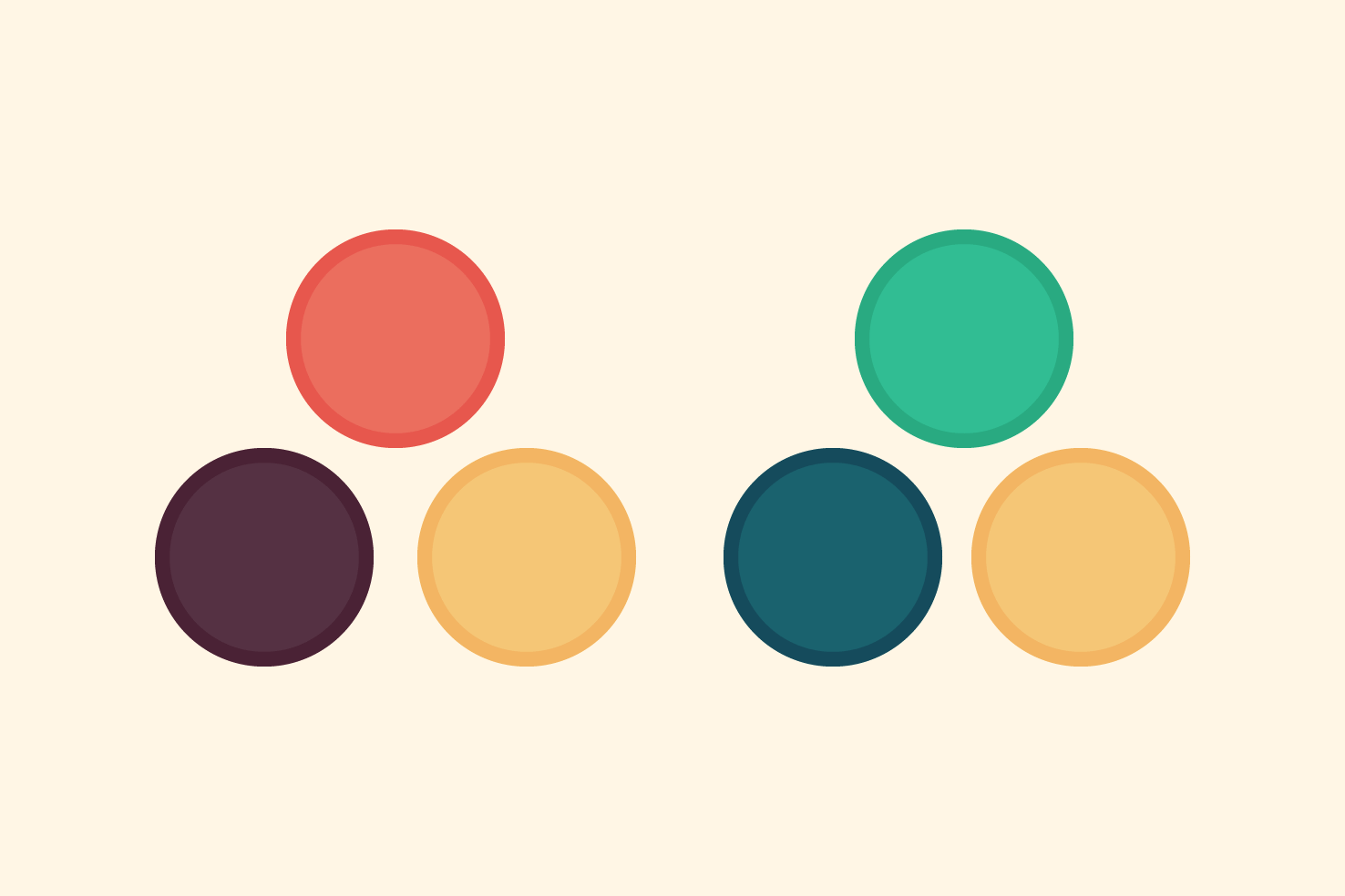
With those colours I broke them down into two complementary palettes that are tied together by a common yellow colour. Of course there are plenty of tints and shades to go along with that to use as and when necessary.
Before going into the sketching I thought long about my understanding of how people use the website. The main focus is retaining new visitors. That’s generally everyone’s struggle right?
The main idea I had was:
- Introduce
- Latest content
- Newsletter
- Popular content within design and code categories
The homepage isn’t the most visited area, it didn’t invite that. Again, the visual interest was lacking, and I believe ways to browse content.
I have a reasonable amount of articles with a level of popularity, this was something I wanted to bring in. As well as promote newer content. It’s important that the website is perceived as active.
Changing the layout dramatically here isn’t really possibly. Highly art directed articles can become a maintenance issue. They are nice, but not feasible. It’s something I want to explore over time.
The main issue I want to address is, increasing the amount people browse the website. The vast majority of users arrive by search. To do it without being annoying and maintaining a great reading experience.
My observations were:
- Keep a similar layout
- Add a more editorial style where possible
- Improve reading experience
- Remove related articles
- Replace with one highly relevant article
- Allow for larger images where necessary
I had done so many sketches, settling on the idea that the introduction accompanied a latest post.
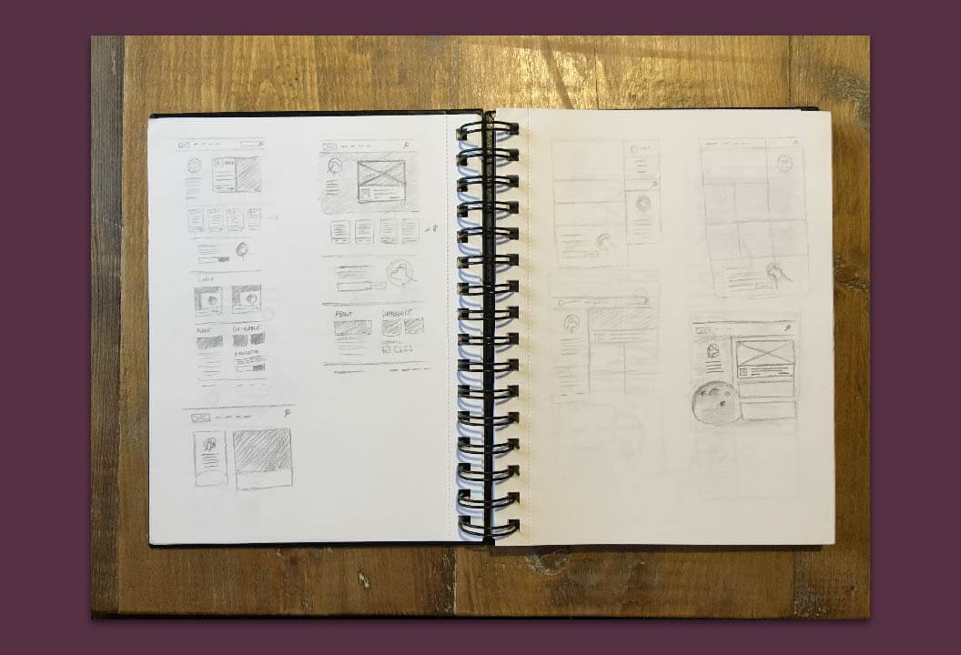
Sketching serves as a way to explore themes and ideas that may fit the style of the website.
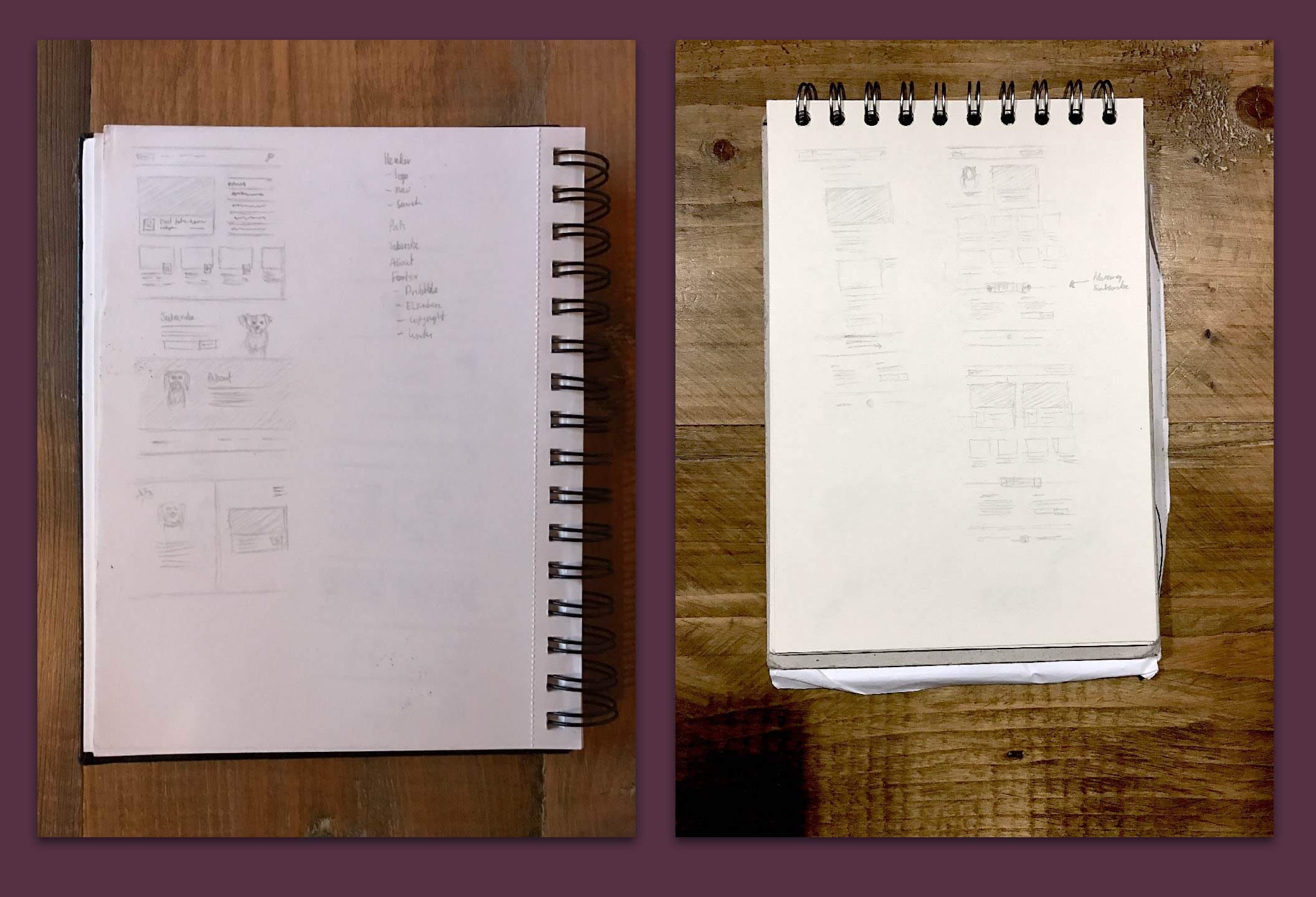
I progressed through the sketches considering the priority of the content. As mentioned earlier I did debate the value of an introductory area, which I’ve gone for. Along with the latest post it seemed the right thing to do. Following with more recent posts, the newsletter subscription and popular posts.
Small screen and post versions were explored too at different stages.
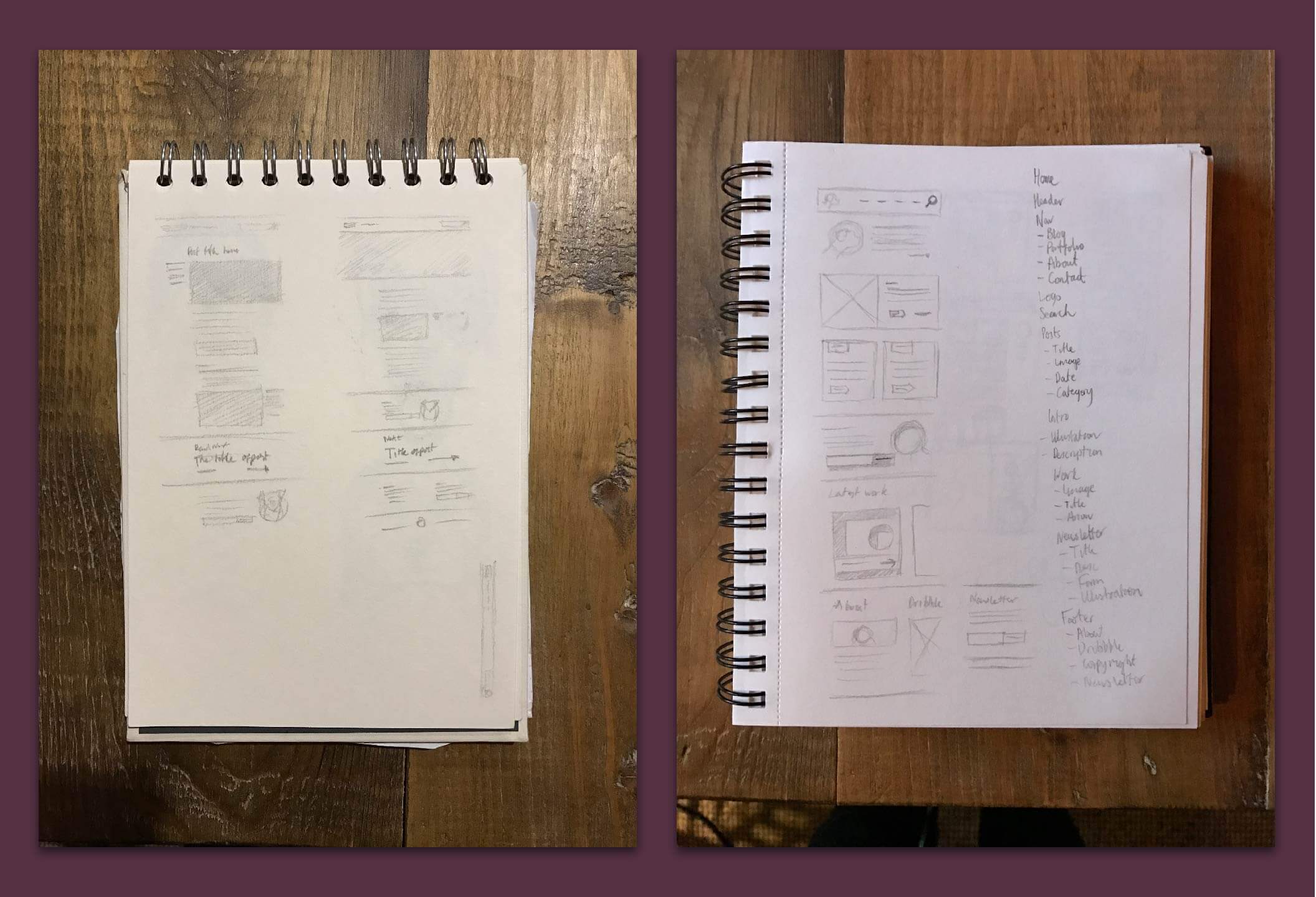
I had a reasonably good idea what I wanted to do from the sketches and planning earlier. The ‘wireframes’ closely matched my sketches, for the layout and visual style to be iterated upon further.
I used Avant Garde throughout the wireframes. Usually I would decide typefaces early, but it can be expensive mistake if you get it wrong. I picked based upon what I had available to me already, that matched closely to the requirements. It turned out to be a good decision.
I produced wireframes for only the homepage and blog/category pages.
The actual article page wasn’t necessary to wireframe. Many visual decisions are made within the articles which as a wireframe isn’t too helpful.
It was always in my mind for time saving that I focused on the core pages. As a better about and contact page can come later.
The specifics I wanted within typefaces aside from legibility were to fit in with the friendlier style I wanted.
I was looking for a sans serif, typeface that was something along the lines of, ITC Avant Garde Gothic, but not as geometric and a little softer.
I needed something that would be for the long term. I wanted to look at the choice objectively as possible. I eventually stumbled upon Averta from The Designers Foundry.
It has a nice variety of weights and true italics. This certainly helps longevity. It was extremely affordable and it matched everything I wanted.
Paragraphs is more flexible in this regard, I had availability through Typekit and Cloud Typography. I ended up with Abril Text and Sentinel, as the choices.
They both have a relatively modern style, which pairs well with Averta. They’re both great for reading. The difficulty was choosing between them, they both worked great. In the end I settled with Sentinel.
Cloud Typography has really fine grained control of things like number style and ligatures. As the support for this with CSS is still limited, it’s a nice workaround.
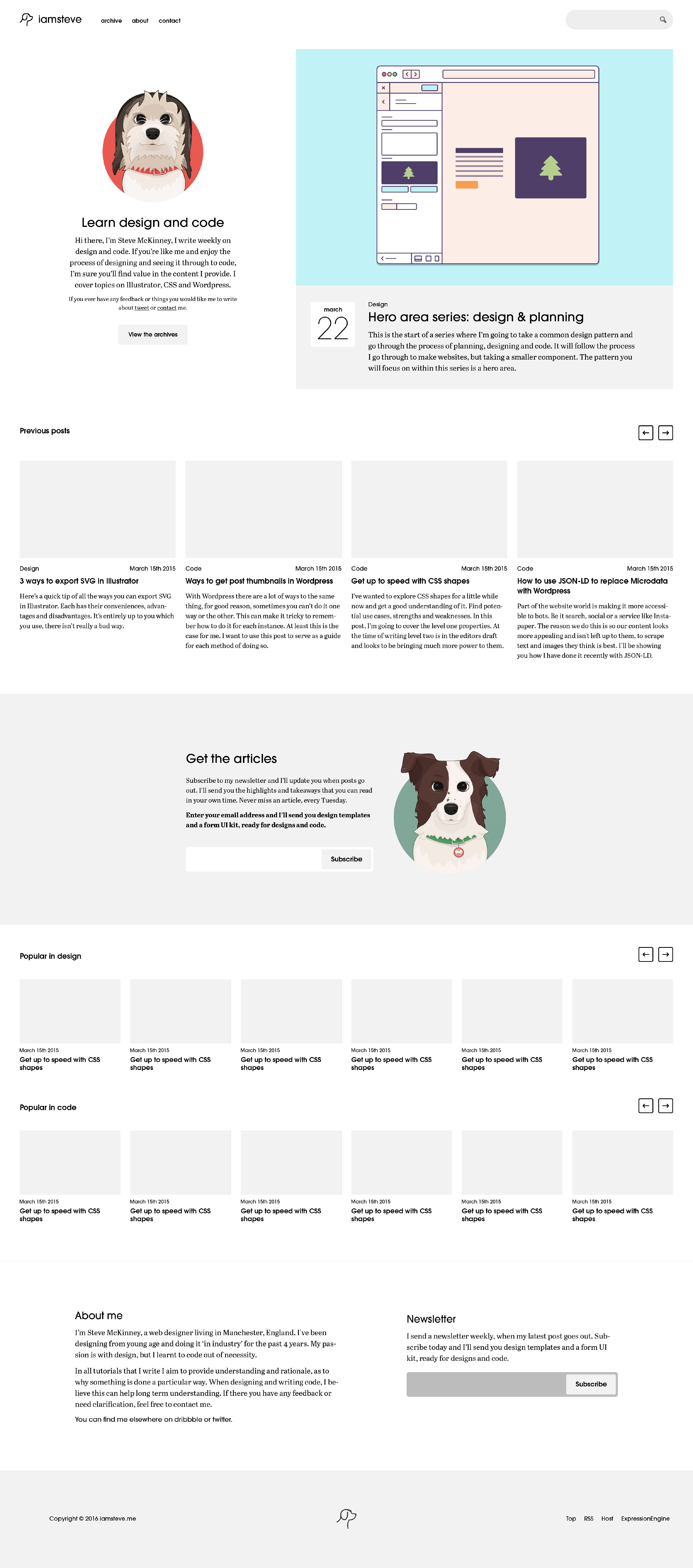
After all the choices made earlier I built up the visual style. I wanted something that was light, inviting and colourful.
The header/navigation area I wanted to keep the overall style quite subtle. The focus would always be on the content. For new visitors, I want them to either read the introduction, or get into the latest article.
However, inside the articles it’s nice to have the navigation readily available at all times. It’s a balancing act, that’s why the scroll to show/hide style has been so popular.
I wanted to develop a system for featured images that worked well. So when it came to image sizes in different locations I could have featured images generate sharp sized images, from one size.
This was too idealistic. As illustrations made at small sizes felt weird scaled up to the large size and vice versa. So I settled upon the three you see on the homepage.
I decided that they should try to follow screen aspect ratio, which is most commonly 1:1.6, but this felt too tall.
I decided upon 1:1.5, this worked well for trying to achieve vertical rhythm. It was a good basis for images within posts too. As I wanted to try have them feel consistent.
This is still a work in progress, but featured images were always going to be a challenge initially. The time to make them alongside writing and building up a style.
I’ve done a fair amount so far. I’ve done some I’m happy with and others not so much. The important thing is I feel like I’m making progress and developing a style. Hopefully you will see this if you browse the website.
Another tricky area to achieve balance with and variety. The idea that was prominent in my mind was type sizes are a pain to manage responsively.
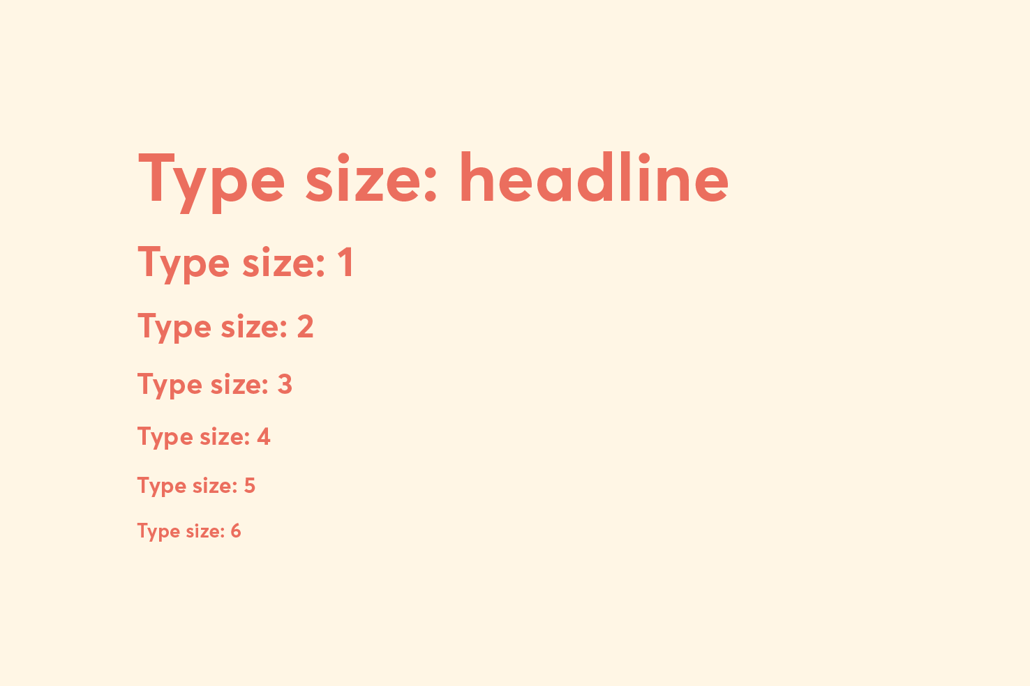
I set about creating some rules, eg: type on small screens shouldn’t exceed 24px. I find in the majority of cases that websites overlook typography on the small screen. I didn’t want that to be the case.
During the development I was able to keep this nicely under control with the Tachyons style of writing CSS. If there is one thing to use this approach for; it’s type sizing.
I wanted to try add some editorial ‘flair’ throughout. It’s hard to be creative with article pages in a sustainable way, so that was something to be wary of along the way.
Another part I could bring in the editorial spin was to extend the background out on the featured image.
All my images are generally solid colour backgrounds, so I knew I could use a bit of PHP to check the image and return the colour value. You’d never know that this is happening.
Another part of the solution was to allow images to be flexible within them. As depending on the tutorial larger images may be beneficial. Then I can use that size throughout the post to keep consistency.
I use blockquotes quite frequently, to highlight key areas. I use them to ‘sign post’ things, so I figured why not do that. As you’ll see with this.
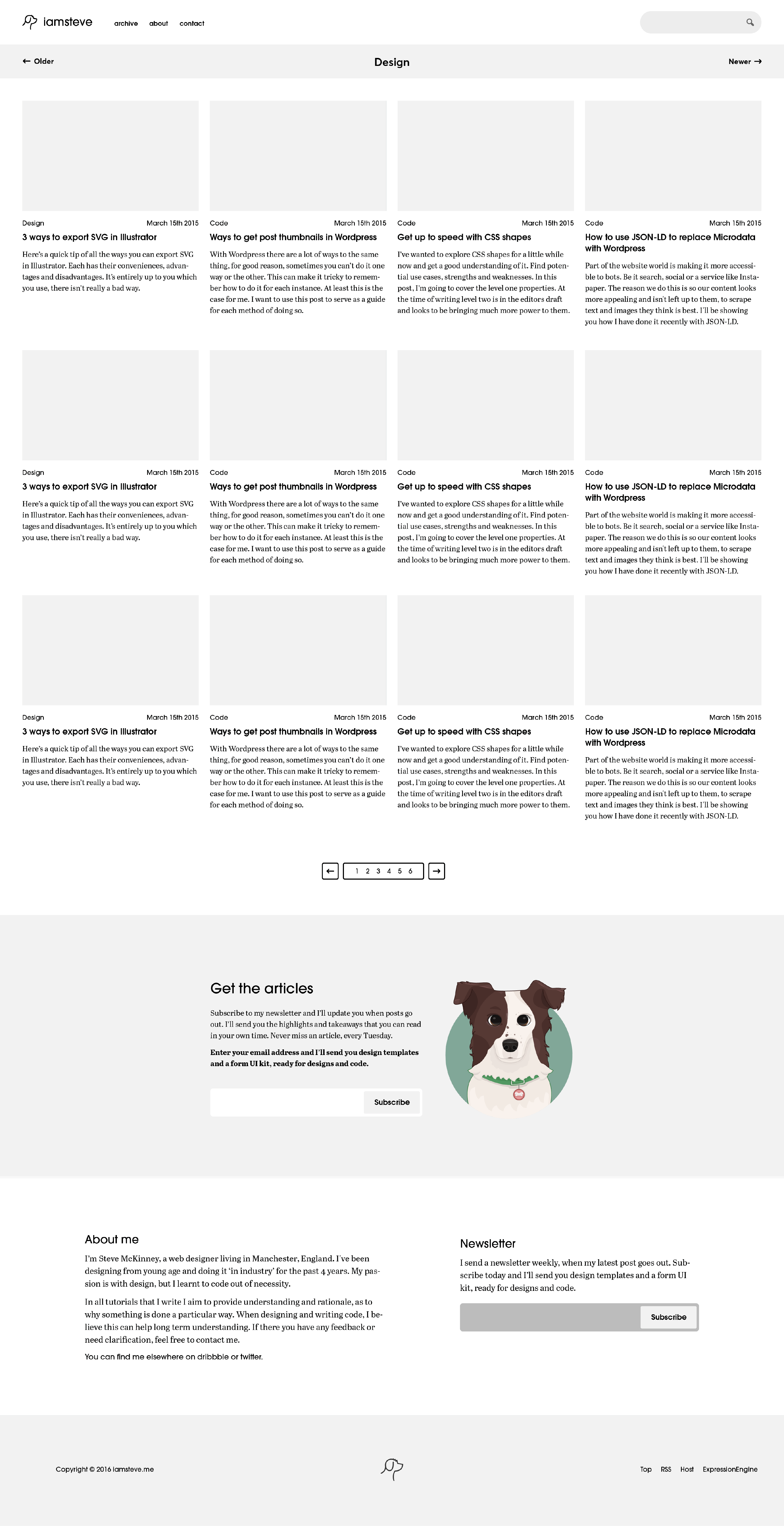
The main aim for these pages were to aid browsing. All the styles between them are pretty much like for like. So it builds a familiarity through navigating these pages. I kept it simple, as they aren’t the most visited or used pages.
I had three decisions. How many posts to display on a single page, the pagination style and the page title.
The answer to the how many posts to display is as many as you can get away with. I think it’s a fair balance. I wanted the page title to be small and compact.
The pagination at the bottom in particular I had to scale back a little. I initially wanted it to have the page numbers to navigate by. It was to do with the development making things tricky. Something I hope to find a solution for in the future.
I’ve still got the about page to do. I’ve come round to the idea of hiring someone to write that for me, so I’m going to leave it until I have the content.
The contact page, the subscriber download, other improvements that build upon this redesign. It will go on. I’m motivated to get it all done.
On reflection I’m happy with the outcome. On the brief time the redesign has been live, I’ve had a positive reaction. So far I’ve noticed positive trends in analytics data, a couple more months and it’s probably worthy of a post.
My main intentions were to get something out that was a strong start. As the homepage is a huge area for expansion, I’ve already been working on some improvements.
The same goes for articles, I’m happy with the readability. I will be adapting those as time goes on as I now have the time to invest in ideas. As mentioned earlier to make things sustainable but creative in design is tricky.
The biggest takeaway I gained from this was it’s important to ‘ship’ stuff you’re happy with, but pave a path for continual improvement.
View on Github