iamsteve – a new logomark
I have updated my logomark. It’s been around 5 years, since I last made a change relating to my logo. I’m going to cover the steps leading up to this.
258 views


I have updated my logomark. It’s been around 5 years, since I last made a change relating to my logo. Since then, I have grown as a designer, my aims, goals, and where I am have shifted.
I’m going to cover the steps leading up to this. It’s relevant to the process and gives a better of understanding of what’s planned for this website. Then, I will cover the process.
- I started the process in 2013 – with a new design as well as logo
- I scrapped it, but experience says I should have went ahead with it
- I decided to use my dog Rio as part of the logo
- It met my goals of adding personality, reflecting me better and being adaptable
- Looking back at the logo it was going in the right direction
- There were too many details that weren’t clear enough at small sizes
- Anticipate the use cases, like any good logo should
- I’ve made small design tweaks to the website as well as the logomark
- If you have smaller amounts of time, don’t let the present hold you back
- Make small changes so you can have an impact now rather than much later
- Refinements can be made later
- Build up to bigger changes
I originally started this process sometime in 2013. I had begun a redesign, including the logo and was happy with where I was at. Ready to begin code.
Then as if by night the whole design world, shifted to ‘flat design’. It put me off the redesign. I felt like the visual appeal of it would immediately appear dated and not fit in. Although I was really proud of the effort. It aligned with my goals and where my focus lay, blogging.
It didn’t feel right to not be fitting with the times. Although the more experienced me says, it met the goals you set out to achieve at the time and trends don’t last.
After coming back to it, I’m still happy with that effort, but my goals differ. As I’ve been blogging weekly for over 9 months now, it only made sense to go back the drawing board. It’s always a big undertaking, due to the amount I have to spread it out, with the work life balance.
I started with the logomark and a mini refresh of the current design. It aligns more with what I’m doing now. I plan to expand upon that a further, by introducing more elements my redesign will bring in, as a means to an end. I no longer let the current state of the website hold me back. If I did I wouldn’t have started writing at the end of last year.
This overall is probably one piece of advice, I would give everyone looking to start to build an audience. Don’t wait for the perfect opportunity, start and make changes over time.
When thinking about the goals I had for a new logomark, some of them were made a couple of years ago. On reflection, some stand true. As I’ve learnt more about logo design, this has added more.
- Add more personality
- Reflect me better
- Something that can last years
- Be suitable for all situations
- Something I could put a fun spin on
The first two goals were most important. I’ve lost some of the decision making I made in the past, but I knew the right idea was to base it round my dog Rio.
I’ve heard in the past, your dog is a reflection of you. This helped justify exploring this idea. Looking at similar logo ideas, I noticed outline worked well for particular details. Other styles were more illustrative, while not ideal for every situation, it inspired ways I could do that myself.
This confirmed that using Rio was the right choice. I was afraid it was a bit silly, but that’s part of what adds personality.
The idea I came up with originally was the whole silhouette of Rio. This made sense to me at the time, it covered the main characteristics, that made Rio stand out.
I sketched up multiple ideas it, found one I settled on, eventually vectorised it and was quite pleased. I knew something felt off though. I couldn’t quite put my finger on it.
Looking back with more understanding. It was mostly to do with the shape of the head and the paws. The head didn’t capture he had ears, and the paws, were bordering on too thin and disappearing.
A logo must be able to retain the majority of these details, at the sizes you will use it at. Realising the issues were with the head and paws, you could throw the tail into that category as well. I had to find an alternative solution.
Making a logo strong in the many use cases, means it will last. It being my dog, is an idea I won’t grow bored of, as he is of huge importance in my life.
One of the things around basing it upon your own pet is, you have lots of pictures. I looked at pictures of him, observed the characteristics better.
This was the majority of my research. Although as part of validating my idea, I looked at other logos for inspiration. It’s important to then forget that inspiration. That’s the ideal way to handle it, as you can find yourself too influenced.
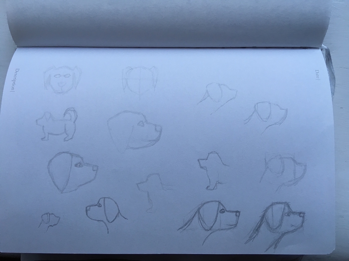
Here’s one page of the sketches I had done.
I sketched many ideas, exploring different routes and just trying to get a good shape going, but remaining simple.
The sketch I went on to vectorise.
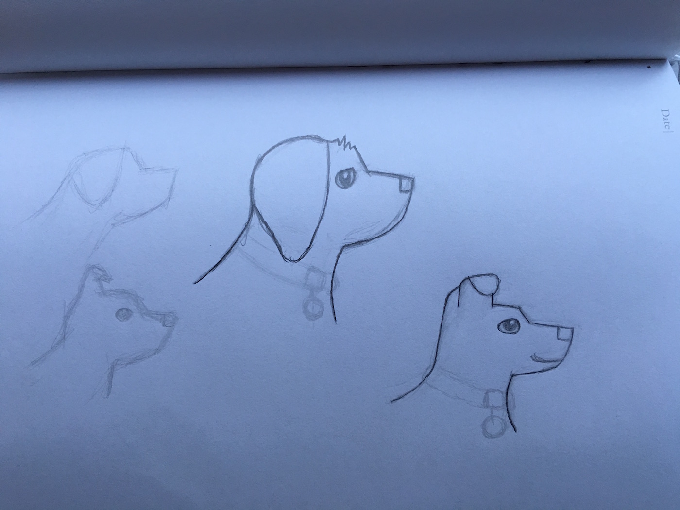
I eventually settled, I was happy it was a clear simplification and it felt like him. Admittedly the eyes and nose didn’t stay, but it allowed me to explore a slightly more illustrated form. Which by a happy accident allowed me to visualise, how I could meet another goal.
In that image as well is Oscar. He’s a companion for Rio that will be used in my redesign. This is his final version, although this is for another post.
I took a picture of the image and scaled it down to a reasonable size. So the logo could be at the size, I would use it around 48px. You should aim for the middle ground in the size it will be used. This way you make sure, you retain, much of the details of the sketch. You can build upon those details in larger sizes and reduce in smaller.
The blue outline was too large to start from, so I went with the smaller red line.
The shapes formed easily and I was happy with the outcome. All the hard work you’ve done in sketching and simplifying before the execution, allows for this to happen.
After that I made various sizes, further simplifications and refinements to the shape. The ruffles, ear, and neck shape were areas that needed most work.
The ruffles of fur were a tricky area for smaller sizes. However I didn’t need to rid them entirely (except the favicon). The same applied for the ear, it was a process of adjusting the points to allow for enough space between the top of the head and near the neck to make it clearer.
In the end I fit the sizes to 16, 32, 48, 96 and 128 pixel squares. It’s quite a lengthy, but necessary refinement process. If you have details that are just going to blur and disappear at a small size, you shouldn’t keep them.
All this works towards having a logomark that works at various sizes. You have to get over the loss of detail at smaller sizes. The importance is to retain sharp shapes.
Here are all the logomark sizes I’ve done. You can see the differences between each.
If you’re like me and have to use your time effectively to improve your own website, but are struggling to find motivation. If you want to introduce things, that are genuinely going to help your goals, try work within the confines, of what already exists.
It’s frustrating, but it’s for the best. Identify your goals and what you can do now to work towards that. You have your ideal in mind, which is to redesign everything. However, if you don’t make changes now, you’re not putting things in place, that will be able to make long term impact.
Once you have it out there, you’re entitled to make changes and refinements – so don’t hesitate to make improvements. It’s all a learning experience and content for you to share anyway! I’m sure I will.
View on Github