This post was published 10 years ago
There’s a chance things are out of date or no longer reflect my views today
How to: flexible squares with CSS
How to maintain a perfect square in a responsive layout using CSS padding. A quick tip covering the technique and how to handle content within the square.
How do you maintain a perfect square shape with a responsive layout? The solution appears simple; the only issue is your content. Which if you want to maintain a square shape it should be able to accommodate the content. I’ll show you how to do it in with this quick tip.
The problem
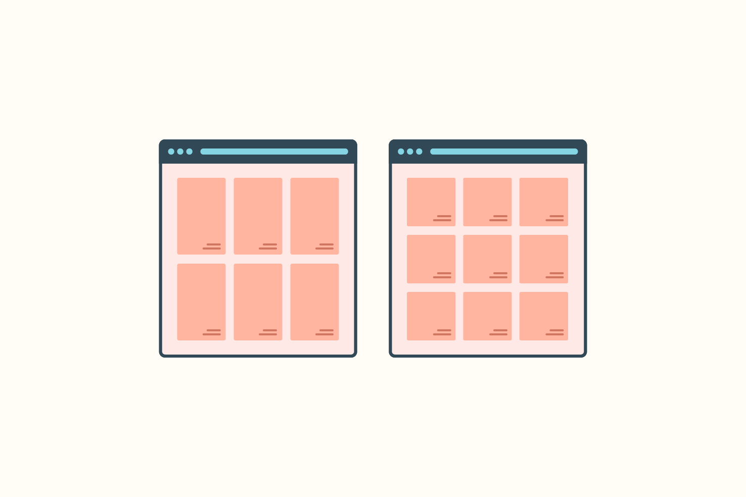
So you have a row of items that you want to maintain a 1:1 ratio. Then as you resize the screen you want those to retain that ratio and adjust at certain breakpoints and continue to with the square shape.
The solution for elements without container
To solve this problem we need to use a percentage padding on the bottom. The value of the padding-bottom must be equal to the width. So if I have a row with four items, that means the padding would need to be 25%.
HTML
Your HTML may look something like this.
<div class="“row”">
  <div class="“square”"></div>
  <div class="“square”"></div>
  <div class="“square”"></div>
  <div class="“square”"></div>
</div>
CSS required
The basic CSS requires the expected width and padding-bottom. The height is for security, in making sure you start from 0.
.square {
  width: 25%;
  height: 0;
  padding-bottom: 25%;
}
The solution for working with grids
If your items are within grid layout, understandably so, this affects the padding-bottom. In this case, it’s just 100% for all.
HTML
Your HTML may look something like this.
<div class="“grid”">
  <div class="“grid-cell" grid-25”>
    <div class="“square”"></div>
  </div>
  <div class="“grid-cell" grid-25”>
    <div class="“square”"></div>
  </div>
  <div class="“grid-cell" grid-25”>
    <div class="“square”"></div>
  </div>
  <div class="“grid-cell" grid-25”>
    <div class="“square”"></div>
  </div>
</div>
CSS required
Essentially the same aside from our values. Depending on your element, it’s possible the width is redundant if it’s a block level element.
.square {
  width: 100%;
  height: 0;
  padding-bottom: 100%;
}
Borders can affect dimensions
As it’s common practice having box-sizing set to border-box, adding a border to the outermost element will change the dimensions. This is something to be aware of, and you will need to make adjustments.
An option is to use calc() and subtract the border from the width and padding-bottom. Using box-sizing: content-box, will remove this issue but with that, you create another problem.