This post was published 10 years ago
There’s a chance things are out of date or no longer reflect my views today
Enhancing horizontal scrolling with flickity.js
How to enhance horizontal scrolling navigation with flickity.js. Adds touch and mouse drag support, making the pattern work well on Windows too.
— views
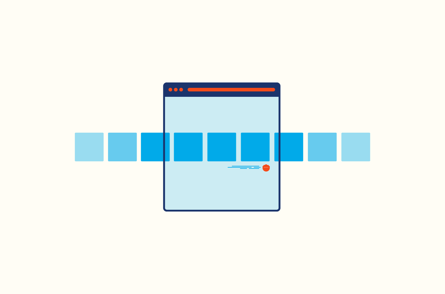
I first wrote a tutorial little while back on horizontal scrolling navigation, with the intention of accommodating only mobile devices. As with every device, I have come across, the usability of horizontal scrolling areas is good.
One thing I mentioned within the post was how poor the behaviour is on Windows. The issue with Windows computers is something I wanted to follow up. Essentially it’s a regular carousel, which I’ll be using flickity to add the functionality.
View the examples
Keep the small screen performance
With touch based devices, as far as I’m aware they don’t display scroll bars by default or impede usability for horizontal scrolling areas. So in the case of navigation, it would be ideal to exclude the flickity functionality for touch devices. Less JavaScript running will keep performance up too.
HTML
The basis for the HTML is your items need a container, as to which we apply the CSS to stop the elements from breaking into new rows. The contents of your items isn’t a problem.
<div class="“scroll”">
  <a href="“#”" class="“item”">Item</a>
  …
</div>
CSS required for scroll region
The basis for the overall CSS is everything we would need to make the navigation scrollable without JavaScript. You gain the benefit of not having to wait for JavaScript to finish loading. It helps our perceived performance by avoiding the jumpy flash of unstyled content, during the initialisation of JavaScript.
.scroll {
  white-space: nowrap;
  overflow-x: scroll;
  -webkit-overflow-scrolling: touch;
  -ms-overflow-style: -ms-autohiding-scrollbar;
}

.scroll::-webkit-scrollbar {
  display: none;
}
We have additional extras in -ms-overflow-style to have scrollbars autohide in IE 11 and Edge. As well as -webkit-overflow-scrolling to add the inertia scrolling. The final part of the CSS is hiding scrollbars in browsers which support ::-webkit-scrollbar. This is safe to do so when using Flickity as browsers that handle horizontal scrolling nicely will benefit and those that don’t won’t have an ugly scrollbar there (I‘m looking at you Windows).
CSS required for flickity
Flickity has some default CSS needed to make things work well. It’s available from the website, however, I’ve trimmed it down to what’s necessary and removed overflow: hidden from .flickity-viewport. It prevents box-shadow from being cut off for a later example.
.flickity-enabled {
  position: relative;
}

.flickity-enabled:focus {
  outline: none;
}

.flickity-viewport {
  position: relative;
  height: 100%;
}

.flickity-slider {
  position: absolute;
  width: 100%;
  height: 100%;
}

/* Draggable */
.flickity-enabled.is-draggable {
  -webkit-tap-highlight-color: transparent;
  tap-highlight-color: transparent;
  -webkit-user-select: none;
  -moz-user-select: none;
  -ms-user-select: none;
  user-select: none;
}

.flickity-enabled.is-draggable .flickity-viewport {
  cursor: move;
  cursor: -webkit-grab;
  cursor: grab;
}

.flickity-enabled.is-draggable .flickity-viewport.is-pointer-down {
  cursor: -webkit-grabbing;
  cursor: grabbing;
}
JavaScript: add flickity
To start, you need include flickity in your code, or build process. You can download it from the website.
<script src="path/to/flickity.js"></script>JavaScript: flickity options
There are quite a few options we need to change to get flickity to behave the way we want. In the flickity set up it recommends using adding js-flickity class to your element. That’s fine if you want to use data attribute options. If you add it and change the options within JavaScript things may not work, from my experiences.
var scroll = document.querySelector('.scroll')
var flickity = new Flickity(scroll, {
  cellAlign: 'left',
  freeScroll: true,
  prevNextButtons: false,
  pageDots: false,
  contain: true,
})
Exclude flickity for touch devices
If you’d like to exclude it for touch devices, it is possible. The reason you would want to do this is because the usability and behaviour are good for those devices already. It also excludes the JavaScript from needing to run, so you get the performance gains.
With Modernizr
It’s easiest with Modernizr; I would recommend using a trimmed down version to get the touch support. As it ends up being a small amount of JavaScript.
// Could also be an older version of modernizr so replace with Modernizr.touch
if (!Modernizr.touchevents) {
  // Initialise flickity here
}
Without Modernizr
It’s a little trickier, but it does save you having to get Modernizr. I used this topic as a reference.
function is_touch_device() {
  // Checks for existence in all browsers and IE 10/11 & Surface
  return 'ontouchstart' in window || navigator.maxTouchPoints
}
First we need a way to detect if touch is available. Using the updated solution in the reference topic. Adding this small function, it checks for the existence of a touch event. The condition after the || allows us to include IE 10/11 & Surface as touch devices.
if (!is_touch_device()) {
  // Initialise flickity here
}
Then we need to check if that value returns false if so apply our Flickity.
Examples
I’ve posted a few examples using horizontal scrolling. I’ve added flickity to them.
Navigation with flickity
The navigation is reasonably easy. It works from the off. As we’re not using flexbox for layout, using flexbox we may have to adjust more properties. The next example covers that.
Demo
Content carousel with flickity
In a post, I wrote previously covering a scrolling content layout, in that I used flexbox. Which in this example doesn’t play too well with flickity, this is fine.
There are a couple of things to account for. Flickity uses absolute positioning for elements, which our flexbox layout doesn’t like. You need to ‘destroy’ Flickity to continue to allow the toggle functionality to work. After the example, I will show you how to solve these problems.
Demo
Original example JavaScript
// Select initial elements
var all = document.getElementById('show-all')
var items = document.getElementById('items')

// Add value to counter
var count = items.children.length
var counter = document.getElementById('show-all-count')
counter.innerText = ' (' + count + ')'

// Listen for clicks and toggle button and items state
all.addEventListener('click', function () {
  this.classList.toggle('active')
  items.classList.toggle('items-columns')
})
New example with flickity
You build upon code from before using the destroy example from the documentation.
The initial setup
Similarly to before, we need to initialise flickity. However this time, as we need to destroy it to change our layout, we assign our options to a variable, for later reuse.
The isFlickity variable is for changing value based on the state of flickity. When true flickity is enabled, when false it is disabled.
if (!is_touch_device()) {
  var options = {
    cellAlign: 'left',
    freeScroll: true,
    prevNextButtons: false,
    pageDots: false,
    contain: true,
  }
  var isFlickity = true
  var flickity = new Flickity(items, options)
}
Additions to the click event
Next is to modify the click event. We add a conditional that checks isFlickity is true to destroy it, otherwise initialise. Just below that conditional is redefining isFlickity to the opposite of what it is currently.
all.addEventListener('click', function () {
  this.classList.toggle('active')
  items.classList.toggle('items-columns')

  if (!is_touch_device()) {
    if (isFlickity) flickity.destroy()
    else flickity = new Flickity(items, options)

    isFlickity = !isFlickity
  }
})
Putting all the JavaScript together
For easy reference the whole code. You’ll notice that the options and initialisation are in a conditional to check for touch devices. Remove this if you want it everywhere.
// Select initial elements
var all = document.getElementById('show-all')
var items = document.getElementById('items')

// Add value to counter
var count = items.children.length
var counter = document.getElementById('show-all-count')
counter.innerText = ' (' + count + ')'

// Flickity related
if (!is_touch_device()) {
  var options = {
    cellAlign: 'left',
    freeScroll: true,
    prevNextButtons: false,
    pageDots: false,
    contain: true,
  }
  var isFlickity = true
  var flickity = new Flickity(items, options)
}

// Listen for clicks and toggle button, items, and flickity state
all.addEventListener('click', function () {
  this.classList.toggle('active')
  items.classList.toggle('items-columns')

  if (!is_touch_device()) {
    if (isFlickity) flickity.destroy()
    else flickity = new Flickity(items, options)

    isFlickity = !isFlickity
  }
})
CSS
You’re now going to add to the CSS from earlier. It only requires a few extra lines to make the content work with flickity.
.flickity-enabled.items {
  display: block;
  margin: 0 -24px;
}

.flickity-viewport {
  margin: 0 24px;
}

.flickity-enabled.items .item {
  width: 25%;
}
When flickity is enabled you need to override the display: flex rule. Without doing this, the whole thing looks wrong. Next in .flickity-enabled.items the negative margin offsets the margin in .flickity-viewport. The padding we had originally on the .items is no longer working because all our elements are absolutely positioned. So these two margins are allowing that to happen again. You can adjust these as necessary.
Finally, our items need a width. The width can be anything that works best for you.
That’s it
In each of these examples you can add further functionality that‘s down to your preference, by referring to flickity documentation. The last example is almost worthy of a post on its own, as a few things have to be considered when using flexbox. It was worth exploring this, however, it’s probably better to stick to using inline-block when adding flickity.