Colour series: picking your palette
In this first post, I’m going to run through why colour theory is only a small part of choosing colours. Then you’ll begin to pick your palette. I’ll explain the things, that I consider when choosing a colour palette. This should help to inform your choices.
1,239 views

I had a discussion with someone I work with about how to use colour well. It’s a difficult topic to explain, as it all comes naturally to me. However, as we discussed more, I found it easier to communicate the process. I figured it would make a suitable series of posts.
To start the series, I’m going to run through why colour theory is only a small part of choosing colours. Then you’ll begin to pick your palette. I’ll explain the things, that I consider when choosing a colour palette. This should help to inform your choices.
Let’s address colour theory
There are plenty of courses covering colour theory in further detail out there. It’s useful to learn about it, however by following a more precise approach, with examples of how and why along the way, practical and applicable advice can be easily formed. My post aims to cover those angles and ensure you understand why, to guide you through the how.
Applying colour theory to the web
The web is a difficult medium with many variables, in the way of practical colour theory applications. Those restrictions are different to that of print, which is experienced in only one form. The web has much more to contend with.
Colour theory can be useful when used on the web. The most noticeable way is through the harmony you can achieve with colour. Limitations come into the equation when working with visual hierarchy and contrast.
Some of the points I will cover cross over into colour theory, but it’s about understanding what the content and situations the colours need to adapt to. Use colour theory as a reference to good colour combinations, rather than applying them.
How many colours should I use?
You need to cover two main angles, your brand/project and readable contrasting colours. You want to get your personality across, whilst there needs to be colours for maintaining readability. A palette must be flexible for a variety of use cases. Bright, light and dark colours are all necessary.
I tend to make a palette of around 5 main colours. I don’t limit it to those 5, this is important. A successful colour palette will require tints and shades from base colours, we’ll discuss this in another post.
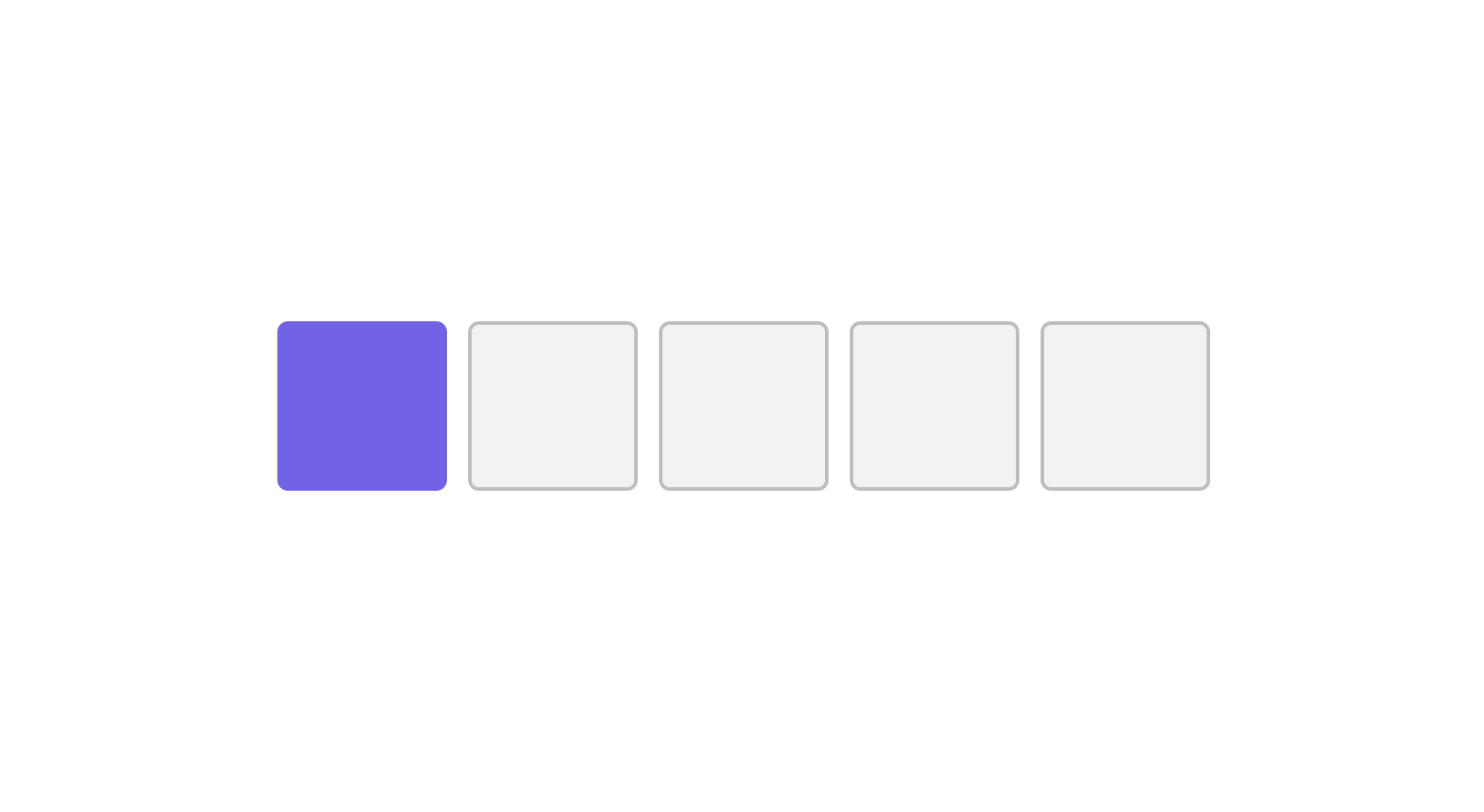
Picking your first colour
The first colour sets the tone for the whole palette. So it’s important that this colour is the one, you would want your project to be represented by.
Questions to ask yourself
- What are your initial thoughts that represent the project best?
- How would you like to be perceived? eg: Calming, trustworthy, confident, etc.
- Who are your target audience or most frequent visitors?
- Would they perceive your colour choice the way that you do?
- Would the primary background colour be dark or light?
Initial thoughts

You’ll have immediate ideas for what something means to you. These are a good starting point, it gives you something to validate, for the next questions. After all, you could be part of the target audience. Draw upon your experiences of things that are similar to your project. It’s fine if these turn out to be wrong.
If you’re unsure of colour perception, do some research. This will help inform your choices better.
Company/individual, audience & goals
You will be looking at what message the colours communicate. Think about how the company/individual expects to be perceived.
Your goal may be to change the way you’re perceived. Look at the current colours you’re using, find weaknesses and how they can be improved upon.
Light or dark background

From the questions you’ve asked yourself, it should be possible to determine whether the website will have a light or dark theme.
When choosing your colours, if you’re going to have a dark background, make sure you choose the colours on a dark background too. It doesn’t have to be the one you will use, but it will influence your choices.
Choosing your second colour
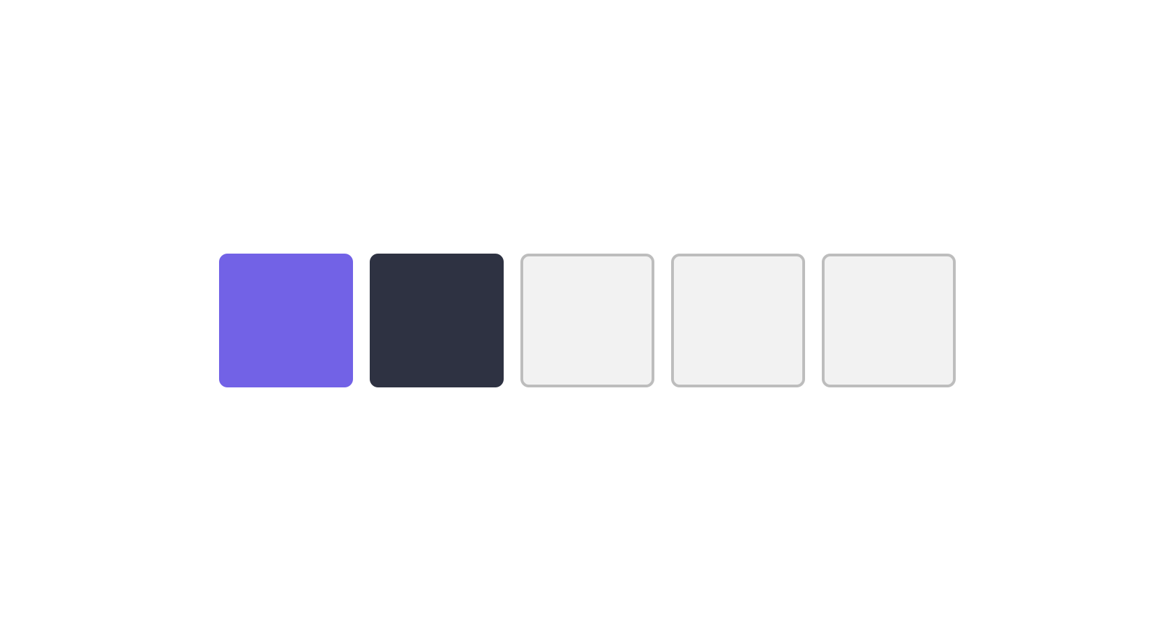
The second colour is your workhorse, it will be used for the majority of the text on your website. It has to complement your heading colour and contrast with the background it’s set on. This is where we have to consider use cases a variety of use cases, that will inform our third colour too.
Considering use cases
Aside from the goals that the first colour must meet, you have to consider the areas which require the most contrast for the best readability. I will give you an overview of the areas you will use this colour.
Hierarchy
Hierarchy is important in design and colour plays a part in that. You can use colour to add emphasis, or deemphasis, depending on what the intention is. Your colour palette should have flexibility for this, it doesn’t have to be a variety of different hues. It can be tints and shades of this secondary colour.
Text elements
Using colour effectively for headings, paragraphs and links, can really help aid a good reading experience.
Headings & paragraphs
Your content should have good contrast with the background it’s on, otherwise, it becomes difficult to read.
Headings serve as an indication of a new section and aid hierarchy in their own right. Your aim could be to help the scannability of articles. By making headings darker than your paragraphs, you will help the reader who favours scanning.
Links
Links are something that need to be reasonably apparent within a set of text. However, you have the choice of underlining them or having them as a colour that stands out. The problem I face often is: “do links being this colour distract?” It’s a balancing act of purpose, a link within an article may be purely for reference, so it doesn’t need to stand out too much.
Choosing your third colour
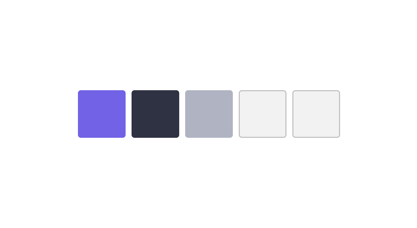
This isn’t necessarily a new colour, but it’s intention is to be used the same. It’s can be a shade of your second colour, with the purpose of helping visual hierarchy. There are times when the second colour could be too harsh, and the ideal would be to make a lighter version of it. Still providing the contrast needed.
Refer to the use cases of the second colour and tweak this colour by making a lighter, less saturated version.
Choosing your fourth colour

We’ve been through our workhorse colours, the previous three colours will serve you well. However, there is a time where you will need a colour that really separates itself from the pack.
Your main colour may be used throughout to reinforce your project/brand perception and while it will tend to be an attention grabbing colour, it could prove ineffective due to the amount it’s used.
This means you need a colour, that will stand out just as much. It still has to complement the colour palette, (this is the aim of the post) all colours should complement each other and be purposeful in our knowledge of colour theory.
Buttons
Buttons are a great example for your fourth colour. Buttons are overused, in my opinion, where a ‘link like’ appearance would suffice. If a button is used to convey the next action of importance, it must be immediately noticeable.
You need to consider how many buttons there are on the page. If the primary action is competing with several other elements, that stand out equally as much, you dilute their effectiveness. This is part of hierarchy too if something doesn’t need to stand out as much as something else, it shouldn’t.
The fourth colour should be used to bring attention to your most important elements. So think carefully about how you use it.
Choosing your fifth colour

The fifth colour should be something the majority of your colour choices can be used on. I generally have in mind that this colour will be used for backgrounds, for the majority of cases.
Depending on the basis of your palette, whether it’s for a light or dark background will decide this. In turn, it will be your lightest or darkest colour.
You’ve chosen your colours
You should see that you have a balanced colour palette now. This gives us a solid start. However, this won’t be perfect, it’s rare you will pick a perfect colour palette from the off. At least, that’s the case for me.
There is a huge amount to take in here. Your first and fourth colours have the most freedom, whilst your second, third and fifth colours have the most restriction. Having this balance is necessary to a good colour palette.
Trial & error
In the next post, we will look in greater detail at refining our palette. I want to make a quick note on trial and error. When we’re unfamiliar with something, trial and error are a great way to learn. It’s a big part of the colour selection process too. We have so much to consider for use cases with our colour palette. That just to pick a set of colours and use them without any fuss, is unrealistic. So keep practising and observing colour around you and on websites.
View on Github