About version six
I’ve finally done the redesign of this website! Version five lived for longer than I ever intended. This post is going to be a shorter summary of the changes. I’ll be posting a full case study over the coming weeks.
— views

I’ve finally done the redesign of this website! Version five lived for longer than I ever intended. This post is going to be a shorter summary of the changes. I’ll be posting a full case study over the coming weeks.
So what’s new?
Aside from the visual changes, the focus is on the blog. This site will only serve as a blog for the foreseeable future. There was a portfolio, but this will be separate. It allows for quicker redesigns and not having to think about how it aligns with the rest of the site.
Header
The most important change to the header is the addition of search. There was search on the old version, just at the bottom. It wasn’t as helpful in the past due to the lack of content. Giving it more availability may increase searching.
Homepage
The homepage is the area I want to draw more people to. Previously it has been a single post, with the about section and dribbble, then moving into a list.
The aim has been to make content more discoverable and encourage browsing. From the introduction and latest post, through to the popular posts by category. Over time I want to evolve this further.
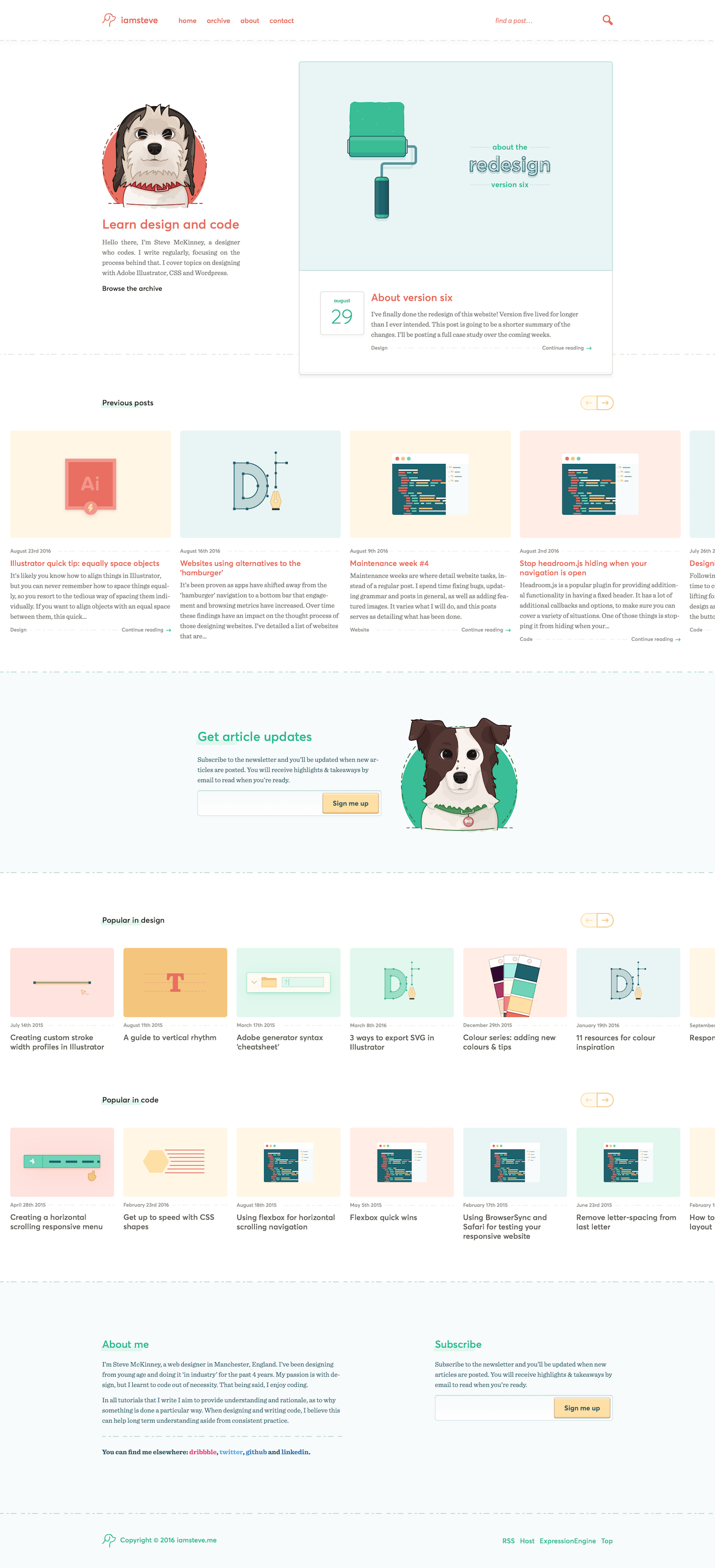
Illustration
I’ve gone with a couple of illustrations of my dogs to serve as mascots throughout the homepage. They add to the friendliness I want to bring to the website. They were a big challenge, as I’m not a fantastic illustrator… yet.
This is something I hope to bring out more in the future as I iterate on this design.
Newsletter
I have started a newsletter, it’s in the aim of growing and retaining an audience. I’ll notify you when posts go out, this will be once a week.
I have plans for subscribers, and it’s where most of my efforts will go now the redesign is done.
You should consider subscribing.
Posts
Posts don’t have a dramatic overhaul in layout. However, I made some observations, that would make for a better reading experience.
- Ability to have more flexibly sized images within posts
- Improve font sizing
- Better readability
- Improve the related post(s)
I’m happy with the improvements. I don’t want to do anything to cause annoyance within them. You’re here for the post.
A better small screen experience
Not very many people browse this website on their phones, 92% is considered desktop. Just over 1% of the remaining 8% is tablets and nearly 7% is phones.
Again, the reading experience is something I’m particularly happy with. I believe it’s a huge improvement. As well as just browsing through pages of posts and homepage both flow nicely.
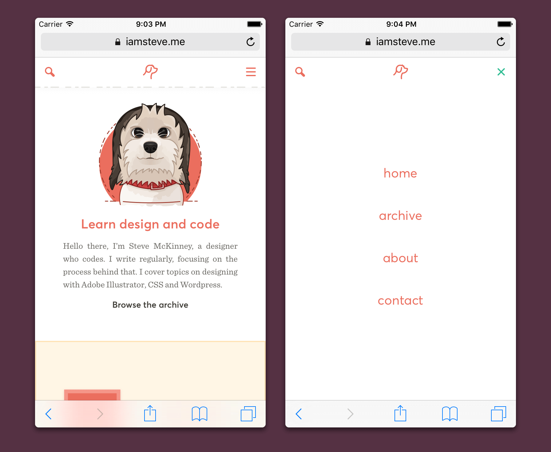
I’m pleased with the way the header area works, from showing the navigation to switching to the search. Although I’m considering moving to a bottom navigation.
Going forward
The priority going forward will be to add incentive to sign up to the newsletter. Everybody wants you to subscribe to their newsletter. Why would somebody subscribe to mine?
Having people subscribe to your newsletter is highly valuable. I wanted something in place before this redesign went live, but I decided not to wait. The about and contact pages, will follow the newsletter improvements.
I have a few things design wise I want to improve too. The doubt over the past couple of weeks, was what pushed me to get it live. This tweet by Jason Fried was timely.
Danger of not shipping as soon as you can - second guessing creeps in. The longer you wait, the more doubt you cultivate…
— Jason Fried (@jasonfried) August 23, 2016
It’s something to always keep in mind. As I want to improve the homepage further.
Bugs
I’m fairly sure there’s going to be some bugs. As I’ve been preparing this post, I’ve been fixing and tweaking things. I’ve done my best to cover all angles. If you see anything major I would appreciate the heads up.
That’s it
Thank you for spending time on this website and reading the content I produce.
View on Github