A guide to vertical rhythm
Vertical rhythm creates visual harmony between text and other elements on a page. This guide focuses on the why rather than the how, to build a solid understanding.
— views
Vertical rhythm is the typographic practice, to create a vertical harmony between text, images and so on. On the web it’s quite difficult to achieve. Yet understanding what it is, with the aim to maintain it, you can improve your reading experience. If you’re aware of it, but have struggled to understand vertical rhythm, this post is for you. It will focus more on the why, rather than the how. So you come away with a better understanding.
Highlights & takeaways
- Your baseline is the basis for everything
- I recommend a pixel value which can divide twice and result in a whole number
- Use a type scale for font sizes
- Pick unitless line heights
- Use a combination of margin, padding and line height to help keep things aligned
- Use incremental line height where you need to change it
- Watch out for margin top collapsing, using padding top instead
- Responsive is tricky, it’s up to you whether you decide to maintain it closely
- Fluid layouts can’t maintain baseline with images
- Instead it needs to adapt to screen width rather than be fluid
- To get the image to adapt correctly you need the aspect ratio and divide that by the content width to find the ideal height
Takeaway example
Vertical rhythm
A vertical rhythm starts from a baseline. It’s the basis for everything from the font sizes, line height and image sizes.
What a baseline is
A baseline in terms of vertical rhythm is essentially a vertical grid, everything must sit between the lines. For type it means the bottoms of letters—not descenders—sitting on the line. It’s easy to relate this to how you would use a horizontal grid. The difference being: a horizontal grid is built on a fixed number of columns, a baseline grows with the page.
Typically, you take a pixel value to base it on. You can use other units such as em, however, for this post I will be sticking with pixels.
Understanding how items align to the baseline
The way items will align to the baseline, is by spanning one or multiple lines. Like you can have items span multiple columns, in a traditional grid.
It’s important to note that the tops and bottoms of letters won’t always align with the line above or below it. They will sit somewhere in the middle. However if you were to open developer tools and highlight text, you would find the outline should line up with the above and below lines.
This tends to be because of our line height, it gets applied above and below all lines. Not just in between.
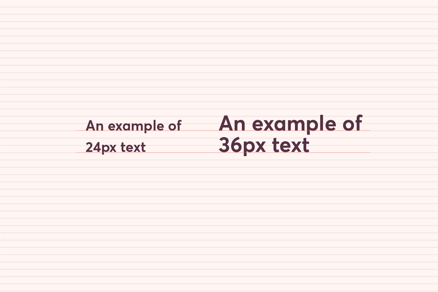
Choosing font sizes and your baseline
The way you select font sizes where it concerns the baseline, in the simplest way I can put it is, use multiples of the baseline to begin with.
I’ll be using a baseline measurement of 12px. Keeping this number in mind throughout will help you to understand the calculations.
Don’t be restricted by your baseline
Font sizing can be harder to grasp in terms of a baseline. 12px as a font size is too small and 24px is generally too large for body copy.
When it comes to font sizing, you can use line height and margins, to correct this. With this in mind you can pick a type scale, then do the calculations, based around how they align to the baseline. This is my preferred approach as you don’t end up tied to font sizes and line heights that don’t work throughout your design for the sake of aligning to the baseline.
I’ve be picked 16px as the font size for body copy. However, to align correctly to the baseline, you need to make up the additional 8px. By having a 24px line height this means it will align to the baseline every other line. Falling nicely on even numbers, to give your base measurements.
body {
  font-size: 16px;
  line-height: 24px;
}
Pick a unitless line height
However I recommend that you use a unitless value of 1.5 which is essentially 16 × 1.5. I use 1.5 as it tends to be the most comfortable for a 55-75 character line length.
body {
  font-size: 16px;
  line-height: 1.5;
}
Make up the difference with margin or padding
If you were to use a number like 18px, it’s logical, this falls between 12px and 24px (the next multiple of our baseline). However when combined with our unitless line height of 1.5, it equals 27px. This is an awkward number to fall on, as it is odd.
You could adjust the line height, however, the solution is in the margin we use. Setting a bottom margin to be enough to add up to the next multiple of our baseline, which is 36px.
body {
  font-size: 18px;
  line-height: 1.5;
}

p {
  margin: 0 0 9px;
}
You may find this to be too small a margin below the paragraphs. In this case you can double it and find it more ideal.
When line height needs adjusting
There are cases you will come across, where it is necessary to adjust the line height. This will generally be for headings, but other cases such as narrower width text too.
It’s up to your own judgment, however if you have a heading that is 48px, a line height 1.5 times that will have far too large space between the text.
Use incremental line height
I recommend using line heights that follow increments of .25. The reason for this is because 48 × 1.25 is 60, which falls on our baseline measurement. If we were to deviate from this with 1.333333, it would equal 64, which is still a good number, but increases the difficulty, of aligning, back to our baseline.
Going up from here to 48 × 1.75, that equals 84, which also falls on our baseline.
Recap on font sizes
There is lots of information to take in here, it’s important to experiment with this particularly. As you will find some numbers more ideal than others.
- Decide your font sizes first, don’t be restricted by your baseline
- Make up the difference where your baseline is off with margin, padding and line height
- Adjust your line height in increments of .25
Margin and padding in relation to the baseline
Not only do you use margin and padding to help maintain your baseline. It will provide the right whitespace between sections, which aids your reading experience. It can take a bit of trial and error to get to grips with this, in terms of balancing your baseline where it goes off.
It’s fine to add space above and below items to help align to your baseline. You will want to watch out for collapsing margins. Using a combination of padding to the top and margin to the bottoms of your content items, will make sure this is avoided.
Using margin and padding you can effectively improve your page hierarchy too. You can add more space between larger font sizes and less for smaller font sizes.
Images
Images can be the thing that upsets your whole vertical rhythm. They tend to be quite uncontrollable from a responsive perspective.
As you can use an image and it be suitable for viewport widths greater than 1080px for example. As soon as you go lower than that your image begins to resize. There is one solution I am aware of, none are completely ideal and rely on you picking an image sizes based around the baseline at specific widths.
Take an adaptive approach
This way you can adjust your content width, at specific break points, and gain some control.
You should already be maintaining good line lengths in your content. So you can adjust this, based on screen width.
For example, if your content width is restricted to 640px, you could make your images 640x480. The 480px height is a multiple of our 12px baseline.
Once we reach a viewport less than 680px we adjust the content. I choose 680px, as it’s not leaving it too late and getting too snug to the viewport width. At this breakpoint you can adjust the content width to 480px.
This makes our image 320px in height, which falls within our baseline. At another stage you can adjust things again at around 520px, then adjust the content width to 320px.
.main-content {
  width: 640px;

  @media (max-width: 680px) {
    width: 480px;
  }

  @media (max-width: 520px) {
    width: 320px;
  }
}
Calculating the image height
It requires a couple of calculations to find the right image height. You need to know the aspect ratio of the image and divide that by the content width you want.
image width / image height = aspect ratio content-width / aspect ratio = image
height
Thoughts on vertical rhythm and images
To recap you change your content width based on values that allow the height of your image to fall on a baseline value. It’s not quite ideal, but it does allow you to have a layout that responds to the browser.
It takes more effort to maintain, if you’re the sole content creator on the website, this is something you can control. However this approach may go against the fluidity you want to create with your website. It’s up to you how far you go with images without introducing some kind of JavaScript.
An example CodePen
Finishing
This is a big topic for me to write about. It’s generally everything I’ve learnt being shared that I know about vertical rhythm. I personally haven’t maintained it on this website and it’s long overdue a redesign. The principles of vertical rhythm are something I try to use through out my designs, and I find it beneficial.
I have covered a small part in relation to responsive web design with vertical rhythm. To cover that well it will require a full post of it’s own.
I hope this post serves useful if you have struggled in the past with vertical rhythm. I’d like to hear your feedback on twitter on how I can improve posts like this, or if you found it useful.
View on Github