About version 8
Design and development decisions for the 8th version of this website. New design, using Next.js App Router and pretty much all in on Tailwind.
— views

I had been wanting to redesign for a while—it’s been more than enough time. The previous design had been in place since late 2016—along with iterations throughout 2017. I think the design held up well, but it’s time for something new. And as with some form of tradition in writing about major changes here, I want to document some of the decisions.
Goals
There’s always goals when you set out to redesign outside of modernising the design and working towards something fresh.
- A new colour palette
- A richer reading experience with MDX
- Image flexibility
- Use Next.js app router
- Embrace Tailwind more
Design
The design itself is a modernised version of what came before it. When I design something for myself or part of my own projects, I want to utilise the skills I have. It’s what makes it enjoyable.
I have evolved the design through the typography, illustration, colour and layout.
Typography
I’ve opted to move to two sans serif typefaces. They’re both grotesque’s, so they do complement each other.
I feel both are within the trends of where type is at currently. I’m drawn to type trends, the choice does carry how modern a design feels. The last version I used a typeface that was inline with the Circular/Product Sans popularity of the time.
I chose Roc Grotesk for its strong presence, which I use for headings. I really like the proportions and the variety in widths and weights that come in a variable font.
Whereas I’m using Elza for body copy, which is a better choice for reading, for a few reasons.
- The slightly larger x-height
- More open characters
- Characters like ‘a’, ‘e’ and ‘r’ feel better for reading
Colour
The colour palette is familiar but renewed. My aim was to pair back the colour and really reserve that for post images and the occasional flourish. I achieve that through introducing more neutral colours and complementary colours that have a stronger contrast (eg: red vs green).
I have made some sensible decisions with the colour palette—but I know myself I will likely change this over time. Overall, I want the website to less stark, less washed out and have more harmony.
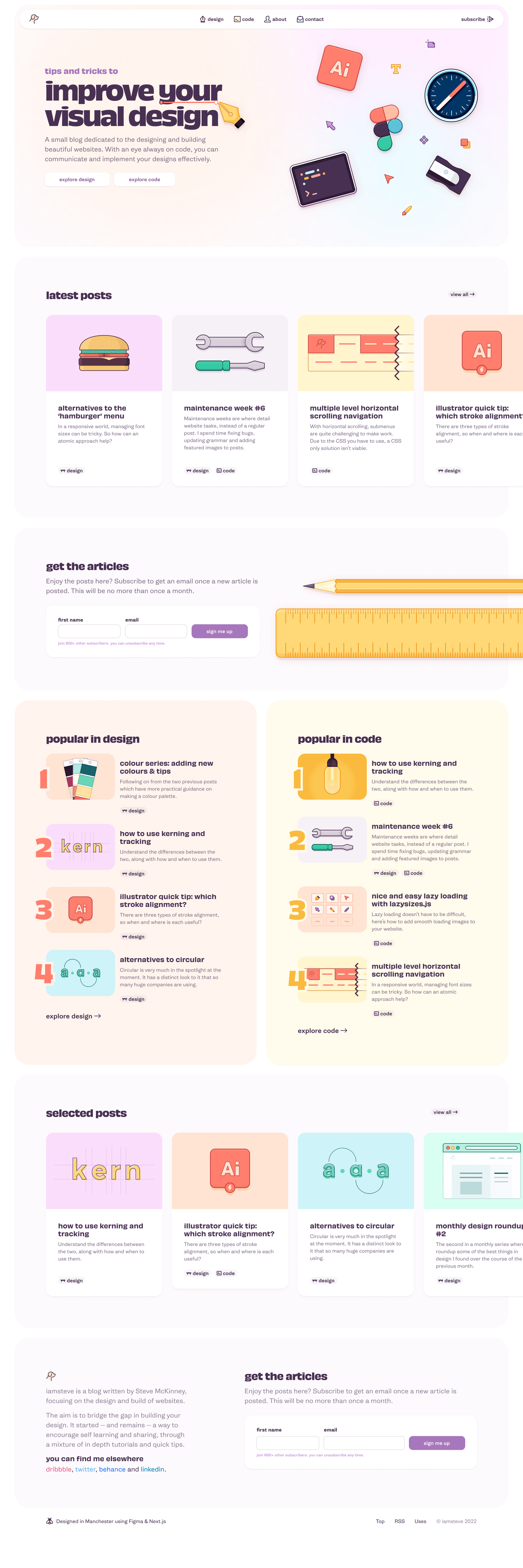
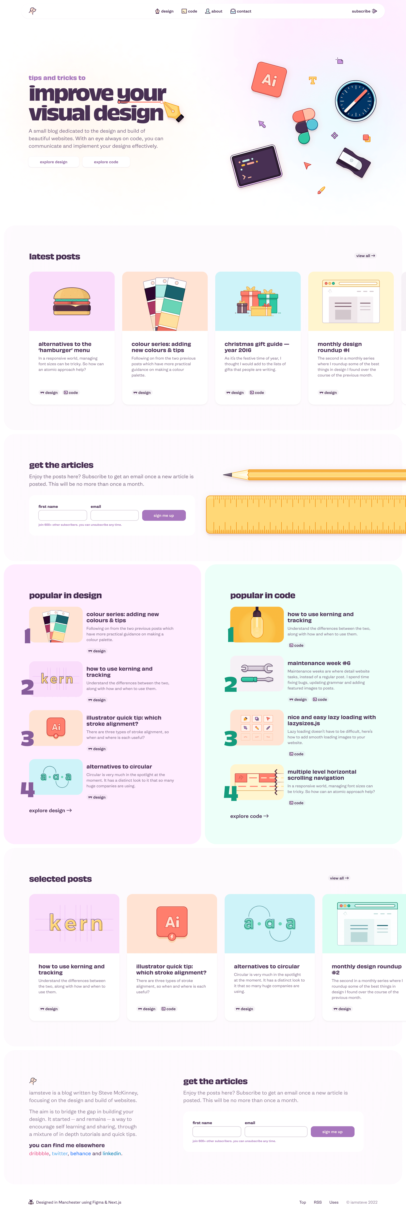
Monochrome or colour?
I struggled with the amount of colour used throughout the website. It’s probably to do with how much I’ve looked at this design. But I’d like to show what the homepage hero would look like between the monochrome and colour variations.


Slight structural changes
Overall, throughout the website remains similar. I want to try divide the design and code categories and everything else into the archive.
Design iteration
It took a long time I felt for me to reach a point I was happy with the design.
I had a couple of clear directions and had I not decided to throw everything out I think this version would have been released much sooner.
I felt confident in this direction for a while, but the more I looked at it the more I wasn’t happy with it. There was something I couldn’t correct with this and I also feel it would look dated quite quickly.
I liked where I was going with the navigation. And I liked the divided popular in sections, the numbers and chart ranking feel gave something different.
The one thing I feel with the design I have now, is it will hold up better over time. There’s loads of ideas I had and how I wanted to structure the homepage, but they were a bit too ambitious for the time being.
Early mobile ideas


Mobile was where I kicked off the design, I wanted to not leave it as an afterthought even though it’s a small portion of the traffic. It felt easier to approach a redesign from mobile as well.
You can see within these examples some different directions I was thinking of heading.
Rebuilding and moving to Next.js app router
As part of the last version I decided to move to Next.js. This was a learning curve and using the pages router.
However, for this redesign that was flipped on its head with app router. I was expecting to reuse some of the more challenging elements of initially moving to Next.js.
I did try to transition to app router from pages but for me it didn’t work and as Vercel are clear this is the way forward I decided to do it from scratch.
View counter
I spent an inordinate amount of time on the view tracking—JavaScript development is not my best skill 😅. I referenced a lot of Lee Robinson’s code as he had one in place, but there was a lot of figuring out required as I was using Supabase over Planetscale.
But this was much easier to setup view count sorting on the homepage which I wasn’t able to achieve previously. Swings and roundabouts.
Pagination
I felt pagination was surprisingly painful to do. I feel there’s some bugs in it but it seems to do the job. I referred to timlrx’s theme for this and customised to my needs.
Contentlayer
I discovered Contentlayer, which I really like from a publishing aspect. It adds a lot of flexibility to how you can get your content as there is a JSON representation of it.
You can also make your frontmatter typesafe, which is a nice benefit as I can force myself to make sure all needed frontmatter is present.
Otherwise I’m not bothered about types and typescript, it’s too much for me.
Contentlayer appears it is no longer being maintained. I intend to replace it with velite as this looks like the closest thing to it.
Better code highlighting
Another place I had a load of faff with getting builds to work on Netlify. But I think in the end this was down to the node version I was using on Netlify even though I thought I was on a more up to date version.
I was resigned to using rehype-pretty-code but managed to get it all working with rehype-prism-plus. Which I was able to get a decent theme going, pretty code is far too limited in code highlighting.
And personally I find it easier to read when your brackets in HTML and JSX are the same colour as the tag, which wasn’t achievable without using Prism.
Using border-image for nicer borders
The standard borders available in CSS aren’t desirable visually. You have dotted, dashed and not a lot else when it comes to controlling border style.
That’s where border-image comes to the rescue. Throughout the homepage and header sections of most pages I use a more visually pleasing border.
In terms of code it’s fairly simply but I don’t think border-image is easy to use. The border will break at certain screen widths but for the most part it’s fine.
Container queries to create large and medium sized cards
This has been a great opportunity to learn how to use container queries to build some things on this website.
It took some getting used to, as it’s no longer tied to the window size. I found it’s more getting over your years of being used to using media queries than a bit of new syntax.
It’s quite pleasing to have one component serve two purposes. If you look at the homepage, there are large cards with images and smaller cards without images. These also differ with font size and spacing.
Grid and sub-grid to manage layout
At the time of building this website, subgrid had become available, this means I can define the whole layout for the website from the <body>. Which makes it quite straightforward to orchestrate your layouts throughout breakpoints.
12345678910111213141516grid-template-columns: [margin-start] var(--grid-margin) [container-start] repeat(2, minmax(0, 1fr)) [content-start] repeat(2, minmax(0, 1fr)) [prose-start] repeat(8, minmax(0, 1fr)) [prose-end] repeat(2, minmax(0, 1fr)) [content-end] repeat(2, minmax(0, 1fr)) [container-end] var(--grid-margin) [margin-end];I have defined a few layouts, but the one here is for larger screen layouts. I have a few points where I can decide where to place content.
I still have some things to learn with grid, but I’m fairly confident with it.
What’s next?
There’s things I decided not to include for launch and spend more time figuring out how I want to approach them. I’ve a bit of learning to do for some of them, but they are…
- Categorisation of posts & article cleanup
- Publish new articles and find some rhythm of what I write about
- Move from Contentlayer to Velite
- Bug fixes and responsive improvements for less loved pages (eg: contact & about)
- Links archive
- Notes section for updates and emerging articles
- Different homepage structure as I add more content
- Post improvements, better layout, content styling, etc.
- Search