Shop filter series: visual style
The previous post in the series completed the wireframes. They’re a solid basis for adding visual style. The content and interface elements required are all there. Further layout refinements, colour choices, typography and clarity improvements will be made throughout this post.
— views

Last in the series completed the wireframes. Now they’re a solid basis for adding visual style. The content and interface elements required are all there. Further layout refinements, colour choices, typography and clarity improvements will be made.
Catch up
Previous to this was the completion of the ‘wireframes’. Setting the basis for the layout for applying the visual style in this post.
Skip ahead
If you’d like to download the files to have a look and skip ahead feel free.
Download the designs for this post.
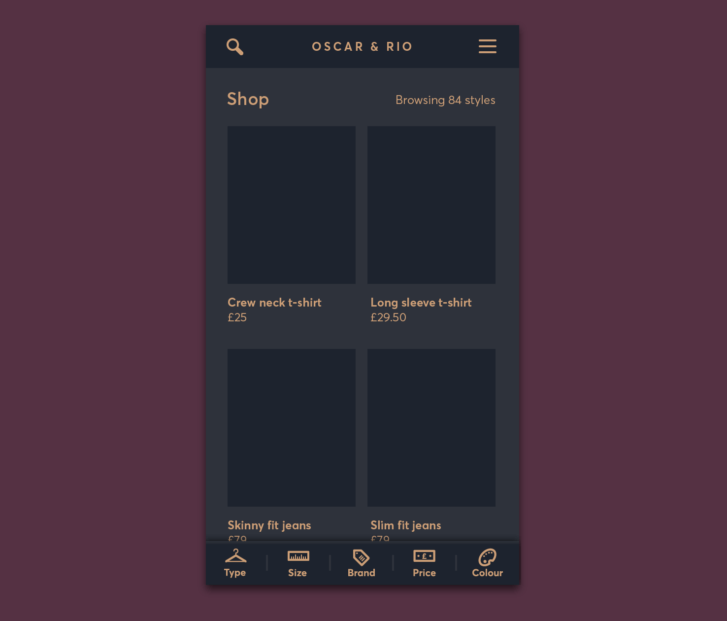
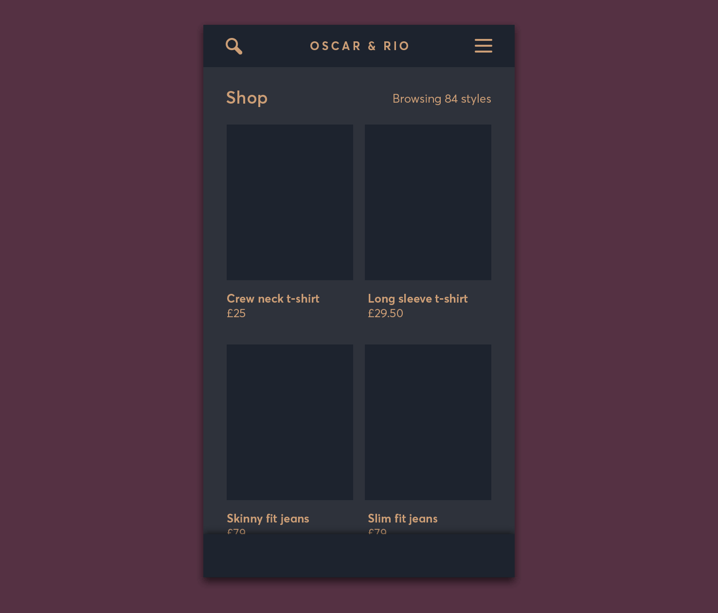
Where you’ll be at the end of this post
At the end of this post the majority of the visual style will be applied, aside from on the filters themselves.
Colour palette
Firstly it’s necessary to choose colour palette. This really sets the tone for how things move forward. Choosing this early on is ideal. For this design the intention is to have a luxurious feel.
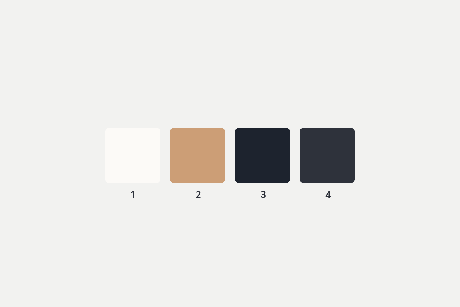
| Number | Name | Hex |
|---|---|---|
| 1 | Light orange | #fcfaf7 |
| 2 | Orange | #e8bba2 |
| 3 | Dark blue | #1d232e |
| 4 | Blue | #2e323b |
I decided to go for a dark, ‘rose gold/copper’ palette. Keeping it reasonably monochrome it helps to meet the luxury criteria.
Things with a dark theme tend to be trickier to design, so this makes for a good challenge. There can be different considerations you need to make throughout.
Opening swatches
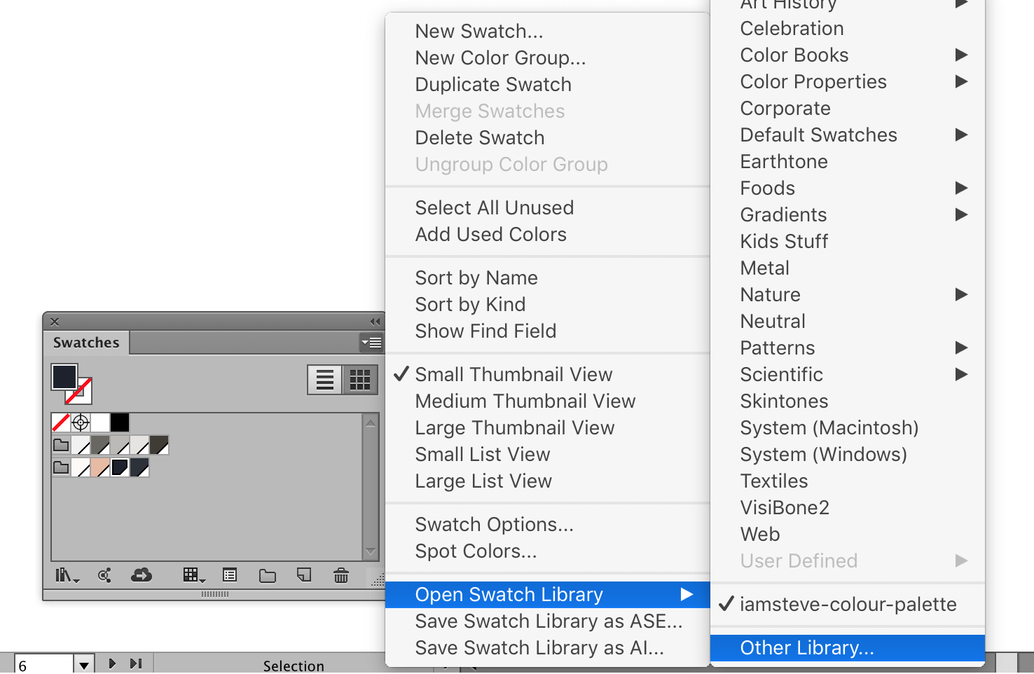
If you downloaded the swatch palette earlier, open the swatches panel by going to Window > Swatches. Then click the little icon at the top right of the panel. In that menu go to ‘Open Swatch Library’, then ‘Other Library’.
Navigate to the swatch file in this post and you should be good to go.
Typeface
I’m going to continue to use Averta, from The Designers Foundry. Alternatively Cabin or Work Sans on Google Fonts are similar free options.
The aim will be to continue to communicate the message through the design. Averta fits the luxury feel and works well at the smaller sizes used throughout.
Low contrast sans serifs, or higher contrast serifs are good matches for the style.
Remove close
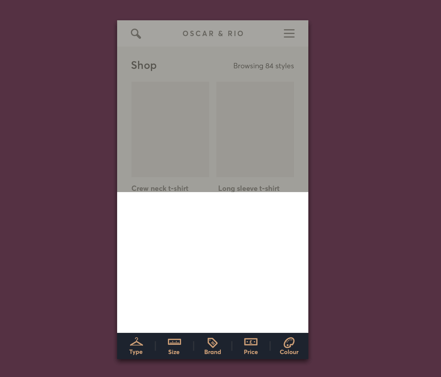
The more I thought about it the more it was the wrong decision to add this in the previous post. There are two reasons: aesthetically it is randomly placed and it would be difficult to reach.
Remove each of the close elements. In the coming steps it will be replaced in a more reach friendly position.
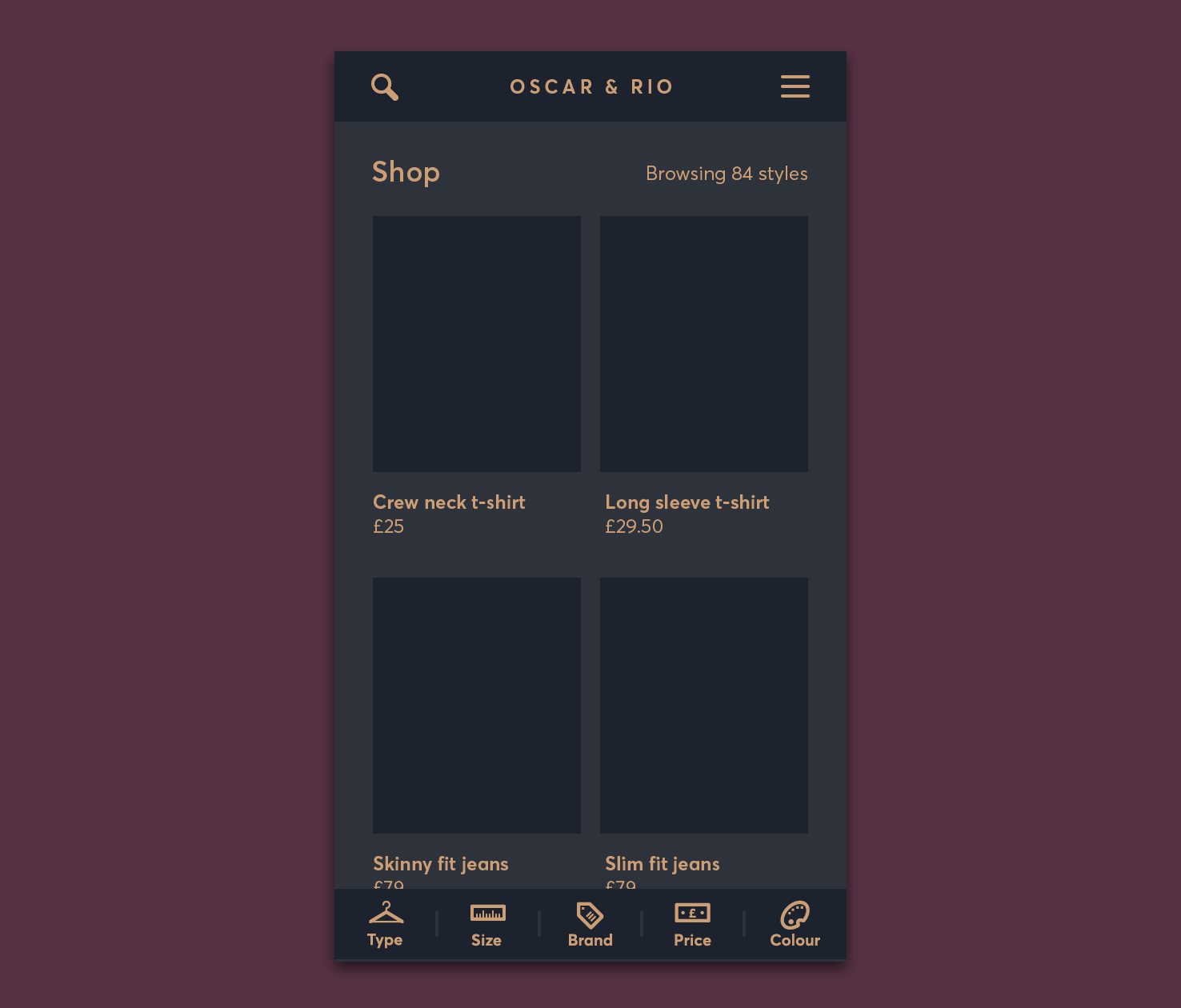
Filter bar
In the first art board you’re using as the base. Double click the filter bar to edit the symbol.
Set the background
Select each of the background squares and fill them with colour 3.
Fill the icons and text
Select all the icons and text and change their fill to colour 2. You can do this quicker by going to Select > Same > Fill or Stroke.
Add subtle dividers
To add to the luxury feel add dividers between each filter.
- Draw a vertical line / that is 16px
- Change stroke weight to 2px and colour 4
- Drag it to the centre of the first and second rectangles
- When it snaps let go
- Align centrally
- Duplicate for the other 3
Header, logo & icons
Firstly, delete the white and transparent rectangle. This will make editing things easier and clearer.
Then, similarly to the filter bar, double click to edit the symbol. Make the background colour 3 and change the icon strokes to colour 2.
Content
Moving on to content, select the background layer and change the colour to number 4.
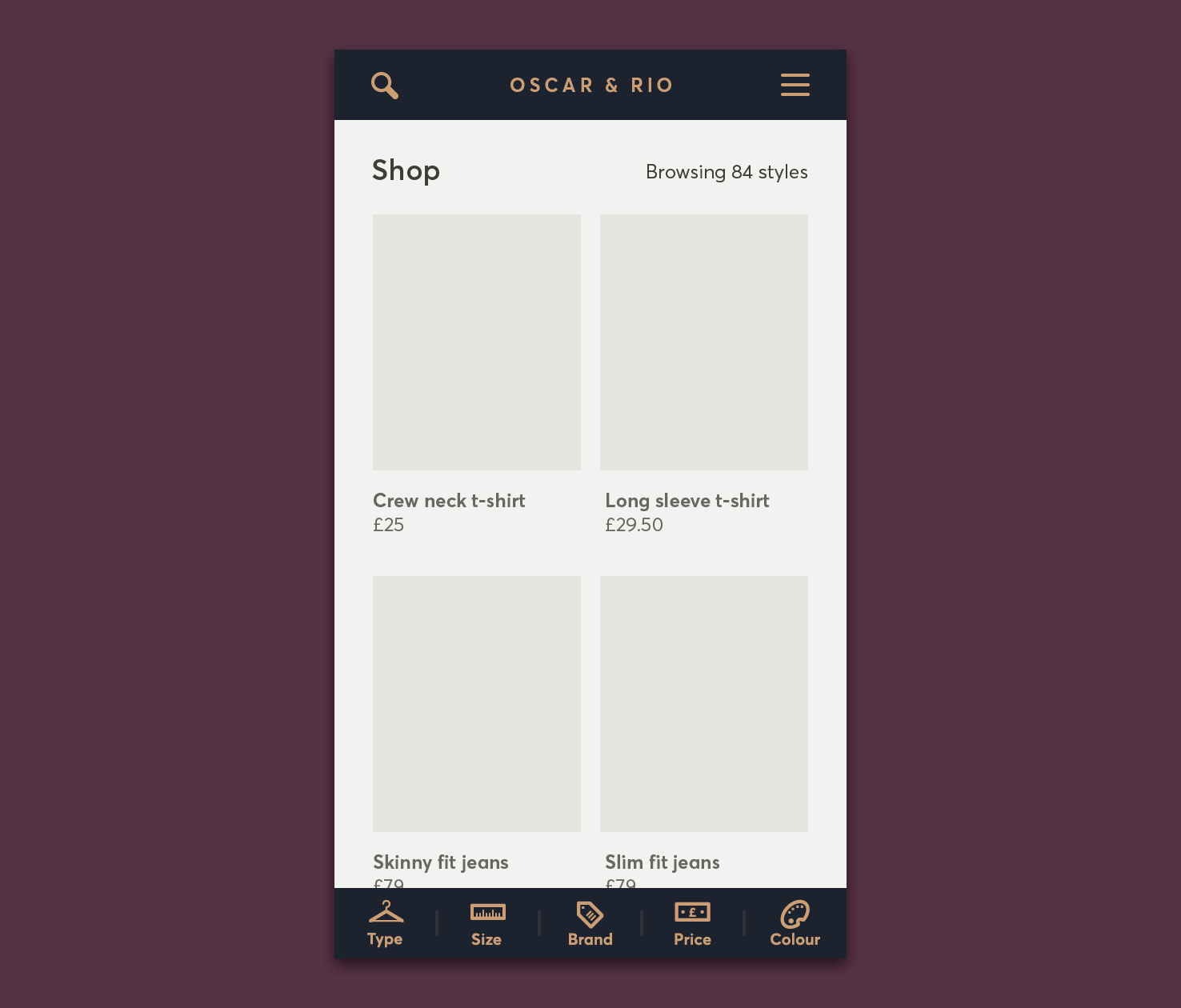
All text
Change all the text colour to number 2.
Images
You can add actual placeholder images or change their background colour to 4. This will make things more realistic or more fitting.
Further building up visual style
Now you have something that looks complete. However, you can add a little extra affordance by adding a shadow to the filter navigation.
Add a drop shadow to the filters
Copy one of the rectangles for a filter background. Paste it in place cmd + f. Make the width 320px by stretching it to the artboard or using the transform panel.
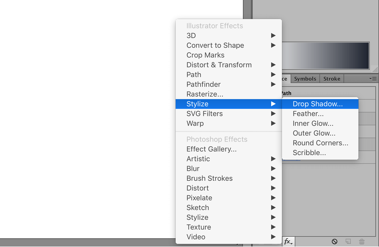
Click the ‘fx’ icon and go to Stylize > Drop Shadow.
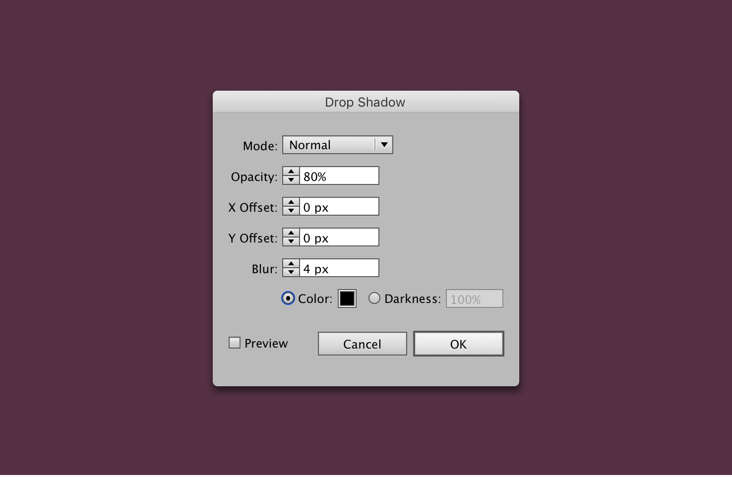
Add a black shadow with the settings 80% opacity 0px X and Y offset, 4px blur.
Finally, move that layer backwards with cmd + [.
Add a gradient to filters
Now that the shadow has been added, it causes a bit of an undesirable blended appearance. To account for that you need to add a gradient to each of the rectangles. It’s kind of like a bevel highlight.
Select each of the individual rectangles, and open the gradient panel, by going to Window > Gradient. Click the gradient in the panel, which should change the fills, to a white to black gradient.
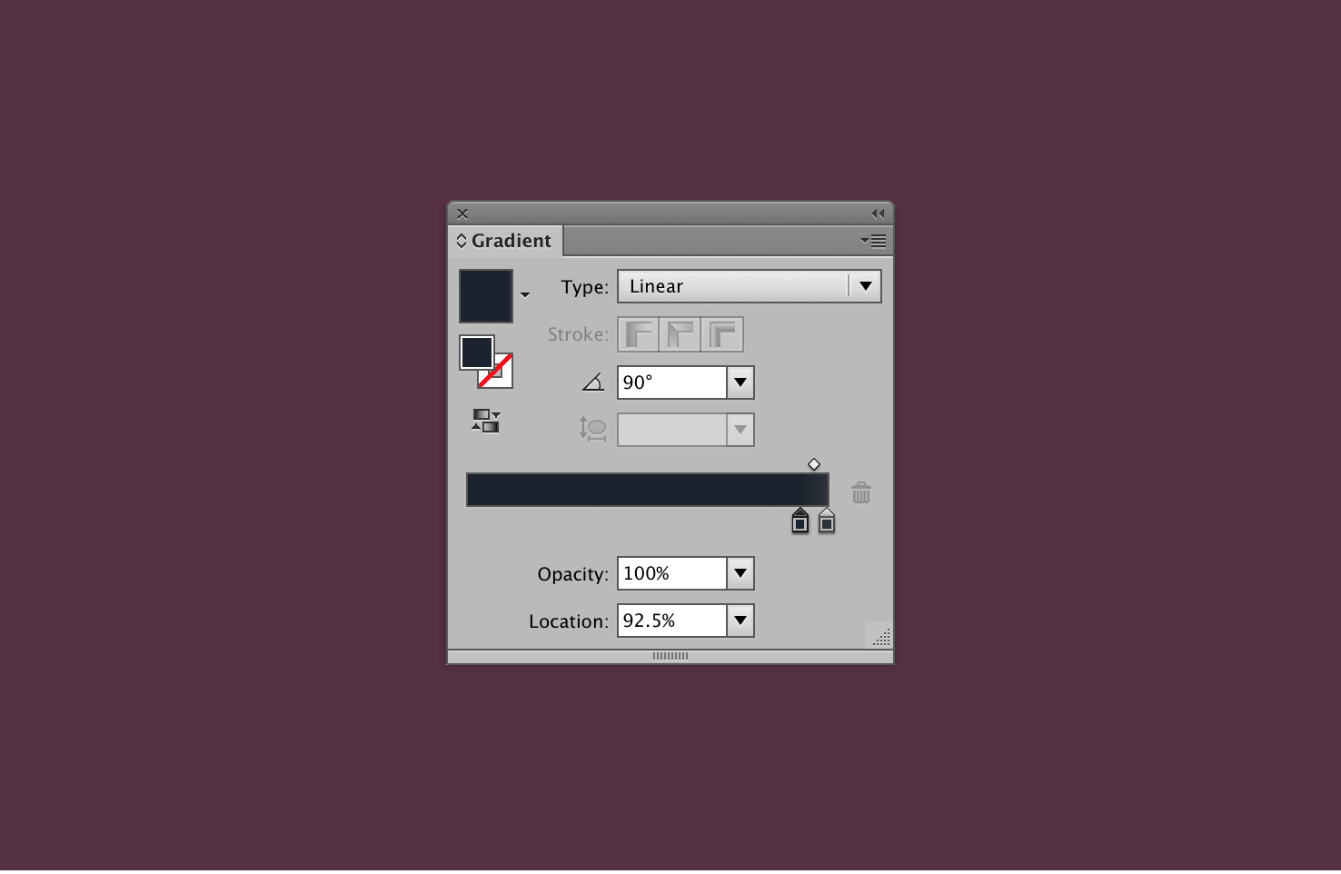
Using colours 3 and 4 in the two gradient points. The first point at 92.5% and the other at 100% creates a subtle highlight.
Finally change the angle to 90°.
That’s it for this part
The aim for this post was to show you how to use a darker colour palette. There were limited colours, but it allowed all of them to be used purposefully.
Shadows can be difficult to convey well in a darker palette. The use of a highlight is valuable here.
All that’s left is to complete the visual style for the filters.
Again, here’s the Illustrator files to download.
View on Github