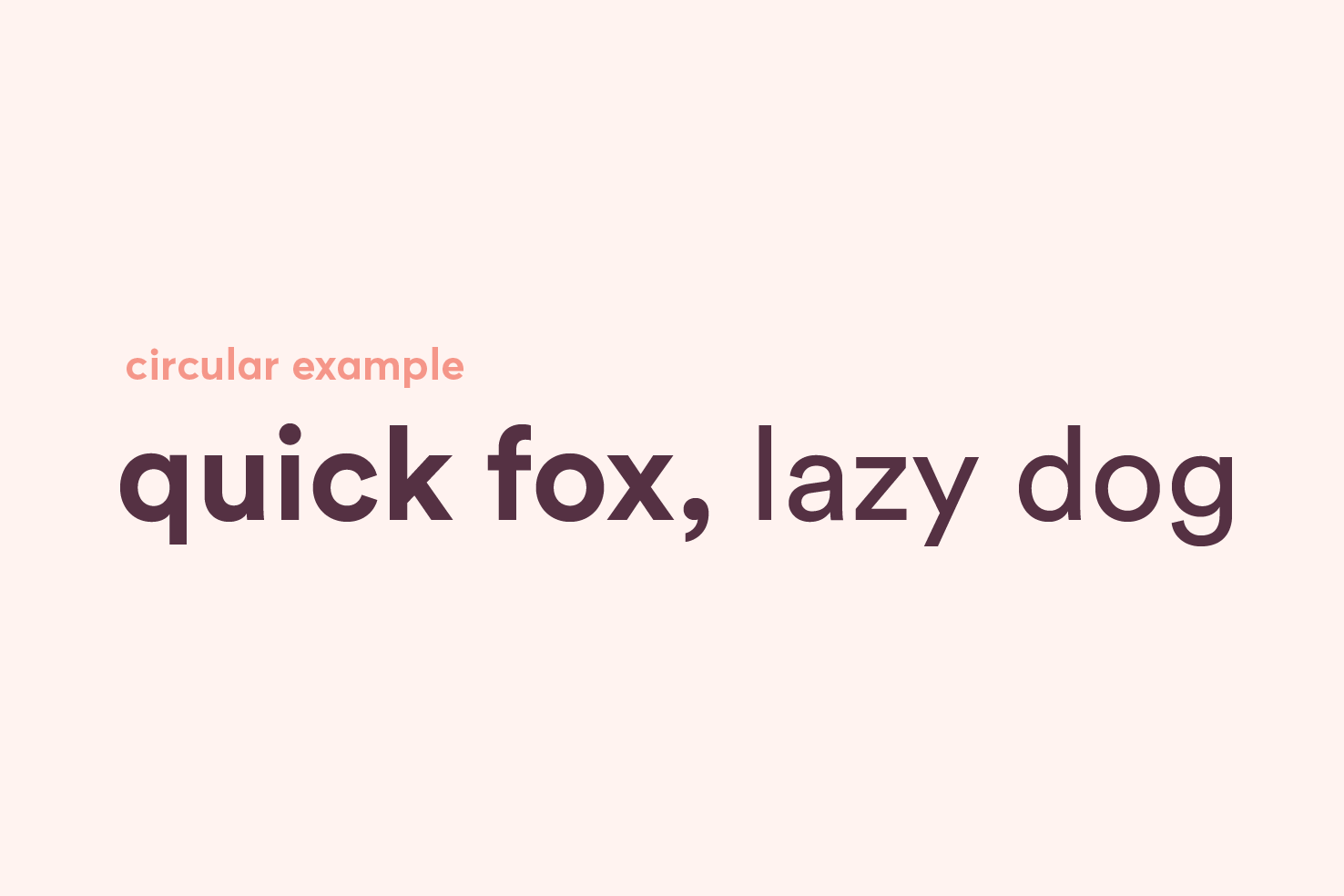
Alternatives to Circular
LL Circular is everywhere right now — Google, Airbnb and more. This post rounds up alternatives available on Typekit, Myfonts and Google Fonts at different price points.
10,840 views

Circular is very much in the spotlight at the moment. It has a distinct look to it that so many huge companies are using. From Google to airbnb, it’s everywhere. If you’re looking for alternatives — but similar — with an affordable price point for personal projects, or through a different service, this post is for you.
Circular
There is reason for its popularity outside of what Google has done for it. It’s a superb typeface that has many aesthetically pleasing features. So, what makes Circular distinctive?

- Low contrast
- ‘Circular’ features
- Geometric style
- Which retains friendliness
- Good x-height
- Versatile in use
All these things are what I believe add up to it’s popularity. It’s modern and geometric, but friendly and approachable. It’s suitable for large and small text sizes. The alternatives that I have found try to fit that as closely as possible.
myfonts.com (none are free)
You could dig for ever on myfonts, there are a variety of price brackets and endless typefaces. I have found some really close matches here. It certainly is the best place for close alternatives.
Cera
Possibly the closest match. It has a very similar double storey ‘a’, and similar features in contrast and geometry. However, at the same time ‘a’ having a less round bowl may detract from the similarity.
Campton
What makes Campton a good choice is it’s reasonably similar geometry. Though not perfect as you have a single storey ‘a’, and the ‘c’ differs.
FF Mark
FF Mark on its own is popular, it is a similar typeface. It has been used part of many bigger rebrands like mastercard. The weight, width and styles of the letters match closely.
Texta
Texta is a good alternative because of its similar character width, double storey ‘a’, it’s not the best option but looks closer in lighter weights.
Qanelas Soft
Qanelas Soft, as it is in the name, is possibly a little too soft to compare with Circular as precise as you would like. What stops me from suggesting Qanelas itself is the closer match to Futura or Proxima.
Google fonts
Some of the matches here aren’t as close as I would like, but they do share some characteristics with Circular. Some have few weights and styles, but it’s expected for free fonts. Overall, there are a few alternatives.
Cabin
It’s a push to recommend Cabin, as the character width is narrower than Circular. However, it has quite a friendly feel to it.
Rubik
Rubik is a little bit of a weird example, and admittedly scraping the barrel for alternatives on Google Fonts. However, if you look past the softer edges of the characters and slight squareness, it’s a reasonable match.
Montserrat
Personally, this is the closest Google Font you will get to Circular. Montserrat has a good variety of weights, and it matches Circular well in x-height, weight and width.
Work Sans
Work Sans is another good Google Fonts alternative, however, it is let down by the heavier weights. The contrast is noticeably higher at the heavier weights. It does have a friendly feel to it though.
Typekit
A reasonably wide variety can be found on Typekit, with plenty of weights and styles. I’m sure there will be others too. Some aren’t the closest matches, but nonetheless share similar characteristics.
Usual
A better example at lighter weights, like some of the others it loses its resemblance at heavier weights.
Effra
A good example generally, however, it can be let down by the curves on letters like ‘q’, ‘d’ and ‘g’. If you ignore those and look at the weight of characters and x-height, it shares similarity. Letter shapes like ‘c’ also share similarity.
Soleil
Another good example where the weight and x-height of characters do match quite well. At lighter weights particularly it is a good match, when you get to the heavier weights, the characters are possibly a little narrow.
Gibson
Gibson on the face of things is a good match, it’s also a pretty solid alternative to the likes of Gotham.
Europa
Europa is possibly one of the best alternatives you’ll find in typekit. It has very similar geometry to Circular, making it a good match with the double storey ‘a’, single storey ‘g’. You also have the ‘c’ which has a similar opening.
Faricy New
Faricy New has good geometry on the ‘a’, but potentially lacks the linear contrast that Circular has.
Hopefully these provide suitable alternatives
Circular is a popular typeface, but it comes with a significant price tag too. So for projects that don’t quite have the budget, these typefaces may provide alternatives.
View on Github


