
Go2Golf logo case study
I’ve been working on a recent branding project for a company called Go 2 Golf. It will be a website that will help people find golf courses across the UK. The first step for them was to have a logo made, this is the process I went through to make it.
113 views
I’ve been working on a recent branding project for a company called Go2Golf. It will be a website that will help people find golf courses across the UK. The first step for them was to have a logo made this is the process I went through to make it.
Start with requirements
The requirements for the logo were to be youthful and fresh. As a new company, it’s important to be recognisable too. I wanted the logo to convey golf, but still have a ‘smart’ element to the design.
Get an understanding of the industry
I set out to brush up on a little golf knowledge. As it’s not an area I’m overly familiar with, outside of the basics.
I was looking for an edge, to help my imagination. In turn, I found 2 under par is an eagle.
It was something to go off. An eagle is certainly recognisable and a strong mark. The golf crowd would know the link surely? However, on its own, you can’t immediately say ‘yes, this logo relates to golf.’
Take an idea as far as you can
I worked with other ideas, trying to play into the number two. Ultimately that was trying to force it. The reason I was quite set on this, is down to numbers in logotype specifically, being difficult to work with.
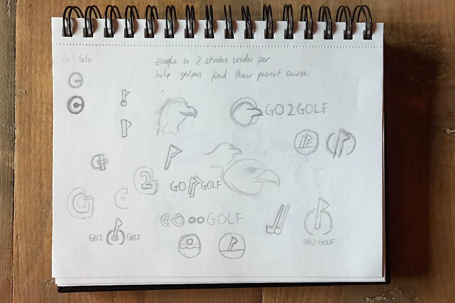
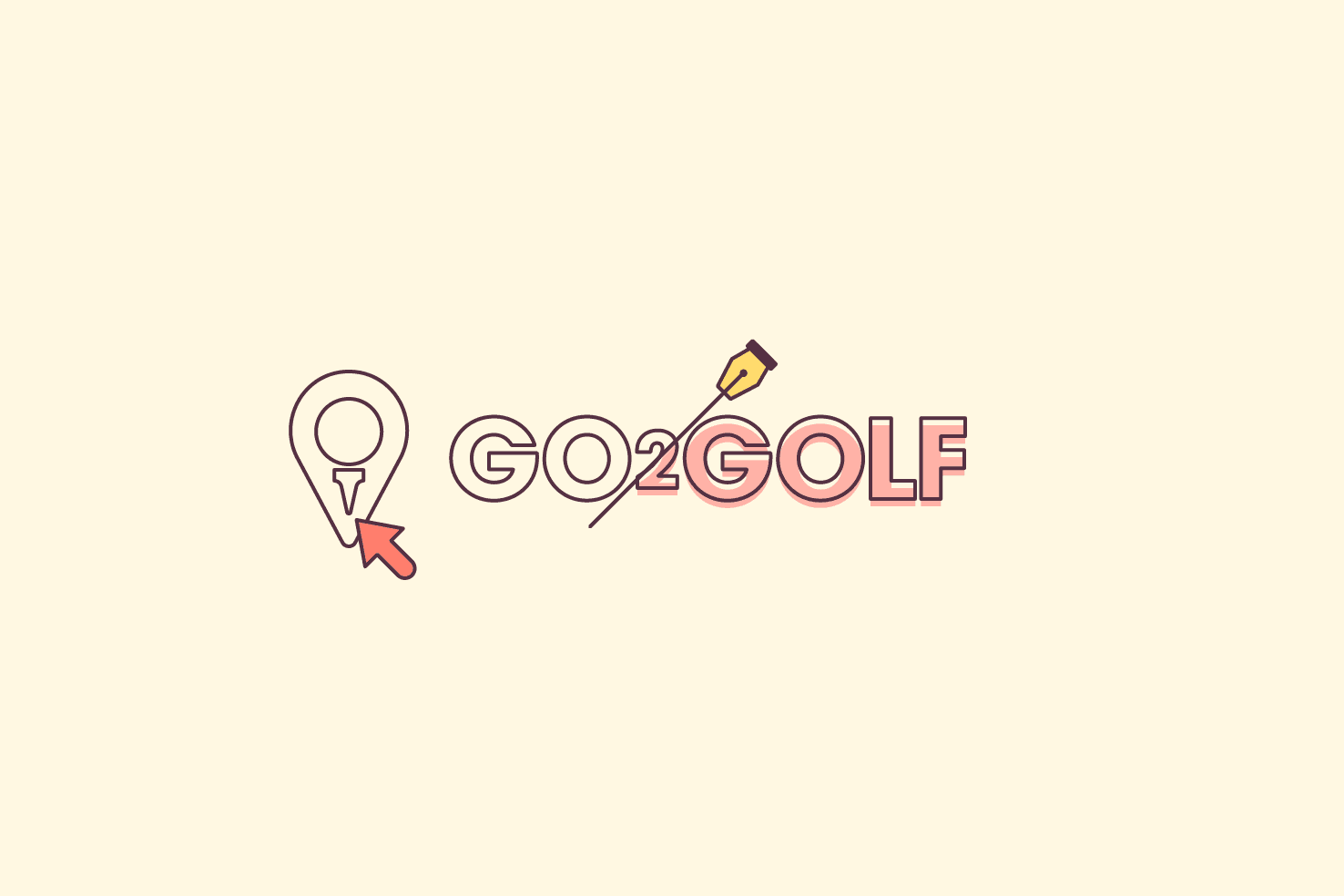
As time and ideas went on, aiming for something seemingly obvious. I thought more around Go2Golf is a place for finding golf course locations. So combining the ‘location’ symbol with a golf ball and tee.
Recognise why an idea isn’t working
It would be easy to go with the magnifying glass metaphor, but that’s not youthful. Nor can you really reinvent that, it would be the same as any icon.
Present your ideas
From my sketches, I was happy to present my explorations. I explained the strengths and weaknesses of each idea, and why I came to each idea. Some were more suitable than others.
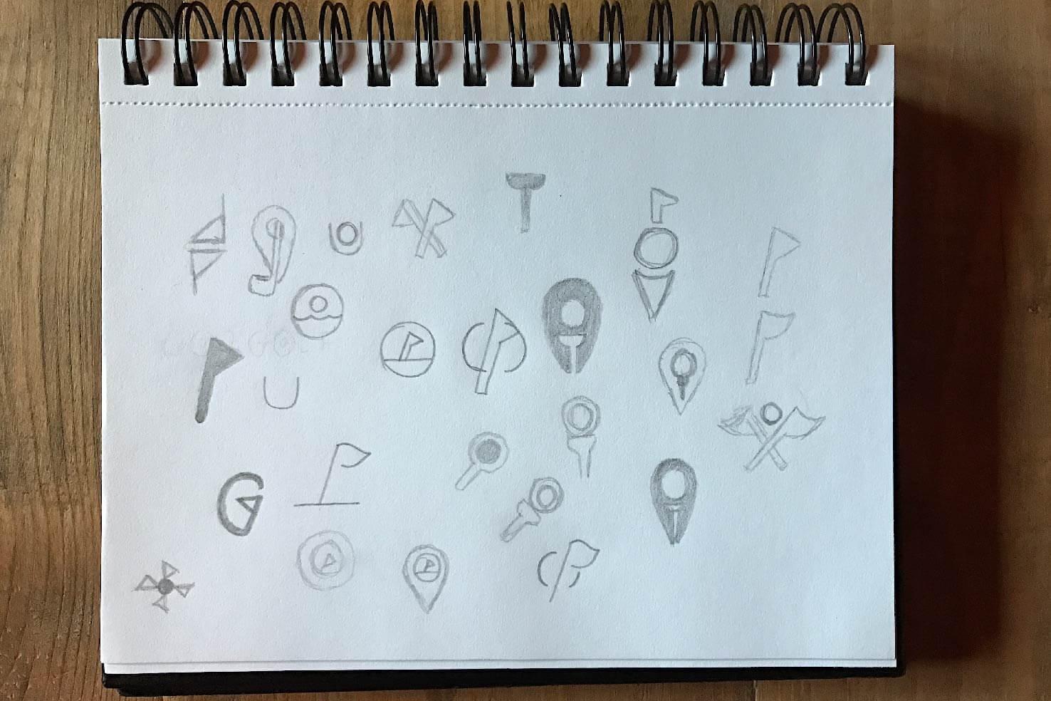
Taking the time to explain your thought process with the client early can make the process much easier when presenting a final design. Going forward with the strongest idea, the location pin and tee combination was well received.
Execution
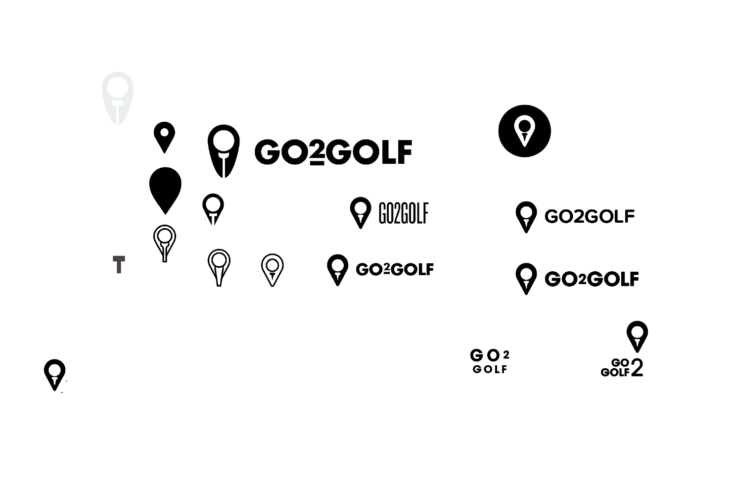
Usually, I would bring the sketches into Illustrator. However, I didn’t feel it was necessary for this instance. The basic shapes would be built from what’s available in Illustrator’s tools.
Relying too heavily on the sketches
I used my sketched idea as a direct basis for creating the mark. More often than not this approach works, but this time it didn’t.
I made the mark a few times following sketches trying different proportions. It just wasn’t working. It was difficult, I had doubts about the idea.
Leave it and come back to it
Whenever you hit a roadblock it’s important to take a step back. Have a break, sleep on it, go for a walk. Anything that involves letting the idea be left alone.
So I came back and I gave a different approach a try. That was it.
Choosing suitable type
What kind of typeface can communicate golf, but meet the goals? Immediate thoughts were bold and geometric.
I settled upon ITC Avant Garde Gothic. Other options were the likes of Futura and Brandon Grotesque. In the end, it was to the differences in the very bold weights of Futura and Avant Garde that made the decision easier. Brandon Grotesque was a little too soft in appearance.
Numbers can be quite clumsy in logos
As mentioned earlier, they’re difficult to work with. Especially the number two. It has a lot of white space around it to make things feel awkward. My aim was to de-emphasise it slightly, by making it smaller. This was another factor in the type choices.
As a result, it adds some character and distinction to the type, whilst taking some of the attention away from it.
Presentation is important
I used Marvel to present the logo. At first, this may appear strange, as it’s a prototyping tool.
However, I wanted it to be seen in the browser. While not completely in the right context, it’s always helpful to see things where it will be used most. It’s also easiest to keep everyone involved on the same page.