This post was published 10 years ago
There's a chance things are out of date or no longer reflect my views today
Images with srcset & picture
Images for me is something I consider the most tricky part of building a website, particularly for a portfolio focused website. It’s important to display these images in the best quality and smallest file size you can.
374 views


If you haven’t read the previous posts, I have spent the best part of my free time building a portfolio, where I focused on performance. These posts covered asynchronous and critical path CSS and Javascript.
Images for me is something I consider the most tricky part of building a website, particularly for a portfolio focused website. It’s important to display these images in the best quality and smallest file size you can.
srcset the beginning of making it easier
The srcset attribute is the start at making this become easier. As another thing I wanted to understand, I set out to use this where it made sense.
Determining correct usage
I’ve read posts mentioning correct usage in a couple of places how to determine which is the right choice to use <picture> or srcset.
The gist of both of those posts is the majority of times you should use srcset. However, I found myself using both evenly over the course of the website. I’ll cover a few ways to determine how to get the correct usage for yourself.
A simple retina implementation
A photo of yourself in the about section of your website is as easy as it gets to implement srcset.
<Image src="photo.jpg" srcset="photo@2x.jpg 2x" alt="…" width={738} height={492} />
This is great because the browser can decide whether the display is of a higher density or not.
A <picture> implementation
This example could equally be a srcset implementation. The case where srcset doesn’t work is when you need to adjust your layout based on breakpoints and the image sizes somewhat conflict.
The reasons for conflict I have found are for when you have a higher density version of an image. srcset doesn’t allow for w and 2x to be mixed. It gets difficult to control this as outlined in the Srcset and sizes post.
For a case I needed this worked nicely:
<picture class="featured-image">
  <source srcset="small.jpg 2x">';
  <source srcset="regular.jpg, regular@2x.jpg 2x" media="(min-width: 35.5em)">
  <img src="regular.jpg" alt="…">
</picture>
A more complex srcset implementation
This could be considered excessive, but it covers so many screen sizes should you want to have an image that spans the full width of the browser.
<img src="medium.jpg" srcset="xsmall.jpg 414w, small.jpg 768w, medium.jpg 1032w, large.jpg 1800w, xlarge.jpg 2400w">
For example if I have a iPad mini (768px width) in portrait small.jpg would be shown however if I had a retina iPad mini (1536px width for srcset) in portrait the large.jpg image would be shown.
srcset always aims to display the best image possible for the resolution while medium.jpg would be almost as close as large.jpg in terms of matching the resolution. If this was using <picture> it would be much more complex.
A complex picture implementation
If you have more art directed photos, where you need a specific part of an image to show at a specific screen size. I think <picture> is the best way to go. If you leave this down to srcset I’ve found that either higher density screens get shown poorer quality images or lower density screens get sent images too large in file size or smaller screens end up with images lacking the focus for the size of screen.
<picture>
  <source srcset="xsmall.jpg 1x, xsmall@2x.jpg 2x" media="(max-width: 37.4375em)">
  <source srcset="small.jpg 1x, small@2x.jpg 2x" media="(min-width: 37.5em) and (max-width: 64.4375em)">
  <source srcset="medium.jpg 1x, medium@2x.jpg 2x" media="(min-width: 64.5em) and (max-width: 79.9375em)">
  <source srcset="large.jpg 1x, large@2x.jpg 2x" media="(min-width: 80em) and (max-width: 119.9375em)">
  <source srcset="xlarge.jpg 1x, xlarge@2x.jpg 2x" media="(min-width: 120em)">
  <img src="medium.jpg">
</picture>
As you can see there is a big increase in the amount of code required. Each source has to have the media from the min-width to the max-width. This is frustrating as more often than not you don’t approach your media queries in CSS this way. However to ensure you’re serving the correct image this is a small inconvenience.
How to do it using Wordpress
It’s not a trivial process to do this through Wordpress currently and it’s certainly not efficient on your server if you have to introduce many image sizes. I know they’re working on something as of writing this post.
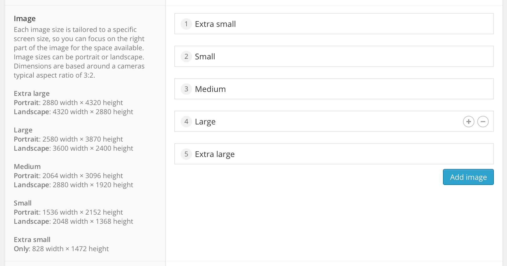
Add your image sizes
I added a variety of sizes, trying to be descriptive as possible in what they are. The orientation may not be necessary as the height is flexible but it shows the intention.
add_image_size( 'portfolio-large-landscape', 1800, 9999, true );
add_image_size( 'portfolio-large-landscape-2x', 3600, 9999, true );
Use Advanced Custom Fields
This plugin is a saviour for all things Wordpress. I have used it for finer control over the images on pages that require it, such as a portfolio.
After setting up the image sizes I have allowed for the exact image to be uploaded. As each image should be tailored for the size. This isn’t always necessary, so if you only need one image in various sizes, this will not be for you.
It would make this post long to show precisely how I’ve done it. it’s not code I would consider great as I’m not an expert with PHP—but it does a job.
CSS-Tricks always has solutions
A guest post on CSS-Tricks has provided a solution for doing it. I personally haven’t used it but it is an option.
When to bring in picturefill?
Picturefill offers a way to allow support for the picture element in nonsupporting browsers. This is my opinion on how and when to use it, but it’s your choice.
Use for the picture element and ‘w’ descriptor
If you’re using the <picture> element and srcset with the w descriptor or sizes attribute it’s probably safe to say you will need to use picturefill.
Don’t use with ‘x’ descriptor
If you’re just providing higher density images you probably shouldn’t use it. It has good support across the board except in Firefox.
It’s still very difficult
I think srcset and <picture> are great additions and it’s only the start to getting past the difficulty that is images. I’d really like to see a way to defer their loading. CMS’s have a long way to go as well in terms of thinking about this to make it easy for content creators to make sure the images display great at whatever the size.